Painter Jon Ridge argues that it’s hip to be square…
You’re free to make up your own mind where the ‘eye opener’ actually appears in this piece, because there have been a few, not least of which is my recent, retrospective realisation of all the other little significances along the way.
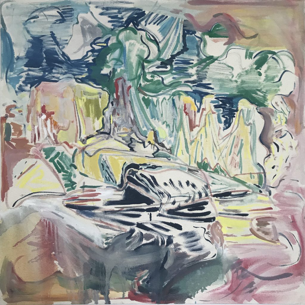
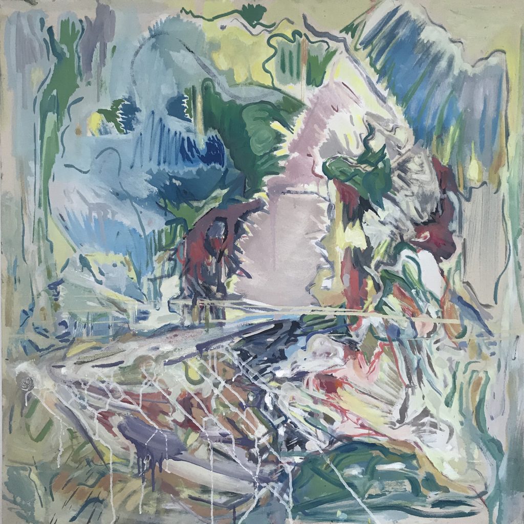
A great many of my paintings happen in a square format. I sometimes make sketches that have some bearing on the composition of the final piece, but in most cases I don’t, as my way of working is more often than not intuitive.
On one particular occasion I had my sketchbook to hand, and, not relishing the prospect of drawing yet another slightly wobbly square to sketch in, I looked for something square, of appropriate size, to draw round. I found a rather forlorn freebie music CD, the kind that comes in a small card sleeve. Just the job, I thought. And with music in mind, I found myself wondering if the square format that I had always loved when applied to the sleeves of vinyl records of 7”, 12” and occasionally 10”, might be the reason that a lot of my paintings happen on a square.
For so many of us, pop music culture was an indispensable guide to decision-making as regards style, politics, design etc. We know that many bands, hugely successful or otherwise, first met at art college; and so, pop culture is littered with significant art reference points. Pop music culture was a thrilling touchstone that, for me, prefigured the realisation that art could be thrilling too. It took the mention of the Bauhaus at school to alert me to the fact this was not just the band-name of a bunch of theatrical post-punkers singing about Bela Lugosi, but a hugely significant art movement presumably endorsed by my spiky heroes. Similarly, my first sight of an Auerbach painting was the cover of the band Japan’s live album ‘Oil On Canvas’; and subsequently, I witnessed No-Wave ‘art rockers’ Sonic Youth working with a whole host of contemporary art ‘names’, deriving sleeve art from works by Gerhard Richter, Richard Prince, Raymond Pettibon and Mike Kelly. Much of the music I bought in record form tended to be by artists that eschewed the glossy group shot promotional cover favoured by short-career, big-hit poppers; rather, there was an understanding that if a band was looking to play the longer game, using ambiguous imagery would feed their self-mythologising and mystique.
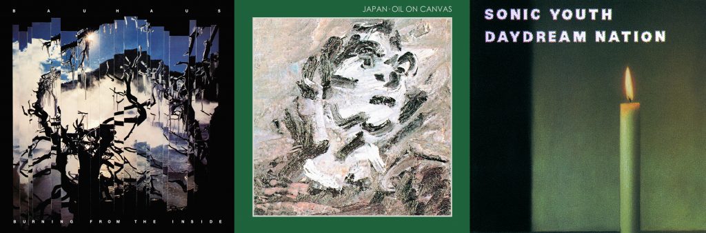
Some sleeves, rather than reproducing a well-known, preexisting painting like Auerbach’s, were pieces of art in their own right, sometimes with no identifying text at all, or text in a perversely small font size. Record labels such as Creation, 4AD and Factory took great care over their sleeve designs, endowing them with status as valuable square artefacts over and above their practical use.
My interest had been piqued; but I took a roundabout route through graphic design (for the music industry, naturally) and as an art director in an advertising team, before going on to art college to create on my own terms.
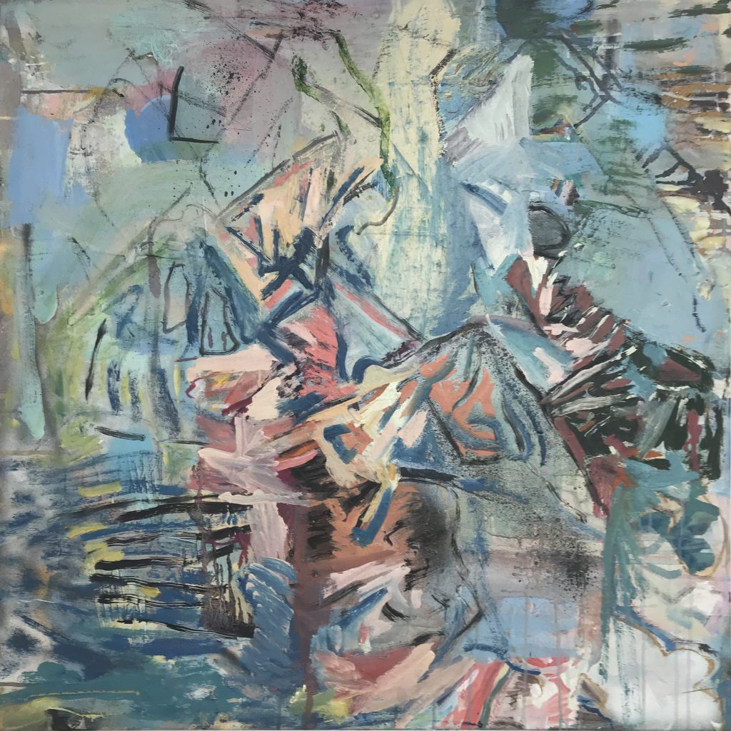
I sometimes send shots of my work to other painter friends, and the response that often comes back is ‘tricky format’. They’re entitled to their opinions; but I, on the other hand, have always felt it the perfect container for what I do. My work is never adequately described by the terms ‘abstract’ or ‘figurative’; it hangs around the boundary between the two, flirting with the border guards. Sometimes it wanders further into abstract territory; and at other times it steals a few steps into figuration, while the guards’ backs are turned.
Using the terms ‘landscape’ and ‘portrait’ to describe the orientation of a rectangle in painting harks back to their onetime literal usage; the fact that the square, for me, has no named orientation, and could be an arbitrary crop of a much bigger whole, implies an extra freedom along the abstract-figurative axis, where focal point and subject matter can come and go freely.
We seem to have come pleasingly full circle from my start-out square, in that, whilst vinyl is having something of a resurgence, fortuitously, for my paintings at least, a culturally significant ‘new kid in town’, Instagram, is also rocking the square format.
Jonathan Ridge (@jonridge): Instagram photos and videos
Comments are closed.