Frederic Anderson: ‘The Language of Walls’
With this essay, artist and writer Frederic Anderson joins the roster of Instantloveland’s writers-in-residence…
‘Artex differs from plaster in that it was marketed as a material intended to receive a textured finish, thus enabling a ceiling to be finished without plastering skills. It was very widely used in Britain in the 1970s, mainly with the familiar stippled and swirled patterns. Artex was also occasionally used on walls.
As of 2016 Artex is still sold, but the textured ceiling finishes are much less popular.
One issue with Artex ceilings is that matching the pattern seamlessly when repairing is impossible. The poor appearance of repaired ceilings harmed its popularity. Furthermore, removal of Artex can be rather difficult.’ 1https://en.wikipedia.org/wiki/Artex
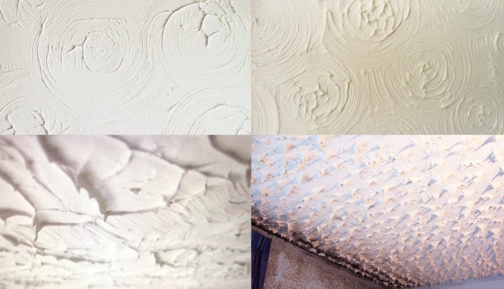
Artex has a lot to answer for. Having lived in a succession of cheaply decorated rental flats in London through the 1980’s and 1990’s, I’ve been exposed to more than my fair share of masterpieces of the genre. Staring up at those sloppy swirling ceilings, I often found myself speculating on the psychological states of their authors. There is something uniquely oppressive about an Artex finish, perhaps because every subtle nuance is frozen forever in glorious ‘still wet’ permanency. Such was its powerful, loud presence that I never quite felt alone in those rooms, as if the ghost of some shoddy landlord was in some way sharing the room with me. In the same way that a teenager’s identity is stamped onto his bedroom wall in his choice of posters, these ceilings shouted something about the character of their author at me every night.
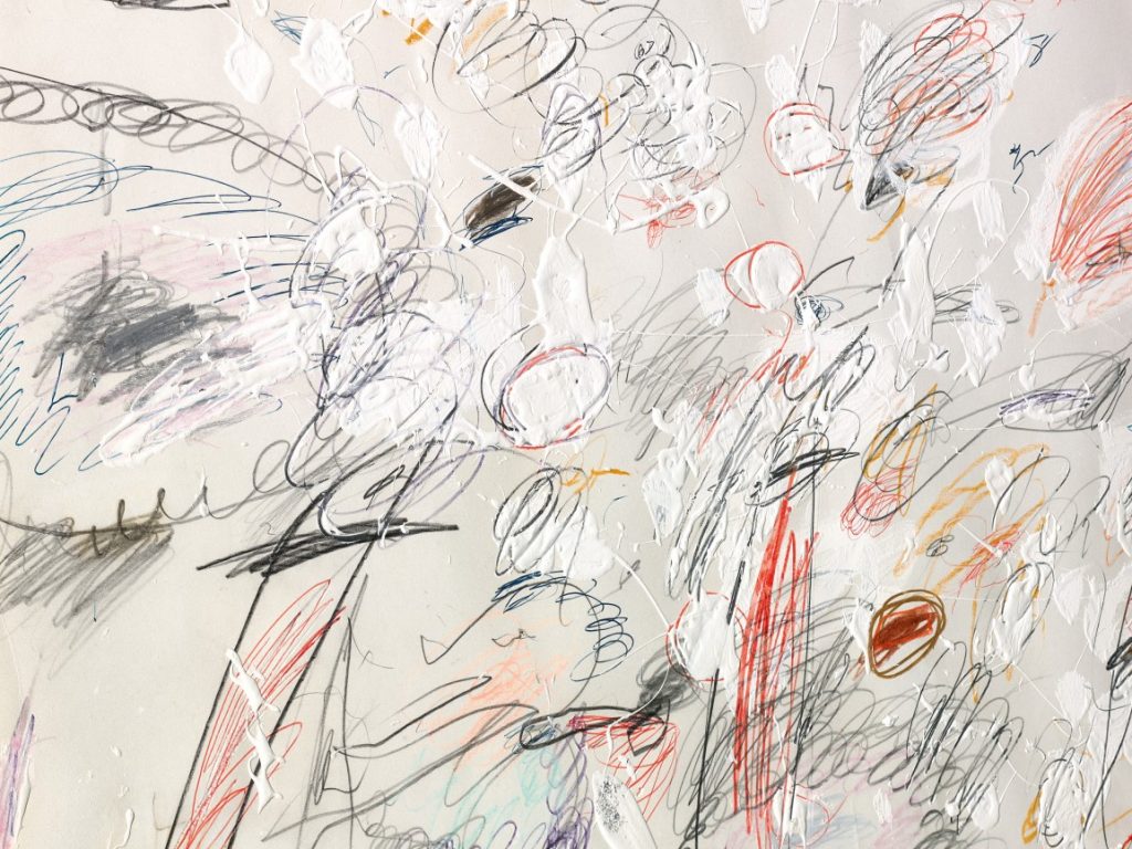
One of the things that made Artex so innovative at the time was that it could be applied by anyone, whereas the use of traditional plaster required a high level of skill. This opened the door to the curious kind of amateur aesthetic that dominated those London rental flats of mine. Another key difference between the two materials was that plaster aspired to be ‘invisible’, ideally creating a smooth, flawless surface that would not catch the eye; whilst Artex, conversely, desperately wanted to be seen. One could make a similar distinction between household emulsion paint and artist’s oil colours – the former designed to create a smooth, even surface that ‘hides’ the gestures used to create it, the latter designed to preserve the slightest nuance of colour, application, consistency, and texture. This cuts both ways of course, and it’s part of an artist’s mindset to want to bend the rules – Franz Kline coaxing extraordinary textures out of ordinary house paints, Mondrian battling with the innate ‘expressive’ properties of artist’s oil paints to create mute, flat panels of colour.
Frozen in these 1980’s Artex ceilings is the collaboration between a medium that faithfully records every nuance of its application, and an amateur artisan intent on simply covering a surface, often following a pattern suggested on the back of the box, for the first, and possibly only, time, working it out as he or she goes. It’s this kind of distracted, mind-elsewhere, gotta-get-the-job-done application that engages the interest of some abstract painters working now, because, weirdly, therein lies the potential to tap in to a particular kind of truth, freshness, depth and directness.
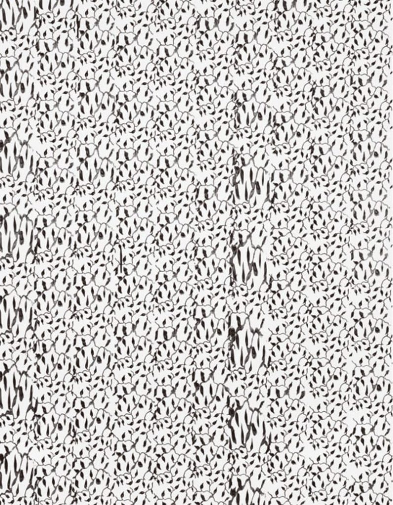
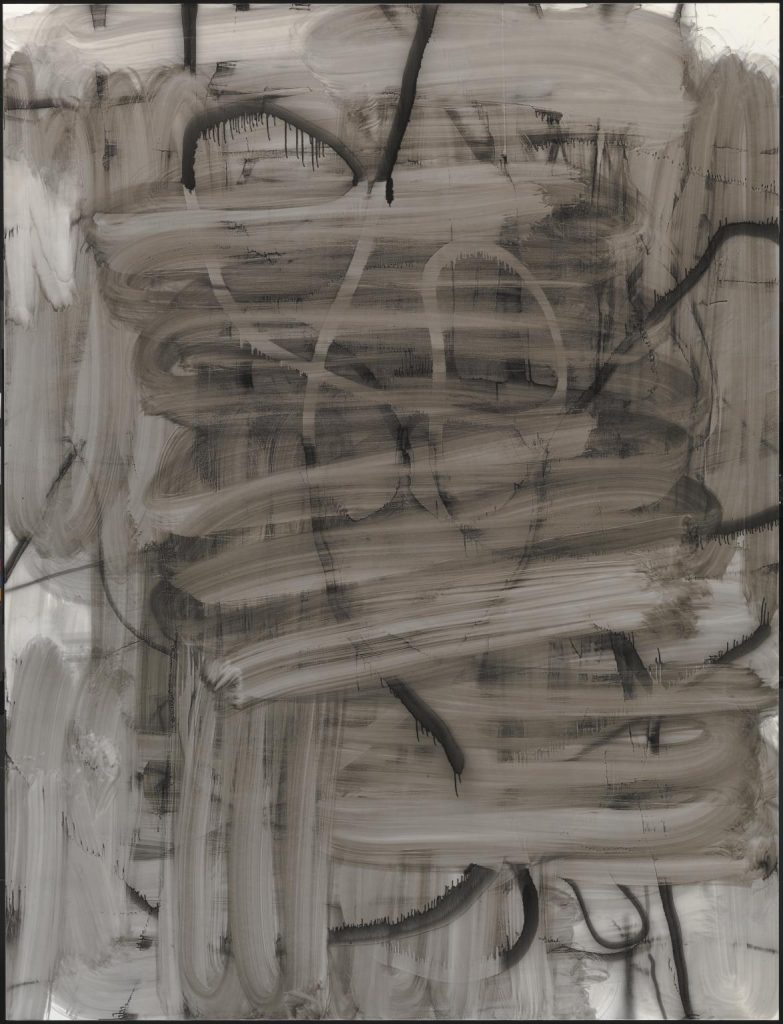
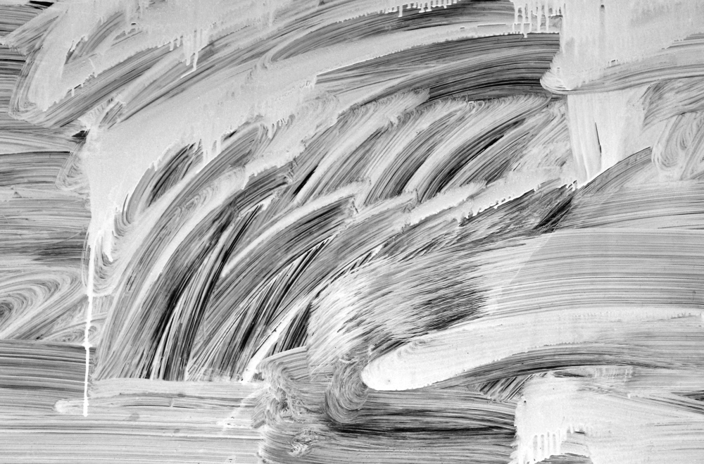
Moritz Neuhoff is a contemporary artist working in Germany who makes extensive use of the aesthetics of amateur decoration and sloppy painting. Using artists’ acrylic paints, he creates complex optical effects that emulate the textures and viscosities of building materials. His artfully carefree compositions employ a handling that often recalls the feeling of Artex walls and ceilings. ‘What appears from a distance to be an enormous surge of color material is flat when viewed closely, almost just a delicate coloration of the canvas. Everything haptic turns out to be an illusion of complex plays of light and shadow, which have penetrated the canvas almost ungraspably.’2Rolf Hengesbach (http://www.evelyndrewes.de/moritzneuhoff.html?&L=1#)
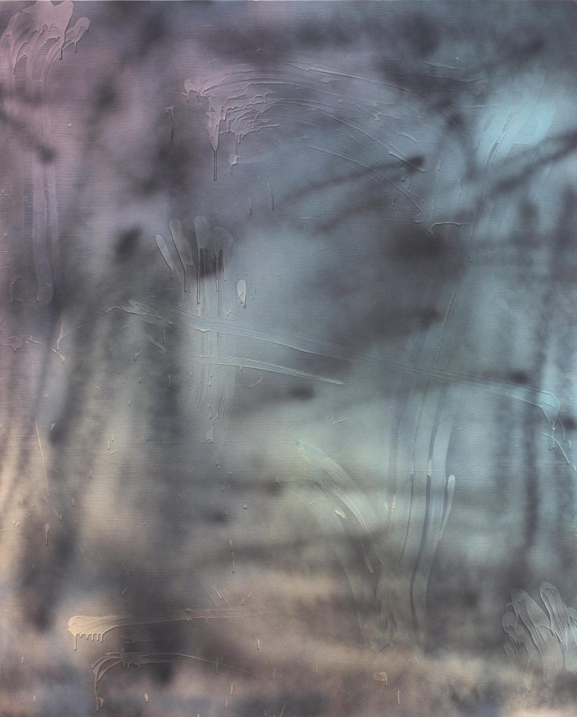
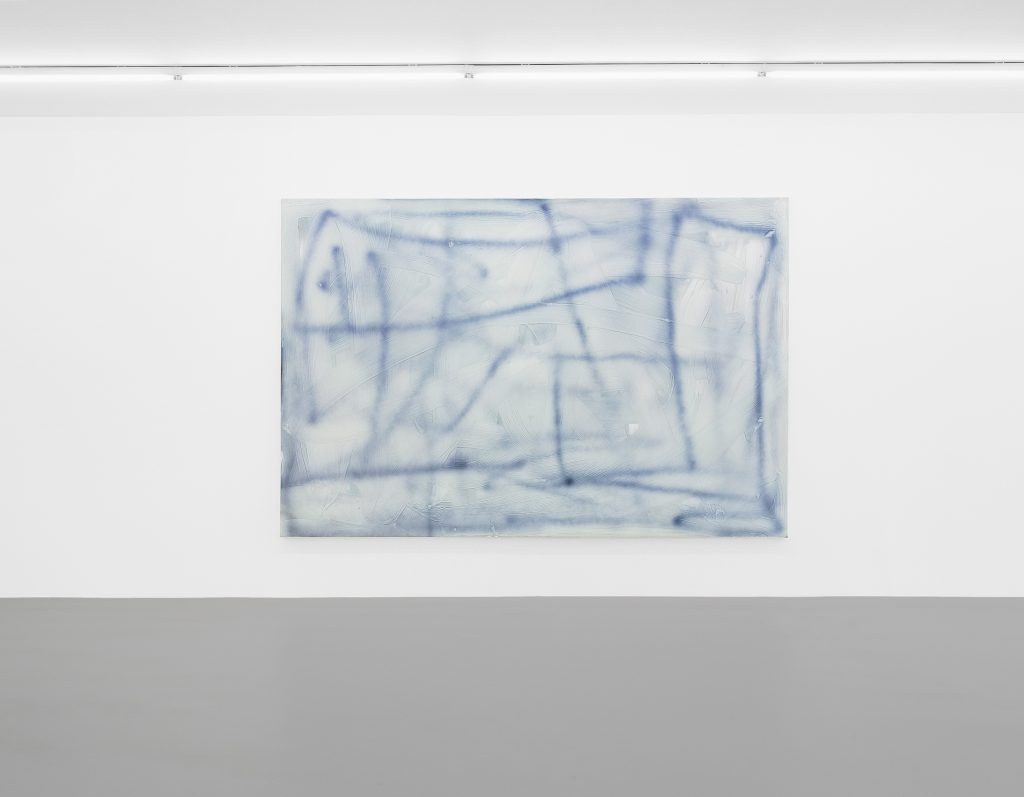
His paintings draw on the language of the amateur painter-decorator who unknowingly makes a ‘painting’ as she or he covers a surface with paint, and unwittingly reveals something about her or his psyche in the process. Many of Neuhoff’s paintings are given a further layer of complexity with the superimposition of sprayed lines. This creates an exquisitely subtle juxtaposition: the illusory haptic layer presents one potential visual ‘surface’ – an arresting ‘thereness’; whilst the sprayed lines, with their blurry edges, by contrast, create a subtle ‘not-quite-thereness’, a second, wholly ambiguous visual surface that sits in uneasy conflict with the first. Visually speaking, it isn’t apparent which intervention sits on top of which; they seem to melt into one another, compromising and undermining each other to a surprising extent. There is also a wry cynicism at play here, a self-aware subversiveness deriving from the emulation of sloppy, amateurish, seemingly uncontrived marks in the contrived space of contemporary painting.
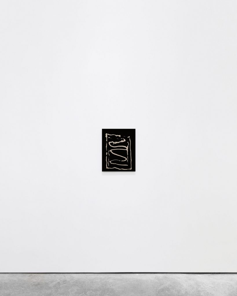
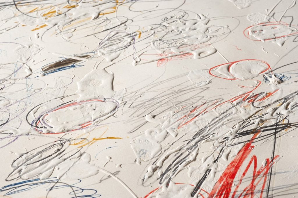
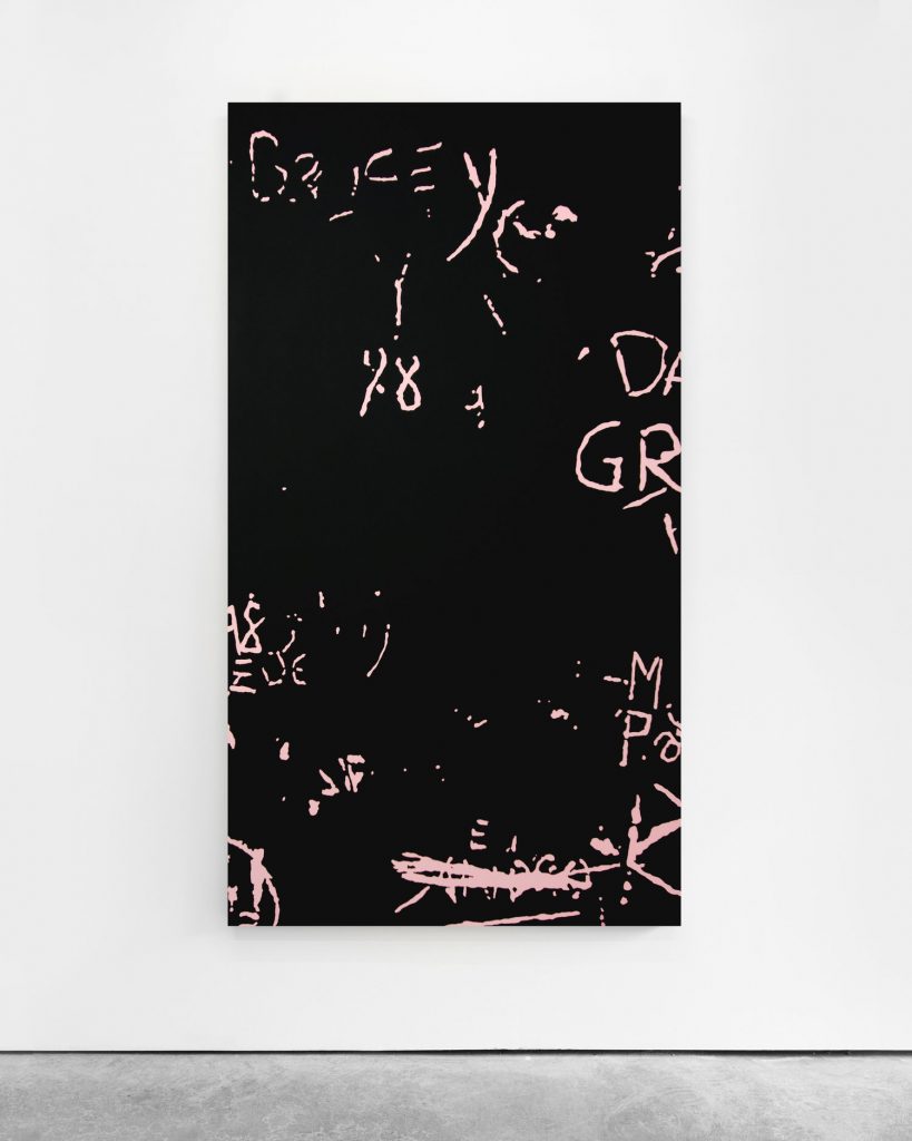
Another contemporary practitioner, Pedro Matos, makes paintings that draw instead on the language of graffiti; unlike Cy Twombly, whose autographic painted and drawn marks allude to graffiti, Matos uses found examples, rather than creating his own. These found interventions are skilfully cropped and rendered in stark, bitmapped two-tone colour to create flat, smooth paintings reminiscent of silkscreens in their elimination of visible brushstrokes. With their banal source material of tiny, scratched marks giganticised and starkly sorted into presence and absence by the bitmapped treatment, the paintings give permanency to what are usually ephemeral marks. The way Matos treats these found interventions flattens them both visually and conceptually. Marks made at different times, by different hands, using different tools, are rendered homogenous by his painting process. This allows the surprisingly sophisticated compositions at play here to come to the fore. Again, what is curious here is how the artist succeeds in elevating names, signs and declarations of love carved and scrawled onto bathroom stalls, school corridors and the like into the realm of contemporary art – giving them a new sense of urgency and vibrancy. In the artist’s own words: ‘I think these works […] share an appreciation for the usually overlooked and underappreciated, reinterpreted and brought into a different context and given a new meaning, both visually and conceptually.’3https://kristinhjellegjerde.com/usr/documents/press/download_url/561/richie-press.pdf In some recent paintings, Matos has drawn on a similar ‘tradesman’ aesthetic to Neuhoff’s, turning his attention to the traces of glue left behind on walls where a sign has been removed.
Of course, there is a long history of artists borrowing tradesmen’s tools and materials. The cycle of abstract paintings that Twombly made in 1969, known collectively as the ‘Lexington Paintings’ after the place they were painted, are fine examples of this. They were made using a kind of off-white oil-based house paint that the artist favoured at the time, with tiny interventions in pencil and wax crayon. The house paint is applied thickly, with an amateurish touch. The paint rolls, drips and spreads over the surface of the canvas, creating a gloopy, sticky-looking texture, partially concealing some of the pencil marks. The aesthetic is that of a graffitied wall, a school hallway perhaps – a place in which the implements to hand are pencils, crayons, biros and penknives, rather than spray cans and fat caps.
‘Twombly loved the qualities of oil-based house paint, which allowed for a free-flowing application while maintaining enough viscosity to accommodate his graphic intrusions. When thinned, it was a wonderful wash that provided a translucent ground upon which numerous layers of paint and marking could be added. Alternatively the wash could form a diaphanous veil, both concealing and revealing previous markings and workings’4Paul Winkler (Cy Twombly, Sieveking Verlag, Ed Jonas Storsve, 2017, p53)
These paintings were famously rejected by Leo Castelli, the artist’s gallerist at the time. ‘The entire group of ten canvases was to have been shown that same year [1959 – the year they were made] at the Leo Castelli Gallery in New York. When they arrived in New York however, Castelli told Twombly that he couldn’t show them because he ‘didn’t know what they were”5Paul Winkler (Cy Twombly Gallery, The Menil Collection Catalogue, Schirmer Mosel 2013, p28) Although much of his oeuvre suggests the feeling of graffitied walls, these paintings are amongst his most extreme in terms of both reduction of marks and ‘wall-likeness’ of appearance, which is perhaps why they confounded Castelli’s expectations. In their prevalent use of house paint, the ‘Lexington Paintings’ draw on the language of walls, and in doing so, they effect a subtle and yet very powerful shift of register. They elude the classification of ‘windows onto another place’ that a mind-set schooled in representational painting would foist on them, presenting themselves instead as displaced, truncated sections of wall superimposed onto other walls. This feeling of expansiveness and solidity they generate derives from a subtle combination of three different factors: the use of wall paint, the kind of nervous scratchy graphite marks more commonly found on graffitied walls rather than in art, and Twombly’s practice of working on vast expanses of canvas pinned directly to the walls of his studio that were later cropped into single, separate paintings.
Christopher Wool draws on this legacy of abstract painting-as-wall. In his case, most notably, through his use of the patterned paint rollers beloved of New York slum landlords. These rollers offer a quick, easy, and above all highly economical way of applying a wallpaper-like patterned finish to a wall, thereby hiding, or at least distracting from, its imperfections. In the 1980s Wool used these rollers to create a series of austere, mostly black and white paintings on aluminium panels. Deploying the rollers on the slick white surfaces of his aluminium supports created inconsistencies, glitches and slippages in the application. These slippages give the paintings a kind of ‘leer’ – a knowing subversiveness, a slightly menacing and distinctly cool self-awareness – a ‘whatchu lookin at?’ pose. As Ann Goldstein has observed,‘the repetitive patterns of these works are articulated by layering, skips in register, drips and scumbles, what Gary Indiana called ‘glitches’. The imperfections imbue these works with fragility, as the seemingly empty decorative patterns are rendered imperfect, and thus vulnerable.’6Ann Goldstein, ‘What They’re Not: The Paintings of Christopher Wool’ in Christopher Wool, exh. cat. (San Francisco Museum of Modern Art, 1998): 255-264) And John Caldwell goes further: ‘Since the repeated pattern has no inherent meaning and no strong association, we tend to view its variation largely in terms of abstraction, expecting to find in the changes of the pattern some of the meaning we associate with traditional abstract painting.’7John Caldwell, “New Work: Christopher Wool”, in Christopher Wool, exh. cat. (San Francisco Museum of Modern Art, 1989): unpeg.
Wool’s repetitive patterns are,in their truncated endlessness, arguably both a contemporary revival of the ‘all-over’ approach to painting pioneered by Jackson Pollock, and companion pieces to Twombly’s ‘Lexington Paintings’ in their allusion to cropped sections of walls.
Aside from walls, all four artists are united by the glimpse ‘behind the scenes’ that their respective practices reveal. This, combined with a subtle sense of an in-between state, a moment of flux, or of something unfinished. With Twombly it is in the tension between irrepressible mark-making and erasure. In the ‘Lexington Paintings’, marks are inscribed both directly into thickly applied still-wet sections of paint and on top of dried sections of the oil-based ground. In other places still, they are partially obscured by veils of thinned paint. The paintings suggest an ongoing struggle between the sort of expression and censorship played out on graffitied walls, here frozen in an in-between state in which neither force dominates the other. With Wool, this ‘in-betweenness’ is most powerfully expressed by his more recent works, in which sprayed lines are scrubbed back and messily half-erased with solvent, drawing on the twin aesthetics of both graffiti and graffiti removal.
Neuhoff’s works, meanwhile, evoke the idea of the unseen underlayer. The sloppy swirls and uncontrolled drips of tile adhesive, plaster and other wall-covering substances not usually intended to be seen, whose very purpose is to be covered up, are here laid bare in all their uncanny, messily expressive glory. By drastically reframing in scale and colour the kind of small graffiti interventions that have become so ubiquitous as to go unnoticed, Pedro Matos gives them a new urgency and vibrant presence. Compositionally, the layering of different scripts and registers lends the work fresh and surprising rhythms; and, as in the case of Twombly, cropping plays a crucial role in the final composition of the pieces.
Both Wool’s graffiti paintings and Neuhoff’s seemingly unselfconscious gestures also evoke, for me, the whited-out windows of closed-down shops – another weirdly vivid visual scrap from my childhood. As with Artex, the application of paint to glass creates a particularly ‘live’ texture, a detailed account of the story of its application. The aesthetics of this texture are so unique that my younger self used to imagine there was a special paint just for this purpose: the last sad duty of any failed business owner being that of ordering ‘one can of closed-down-shop paint, please’ from the trade counter – the shopkeepers solemnly and silently handing it over, not wishing to be seen to be passing judgement; and they themselves nervously eyeing the shelves of closed-down-shop paint as they go about their business, wondering if they’ll ever have cause to use it on the windows of their own premises…
Just as a car turned upside down with wheels in the air, a car on fire, or a car neatly cut in half has an impact quite unlike that of the hundreds of cars one walks past each day whilst barely registering their presence, whited-out shop windows insert the same kind of incongruity into everyday lived experience. A material- glass -designed to be transparent, messily and loudly rendered opaque; a portal onto a space, designed to invite people in, repurposed to keep them out and obstruct curiosity. This kind of uncanny transformation of the familiar draws our attention, rendering the banal vibrant.
These four painters draw on the subtle incongruities that live right under our noses – paintings as walls, unfinished states, slippages, the behind-the-scenes aesthetics of adhesives and cements, and wallpapers doing things they aren’t supposed to do…in so doing, they tease out strange subtexts from apparently simple applications of paint, offering a gritty visual poetry with a raw, unfiltered, emotional intensity. It’s curious how, when all notions of narrative, figuration and identifiable subject matter are expunged from paintings such as these, other more ethereal conveyors of information and emotion spontaneously rush in to fill the void. I can’t speak to the precise nature of the triggers buried in the works of these artists (and to attempt to identify them is to miss the point, I think), but in my own practice I’m often struck by how disconnected visual fragments from my past unconsciously find their way into paintings, revealing themselves suddenly, sharply, sometimes only several years after the work was made. The pungent, almost offensive colour combinations of the wallpaper in my grandmother’s apartment in 1970’s Luxembourg (pretty much my only surviving memory of that time), the seemingly cheerful toy that first revealed to me the devastating relentlessness of gravity, the regrettably widespread use of closed-down-shop paint in 1980’s Brighton and those haunting Artex ceilings…
Comments are closed.