James Faure Walker: ‘Speed Limits: Digital Paint and Abstract Painting’
In his third piece as a writer-in-residence at Instantloveland, James Faure Walker recalls the resistance he encountered as a maker of digital art…
In 2016, French Michelin-starred chef Hélène Darroze posted a Salade Niçoise recipe on Facebook that included cooked potatoes and green beans. The reaction on Facebook from the ‘purists’ was quick and hostile – ‘a massacre of the recipe’, a ‘sacrilege’, and a violation of the ‘ancestral traditions’ of the salad. She was warned that it is ‘dangerous to innovate’.1https://en.wikipedia.org/wiki/Salade_niçoise
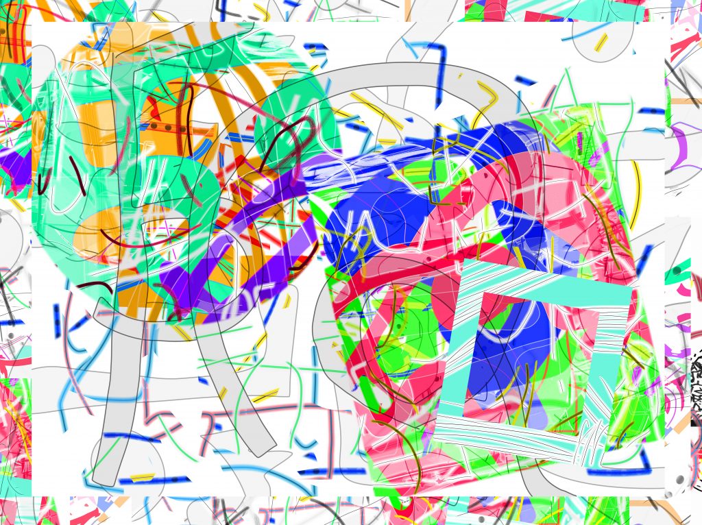
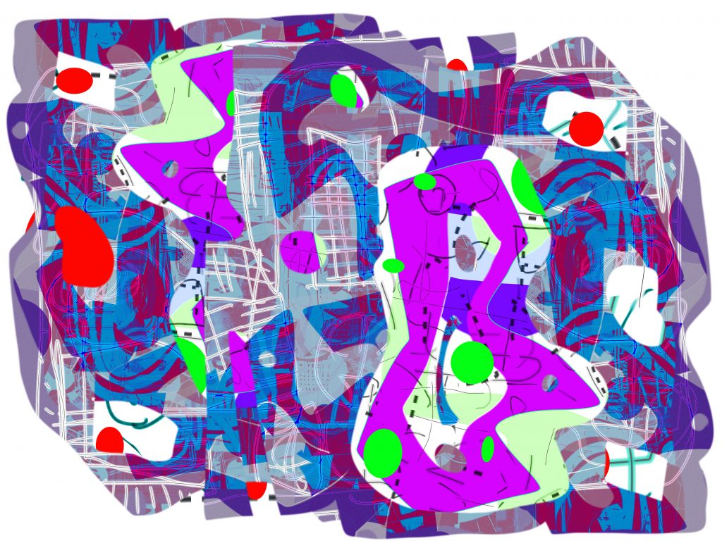
During the lockdown I have been working digitally. Unable to get to my studio, I am confined to using paint software. I have been working this way for more than thirty years, but normally in parallel with physical paint. I have been in reflective mood, painting without materials, painting without a studio. I have been thinking about a series I made in 1990 that I called ‘Propositions’, and have wondered how my current series compares.
Thirty years ago there was no internet to speak of, no social media, and by today’s standards computers were primitive. The printer I used, a Xerox 4020, one of the first inkjets available, has vanished, even from eBay. ‘Computer Art’ had been the subject of the ICA’s ‘Cybernetic Serendipity’ of 1968, but wasn’t taken to be a serious art form going somewhere. Once I discovered what you could do – in colour – playing about on an Apple II, I was hooked. It was a gift for the abstract painter. I could work much faster than with gouache. It had the potential to outclass oil paint on canvas – no need for mixing, drying times, brush cleaning, or all those costs. Had I been sleepwalking all these years, echoing received opinions, conditioned from habit? I couldn’t understand why more abstract painters weren’t here ahead of me. I had thought abstract painting involved experiment and adventure – pushing the art form forward. Was using a computer just an unnecessary distraction for the busy painter? That was the response I got from an essay I wrote in 1992 for ‘Modern Painters’. After the second essay in 1994 (which was on the ISEA conference in Minneapolis), the editor pleaded: nothing more on that subject!2‘Painting with the Computer’, Modern Painters, Summer 1992, ‘Art and the Intelligent Lunch-Box’, Modern Painters, Spring 1994 As one painting professor put it to me at that time, painting is essentially conservative. I tried to introduce Photoshop into Fine Art departments in colleges, but without success. I would be told what it was like to be an artist – I should be intuitive, spontaneous, creative. Obviously, I was robotic. The computer was this unwelcome box of tricks, like painting-by-numbers, all done for you, best relegated to a dark room called the ‘lab’ for the graphics people.
He felt profound humility before the rites of these people, who lived so free of doubt, so far removed from any kind of modernity, as if operating by a different calendar; but at the same time he loathed their tradition-steeped intransigence, their superstition, their unwillingness to place anything above the laws of their ancestors.3Nino Haratischvili), (2019, ‘The Eighth Life: (for Brilka)’, translated by Charlotte Collins and Ruth Martin, Scribe: London, page 377. This passage refers to a remote village in Georgia during the Stalinist epoch.
I absorbed the mini-lectures with a blank face. Galleries explained why computer ‘output’ couldn’t be ‘art’: the paper was too thin, it would fade, and it was made by a machine, nobody would buy it. (The V&A was the great exception. It has acquired one of the best collections of early digital art anywhere. There is also the DAM Gallery, Berlin.4See: http://www.vam.ac.uk/content/articles/t/v-and-a-computer-art-collections/ and www.dam.org There was also the Colville Place Gallery in London, which opened in 1998.) It wasn’t the objections themselves that got to me. It was the refusal even to look at the evidence, the slides I would bring along. These were, supposedly, open-minded visual people. I had stumbled into a brick wall. This made me all the more determined to look into what lay behind the rejection. What was threatened? What was it that needed protecting? It appeared to have more to with the failings of imagination, a lack of belief in abstract painting as a progressive force, than with the new technology itself.
I did share some of these misgivings in my own mind. I was all too aware that some in what had, by then, become the digital art movement saw the rejection by ‘the art world’ as proof enough: they really were the new techno avant-garde. In the book I eventually wrote – published in the USA in 2006 – I revisited these conversations, but never took the line that ‘digital media’, as it came to be called, would supplant painting.5James Faure Walker, (2006), ‘Painting the Digital River: How an Artist Learned to Love the Computer’, Prentice Hall, Upper Saddle River: USA. Further reflections in ‘Painting the Digital River: Before and After’, in ‘Painting, Digital, Photography: Synthesis and Difference in the Age of Media Equivalence’, (2018), edited by Carl Robinson, Cambridge Scholars Publishing. See: https://www.jamesfaurewalker.com/river-gods-painting-the-digital-river-how-an-artist-learned-to-love-the-computer-james-faure-walker-2006.html I never bought into the techno-futurism of ‘Wired’ magazine. All along I had felt that what you could do in the paint programme was painting. It could move your thinking sideways, and it might take decades before it was absorbed and integrated, and treated to be as ‘normal’ as drawing. That had been the story with photography. This was certainly a challenge. Talking about it, writing about it was useful. But making the pictures, that was the real work.
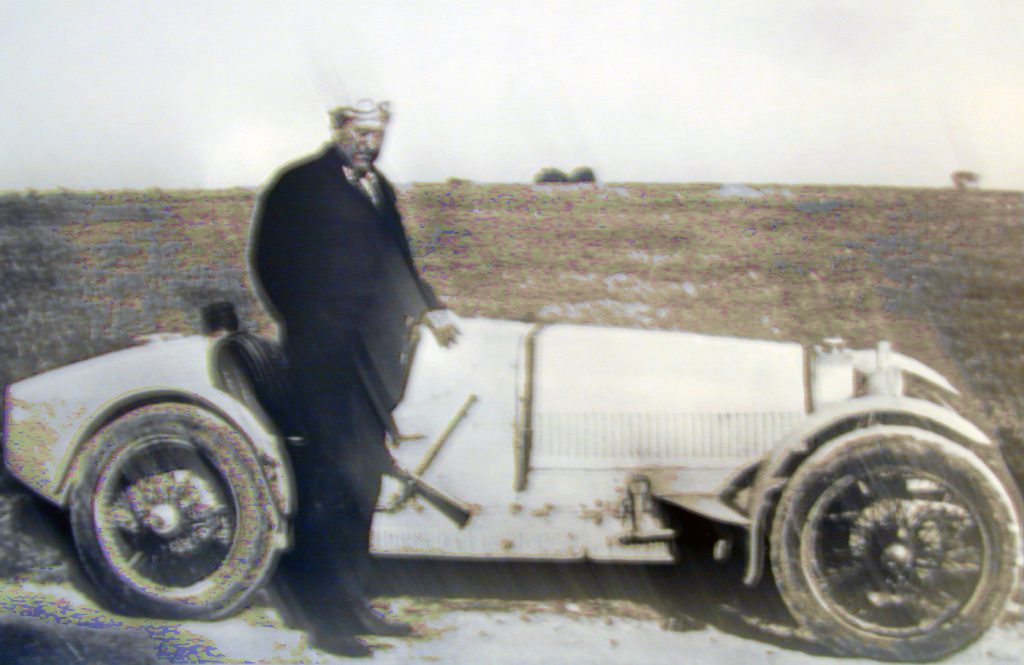
In 2003 I had taken part in the digital section of the Salon d`Automne in Paris. There was a display case of old catalogues. There was a photo of Andre Derain, looking fierce alongside his Bugatti.
In the thirties Braque had souped-up an Alfa Romeo:
He drove, at seventy years of age, like a madman……So began a lifelong affair with motor cars: a Rolls or Bentley for more stately passage, with Marcelle, and a pedigree roadster with the necessary pep – a Simca 8 perhaps – for road-hugging, accelerating, without Marcelle. And in the fullness of time, a liveried chauffeur.6Jean Bazaine, quoted in Alex Danchev (2012), ‘Georges Braque, A Life’, Arcade Publishing: New York, Page 159
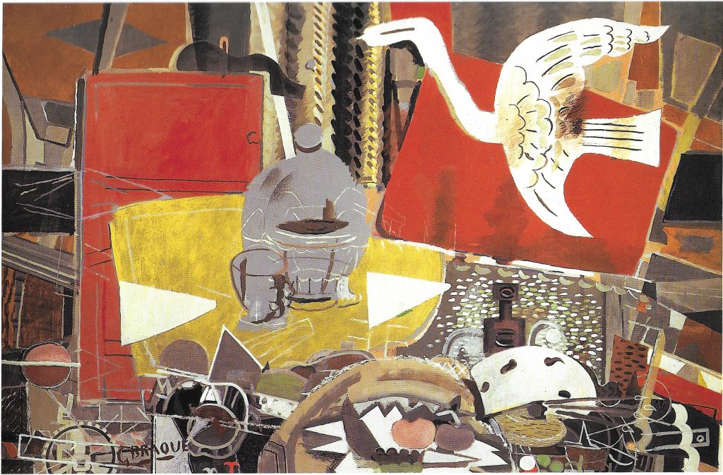
I think of the ‘Studio’ series, sombre, restrained, so carefully constructed and slow-moving; those half-defined forms, glass, fabric, palette, door, the bird like a cut-out ghost edging across. The quiet of the studio. I can’t imagine a painting that is more a meditation on the passing of time. At various times ‘Studio VIII’ has been on show in London, and each time I have been mesmerized. I think of the ‘Studios’ as one of the greatest achievements of twentieth-century painting: enigmas, impossible to define. They lurk in the back of my mind, models of what patient fine tuning can achieve – whether through software or through carburettors. This is how John Richardson put it at the time:
‘Nothing in these pictures is ever quite what it seems: sometimes shadows have substance, while things of substance turn out to be shadows; forms are flattened and flatness is given form; what is hard is painted as if it were soft; what should be opaque appears transparent, and vice versa; objects are only half indicated, or they merge with one another, become something else and disappear; patterned surfaces are introduced for no logical reason, while lines frequently lead nowhere and define nothing.‘7John Richardson, ‘The Ateliers of Braque’ (1959) ‘The Burlington’, reprinted in ‘Braque’, Abbey Library, Meridiane Publishing House, Bucharest 1977, page 23
Braque had come to London in 1933 and 1934:
He and Marcelle were chauffeured around by Ben Nicholson, squeezing with some difficulty into the British painter’s elderly Austin – in motoring terms, rather a comedown – the little car filled to bursting with its foreign dignitaries.8Alex Danchev (2012), ‘Georges Braque’, page 192.
Leafing through the ‘Life of Bryan’, an anthology of recollections of Bryan Robertson, this anecdote came back to me, as symbolic of the modesty of English abstract painting, always in debt to Paris or New York. At the Whitechapel in the fifties Robertson had put on eye-opening exhibitions for a post-war London public: Pollock, Rothko, Rauschenberg, Johns; and the New Generation shows that put Caro, Riley, Hoyland and many others on the map. There are motoring stories in the book, including some on Bryan Robertson’s wayward driving. I got to know him in the 1970’s, and like many in the book I found his generosity and humour inspiring. He was connected to everybody – I had a long conversation with Motherwell, and met Sutherland, and there was the Lee Krasner painting hanging in the dining room. I last saw him when we shared a taxi back from Patrick Heron’s opening at the Tate in 1998 – Bryan always took taxis even when broke. He didn’t rate Heron’s painting at all. Nor apparently did David Sylvester, at least he hadn’t written a word on him since 1952. Nevertheless, it was Sylvester who had curated this exhibition, and it was beautifully set out.9Robertson and Sylvester had always been rivals. Sylvester had also applied for the Whitechapel job in 1952. He probably was supposed to have written the catalogue, but in the event he came up with just one page, where he had as much to say about Bacon as about Heron. The catalogue, incidentally, included a long interview with Heron, and several reprinted essays as fill-ins: one by Alan Gouk, and one that I had written on Heron’s paintings of the 1970s, both from the catalogue of his 1985 Barbican show.
Heron’s most daring paintings were the ‘wobbly-hard-edge’ paintings of the seventies. Some were shown at Waddington’s in 1975, along with paintings of the fifties at the Rutland Gallery that had been shown in New York soon after they were made. I wrote a review for ‘Studio’ magazine. It was typeset, but never published.10The new editor, Richard Cork, felt that painting had had its day. We interviewed Heron for the second issue of ‘Artscribe’ in 1976. He designed the cover, and was a great supporter of the magazine. At the time, after the Guardian articles, his star was not in the ascendant. Bert Irvin was on the cover and interviewed in the first issue. I sent the review to Heron, which is how I got to know him and his red Mini. Those seventies paintings were hot-coloured and uncompromising; there was nothing soft and inviting there, scarce any evocations of Matisse. They were not, in the words that Greenberg always intended as a put-down, ‘easy on the eye’. The red/green borders flashed optically. They were bracing.
The Tate show was superb, but had been curated to link the late garden paintings with the early Braque-derived works, which some had dismissed at the time as ‘Bric-a-Braque’. The ‘wobbly-hard-edge’ period of 1972 to 1983 was hardly present. Whether this selection played to Heron’s strengths or not, it set the tone for subsequent exhibitions.11I discussed this in ‘Patrick Heron’, in ‘100 Reviews Backwards’, (2002), edited by Matthew Arnatt, Matthew Collings, Cornelia Grassi, Verlag der Buchhandlung, Walther Konig. Heron died in 1999. Some years before, Heron had spoken of seeing the large Matisse, ‘Bathers by a River’ (1909 – 1916) in Chicago. Matisse worried over it for eight years, making drastic revisions, and it remains quite an awkward, even ugly composition. Heron knew the rationale behind the modifications, but what fascinated him was the surface treatment; not the rethinks themselves, but rather, their residue; that is what he wanted to recreate. He didn’t want the stress or uncertainty. He didn’t wrestle with intractable problems, at least not on the canvas. He rarely revised. He did not want to leave any trace of effort.
The Bryan Robertson book lifts the curtain on a world of patronage: connoisseurs and critics pulled the strings. It was top-down. Artists knew when deference was advisable, and that was the way things worked – discreetly – which was fine, as long as you were connected. But the Establishment did not speak with one voice, nor was it infallible. There were many variables mixed in. Nevertheless, it is striking that a fair number of Bryan Robertson’s proteges ended up running institutions. He was often called the best Director that the Tate never had, and this was one of his legacies. In pre-Wifi days a senior person at the Arts Council told me they were setting up a local network in Brighton. I thought, how can they manage all that wiring? I realised they meant people-in-the-know, with connections. Now we have Facebook, and anyone can post their work, whether blessed from above or not.
What I missed in the Robertson book was real intellectual muscle, the play of ideas.
I was in New York over Christmas 1974, with my wife, and we arranged with ‘Studio International’ to interview the leading critics. Looking back, we should have been more alert to the change of mood. Roberta Smith, then a fledgling critic, spoke of lyrical abstraction being ‘over’. Harold Rosenberg boomed out: ‘who needs a field painting?’ Rosalind Krauss sensed an ending.12‘The Activity of Criticism’ by James and Caryn Faure Walker was published in two parts in Studio International in 1975. Part I (Max Kozloff, Darby Bannard, Rosalind Krauss, Harold Rosenberg) March/ April pages 83 -87; Part II (May/ June) pages 184 – 186. We didn’t have any introductions, but ‘Studio’ at the time was still a respected journal that opened doors. When I asked the editor what questions to ask, he suggested we find out who was worth looking at. I was taken aback. Were we that provincial? We also interviewed Clement Greenberg, but he didn’t want the text to be published; he didn’t care for my ‘thinking in stereotypes’. I liked his aphorisms – ‘time sorts it out for the squares’. I did interview him again, in some depth, in 1978.13Artscribe’ 10, 1978, Interview with Clement Greenberg. It was republished in ‘Clement Greenberg, Late Writings’ (2007) edited by Robert C. Morgan, University of Minnesota Press
I had first encountered Max Kozloff in about 1967 when I was a student at St Martins. He sat in the audience listening to a panel of London critics pontificating, and stood up to asked them to explain why they were so utterly mediocre. In his SoHo loft in 1974 he spoke of the fallacy of the oracular, all-seeing critic, putting their experience on a pedestal – he had Greenberg in mind, but this would have applied to those paternalistic London critics too. He predicted, correctly, that the next decade would be preoccupied with issues, with ideological turbulence. He spoke of the three C’s – criticism, collusion, corruption.14 The magazine, ‘Arts’, had lost respect because it was widely known the first section was paid for by the artists themselves, it was just PR. Today, with house magazines such as for the Tate and RA, the blurring between celebrities, experts, press releases and reviews is just about complete. Kozloff had misgivings about artists as critics, thinking particularly of Judd and Morris. He saw their writing as manipulative, as an extension of their art, from fixed positions, imperious, spotlighting just one or two individuals. Useful advice for anyone setting up a magazine where most of the writing would be done by artists.15One answer would be to have a wide range of voices, and debate, to make it a proper forum.
Through the 1980’s abstract painters were put on the defensive. A new electronic paintbox, undermining whatever confidence was left, was not welcome. New critics had different agendas; figurative art made the headlines; it had become a globalised art world; pluralism reigned. The paintings of Polke and Richter were abrasive, objectionable, but stimulating and unavoidable. In one of the few blunt passages in the Robertson memoir, Norman Rosenthal spoke of the reaction against his 1981 Royal Academy exhibition, ‘A New Spirit in Painting’:
‘Bryan turned furiously against me. We didn’t really have a reconciliation after that. The art world is a very fickle world and art has many mansions. I went against what he stood for. Bryan was a wonderful person and I owe him a huge amount, but in the end he only believed in his glorious days with abstract expressionism and its spin-off in England, and that’s not enough. The reality is something else.‘16Andrew Lambirth (2019), ‘The Life of Bryan: a Celebration of Bryan Robertson’, Unicorn Press: Norwich, page 295.
I took Al Held to see Bert Irvin’s ACME show in 1980. He said that it wasn’t possible to paint like that any longer. I didn’t agree, but over the years his remark has resonated. ‘Fundamental painting’ was also in the air then – Brice Marden and others. Held called that subdued painterly minimalism ‘wrapping yourself in the mantle of great art’, with paint dribbles like Cezanne’s tears. It was easily satirised. Perhaps that is always a good test: I wonder how much contemporary abstract painting falls into that trap, where the difference between the authentic and the parody is undetectable.17What has been described as ‘Easy-Listening Fundamental’ has returned: painting reduced to the paint itself, to ‘materiality’, perhaps just the one colour savoured and inflected with discreet brushing – ideally with a catalogue endorsement from a heavy-weight critic. It is a taste for static, tidied-up compositions that ask no questions. John Hoyland used to say he preferred a little venom mixed in with the decoration. Held was a veteran of abstract expressionism; he had lived through the struggles, the schisms, the eventual decline. For his generation the hot energy of Abstract Expressionism would not easily merge with the cool detachment of the ‘post-painterly’– whether that was hard- or soft-edge. It was a compromise too far.18Thinking back, you could interpret the distinction as being between paintings made on the floor and those made on the wall. On the floor, in acrylic or watercolour, you can downplay the drawing and the brush-marks, and blend colours; you can crop wherever you want. The canvas on the wall is a literal confrontation: you have gravity, space and illusion. Shifting from one to the other can have consequences: Heron broke his leg badly in a canoeing accident with Bryan Winter in 1967, which is why he came to work on gouaches, horizontally.
In his 1986 text ‘Working Space’ Frank Stella wrote that what abstraction had promised in the sixties, it did not deliver in the seventies: those hopes had turned to ashes; it had lost its ability to create space. He wrote of the then current obsession with the tactility of pigment:
‘Abstraction seems to be lost in a dream in which the materiality of pigment reveals painting. It puts too much hope in the efficacy of clever, random gestures. What is needed is a serious effort at structural inventiveness…. We need ambition to drive abstraction out of its miasma of self-satisfied materialism.’19Frank Stella (1986), ‘Working Space: the Charles Eliot Norton Lectures’, Harvard University Press, Cambridge, Massachusetts and London England, P. 66. Stella developed his thinking from re-appraising Caravaggio, for the dynamism and plasticity of the figures in space . He also argued that Kandinsky’s later works had been vastly underrated. That was also my view, especially after seeing the 2009 Kandinsky exhibition at the Centre Pompidou. Stella has also had a reputation as a petrolhead, and gave a lecture series after being penalised for speeding.
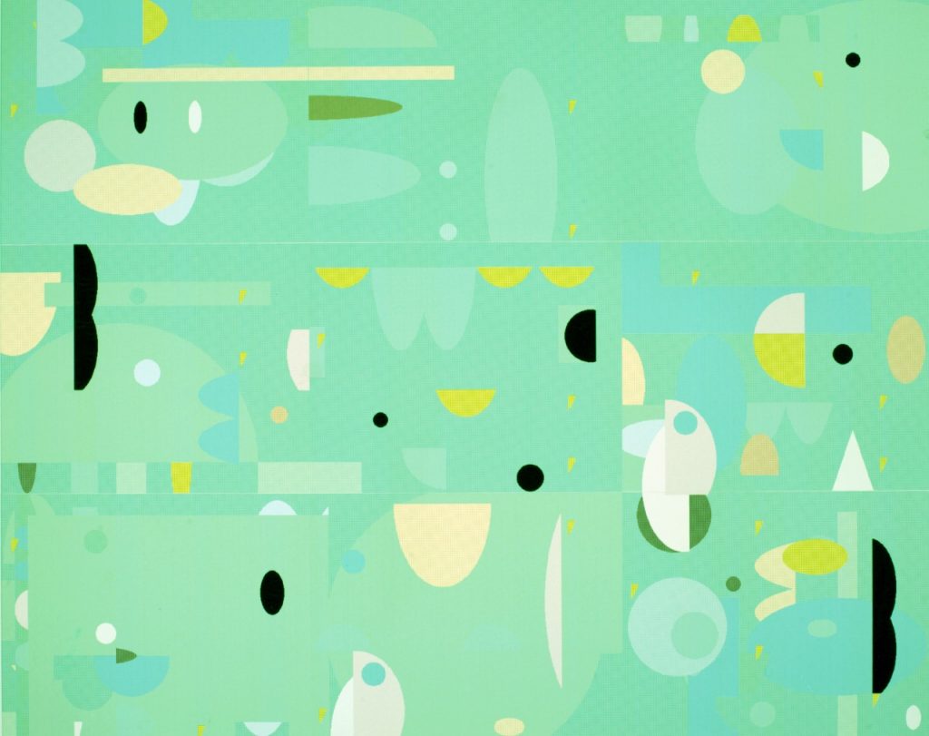
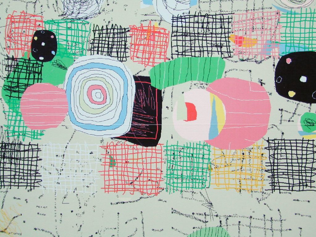
These thoughts were not at the front of my mind whilst making that digital series, ‘Propositions’, of thirty years ago. I was entirely preoccupied with the task at hand: creating a passable picture through tricky software, and then coaxing it through a temperamental printer to become ’output’. For a few years I had been learning what I could do from the available systems. My printer could not manage anything larger than 6” x 8” (15cm x 20cm). No five-year old today would put up with the flickering screen, the time lags, the eight or sixteen colours. Nothing looked ‘real’. It was closer to Lego than to Winsor and Newton. But if we could time-travel back to the thirties, and show it to someone at the Bauhaus, they might have taken a second look, and seen some potential.
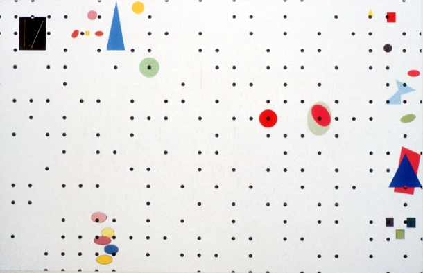
I assembled the small prints onto metre-wide foam boards. I could never see the picture whole till it was assembled. The necessary workarounds, the problem-solving required in a developing art form with hardly any practitioners or precedents, left me with a great respect for the pioneering algorists, such as Harold Cohen and Roman Verostko – they wrote their own software.20Roman Verostko has recently had the honour of seeing the Verostko Center for the Arts open at St Vincent College, Latrobe, Pennsylvania, USA. See http://www.verostko.com My pictures represented what I could achieve within the limits of the equipment. I was speculating about what would be round the corner, the computing power that would make ‘real time’, ‘high resolution’, ‘user-friendly’, more than the empty phrases of sales talk – what was known then as ‘vapourware’. We now take the speed for granted. We don’t even notice the processing. At that time you could easily get lost, so you had to read the manual. Lateral thinking was a must. I called one piece ‘Figaro’, not after the opera, but after the Nissan Figaro, the retro design that came out at the time. I enjoyed the carefree mobility of dots. Another picture came out looking like a Monopoly board. I had spent hours watching my daughter learning to ride in a large barn, going round and round the perimeter. It was a very disciplined riding school off the Lea Bridge Road. I was tempted to parody the narrow-mindedness of constructivism. In software, geometric determinism is a given, it doesn’t have to be underlined. I made a framing border out of greenish permutations.
I never managed to get these pictures exhibited. I had a Nissan Micra hatchback, and they could just fit in the back; that was how I showed them. Gallery people would not accept them as valid, either as prints or paintings. I had sold some previous digital works to the other ICA – the International Colour Authority, who predict colours for the fashion industry. They told me I would get more for them as tea towel designs than as art. It was frustrating. Most responses were on the lines of what artist does this remind me of? Few would look at them in their own right. Bert Irvin suggested I showed them to Chris Betambeau at Advanced Graphics, the silkscreen printers. I had a good meeting with Chris, but in my case the shift to screenprint was not feasible. Limited as I was by quite a crude inkjet printer, I could at least print all the colours simultaneously, instead of in a sequence of layers. On the computer I was free to revise the design throughout the process; I could run though endless re-iterations. Also, the costs involved in silkscreen printing were a consideration, and I knew it was unlikely that I would sell any of the prints.21Chris Betambeau died in 1993.
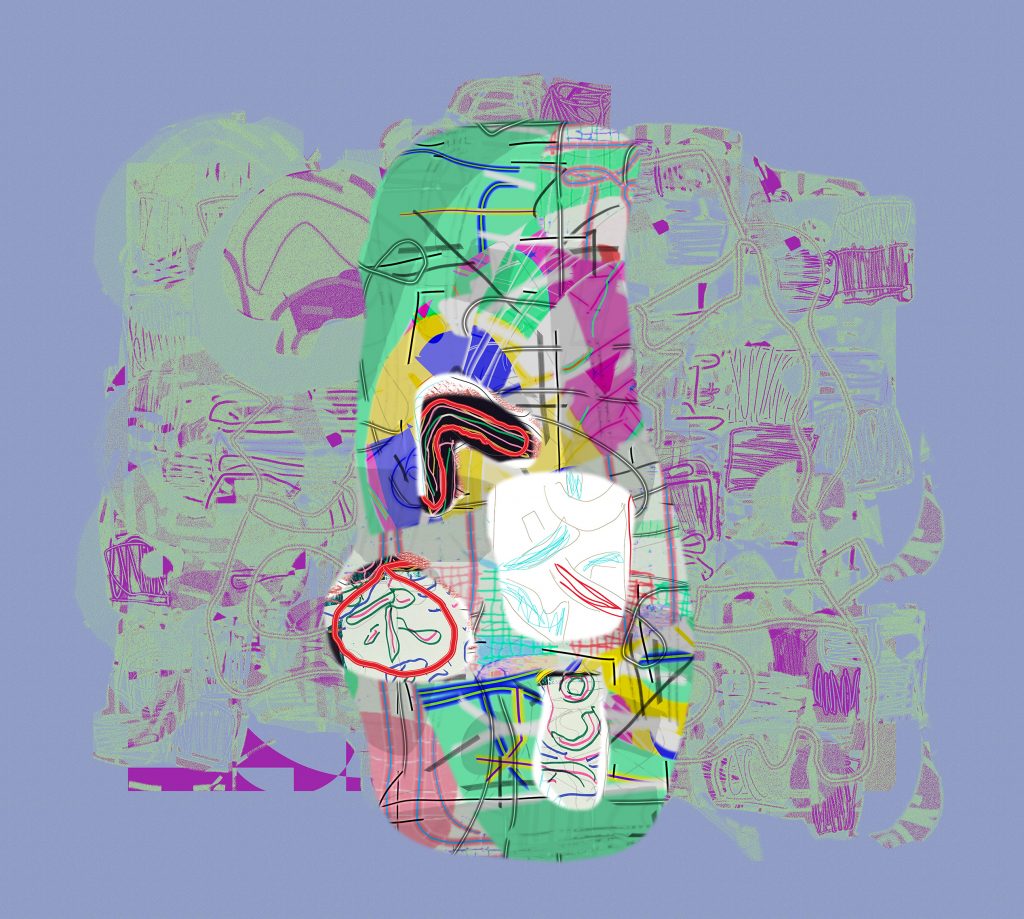
I was using paint software every day, and transferring what I was discovering into the way I thought about paint and brushes in the studio. It was unsettling. There were many failures, but in the end it was invigorating. Paint was just paint, a means to an end. I couldn’t go back to thinking of painting as so charged with magic it would always surpass what you could come up with in a print, a photo, or a digital image. Here was a new and undeveloped method; it allowed free passage between disciplines; each exclusive, and till then protected by a closed-shop mentality, a fixation on materials and crafts.
Looking at Bert Irvin’s recent paintings I wondered whether what I was looking at derived from silkscreen: his thinking was changing. There was a lift, a vitality, an economy in the distribution of colour. He was adapting to the discipline of silkscreen, the sequencing of layers. I asked him about this, and it was like pressing a button. Of course, he said, absolutely. In his excellent book, Paul Moorhouse recounted how Irvin had been sceptical at first:
‘…thinking the technique removed from the direct expressiveness of the artist’s hand, and primarily a means of making flat, hard-edged, rather impersonal marks and images…
Working with Betambeau opened Irvin’s eyes to the potential which screenprinting possessed for vitality and immediacy… Between them they found a way of working which permitted the spontaneity, degree of improvisation and painterly ‘touch’ that Irvin required, while placing all these things in the context of the discipline necessitated by printmaking’.22Paul Moorhouse, ‘Albert Irving, Life to Painting’ (1998), Lund Humphries: London, page 109.
He made the initial brush marks in black, arranged in layers, tested against swatches of colour. So the colour choice was separate from making the marks. This may seem artificial, inhibiting, and at odds with working on a canvas all at once, as a whole. (It has some parallels with paint programmes, except in the programme you can keep changing the colours after you have applied the paint.) But the point is not the relative merits of paint versus printmaking: it was the stimulus; Irvin’s imagination was set free by moving into an unfamiliar discipline, absorbing the insights. Beethoven called his new Broadwood piano ‘the cathedral in the living room’; it didn’t stop him composing symphonies. I can’t see that playing with free-floating geometry is going to block the progress of abstract painting.
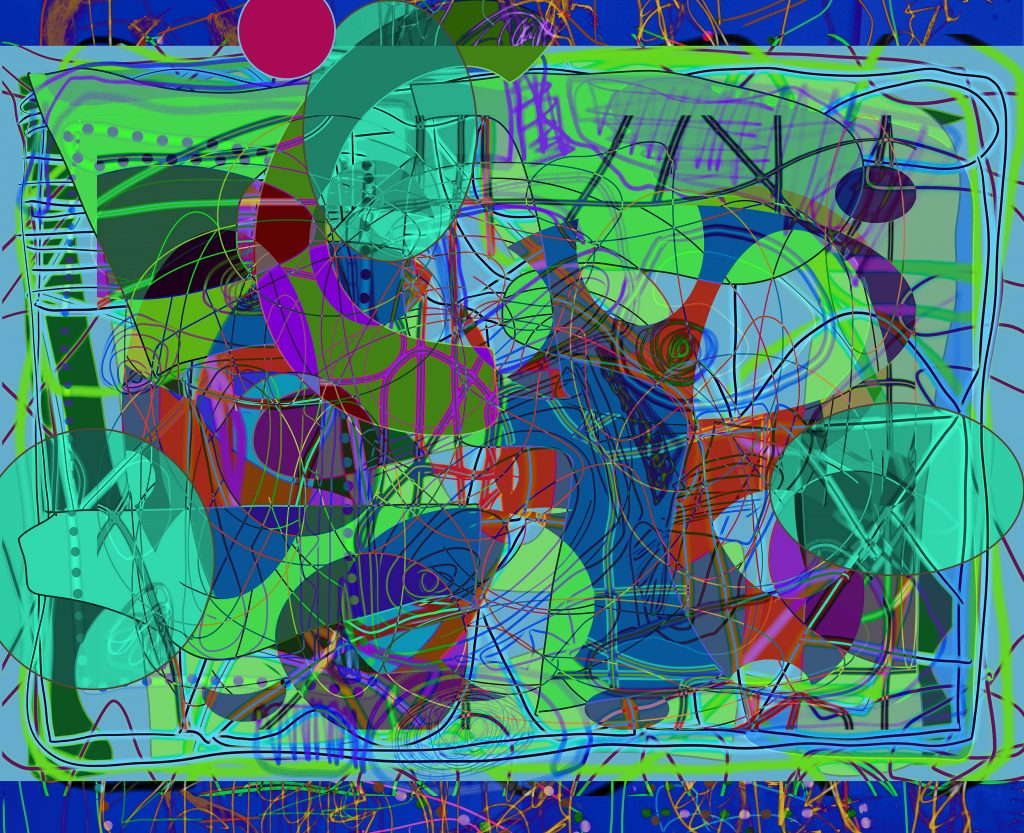
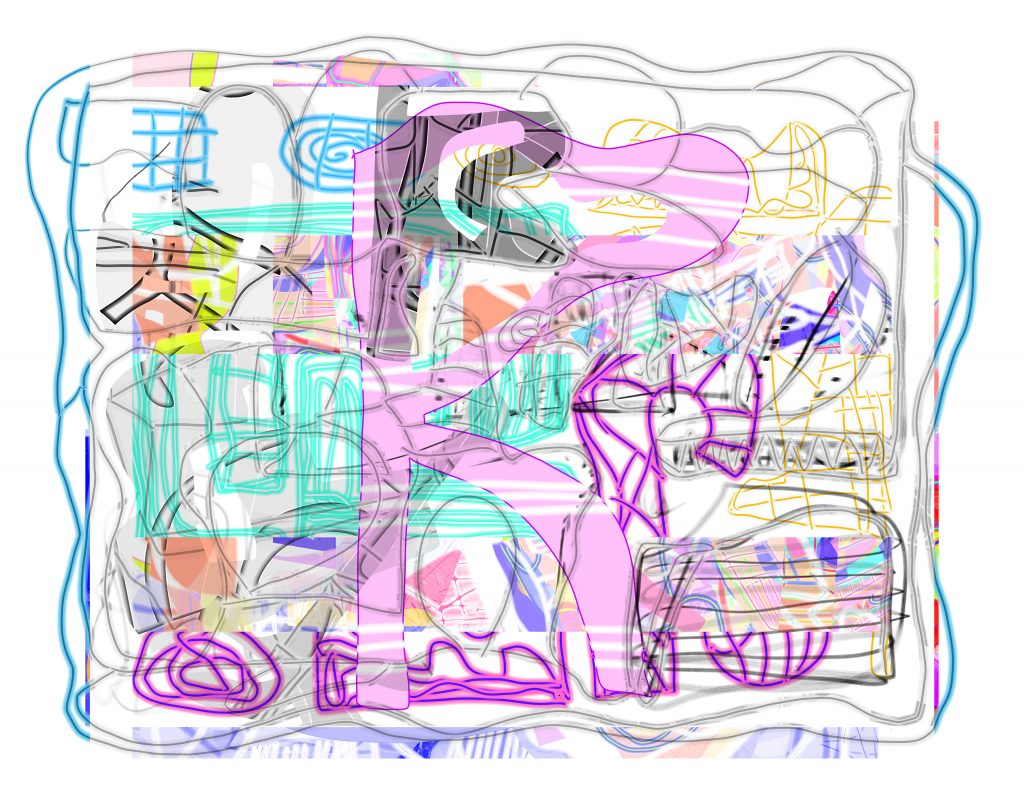
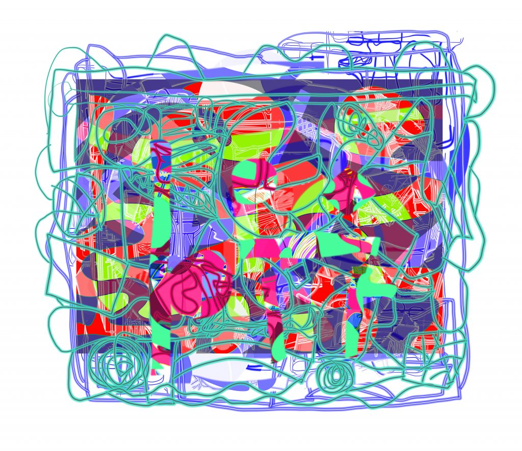
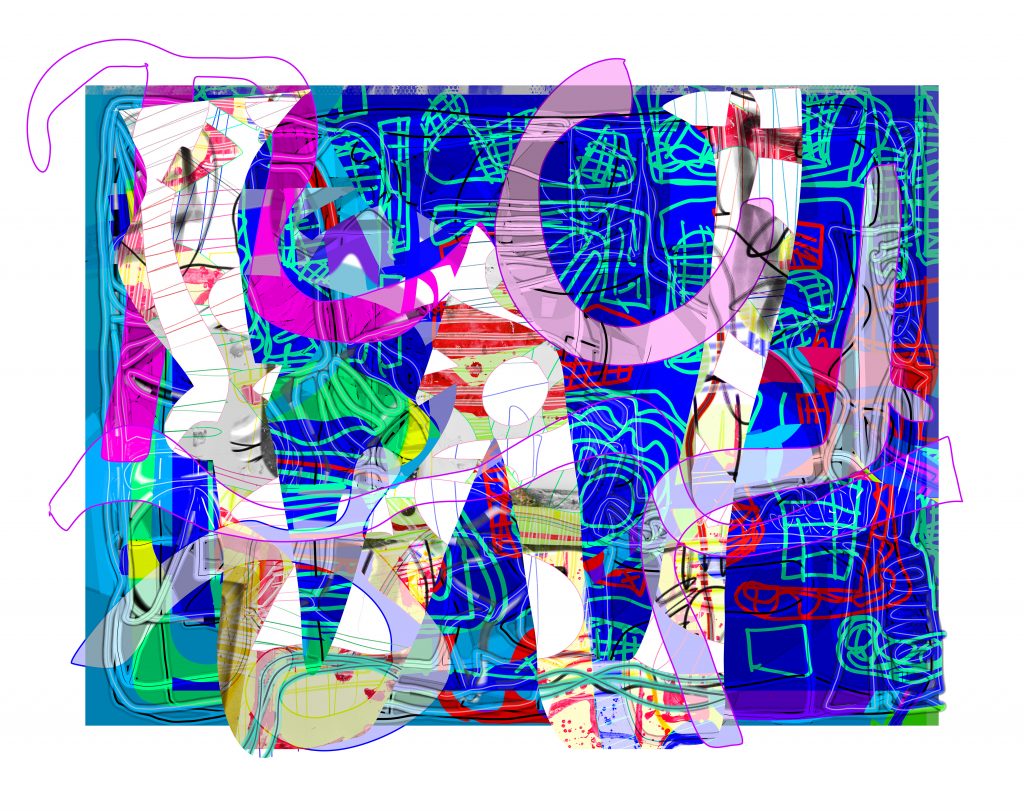
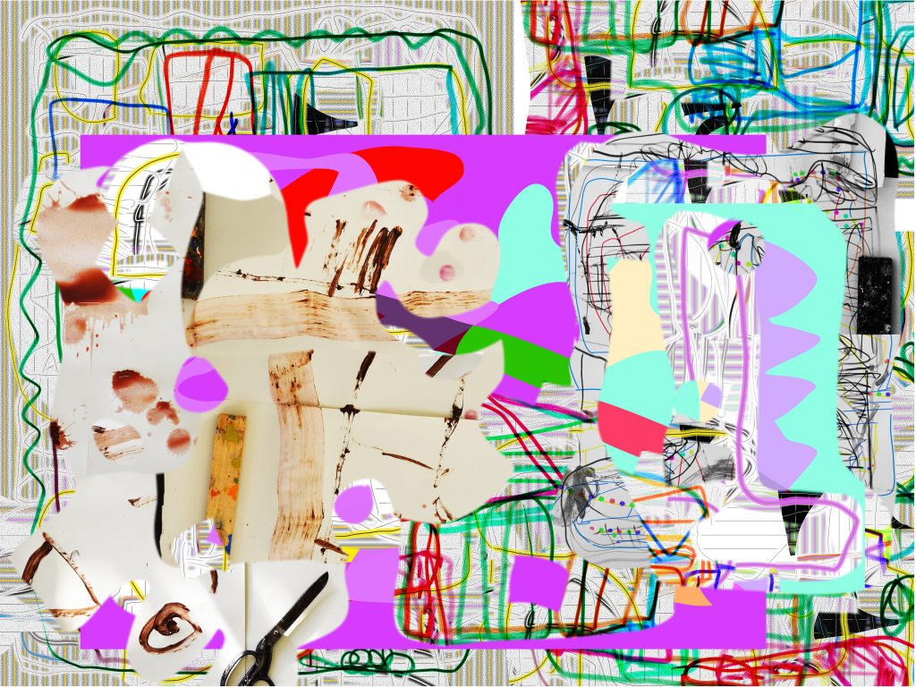
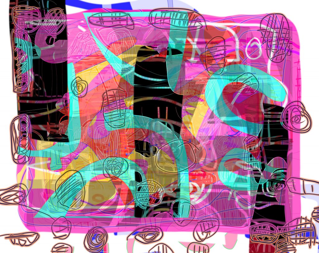
I have stuck with the simple methods I developed early on – before Photoshop or Painter were around. In a programme (coincidentally also called ‘Studio 8’) there was a shortcut called ‘spare page’, reached by the keyboard shortcut ‘J’. It was a hidden ‘canvas’ where you rehearsed whatever you were planning to draw on the main image area. It was as if for every painting you had an empty canvas on the wall next to it, on which to try things out. What happens, needless to say, is that the ‘spare page’ gets more interesting than the self-conscious main ‘canvas’. (Painting tutors notice something similar about the drips and casual marks a student makes when cleaning brushes.) Another method is an extension of ‘cut-and-paste’. I make drawings to be harvested for components. Forms can be rotated, squeezed, made translucent, softened, multiplied, turned into patterns; brushes can be multicoloured… it can be like wandering about in a cubist kaleidoscope.
The SIGGRAPH Art Gallery has been the premier showcase for digital art, part of a vast annual computer graphics conference held each year in a different US city. I have exhibited there eight times. ‘Art’ was a loose catch-all. You did not need encyclopaedic expertise in art history, but you did have to innovate, to ’envision’ the future. Quite a few times my submissions were rejected by the jury. I would get well-intentioned feedback: nothing new there, too much like painting. They recommended I look up an artist called de Kooning. I looked him up in ‘Makers of Modern Culture’. I had written the entry.23Makers of Modern Culture: A Biographical Dictionary, (1985) edited by Justin Wintle, Routledge & Kegan Paul: London.
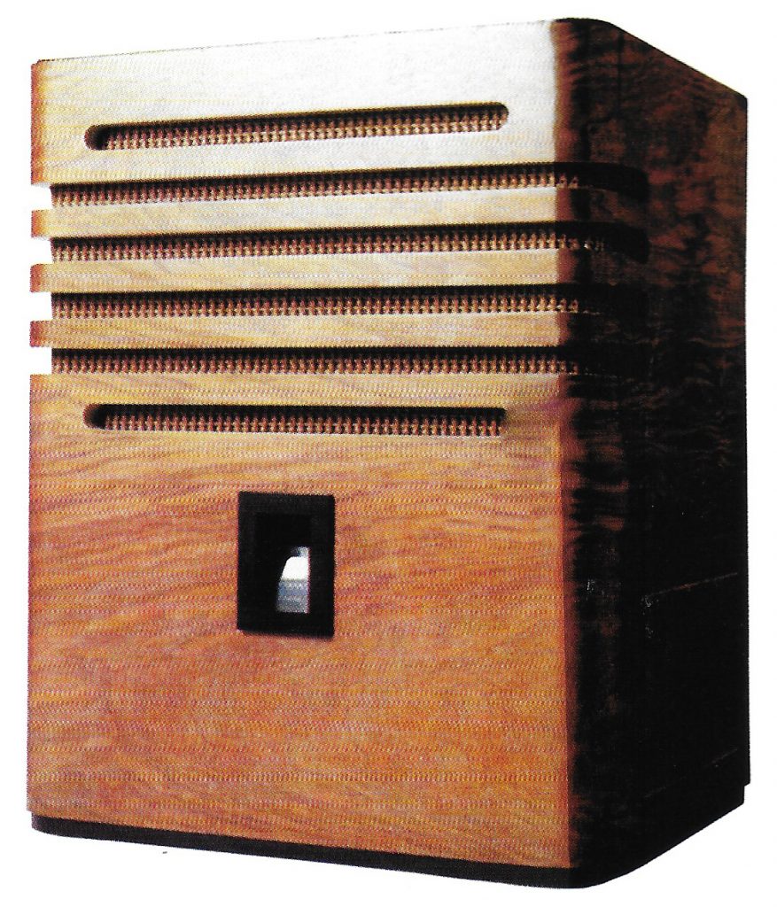
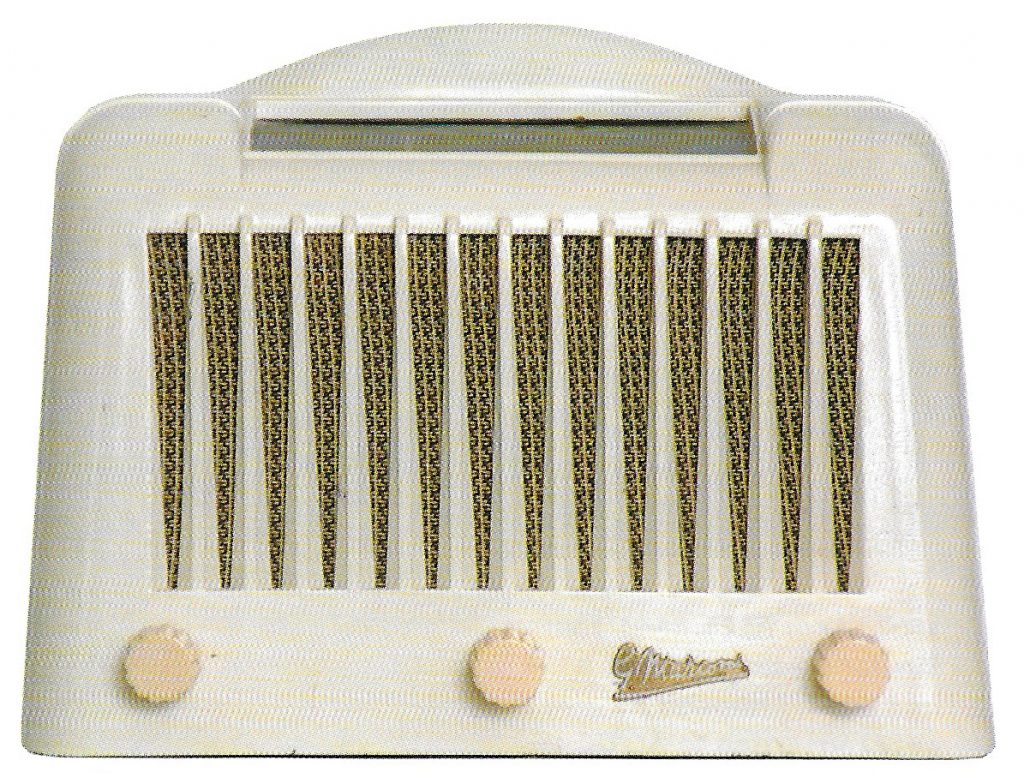
The abstractness, the rootlessness of digital work is a problem: the over-designed feel, centralised and tidied-up in a spatial vacuum. In this recent series of mine one theme has been the vintage radio. I have a1950’s GEC beside me as I work. There were bizarre Art Deco designs in the thirties, streamlined cabinets – the look of the modern, of new tech, which now lives on, whether it works or not, in the limbo-land of the vintage.24A good source is Tony Thompson (2007), ‘Vintage Radios’, Crowood Press. The Ekco AD-65 of 1934 was designed by Wells Coates, the architect of the Isokon building (the Lawn Road Flats) in Hampstead. He also designed the shops for Cresta silks, the firm set up by Tom Heron, Patrick Heron’s father, who was a friend. Whatever happens when you mess around with oil paint the scent of linseed connects you with the art of the past. Digital processing has no aroma. ‘Computer art’ was once something new. Now, as my New York colleague, Annette Weintraub, puts it: ‘Digital has become kind of transparent and almost a guilty secret. So many artists use it and bury it in their process.’ There are courses for how to draw portraits on iPads – I prefer paper. Anyone can go fishing with camera, phone, Google, and mix the images up. You can sample anything from socks to Hubble photos.
Is there still a down side? I have the speed, the resolution and print quality I would have once craved, but working via the screen remains a limitation, without the connection to a ‘physical’ picture. I probably over-produce. Only a small percentage, less than five per cent of finished work, gets properly printed. The editing is where the real work happens. Is it all ‘virtual’ until printed, transcribed or improvised in paint on canvas? Is it a sub-category? Even if that were the case, I have visited a new dimension. I am learning all the time, exploring complex colours and patterns, weird shapes, arbitrary lines, accidents when superimposing one picture over another. One difference from regular painting is the opening up of a vertiginous depth in the picture space: the eye travels unimpeded by surface obstructions, forward and back, even when the forms are chaotic. It is like driving without brakes or speed limits. No restraints, nothing to stop you making something outrageously complex, simple or absurd.
What of the future? These past months the conversations about painting – even the commerce – has happened online.25See: http://matthewburrows.org/artist-support-pledge No physical exhibitions. Artists keep going, one way or another. The prejudices of the past may not matter so much now. All it took was a handful of misconceived exhibitions, a few grandees saying digital art was rubbish, the vested interests of colleges, and the waters were poisoned for a generation. The crossover between painting and modernising technologies – whether cars or computers – should give us a boost. We pay lip service to the radical movements, the inventions of the past, but when it comes to adding boiled potatoes to the salad we throw up our hands in dismay.
Comments are closed.