But But But… Geoff Hands writes on Beatriz Milhazes at White Cube
A first time visitor to White Cube might wonder what is in store as they push open the supermarket-type glass panel doorway and enter the entrance hall that leads immediately into a wide corridor. Three ceiling-mounted avenues of strip lights, beginning underneath the canopy outside the entrance, might suggest a Dan Flavin-inspired light installation. All is crisp and clean – architecturally and atmospherically: the stage is set for a tasteful immersion in the geometric arena of contemporary abstraction. Yet, contradictory as it might appear, it turns out that the ascetic ‘white cube’ environment of this light-industrial warehouse offers an ideal showcase for the visual exuberance and extravagance of Brazilian artist Beatriz Milhazes’ celebratory and multi-coloured paintings, collages and sculptures.
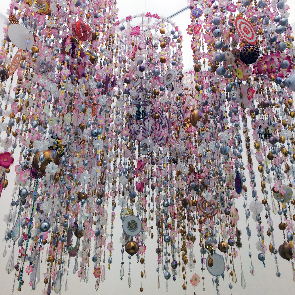
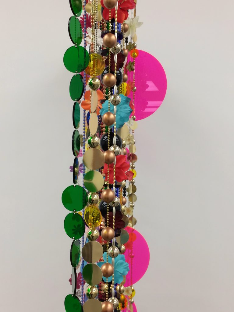
Before arriving at the primary exhibition space in the South Gallery, a side gallery (sign-posted 9X9X9 – which might be a title for a Sol Lewitt or Donald Judd sculpture) will entice you in first of all. If we understand the main gallery as the cathedral, this space functions as its side chapel, and it is here you will find Beatriz Milhazes’ Gamboa II (2015-16), originally made as an integral part of a stage design for the Marcia Milhazes Dance Company. Re-presented as an installation, this construction of five tubular chandeliers of glassy plastics fills the space with the symbolic richness it seems to require: the gold floor covering, albeit one protected by a clear plastic coating, lends a sense of reverence. However, as a counterpoint to these suggestions of sacred formality, two dancers performed in the 2-metre high space beneath the work at the show’s opening, and children have played there since: this invitation to fun and carnivalesque festivity sets the viewer up nicely for what follows in the main exhibition space.
The South Gallery is divided into two areas, with the entrance space being half the size of the second. Three sculptures and six prints are displayed in this first area, with the prints providing a taster for the paintings that are to follow. The three assemblages, including Marilola [2010-15], are constructed from brass, copper, acrylic, enamel, polyester and paper flowers, resin, foiled paper, wood and hand-painted enamel on aluminium. These are the materials of the department store’s window display department, hung and draped for a shopper’s delight – or a teenager’s bedroom. They are unmitigatedly decorative.
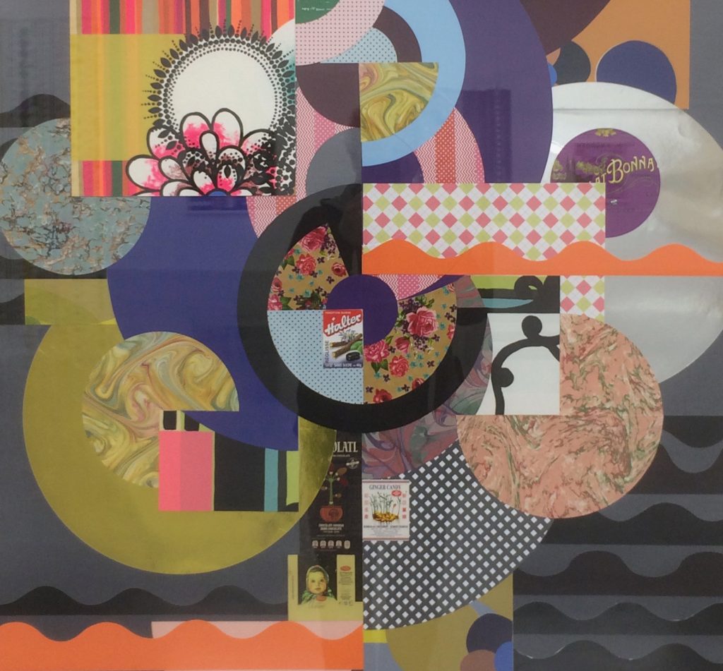
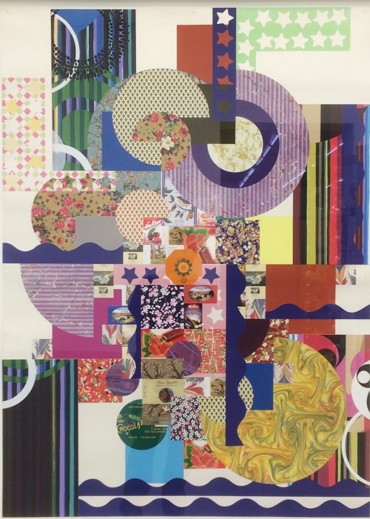
Beatriz Milhazes, detail of ‘Bibi em Ondas Laranjas e Cinzas’ (2017), mixed media, dimensions pending
Likewise, the collages, which incorporate everyday materials such as boxes and packaging from the commercial sector, have a colourful sumptuousness that Schwitters could never have achieved; such is the quality of printed media and decorative materials available today. Take, for example, Bibi em Ondas Laranjas e Cinzas (2017) which is composed of dominating wave-like strips in all four corners of the composition, with a multitude of overlapping discs filling out from the centre in a controlled graphical explosion. The flat print-like qualities of this work, including abstract silhouettes, present an underlying fusion of folk tradition with the modern. As if ethnic textiles was commingling with municipal signage and decorative tropes from fancy packaging.
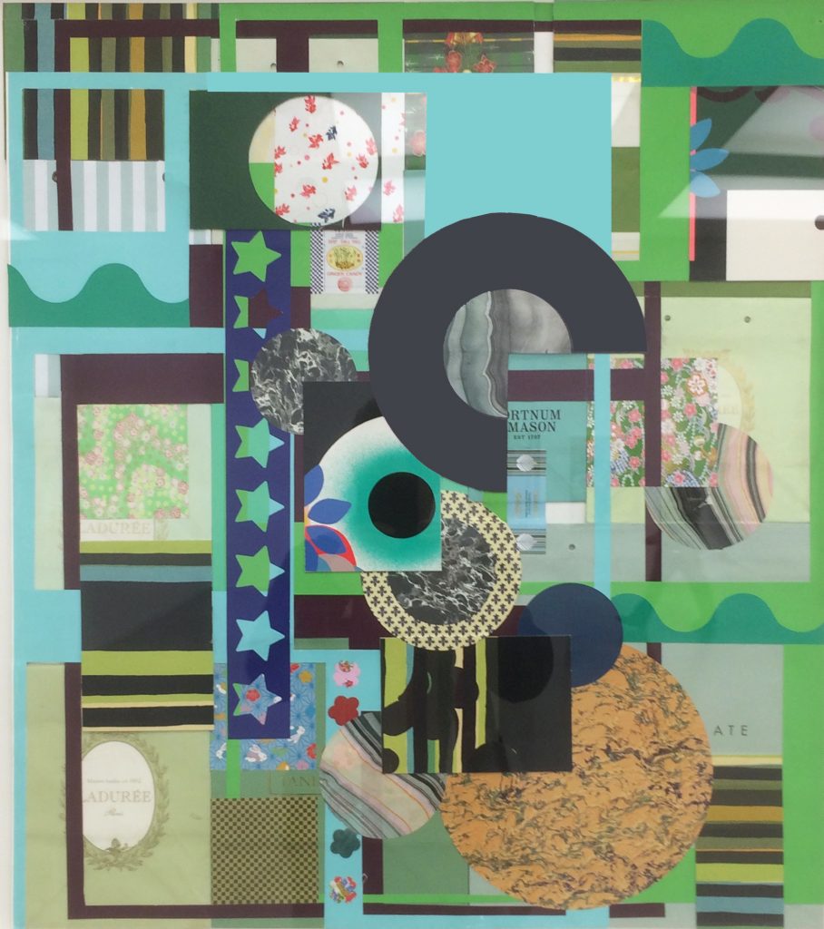
Indeed, in As Irmãs em Azul Celeste (2015-2018) we see that someone has been shopping at Fortnum and Mason for truffles. A gift box of Ladurée macarons is also preserved in this busy collection of predominantly green and blue visual elements. These components of collage constitute intimations of saccharine luxury from those visual environments that demand our attention (and credit cards) at every opportunity. On an adjacent wall, Bala de Leite em Roxo e Azul Ultramar (2017) includes two purple wavy strips that repeat forms from the other collages. With star shapes, groovy sixties-style discs and multi-striped rectangles that could owe something to Bridget Riley’s Op-inspired art or shop awning, the collages make for a coherent and thought provoking display. For in another context, ‘Bibi’ and the accompanying collages could be double-sized, over generous sheets of gift-wrap.
If you have engaged with Milhazes’ work solely via the Internet, or via her many lushly produced monographs, you may have been impressed, visually seduced perhaps, by the decorative use of colour, patterns and shapes; but seeing the work in the flesh is quite different. The collages, translated from reproduction to hard reality, rebirth into concrete reality more than adequately – maybe quite beautifully. Milhazes is a slick operator with collage and assemblage; the work appears effortless, which testifies to her visual rigour and expertise.
But the paintings are another matter.
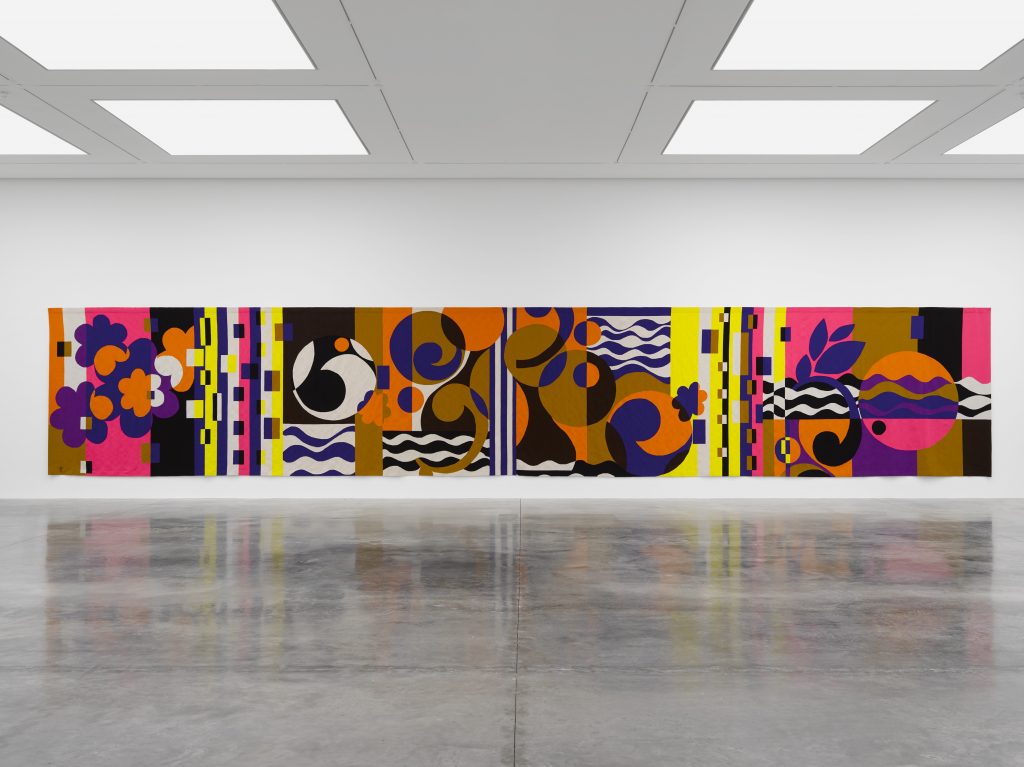
On entering the largest space, the visitor immediately sees the impressive tapestry Rio Azul (2016-18). This is the centrepiece of the show and the glorious vista of abstract colour shapes creates a giant predella, to return to the notion of the White Cube as a de facto art cathedral. Rio Azul is a painting made from wool, albeit with collage references. Six large canvases flank the sides and back wall of the arena. The formality of arrangement is predictable but appropriate given the available space. The paintings might be viewed as sentinels, given their proximity to the tapestry.
Is Milhazes an abstract painter? Is she a painter at all? To be fair, she has described her painting methodology as a collage process. There are clearly unashamed references to the likes of Matisse, Sonia Delaunay, Mondrian and the aforementioned Bridget Riley – so she’s well versed in modernist art history. We might add Frank Stella to the list too (especially for his adaptation of painting to print-type constructions in relief). Not that Milhazes purports to be over-reliant on earlier styles or manifestations of colour dominated abstract styles: she is candidly honest in acknowledging influences, and in interviews she is lucid and informed. Her work is clearly open to the use of found media and a kind of shorthand reference to the natural and urban environments of her homeland culture prevails.
But in the paintings, the overlapping patchworks of flat and decorative colour-shapes seem to reveal a disdain for painting as a skill in itself. Milhazes employs an idiosyncratic painting process. Why paint on sheets of plastic and then transfer the islands of colour to the canvas in a collage/monoprinting process? Is working with a brush, palette knife or even a squeegee (à la Gerhard Richter) too physically direct? Collage, as process, implies a mechanical function to production, where pre-formed colour/shape decisions are taken before application to the surface. Of course Matisse’s late paper cut-out works could provide a precedent for Milhazes’ means of production, but there is something perverse about this process that affects the painterly potential of the medium by literally turning the paint around. The high quality paint, the Golden brand of acrylic, somehow becomes a pasty skin of broken colour patches. The paint is merely reproduced on the canvas surface: and thus, the extraordinary characteristics of paint, ranging, say, from Bridget Riley’s supreme flatness to De Kooning’s wet-into-wet passages of gestural spaces, or Hans Hofmann’s impasto islands of abutted or overlapping colour, are denied.
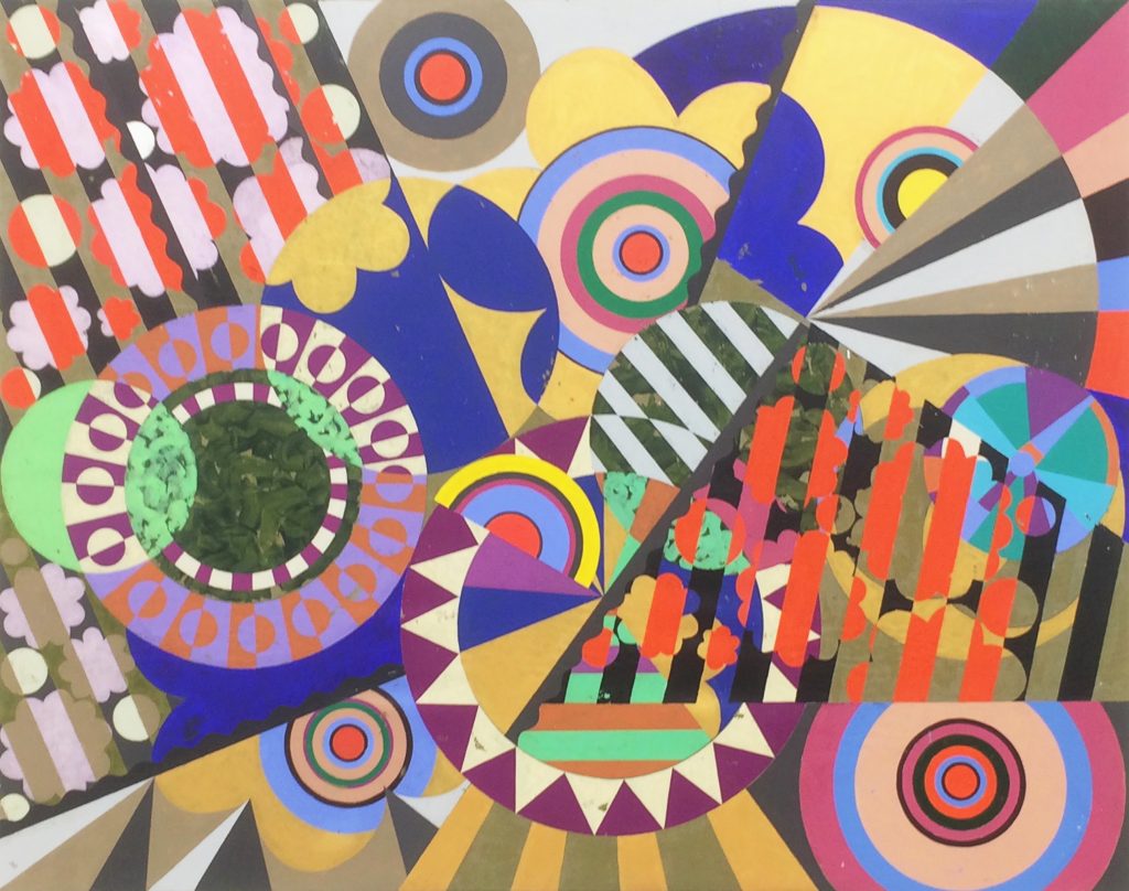
Take Pó de Arroz (2017-18) for example. It’s one of the busiest paintings in the show, and introduces more diagonals than seen in the earlier collages. It’s also one of the largest canvases (repetition of exact size has been avoided in this selection of paintings). The dominating diagonals and the even spread of target-like discs conjure up a Futurist vortex of flat shapes. Closer inspection reveals misprinting of the acrylic from the plastic sheets that have replaced the traditional paintbrush. It’s a troublesome image that might be overworked.
Banho de Rio (2017) is a more successful and a less visually abrasive painting; although one could still have reservations about the paint quality and wonder if there is an underlying textile designer at work here.
To return to Matisse – or even Picasso – the latter (arguably) was in awe of the former. Take a look at some of the portraits of Marie-Thérèse Walter in the concurrent show at Tate Modern’s Picasso 1932: Picasso could do no more than reference Matisse in his almost- abstract figures, chairs and backgrounds. Even the most honest and self respecting painter (or collageist) can try to imply a Matisseian influence in their work. In Rio Azul (which gives its name to the exhibition) Milhazes unashamedly echoes Matisse’s colour shapes and takes immersion into colour as all-engulfing subject matter. The tapestry is beautifully lush, not just because of the colour scheme or the bold, simplified abstraction – but also because the wool retains its essential qualities of colour, structure and surface.
There is something contradictory about Milhazes’ paintings. From afar, and in reproduction, the paintings appear graphical, flat and smooth. They consist of a variety of differential planes of seemingly random and arbitrary colour combinations. In the flesh the colour is initially decoratively pleasing, even if somewhat fugitive in application and material/tactile presence. The temptation, on the part of the viewer, might be to touch up areas of unprinted patches of paint in the mind’s eye. Is this rawness an anti-painterly statement – or does it simply reveal limited skills? Do the brash and trashy characteristics of the paintings undermine notions of ‘high art’ by disassociating the medium (and its application) from personalised dexterity, or do they make a statement about superficiality?
This is certainly an imposing show, given its architectural context and the curatorial effectiveness of the order of arrangement. It is simply and effectively choreographed – but the processional nature is a march and not a dance. The energy of the carnival may well inform the creator of these works; and the cultural background of the street procession, where a cacophony of sight and sound makes the emotions soar into ecstatic jubilation, should be embedded into the images’ DNA. But the work does not fully transcribe this energy – in her own words she is “controlled and rational” – and that’s the spiritually flattening dimension in this work. Matisse’s joie de vivre was implanted emotionally, not purely intellectually or programmatically, in his primary chosen medium of paint. The abstract nature of Milhazes’ imagery is just not abstract enough because the paint medium is subservient to the designerly shape combinations that can’t decide where to go. They are stranded in the vacuous arena of the decoratively superficial – like wrapping paper.
Beatriz Milhazes, Installation view of ‘Rio Azul’, 2018
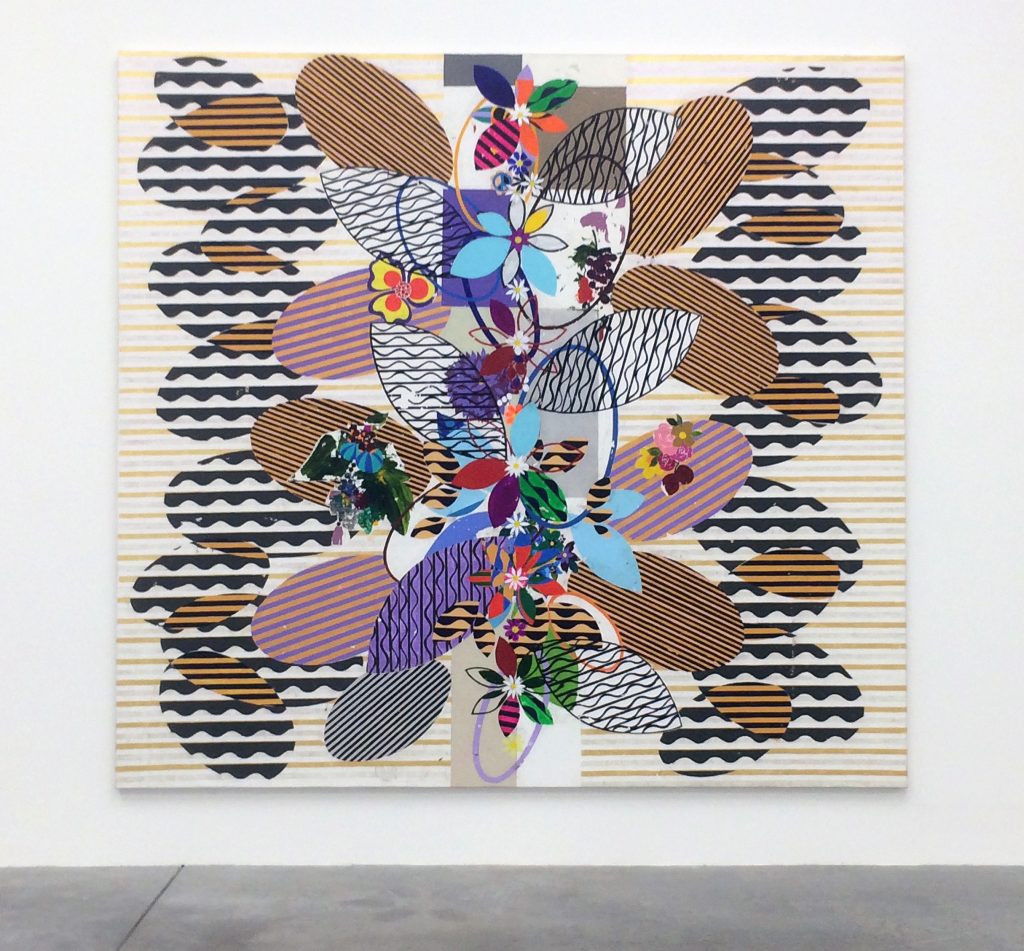
Beatriz Milhazes, ‘Goa’ (2017), acrylic on canvas, dimensions pending
Beatriz Milhazes, Installation view of ‘Rio Azul’, 2018
Comments are closed.