John Bunker: ‘John Hoyland: 21st Century Technicolour Gothic’
‘The mind becomes aware of the limitless expanses wherein its desires are made manifest, where the pros and cons are constantly consumed, where its obscurity does not betray it. It goes forward, borne by these images which enrapture it, which scarcely leave it any time to blow upon the fire in its fingers. This is the most beautiful night of all, the lightning-filled night: day, compared to it, is night.’
Andre Breton1Breton, A: From ‘The First Surrealist Manifesto’, 1924
Until quite recently, a great many of the critical responses to the painterly pyrotechnics that defined John Hoyland’s work of the 1990s onwards ran the gamut from indifference to bemused confusion. In Andrew Lambirth’s words, ‘he moved on, but the art world didn’t manage to keep up. As a consequence, his early work is more highly prized than his later.’2Lambirth, A: ‘Like a burst balloon after a party: John Hoyland: The Last Paintings’, The Spectator, 28th August 2021
And even those sympathetic to Hoyland’s trajectory- such as sculptor Ivor Abrahams- were disparaging, if not of the work, then of the widespread ‘intergalactic’ reading of the late paintings:‘That’s not what John’s work was about, he was a painter, not an astronaut!’3Quoted in ibid.
Now, though, a re-evaluation of the paintings is well under way: Matthew Collings, for instance, speaks in decidedly down-to-earth terms of having ‘made a mistake in allowing myself to lose touch with Hoyland’s work. And then I realised I had so many ideas about him and pictures in my mind of what he had done over the years that in fact I never really had lost touch with him. His paintings were always present in my mind somewhere. Even when I thought I was dismissing them I was actually considering them and wondering about them, taking them in.’4Collings, M: ‘John Hoyland: What Are We Seeing?’, in ‘John Hoyland: The Last Paintings’, Ridinghouse 2021, pp 53- 54
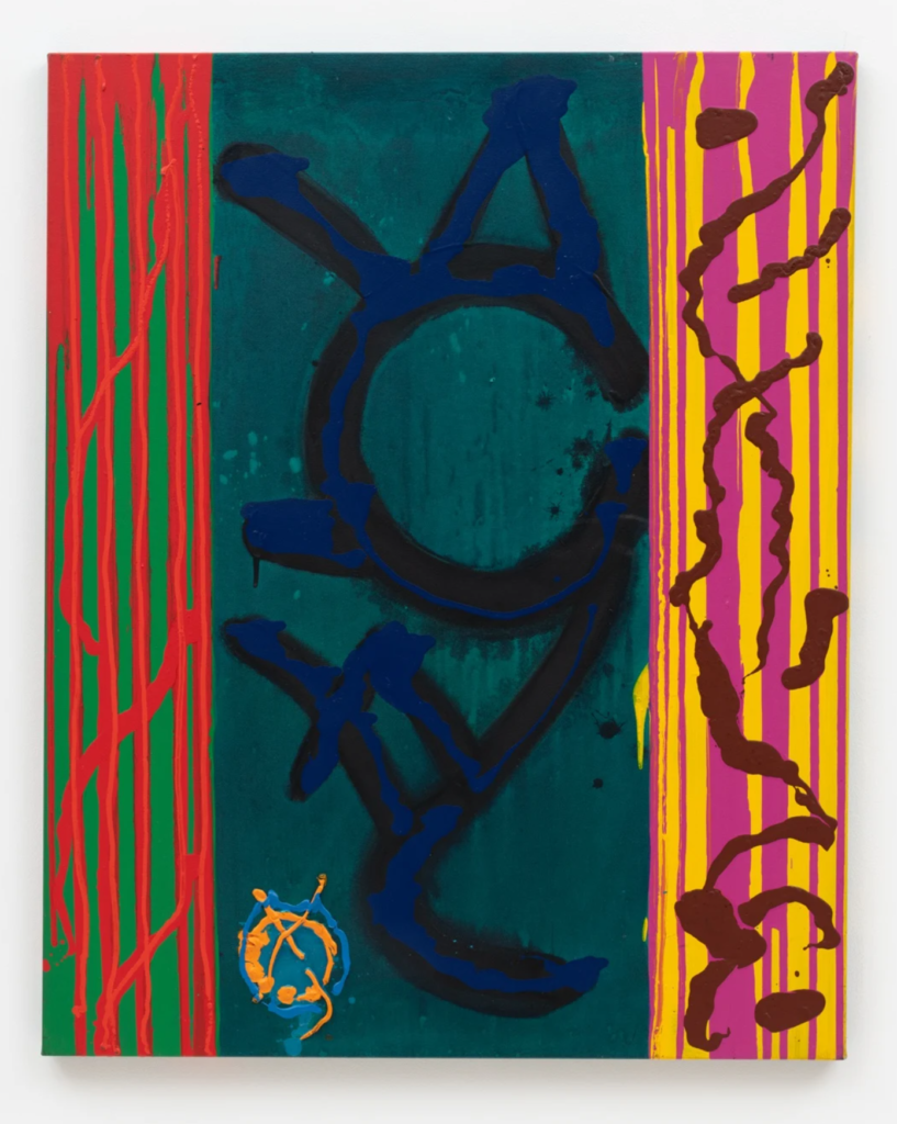
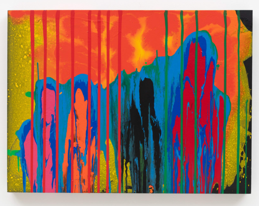
So, what is it about Hoyland’s later works that compels us, like Collings, to keep ‘wondering about them, taking them in’? The paintings currently on show at Hales Gallery, for all their bravado and physicality, are born of that play of productive tensions to be found at the core of his art; most notably, the tension between, on the one hand, an extreme economy of design, and a hedonistic, painterly excess on the other. In these late-period works, this essential tension becomes attenuated and, at the same time, theatricalised. It’s as though he has opened up the rigorous and decisively achieved abstract spaces that he had defined in the 1960s and 1970s and populated them with fiery apparitions and celestial bodies, frozen or incandescent. Vertiginous spaces appear, multiply and intensify, evoking in paint the deafening cacophony of a ‘wall of sound’: think Hendrix’s feedback-tortured rendition of the ‘Star Spangled Banner’ or Radiohead’s ‘National Anthem’. Bravura high-wire performance with colour is pitched against dark, mysterious poured glyphs that nod to quiet ritual and rumination; silhouettes of single figures appear from behind curtains of volcanic hues, hinting at a cosmic consciousness that might only be discovered in embattled solitude; but here, finding its voice in the brassy delivery of a consummate showman.
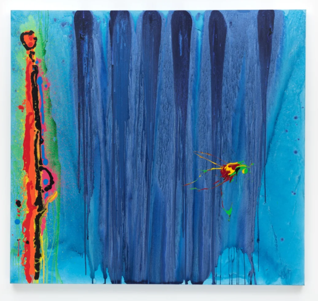
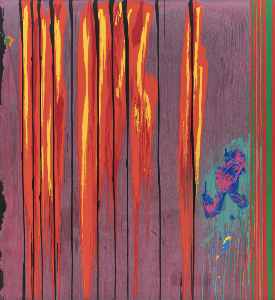
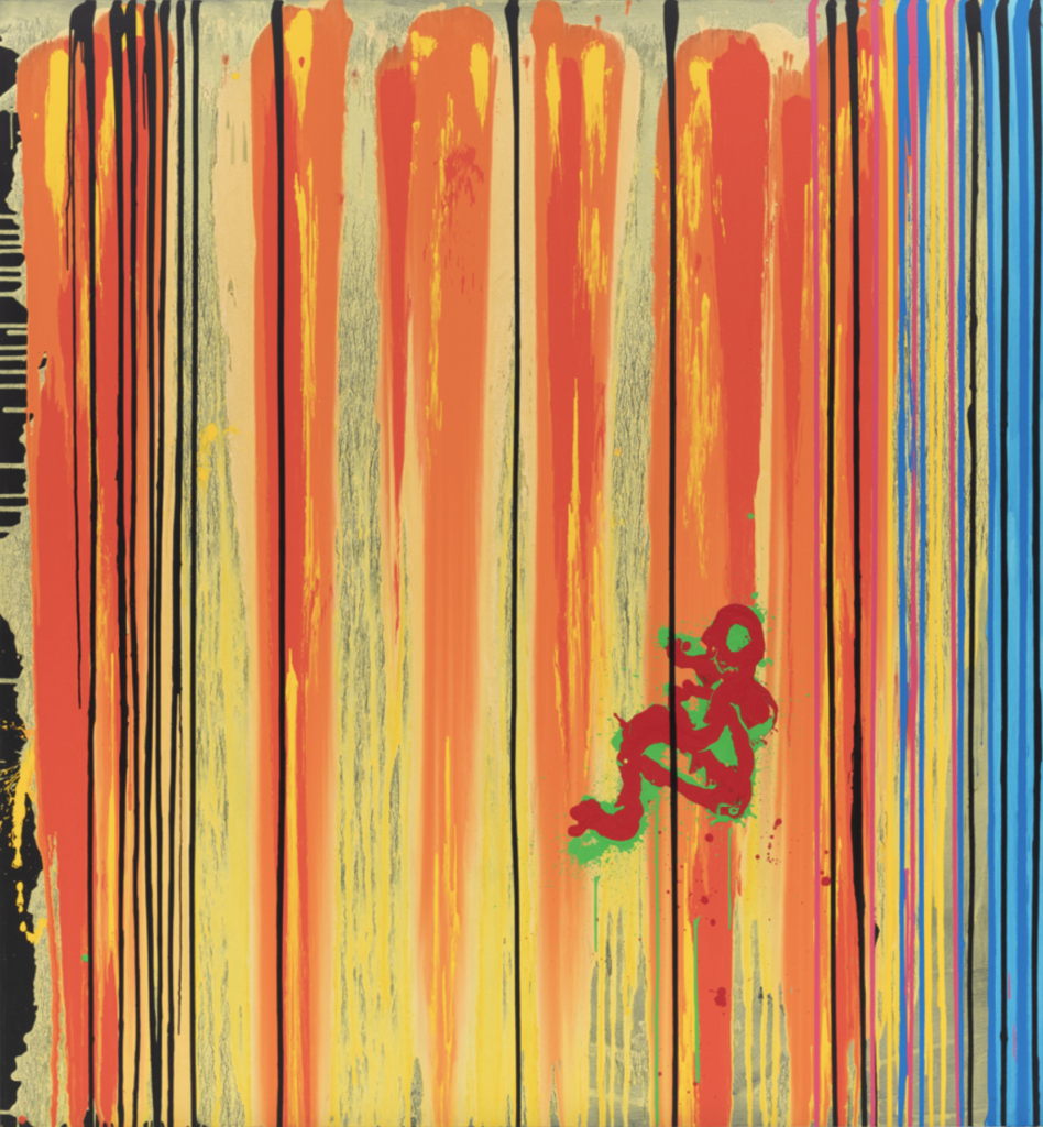
There is, however, another kind of tension at work in this show: one which manifests itself in the relationship between two of the paintings- ‘Jump’ (21/05/01) and ‘Falls’ (28/03/21), hung side-by-side, and taking up an entire gallery wall at Hales- and the historical circumstances that attended the year of their making.
In his monograph on the artist, ‘Scatter the Devils’, Lambirth frames the paintings of that time as first and foremost a response to the latter’s extensive travels, and a celebration of the tropical colour, light, landscapes and waterscapes of Bali and Jamaica, experiences through which Hoyland was able to rejuvenate his art. ‘Falls’, we learn, was ‘a painting directly inspired by an observed event. Hoyland saw a figure jumping off the cliffs into the sea at Nigril in Jamaica, when he was sitting at Rick’s Café watching the world go by. It is a common enough occurrence, people diving from a height into the water, but something about the particular combination of events (mood, weather, light, movement and so on) stayed in his mind and later demanded expression in a painting.’5Lambirth, A: ‘John Hoyland: Scatter the Devils’, Unicorn Press, Norwich, 2009, p121
Well, that is no doubt true, as far as it goes. Yet Lambirth’s reading entirely excludes any consideration of how the era-defining events of September 11th, 2001, have retroactively- and irreversibly- changed the ways in which we ‘read’ certain categories of images. We know, from the chronology of their inception and completion, that ‘Jump’ and ‘Falls’ inhabited, for a short spell, a world in which the twin towers had not yet fallen; and the sense of unease, of psychological disturbance, that Lambirth detects in ‘Falls’, whilst powerful, is nevertheless unfocussed, unspecific:
‘Here the figure in the vividly complimentary green and red is half twisting, half sitting on the way down backed by giant falls of paint: tall pours and luscious tongues of red and yellow, punctuated by thinner verticals in black and blue and puce. The thin black verticals cut the painting into panels, and the figure lies beneath one of those divides, like a prisoner behind bars. It’s an unsettling image about power and powerlessness, free-flow and entrapment.’6ibid.
All of which rings true; but can no longer be understood as the whole truth of the painting’s meanings. A single, horrific, and utterly unforgettable image- the ‘falling man’ of September 11th 2001- has, in ways yet to be fully understood, ‘re-set’ our reading of every image that preceded it, and of every image that came after it.
We are no longer able to see an image such as ‘Falls’ with the same eyes we used until that September morning. That new- and painful- awareness is acquired through sudden, shocking descent is a notion that resonates through our culture: in Christian doctrine, ‘the Fall’- Adam and Eve’s expulsion from Eden- marked the end of human innocence; and the ‘falling man’ marked the end of all possibility of an ‘innocent’ reading of the vertiginous spaces of the particular strain of abstract painting to which Hoyland’s ‘Falls’ belongs.
To frame Hoyland’s last two decades of production simply as a series of encounters with the spectacular- whether that be his literal travels in the tropics, or his metaphorical ‘space odysseys’ into the unknowable vagaries of the furthest reaches of the cosmos, in which he conjured up brooding storms of powdery darkness, activated by extreme contrasts of high-keyed colour- is to see his work purely as the sum of his stated intentions, and to exclude from consideration the extent to which the paintings function as sites within which it is possible to experience the post-9/11 warping of our shared perceptual and psychological space; it is also to ignore a great deal of the content that certain commentators on Hoyland had detected within the paintings from the earlier days of his career.
Hoyland’s work of the late 1960 pushed against his self-imposed boundaries, and against those set by the waning cultural imperatives of High Modernism. In his monograph on the artist, Mel Gooding discovers in these paintings ‘a dynamic of oppositions and contradictions that gives [them] an edge of unease, as if the forms, though purely abstract, had some kind of psychic charge to them; we’re emergent from a dreamlike space. This was a quality detected in their emphatic theatricality by the Freudian critic Robert Melville as early as 1965, and mentioned in a published conversation with Brian Robertson. Adept at the detection of hints of hidden psychological inflexion in an artist’s work, Melville added Hoyland to his ‘secret list’ of the ‘surrealist underground’ of British abstractionists.’ 7Gooding, M: ‘John Hoyland’, Thames & Hudson, 2006, p65
This ‘psychic charge’, this sense of the surreal in Hoyland, suggests that the real trajectory of the work is not outwards into the cosmos, but inwards, into realms alluded to in the early 1960s by JG Ballard:
‘The biggest developments of the immediate future will take place, not on the Moon or Mars, but on Earth, and it is inner space, not outer, that needs to be explored. The only truly alien planet is Earth.’8Ballard, JG: ‘A User’s Guide to the Millennium’, Harper Collins, 1996, p197
Ballard, in the words of Pedro Groppo, ‘draws on the Gothic tradition of examining structures that project and introject certain anxieties and desires that can go by unnoticed in everyday life. In a sense, landscapes and buildings can be metaphors for a number of psychological, moral, and aesthetic issues. In Ballard’s works, as in Gothic fiction and Surrealism, these external structures are often projections that embody in one way or another unspoken tensions, contradictions, and thought processes of their inhabitants and designers.’9Groppo, P: ‘JG Ballard’s Inner Space: The Juxtaposition of Time, Space and Body’, Researchgate.net , 2009. https://www.researchgate.net/publication/285031866_J_G_BALLARD’S_INNER_SPACE_THE_JUXTAPOSITION_OF_TIME_SPACE_AND_BODY
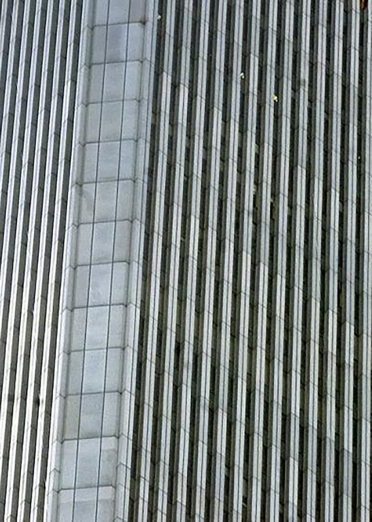
Consider Barnett Newman’s ‘zips’, Larry Poons’ walls of poured acrylic, Antony Caro’s huge, imposing welded steel sculptures and Hoyland’s own early signature paintings of abutting, palette-knifed slabs of pigment: it’s not hard to see them as architectural vistas riven by sheer, vertiginous drops, as looming voids, or as prodigious walls of steel. The more severe, regimented and gargantuan the organisation of the work in terms of the frontality of the implied formalist grid (the mainstay of abstract painting for so long), the more we sense our own physical and mental vulnerabilities in its presence; the more we project our doubts and desires onto it.
In both Gothic literature and the canon of twentieth-century Horror fiction, it is architecture itself that is often assigned a central, and distinctly malevolent, character rôle. From the haunted house and ruined abbey of old we move on to the high-rise living and bombproof test sites of Ballardian fiction- structures seen as harbingers of despair, or as sites of euphoric surrender to personal obsession and death; structures that reflect or even shape the motivations of the human beings looking out across the endless vistas of concrete from their confining cubes of steel and glass.
Hoyland’s virtuoso weaving-together of wayward openness with dramatic, focused intensity in ‘Falls’ is a notable achievement; but the glittering metallic hues, the neon pours and the pyrotechnics of this and of so many other of his late paintings have, perhaps, dazzled us into a state of acquiescence with a new orthodoxy- that of Hoyland as a poet of cosmic space, of nebulas and exploding stars- and made us miss how earthbound his paintings have always been, how closely linked to the real world events anterior to their making, how susceptible to the pull of gravity, in ways that cannot help but resonate with the grainy footage of the ‘falling man’ as his body twists and turns on its nightmarish descent, framed and measured against a backdrop of gridded glass and metal.
If Hoyland was, after all, an ‘astronaut’ in paint, his realm was Ballard’s ‘inner space’; and the paintings made on his inward journeys demonstrate, beyond any doubt, his mastery of twenty-first century technicolour Gothic.
7 thoughts on “John Bunker: ‘John Hoyland: 21st Century Technicolour Gothic’”
Hi John Thank you for an insightful, thought-provoking and illuminating essay. I believe that John Hoyland’s work from the mid 90’s onwards demonstrate his intuitive knowledge, understanding and use of materials and colour, creating sensuous expressions of man’s most basic primordial desire to make abstract marks. Abstract marks that express our inner desires to make visual that which cannot be said with words, however poetically expressed. Rather than allowing the outside world in as some would argue, I believe he releases the inside world out, reconnecting abstraction with feelings and emotions, in contrast to the fashionable postmodernism and conceptualism of the period, when expression of feelings were frowned upon by some. Which is perhaps why many of the critical responses at the time were so indifferent, bemused and confused, those that made them having been so completely seduced by the prevailing fashions of the period.
Many thanks for this. Manages to walk the line between attempting to unpick meanings that never existed and looking on the paintings as purely formal objects. Bringing surrealism into this is interesting as I’ve never seen surrealism as being to do with common notions of the unconscious but rather as a criticism of the limits of language.
Thank you Mr Bunker for making clear what the small dripped parts are in John Hoyland’s paintings. I was baffled by them. Why was this artist beginning a painting by pouring strong intense colours before adding the vertical bars and then the small writhing units? The paintings had no unity and only now can I see what he intended.
The children of Kindergarten PS89 next to the Twin Towers made drawings and paintings of what they saw on 9/11. These are straightforward, fresh and beautiful as is normal in kids’ art, and they express feelings not normally seen in children’s art.
Hoyland tries too hard, and wanting to say much, he overdoes it. So we are left with the uninspired artiness of obtuse intent.
I find all this talk of moods and inner space rather comedic and self-serving (does that make me some kind of postmodern trendy?). The references to Ballard and Hendrix are boomer-ish enough but then John has to the nerve to invoke the World Trade Centre pictures. All the better to lend Hoyland’s paintings ‘psychic charge’ I suppose. Hoyland is in reality a bravura mannerist. The fluorescent colours compliment the conservative autographic schemes but let’s leave it at that.
John himself tells us of his progress in the statement he made about wanting to be a tough guy, ending up howling at the moon. As an Abstract painter myself, it was natural to try to get to know him personally.This proved difficult, as he could be very harsh in the pub, with Caulfield. This all changed when we both had open heart surgery. He rang me most days for an hour, leaving me in tears of laughter. He could be caustic, cruel and funny in the same sentence. His subject was the Royal Academy and his peers. Although others may see bravado, I see insecurity, which gives the late work an inspiring humanity, far from showmanship. A vulnerability which paradoxically makes him much more significant.
Instant loveland does it again ,with the review of the Harrogate Mercer show.Its no wonder the wonderfull collector whose work this is,gets the electric chair,80s tablecloth treatment.Matthew Collings isn’t in the show,but their are some good paintings there to be looked at and discussed.Which is surely the role of the critic,to make the audience look.Most of them won’t know the difference between Modernism or Post Modernism,let alone clever clogs critics verbal masturbation.They just want a way into the Art.Get out more often! With Respect
What immediately comes to my mind is Bridget Riley’s ‘Fall’ 1963 – an image which I often return to and have re-configured for my current series of paintings . Hers is a more elegant, ambiguous, perhaps romantic fall; in contrast to JH’s sudden, gushing waterfall drop, superimposed by rigid bars . Almost as if to reinforce the shock of the fall and to be imprisoned by it . And that has me wondering about the knowledge of his own death, perceiving it as a steely cage of inescapability . (Fall of man, fall of church, fall of empire, blah de blah) . Thus predicated with a sense of wanting to escape in the first place, and the subsequent outrage that one cannot . That said, I can relate to Ethan Punch’s comment here wrt “bravura mannerist”, tho JH’s output could never be as ludicrous as Anish Kapoor’s recent orchested-by-assistants “emotional” outpouring at Modern Art Oxford, possessing all the sincerity of a team leader and the appeal of a blood clot .
So I’ll bookend this comment with a reference to another great female painter : Lee Krasner . Her notably unsexy, unpretty self portrait circa 1930 which brilliantly set the scene at the Barbican’s ‘Living Colour’ . LK foregrounds what seems like an army of unyielding trees (again, with the straight line verticals) with a series of diagonals and circles . From the angled paintbrushes, arms and canvas to the dotted connections between the structure’s tacks, her buttons and glaringly defiant eyeball stare, she eloquently acknowledges she can balance a composition as well as anyone but why play within the lines when I can be difficult and awkward and independent and even – let’s face it – confidently inconsistent !!