In the third of Instantloveland’s dialogues with contemporary practitioners, Katie Pratt explains to John Bunker how working to a systems-based aesthetic can feel like ‘shooting in the dark’…
Katie Pratt studied painting at the Royal College of Art. Her abstract oil paintings introduce organisation to disordered, splashy paint; they are simultaneously organic and geometric. They contemplate how humans organise, socially and politically. Her work has been exhibited internationally, including in London, Los Angeles, Houston, Riga, Reykjavik, Mannheim and Sièrre, and in the 2021 John Moores Painting Prize exhibition in Liverpool. She won the 2001 Jerwood Painting Prize and was awarded the 2019 Thermae Bath Spa Commission. She lives and works in London.
JB: Can you remember the first abstract painting to make a real impression on you?
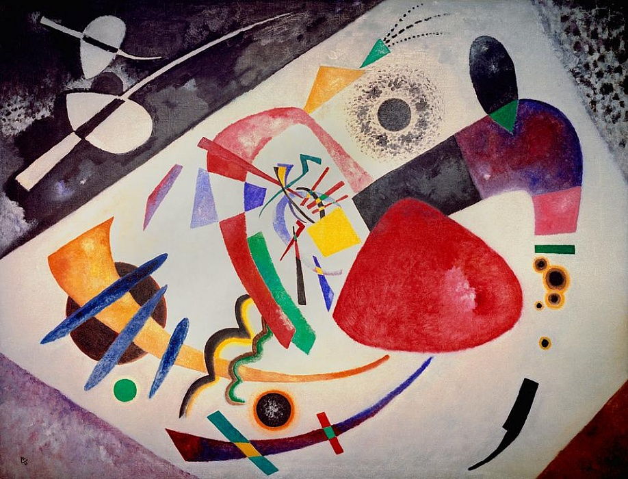
KP: It was Wassily Kandinsky’s ‘Roter Fleck II’ of 1921, in the Lenbachhaus in Munich. As a teenager I used to visit my grandmother regularly in Munich, her native city (she had fled Germany in 1939, returned in 1980, and then came back to London in the 1990s for her final years). We went to the art museums during every trip, since I already wanted to be a painter. There is so much work from the Blaue Reiter artists in the Munich collections that you could really see the community context – the dialogues between artists, and their influence on one another. These painters had a directness that really excited me. The colour was selected and distilled with precision to describe the essence of the mountainscapes and the drawing, too, was direct and economical. The Lenbachhaus has a massive Kandinsky collection and the developmental stages of his practice were on display and readily discernible. I could track his progression toward abstraction, but it felt so instinctual to me anyway. This painting, ‘Roter Fleck’, in particular, really conveyed a sense of abstract painting as representing a reality that was not observable in an ocular sense; that was nonetheless actually experienced and expressed here in an idiosyncratic visual language. The iconography felt strange but logical. Additionally, Kandinsky had originally been a lawyer and I am interested in legal systems as painting strategy. As an adolescent, I was also completely sold on the idea of a spiritual code underpinning the music of the universe. Now I’m sceptical.
My grandmother had known a lot of the artists – including Kandinsky’s companion, Gabriele Münter, so the paintings were accompanied by dubious anecdotes (from a notoriously unreliable narrator). All of us kids got the same museum education, which also made a big impact on one of my cousins, who went on to study Art History as a result and is now a successful art professional. We sometimes run into each other at exhibitions.
JB: Do you see yourself as an abstract artist or as an artist who works with aspects of abstraction?
KP: I don’t have a strong opinion, but I suppose I prefer to be someone who works with aspects of abstraction. The world appears to me as series of networks and I paint the connections that I see between things, both physical and conceptual. All the knowledge I gather or the ideas I learn of through other artists are registered as grammatical structures in my brain and are transposed through the themes that I’m currently investigating.
Abstraction is, to me, about representing ideas that are absolutely real but essentially abstract, like maths or a system for sharing communal resources. My abstraction is not concerned with abstracting in the sense of deconstructing a visual observation – as in seeing something and changing it until the observed qualities have degenerated. That is a perfectly noble way of working, but it’s not my project.
Very recently, I’ve realised that my paintings declare a state of mind that is obsessed with order and control, which is unfortunate. I suddenly felt like I’ve been doing naked karaoke all these years. And I’ve exhibited it publicly.
JB: Could you talk about what roles chance, pre-planning and improvisation play in your painting process?
KP: Like most artists, I am alive to the possibility of the unforeseen and accidental. Sometimes I take cues from chance events. If colour has splashed over from another painting, I might utilise that. I don’t see the image in my head – that’s part of the motivation for my making the painting. The ground, and a prospective colour-scheme, are usually decided on before I start. There is an overview of a series of artworks and how they might work in concert. The imagery comes from functions or algorithms that respond to how the painting looks already and directs how I might want to influence its direction. Often these algorithms rely upon chance occurrences for data – such as lumps in the paint, drips, brush hairs or splashes.
JB: Do you see yours as a ‘process driven’ kind of painting? Can you talk about what ‘process’ might mean to you?
KP: Yes, definitely. The imagery comes from the process, so there’s no denying it. When I write rules or systems as instructions for a painting, I am guided by what I think will likely happen- how colour relationships will build and modulate with scale, how forms will be constructed, and so on. But I don’t know for sure. I’m a systems thinker and I paint in systems but I know full well how the mind warps and shifts ideas over time. I work with these kinds of experiences, such as watching a painting unfurl and adapting the plan and responding visually, whether subconsciously or deliberately.
Sometimes I deliberately shoot in the dark and do something I’ve no idea about. There is always a tug between what I predict will happen and what I have no control over. What I’m aiming for is something that I can’t see unless I paint it: something that does not look like anything I’ve made previously and that opens new avenues of transference.
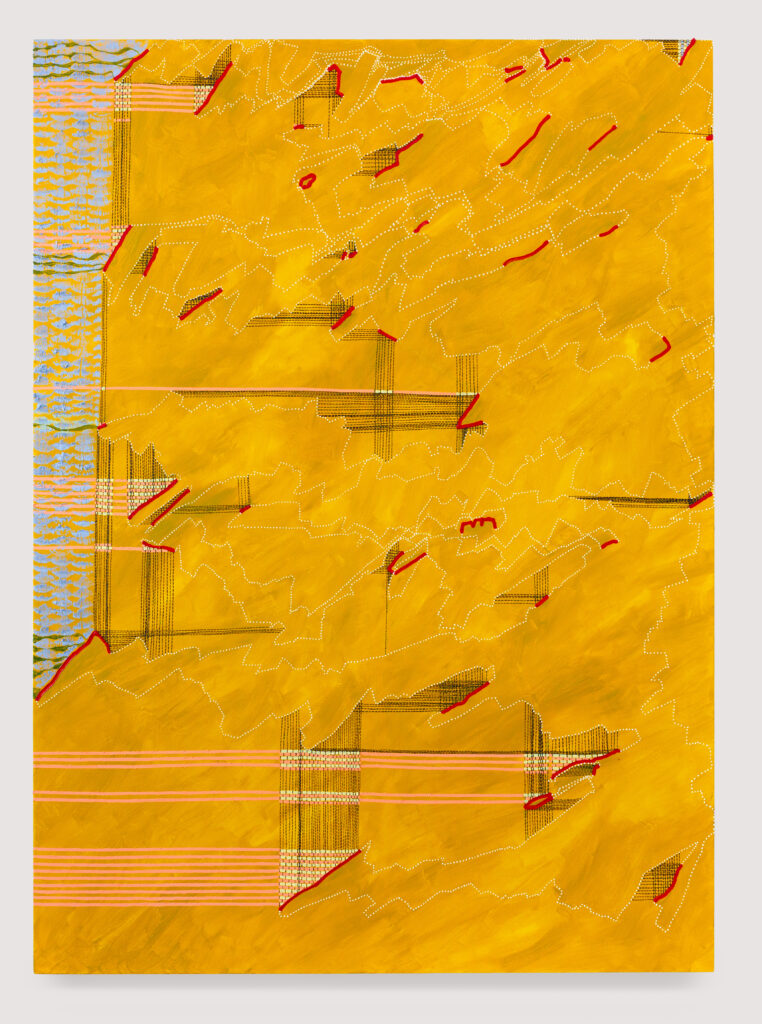
JB: It’s intriguing to hear about Kandinsky’s possible alternative career! And it is interesting how a lawyer is involved in translating a set of primarily abstract concepts, ‘the law’, into practical outcomes for clients. I’m intrigued by this notion of translation in terms of your own work. When you mentioned your obsession with systems I began to think about diagrams, charts, graphs and maps, and about how bar charts and graphs translate data into understandable visual form. I can see the ghosts of these visual structures in your works. Am I on the right lines here? Am I right in thinking you are channeling information from the real world to produce abstract images?
KP: I don’t believe that I channel information from the real world directly – I think analogously. My painting systems are simple functions or algorithms that are described in my head as a set of rules. But once you start painting in that way, you think about the significations. What would happen if those strategies were applied in the real world? Where do those regulatory or behavioural patterns occur naturally and socially?
JB: It is fascinating how information about human relations- geopolitical, fiscal and even emotional behaviours, once stored, can then predict, impact on and transform future outcomes for individuals and societies. Of course, now, the storing and the manipulation of data have been utterly transformed. We are only beginning to understand the power of ‘big data’ and computer processing that happens on an industrial scale. Could you give an example of the kind of data that attracts you?
KP: Numbers, socialism, ownership, democracy, money – these are all concepts and not actual things. They are thought experiments and they are highly acculturated: that’s why I take an interest in social anthropology.
I think if I were to work with actual data, it would be for the purposes of making a painting that is unlike one I’ve made before. I would be an unreliable, useless and defunct computer for any potential collaborator. I am interested in complex systems and my painting process is dynamic, but the paintings are systemically flawed. That is important because otherwise the logic would be didactic and cumbersome.
The real world- the books I read on economics, particle physics or political history- enable me to visualise new regulatory structures and to contextualise concepts I’ve been employing in the paintings.
I negotiate the friction between visualising and using algorithms that are outside a visual language so that part of the visual imagination is disengaged. The paintings surprise me and generate imagery that transcends my own capacity to design.
JB: I’d be interested to hear your thoughts on, for example, Peter Halley, whose paintings, it’s claimed, ‘are diagrams of the lived experience in a contemporary urban environment, in which social space is ever more divided and geometrised but individuals remain connected via ‘conduits’ of information flows, roadways and electrical grids’; it’s striking how much theory- post-structuralism, Foucault, and so on- has been brought to bear in interpreting his paintings, the forms of which (the barred ‘cells’, conduits, pathways) are simple in the extreme. Your work, with its interweaving of varied forms, interconnected lines and painterly incident feel very different and visually complex in comparison. Did the rise of ‘conceptual painting’ and ‘Neo Geo’, to give two instances, have a major impact on the way you thought about your practice and abstract painting more generally?
KP: Yes, absolutely – it was very current when I was at art school. I am a massive Halley fan and make a point of seeing his painting whenever possible and often read his writing and watch his lectures online. Specifically with Halley, I think that the quality of the surface and the joy of materiality interrupt any overly worthy reading of the artwork. The differentiating aspect between Halley’s generation and the contemporary situation is the boundless speed at which complexity has inflected our networks. In the twentieth century, it was still just about possible to trace connections and plot information pathways- conduits. There is way too much information and too many potential routes for that to be feasible now. The impact of the digital environment on our perception from linear systems to complex systems is profound. When I read Foucault, who died in the mid-1980s, I bear that in mind. But for me there is comforting synergy in that the digital environment better represents the operation of our brains and consciousness than analogue does.
Fundamentally, the rules I use are about formalising formalism: making formal decisions but fragmenting them into programmes and into tiny micro-choices. I like maths and have a numeric awareness that enables me to visualise the scale of things.
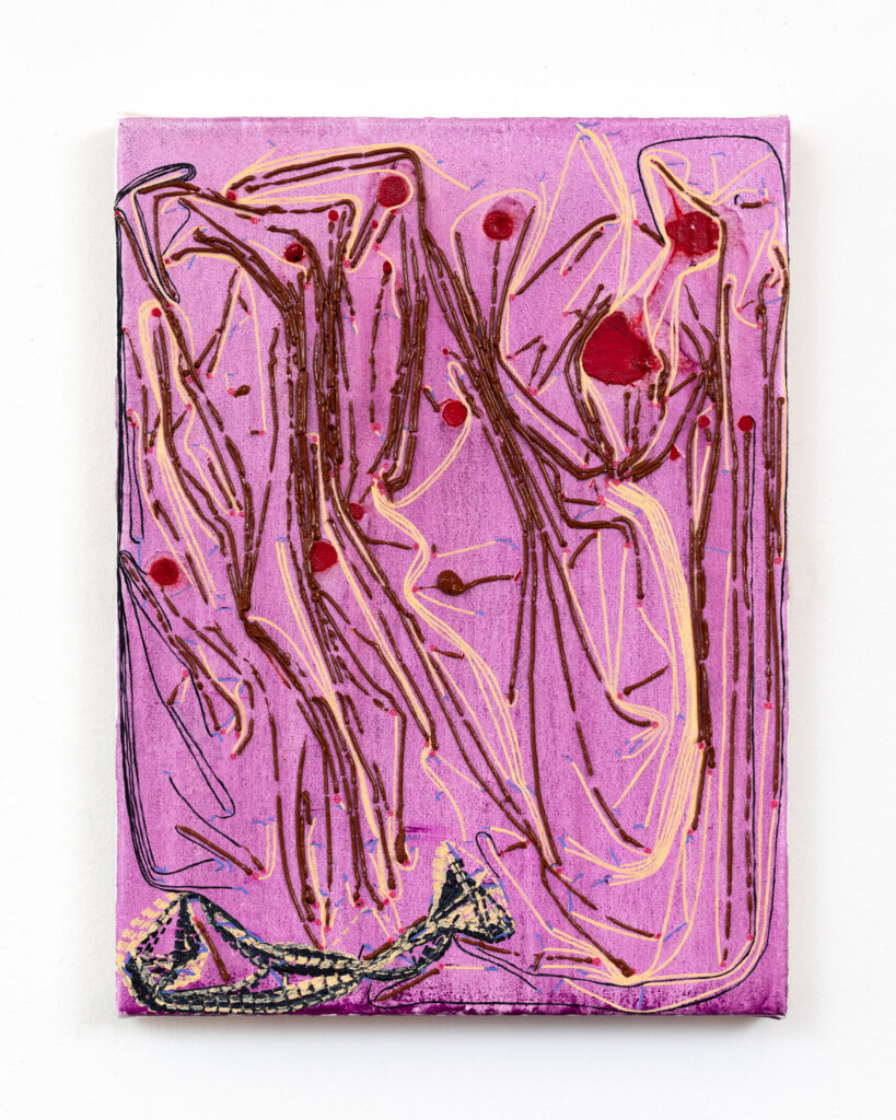
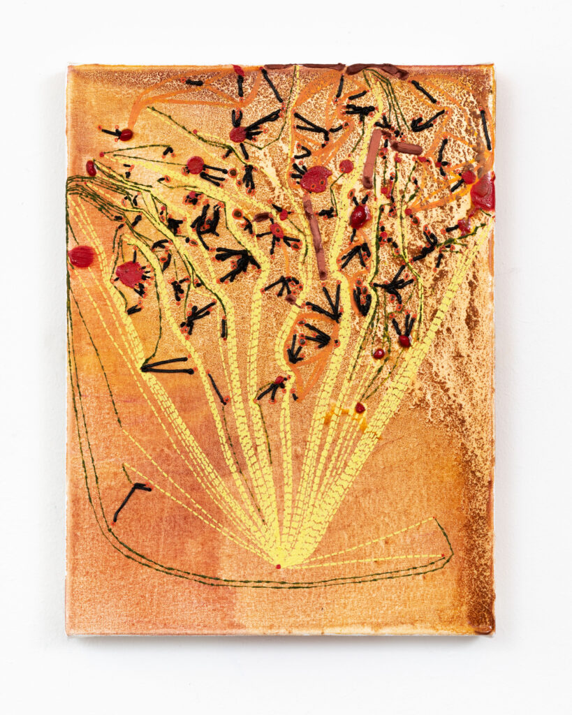
JB: It’s very interesting to hear you talk about micro-choices and ‘formalising formalism’. Bearing these micro-choices in mind, I’d like to get back, for a moment, to Kandinsky’s ‘Roter Fleck II’. I’m drawn to the black circle in the top middle-right of the painting. I like the way he’s begun to improvise on the immediacy, the authoritative presence of the black dot or circle which has obvious grammatical associations with the ‘full stop’. He softens its impact by giving it a spreading penumbra which allow a sort of connectivity between shapes to grow. All the elements, shapes and individual structures seem to jostle for position or gently lay against each other. The interactions between colour, shape and line really do come to the fore. Also, there seem to be images working within images. I like the way in which the centrifugal qualities of the play of forms on the white ground are pushing against the darker imagery that surrounds them. In your work there seems to be a recurrence of a particular kind of line, that connects together different elements at work in the painting. It reminds me of a string of beads or a cascade of full stops in space. But there’s also a sort of illusionistic puncturing of the canvas that one might associate with stitching.
KP: That’s really a very wonderful description you give of the Kandinsky painting.
Kandinsky’s impact on me was profound, but it was early on – before I went to Art School, even (I did my Foundation at the Central School of Art & Design in 1987/8). He’s not a consistent reference point. The factor my paintings share with Kandinsky’s is the geometric function of the lines, juxtaposed with more organic forms – as your intepretation of ‘Roter Fleck II ‘suggests. The lines in my painting are about a thinking process, as opposed to Kandinsky’s, which I would say were used to describe a metaphysical space and experience. It is hard for us to conceptualise how completely outlandish those works of his must have looked when they were made, because autonomous abstraction is now part of our cultural fabric, although nonetheless still not widely understood, in my opinion. Certainly I don’t subscribe to Theosophy, and tend to view spirituality as a vehicle for generalisation; not my thing. I don’t set out to imitate or quote from him.
Occasionally I do quote, but then it’s usually from someone or something I’ve recently seen, and it’s usually acknowledged in the title. The content of my subject matter overall derives from a critique of Jackson Pollock, and to a lesser extent, John Hoyland.
JB: I’m curious to know what you mean by the term ‘critique’ in relation to Pollock and Hoyland. They both present, in different forms, a very masculine image of the painter- all bravura and a ‘flying by the seat of the pants’ attitude to making. Of course, this is a cliched generalisation about what they did and how they did it, but I wonder what might drive your interest in their work?
KP: Exactly – the machismo that Pollock’s work epitomises is part of it. These days, people mostly agree that Lee Krasner was undervalued in relation to Pollock – overshadowed, perhaps. I am also deeply suspicious of what I view asKandinsky’s possible plagiarism of Münter in some of his early landscapes. Incidentally, I ran into Danny Rolph in a gallery last week and we talked about other instances of male artists whose appropriation overshadowed the profile of their female-artist partners. No names.
I am also interested in critiquing the notion of gesture as self-expression. Some believe the gesture is an autographic window into the artist’s psyche or persona – which I don’t happen to think is very interesting. Expression should be specific in the way that speech is, and not a kind of primal scream. Pollock’s gesture is specific to the rhythm of his movement and the composition of his paintings but for both him and Hoyland it is very territorial. My painting often has these big gestural statements in the underpainting but the subsequent layers are hyper-detailed, often slow and laborious in their making, which contradicts the gestural flourish. The critique comes through making a similar beginning, but proposing an alternative approach and different outcome.
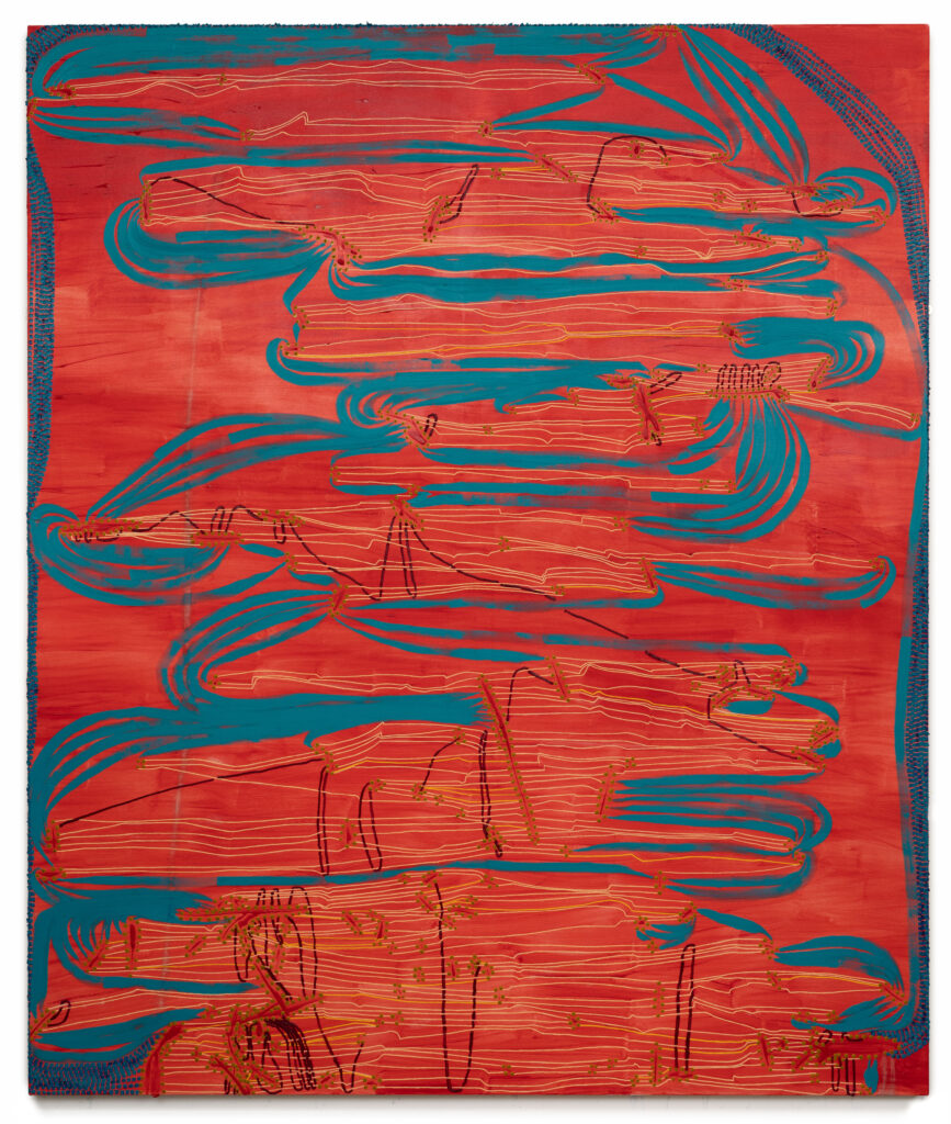
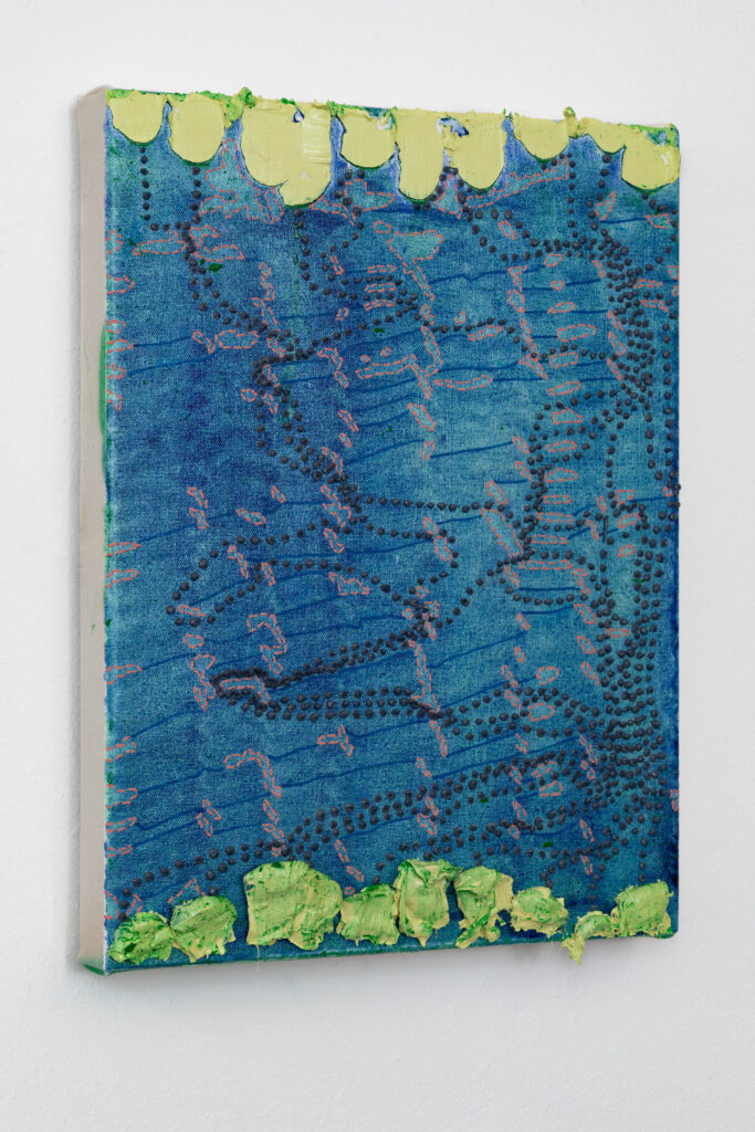
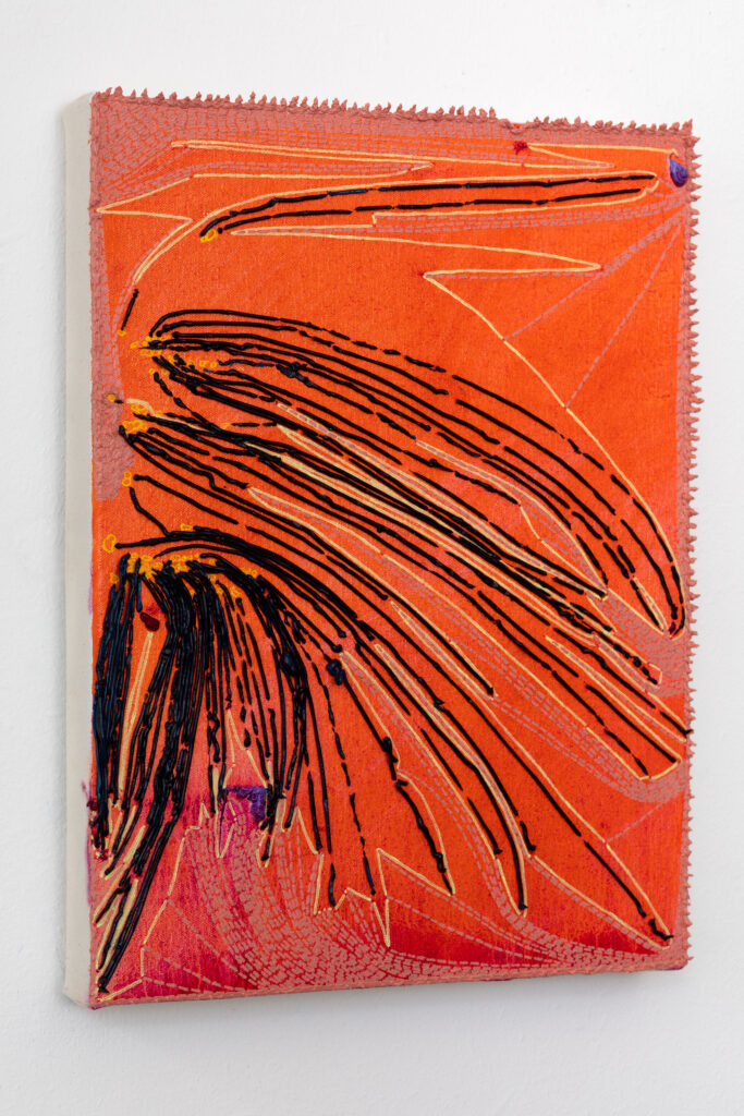
As you mentioned, my approach to line is navigational; they are pathways. They establish one route and in so doing, commit within a paradigm and rule out alternative sequences. The straight line is direct and determined. The dotted line is more tentative, recording my stopping, orienting and proceeding.
I always get asked about stitching. I’m afraid I believe that question is invariably gendered. I can and do sew, but only to repair, alter and adapt – for utilitarian purposes. Being part German/Swiss-German, I was also taught embroidery as a child. And knitting – like a German, with my finger in the air (can’t afford this in either time or materials) and tapestry (obsolete skill) and crochet (forgotten how). The dotted lines relate more to the diagrammatic – to geometry and cartography. The other private psychodrama about the lines is my appalling handwriting which I still blame on successive hideous and painful whitlows I had while learning to write. Again, it’s control – imposing graphic conformity.
The dotted lines are incredibly time-consuming to paint, even more so than the continuous ones. They have become a bit of a graphic mannerism, which concerns me, and I am currently trying to find new ways of drawing connections and establishing networks. I think I am a failed formalist.
JB: A failed formalist? That brings me nicely onto your use of colour. It feels deliberately eccentric, always surprising and unpredictable- beyond the purely formal! What role does colour play in these complex arrangements and decision-making processes?
In much expressive gestural painting, no matter how bravura it tries to be, the colour often remains emphatically sweet, saccharine even, or conservatively organised around primaries and secondaries. Yours very rarely adheres to these kinds of regimes. Any thoughts on why that might be?
KP: Your question addresses something I’ve never even noticed, let alone considered. Therefore it is not a deliberate strategy in the context you cite. But thank you for planting that germ: I really look forward to investigating it.
The micro-choices distract me while I inadvertently make subjective decisions – most notably about colour, since I don’t systematise that at all; except that all colour schemes are de facto systematic. I think about scale – how colour operates locally and on a macro level. Also, there are chromatic illusion and visual tropes, puns and associations. Because of how I paint in stages or layers, colour choices are sequential, and so respond to what is already there and inflect what will happen next.