Frederic Anderson: ‘To Draw Away From’
I’ve always believed that there is a simple solution to most problems associated with painting: to go back to drawing. Going back to drawing, however, doesn’t mean returning to some kind of reliable conceptual ‘source’ for comfort, warmth and reaffirmation; quite the opposite. Drawing is a place of shifting sands where anything can happen, where things are stripped back to basics and there’s nowhere to hide. In the same way that a pop song needs to stand on its own on when reduced to an acoustic guitar and voice, if a composition doesn’t work in pencil on paper, it’s probably not a strong composition.
Good drawing is about agility, change and rapid evolution. You can make fifty drawings in one intensive session and trace a linear progression of thought from the first to the last in a way that isn’t really possible – or, for most artists, financially viable – in painting. The blank piece of paper is less intimidating than a vast virgin canvas, because of its familiar and approachable scale and cheap-‘n’-cheerful availability. It offers the liberating freedom to make mistakes, potentially lots of them, one after the other, and through these mistakes, to allow for new and surprising possibilities to gain purchase.
When something interesting does begin to emerge, this offers an immediate way forward, a stepping stone to the next drawing, and then the next, and the next. Drawings can then be easily shifted around on the wall or floor and viewed en masse from a distance, to explore connections and juxtapositions, again providing more fuel for more drawings, more evolution. At the end of a session, which could feasibly extend over several days, one could trace the evolution of an idea from origin to fruition.
What happens, though, when this kind of open-ended probing enquiry, normally associated with drawing, is applied directly to painting, when it becomes the core strategy of an entire painting practice rather than a way out of a jam? Struan Teague, Daniel Jensen and David Ostrowski are all well aware of the energy, momentum and invention that drawing strategies can bring when successfully applied to the medium of painting.
Ostrowski has used preparatory drawings in the past, but now brings strategies learned from drawing directly onto large canvasses, working problems out in real time and at scale. He believes that ‘the first shot counts’, using materials and techniques that allow no space for corrections, or at best, highly visible corrections that then necessarily become integral parts of the overall composition. Recording subtle variations in speed and pressure, a spray-painted line has more in common with a drawn line than a conventionally painted one – it has a ‘mood’ that is difficult to emulate with a brush. His probing, experimental compositions have the directness, freshness and provisional quality of drawings. Each painting connects to the preceding one in his prolific output, pushing and developing an open-ended idea with no prescribed destination, looking for the unexpected – something, as he has explained, that lights up the fictitious neon sign hanging in his studio that reads ‘Surprise’, or the other one that reads ‘Think Harder’. 1https://brooklynrail.org/2014/06/art/think-harder-an-exchange-between-david-ostrowski-and-alex-bacon
Struan Teague approaches each new painting as a clean slate, eschewing predetermined methods to allow each canvas to develop and evolve organically in response to each mark as it is laid down. Canvasses in his studio are often seasoned before use, either laid out on the floor or folded in the corner; they gradually accumulate incidental marks collected from the paintings being made around them. These ‘found’ marks could form the starting point for a composition, breaking the ice in a continuously unfolding conversation between the nuanced application of different materials and the canvas ground. Teague’s work shares with Agnes Martin’s a feeling of ‘perfect pitch’, where each element in the composition, even the most ephemeral, performs a vital role. A sense of dynamic tension is created between different types of marks – incidental, intentional, fast, slow, dripped, drawn, scratched, smudged. If the paintings were physical structures, each mark would be a load-bearing one – shifting one of them to the left or right, or removing it entirely, would risk the collapse of the composition as a whole.
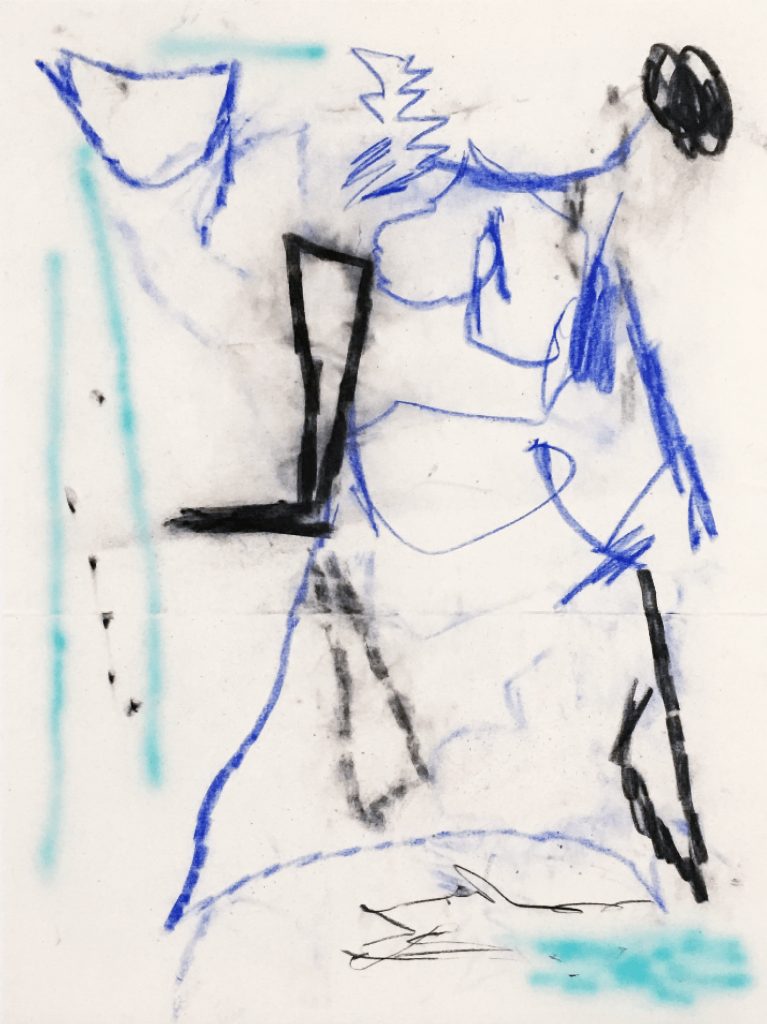
Jensen’s paintings burst with vitality, playfulness and spontaneity, tending to fill the frame. Working primarily with soft pastel and other drawing media onto raw canvas, there is no space for correction here either. Drawing on a broad and bright colour palette, his compositions fizz with energy and movement; hatched fields of colour jostle with lines, scribbles, pencil marks and fingerprints. The paintings tell the story of their own making, as thin spidery pencil lines delineate structures for the rowdy areas of colour to butt up against and ultimately overcome. These are paintings built on the notion of drawing as a playground of uncertainty. They are reductive in the sense of the simplicity and immediacy of the materials they employ – a pencil line, a fingerprint on a raw canvas ground -and yet the exuberance of line, colour and composition prevents them from being labelled as minimal. The momentum of drawing enquiry is more self-contained in these works. Although certain strategies and colour combinations do bleed from one painting to the next, the solutions to the problems of one canvas won’t necessarily provide a key to resolving those of its successor.
It’s curious how, when all extraneous elements are stripped out of a painting, lines can begin to flex, breathe and speak for themselves. The speed at which a line is applied to canvas, the subtle modulations in pressure through the course of its travel, its positioning in space relative to the canvas edge and its relationship to other lines, all ‘speak’ to the viewer. Line is a kind of language. Ostrowski’s sprayed lines have a bluntness to them, both descriptively and figuratively, openly despondent, introspective, stark, dissonant and physically blurry, making a meal of line like a blunt knife making its way through a difficult material. Teague’s lines are sharper, more brittle, higher in pitch, yet no less emotionally charged. They have the quality of lines drawn from life and then subsequently rearranged into new and unrecognisable forms. Subtle variations in line weight lead the eye through the carefully articulated negative space, occasionally snagging it with little hooks, folds and kinks. Jensen’s lines vibrate with energy, struggling to contain the colour they are comprised of, as smudges and dust bleed off into the raw canvas ground.
Ostrowski’s large canvasses have absorbed the raw, gritty and probing quality of the experimental preparatory drawings that precede them. Taking chances at scale in this way gives the work a real sense of urgency. It brings the viewer into contact with the everyday reality of the artist’s studio, through split-second decisions that could go one way or the other, the exquisite and excruciating tension of how and when to make a mark.
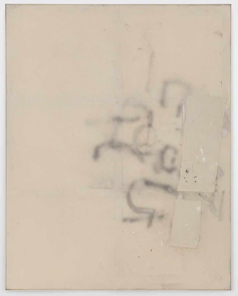
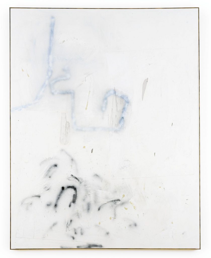
In Ostrowski’s painting ‘F (Dann lieber nein)’ the raw canvas ground speaks of exposure and fragility, the exposure to human traffic of a wall in a public space, the fragility of a sheet of paper and its tendency to absorb all traces of its handling. The colour palette, of beige, faint fuzzy grey and a few tiny splashes of white, has an institutional coldness to it, the palette of unloved public spaces. The marks suggest partially successful attempts at writing, overwriting and deletion. At the perimeters, the lines trail off into beige nothingness like distracted, unfinished thoughts. The applied patches of canvas are roughly cut and roughly placed to interrupt the flow of the lines. The composition is uneven, teetering, falling out of the frame to the right, like a section cut and pasted from a larger composition. The incidental marks, splashes of paint, and accumulated studio dirt also contribute to this feeling of despondency and wear. The blur of the sprayed lines resonates with their unintelligible arrangement, like words placed just beyond reach, fragments of meaning rearranged into poetic abstractions. An imprint of the wooden stretcher frame pushes through to the front of the canvas, contriving together with the drawn lines, paint splashes and collaged scraps to confuse the exact visual location of the surface in space by compounding its presence.
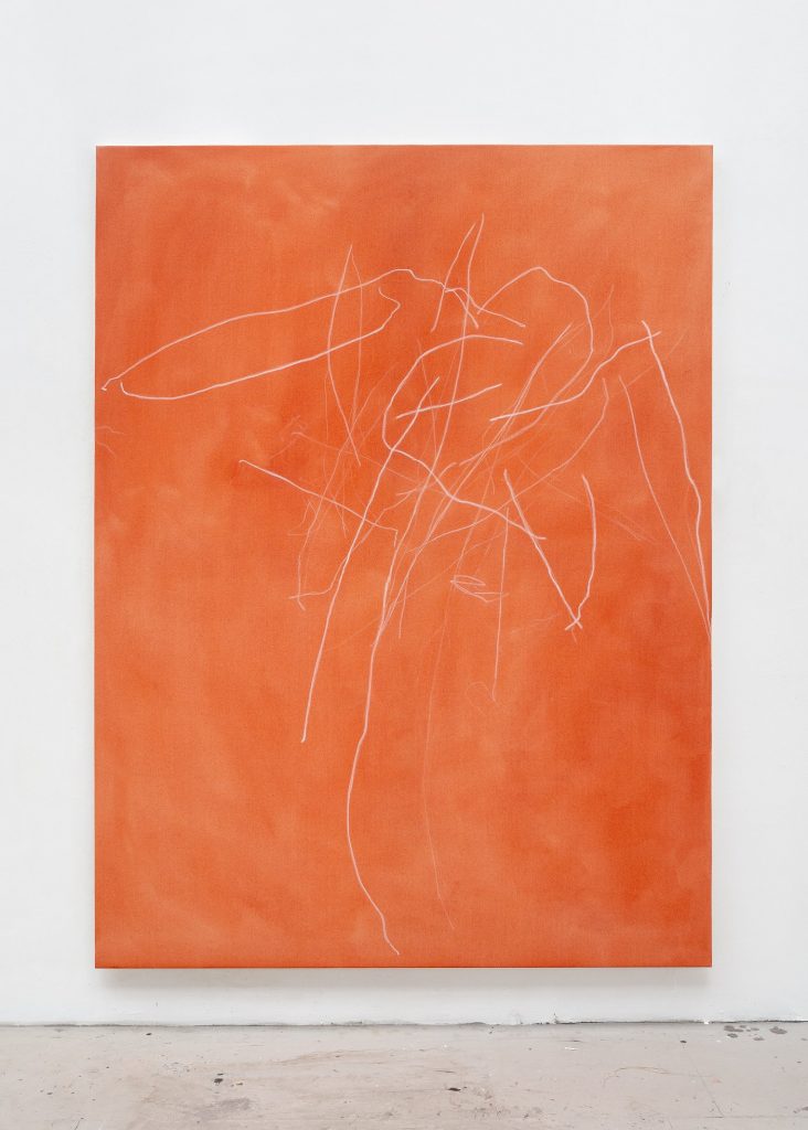
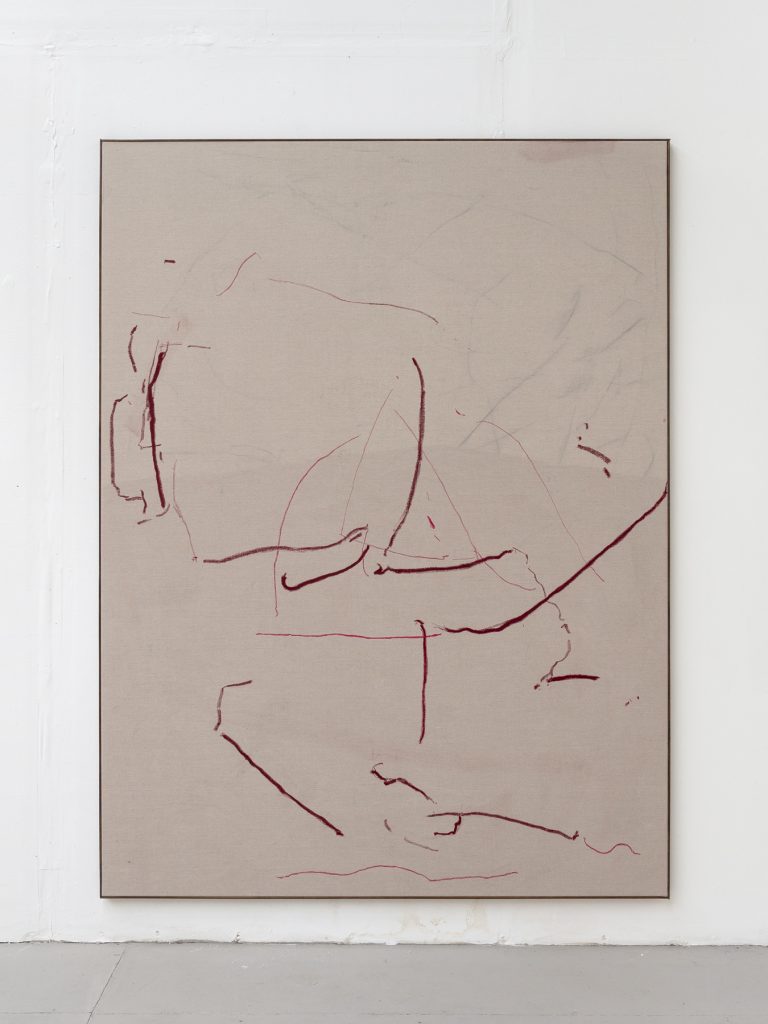
In Teague’s painting ‘Untitled (Maculata/Ercolano)’ brittle, tangled lines float over a vibrant orange earth ground. The soft, brushy quality of the orange distemper creates a dense, otherworldly (Venusian?) atmosphere, which both penetrates and sustains the weight of the drawn lines like a thick cloud of coloured gas. The lines themselves have a non-human quality to them, like a bee’s experience of the vibrant contours of a flower, or a rock’s perception of rain. They have the feeling of having been drawn from life, then fragmented, twisted, bent and re-arranged into abstract form. They seem to describe movements of the natural world, tracing the paths of migratory birds, water currents or molecules in a cloud chamber. There is a tentative, searching feel to them, with faint, ephemeral trails juxtaposed with stronger, more decisive marks. In places letters begin to form, an S, an A, an X, but never fully take shape, re-submerging into the spidery tangle. The colour palette, though brighter than Ostrowski’s, is similarly pared back, reduced to just orange and white. The loose expressive brushwork of the ground is as considered and finely tuned as that of one of Agnes Martin’s bands of pale colour, hemmed in between pencil lines. The weighted areas of orange act with the off-centre placement of the lines to create a dynamic sense of rhythm and movement, with the composition as a whole balanced on a knife-edge, as if removing just one line could collapse the entire structure.
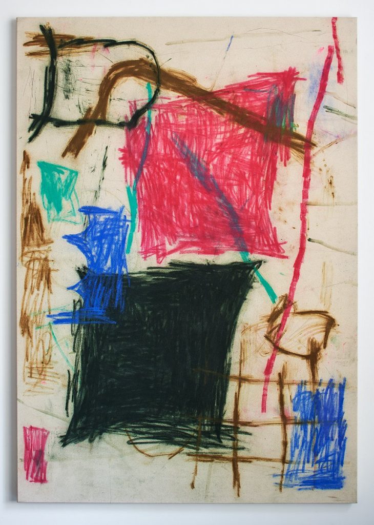
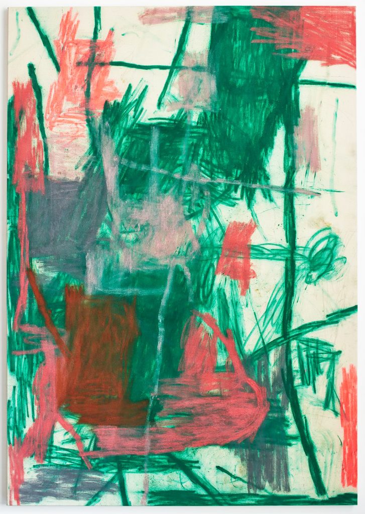
Jensen employs a more maximal approach than Ostrowski and Teague in ‘Theme Park’, filling the frame and bringing more colours into the mix. Rather than exploring the expressive potential of the individual line, Jensen is more concerned with what happens when lines are congregated en masse into tight units, compressed into agitated fields of colour. In ‘Theme Park’ six distinct areas of colour are paced across the raw canvas ground and juxtaposed against each other. There is a kind of fizzy tension between the colour fields and the intensely ‘drawn’ nature of the hatched lines they are comprised of. This painting shares with Teague’s and Ostrowski’s a feeling of something disassembled and reconfigured into a new and unrecognisable form, a kind of collage without collage, as Briony Fer describes Malevich’s work in ‘On Abstract Art’. The nature of the materials (soft pastel and oil stick on raw canvas) leaves nowhere to hide, and indexical marks accumulate to provide an extra layer of depth and nuance to the whole. The painting also has a curiously mutable sense of scale: looking at it on a phone screen, you could be forgiven for imagining it as a postcard-size drawing in felt tip, rather than the two-metre canvas it actually is.
If we are all now in the ‘endgame’ of contemporary painting, it strikes me as a perfectly natural instinct to want to return to the fundamentals – drawing as the rudiment of painting, and collage as the root of abstraction. Looking at the work of these three artists, I wonder if perhaps the clock hasn’t actually already ticked past twelve, and rather than the endgame, we find ourselves instead in a new territory for painting, reinvigorated by a more direct engagement with the nature of materials, the painting process, and the simple language of the drawn line.