James Faure Walker: ‘Tales from the Ochre Factory: Lumps, Ghosts, Cigars’
Artist and writer James Faure Walker has joined Charley Peters, Sam Cornish and Jillian Knipe on Instantloveland’s ‘Writer-in-Residence’ programme. Of his practice as a painter, James writes: ‘I try and do the best I can, and it can be hard work. If a painting looks all of a piece, effortless, well, that would be a relief. Getting there takes practice, a lot of false starts, a lot of rejections. Painting has to evolve and keep re-inventing itself. I can’t afford to be tied to just one technique, just one creed. Maybe I hop about, but I like that freedom. And I like to draw. I’d rather be associated with playfulness and curiosity than with anything too serious. I am on the look-out for the unexpected.‘
I like to think that I know what I am using when it comes to art materials. Earth colours are the ones you dig up. Nothing complicated, just the raw gooey clay that the cave painters used. Well, not exactly.
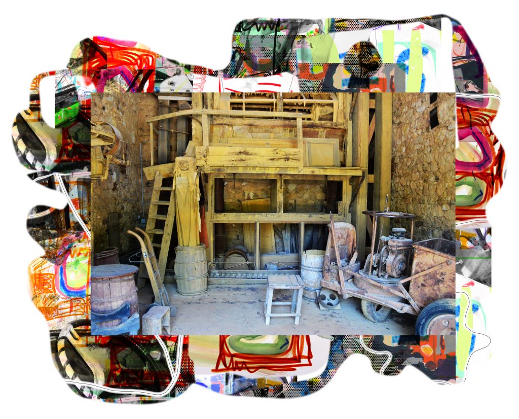
On holiday in France I visited an old ochre factory that is now a museum. You walk through the quarries and marvel at the yellows and pinks of the cliffs.1The Ochre Conservatory, Roussillon, Provence. www.avignon-et-provence.com/en/museum/ochre-conservatoryWhat I had never considered was the time it takes to process it into useable pigment. It takes a year: a year to wash, dry, grind, and purify, and that’s before it’s mixed with a binder and squeezed into tubes – or into cakes if destined for watercolour. At the back of my mind lingers that motto: ‘truth to materials’. Can you be true to something that is already refined? From now on, I am going to stop talking about raw ochre.
And what of that term ‘painterly’? Painterly suggests you work the paint as if it were a malleable and resistant substance. Anything looking industrial and anonymous is out – masking tape, spray-paint, screened, printed. Painterly means you are moving the paint about, really sculpting it. But what of watercolour?
With watercolour the paint is thinned out, almost weightless, hardly there at all – a stain, a breath, as immaterial as light. Heavy impasto, on the other hand, gives the feel of the actual ‘stuff’ of creative struggle. A Tate exhibition some years ago was called ‘The Hard-won Image’. Try that with watercolour and you get a foggy mess. I recall Leon Kossoff being surprised by a student asking why his paint – the brand was Stokes, I recall – was so thick and stringy. He didn’t see it that way at all. When you studied in the atelier system, where the artist worked alongside the student, there were questions you didn’t ask.2Each school of thought had its unwritten code: in that studio at St Martins you used charcoal not pencil (certainly not an ‘H’); ‘landscape’ meant a building site; and the paint needed to be heavily gouged onto the surface. It was the opposite of the cool and detached hard-edge American painting of the mid-sixties. For a few weeks I learned something of painting driven by angst, by the darker recesses of the mind, by passion; the atmosphere was of intense commitment. Kossoff was very much an outsider at that time.In Britain we respect the difficult, like an anti-aesthetic that regards sunny colour and casual brush-work as frivolous – unless by Turner. Watercolour, light-footed and fleeting, looks too much at ease with itself for our taste. Clement Greenberg used to say the Brits were more interested in being right than in being good. He had a point.
Watercolourists don’t say much about ‘physicality’, and those of us who constantly switch back and forth between oil paint and watercolour – changing brushes – also need to adjust our mindset. In my case I need to make a further translation, as I work digitally in parallel – as many others do – drawing and composing on a screen. Does that mean I lose touch with ‘real’ paint? The lack of any paint, or any material at all – apart from what was printed – meant that for decades digital work was treated as a passing novelty. Nowadays we hardly notice screens – the format of this essay – and we seem happy discussing paintings as jpegs. As with vinyl LPs, a cult of painterly facture looks to be part of the rebound against digital smoothness; shiny tech is demonised, alongside plastic, because of its assumed association with the climate crisis. The textures of the hand-crafted – the eco carrier bag, the artisan baker, the blackboard menu in the coffee shop listing the ‘guest’ roaster – are perceived as wholesome. Overdone facture, making the crafting of paint the eye-catching feature, sends the same message. I am no fan of the inkjet-printed canvas in the hotel room, but the idea must be to fool you into thinking you have something authentic on the wall, a step up from a photo or reproduction. In Bruges, I once glimpsed a row of glossy colour photos from a distance. When I got nearer, I recognized they were superb works by Hans Memling, the point of my visit. Dubuffet was using mud and dung in the 1940’s. Art Brut was an attack on the finesse of high culture. He was obsessed with what a painting could be made of – ‘it makes me very uncomfortable to work with mysterious products, when I’m unaware of their basic ingredients’. He even wrote a handbook, with DIY tips, on the ingredients of the commercial paints used by decorators.3Rachel E. Perry, ‘Paint Boldly!: Dubuffet’s DIY Manual’, October 154 (Fall 2015). The essay quotes Roland Barthes at the outset: ‘Another history of painting is possible, which is not that of works and artists but that of tools and substances…’ www.academia.edu/12974895/Paint_Boldly_Jean_Dubuffets_DIY_Manual
Sometimes I think the super-responsive paints I get hold of are indispensable. I might want the look of the unrefined, but that needs a decent umber, and the right brush. With non-representational painting, the eye seeks out a pattern, looks for the connecting logic, or finds none; the dabs of the brush can pull it all into focus. For centuries painters knew how to fool the eye with optical interference. Spots of colour can sharpen the image better than an overload of detail; the eye fills in the gaps, imagines the silvery reflecting water that is not actually painted in. Vermeer’s ‘View of Delft’, seen in the flesh in the Hague, is the classic example. One of the pleasures of looking at Impressionist and Pointillist paintings is the feeling of the image forming as you look at it.
If you watch a tennis player testing the ball, a violinist trying the bow, a batsman patting the pitch, you see them rehearsing their stroke, loosening practised reflexes; they all need the ritual of getting the touch just right, getting the mind in gear. It is the same for the calligrapher, for the painter getting the feel of a brush. In watercolour you may have to get it down in one breath, with complete economy, and without revision. There are only a few types of painting that depend entirely on exposing the brushwork, the drawing; and at the other extreme the point can be to leave no trace at all, to smooth it away, so you have no sense of process or material. A few times I have been commissioned to test brushes and pigments. A toxic chemical may need to be replaced by a newly synthesised one. It is not a simple exercise: the consistency, covering power, and character of each yellow needs your undivided attention. The same for the behaviour of a brush. You have to think laterally of how it could be used. Grainy or smooth, opaque or translucent, rough or sensitive, the manipulated paint can do it all. The lesson I learned is that you get what you pay for: the best brushes cost a fortune. After the trials, it has been a relief to splash around with a gummed-up brush on lining paper. But to what extent do the characteristics of the paint, brushes, surface determine what you make?
If you say you start your pictures by playing around, seeing what the paint wants to do, you can find yourself caught in a riddle.4The Royal Watercolour Society and Schmincke commissioned this video in October 2018: https://vimeo.com/320275277 You may not be leading the picture to a known destination, but you are more than just a spectator: you are in control, editing, and using your know-how. You can be playing a game, as if you were a robot with a loose set of rules. But you are also cheating your way through, making judgements, in the hope of surprising yourself. Needless to say, the more you get to know about how each pigment and each brush behaves, the more scope you have. To what extent is any improvisation really ‘free’? That is always a good question to ask.
For almost two hundred years watercolourists have argued the pros and cons of ‘body colour’. Purists insist on the principle of translucency: adding white, clouds the colour and deadens the luminosity. There is no need for it, they argue, because you should exploit the paper’s whiteness, like a backlit screen. Others maintain that white allows you to mix pastel tints, overpaint and modify. When Chinese white, or zinc white, became available through Winsor and Newton in 1834, it meant the watercolour painter could emulate oil painting, working wet into wet, allowing forms to be modelled and look fully 3D. It was tempting. Oil paintings sold for double the price of watercolours.
The British Museum’s Orientalism show has been worth visiting, just to see a small sketch by Delacroix that anticipates the figures in the ‘Women of Algiers‘.5Inspired by the East: how the Islamic world influenced Western Art’ is at the British Museum till January 26, 2020. On the same wall is John Frederick Lewis’ ‘Portrait of a Memlook Bey’ of 1863, in fact a self-portrait. (The painting has been used to advertise the exhibition). Lewis had spent ten years living in Cairo, adopting Arab dress, returning to London in 1851. This watercolour, using body colour, shows in minute detail the sash of his head-dress – which is also on show in the exhibition. It is a tour de force. Lewis’s photorealism anticipated that of the PreRaphaelites.
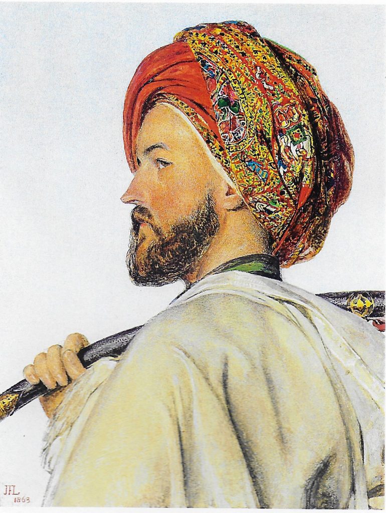
Lewis was known to be eccentric and often irascible. On his return he found ‘English art in the woefullest condition’. In Portland Place he met by chance John Millais. Lewis was soon to be elected president of the Royal Watercolour Society; Millais, forty years later, would be president of the Royal Academy. Running into Millais, he could not resist a rant – at the same time as dealing with a troublesome cigar:
‘“You should know that although I think your painting much better than that of most of the artists exhibiting, I am sure that oil painting could be made more delicate than either of you make it; not sufficient pains are taken to make the surface absolutely level. Why should it ever be more piled-up than in watercolour? But stop, I must have a cigar; come in here.” Being furnished with his usual sedative, he walked on, resuming his diatribe, “I intend to take to oil colours myself, and damme, I’ll show you how it should be done. The illusion of all modern painting is destroyed by its inequality of surface. Hang if this cigar won’t draw”, and he stopped to give it attention with his penknife. “Holbein and Janet’s (Breughel) paintings are as smooth as glass. Why should not yours be equally even?” And then denouncing his cigar as atrocious, he went on, “Parts of your painting are level enough, I admit, but in your deep tints there is a great deal of unseemly loading.” Stopping still, he then broke out into an unmodified oath, and threw the roll of tobacco into the road, adding “Everything goes wrong today. Goodbye, goodbye.”’6This anecdote is taken from Holman Hunt, ‘PreRaphaelitism’ (1905), quoted in Hardie, Martin, (1968), Watercolour Painting in Britain, Volume III, The Victorian Period, Batsford, London, page 53. J.F. Lewis (1805 – 1876) was President of the Royal Watercolour Society from 1855 -58. John Everett Millais was President of the Royal Academy in 1896, the year he died. Lewis began his career in Thomas Lawrence’s studio, President of the R.A., 1820 to 1830.
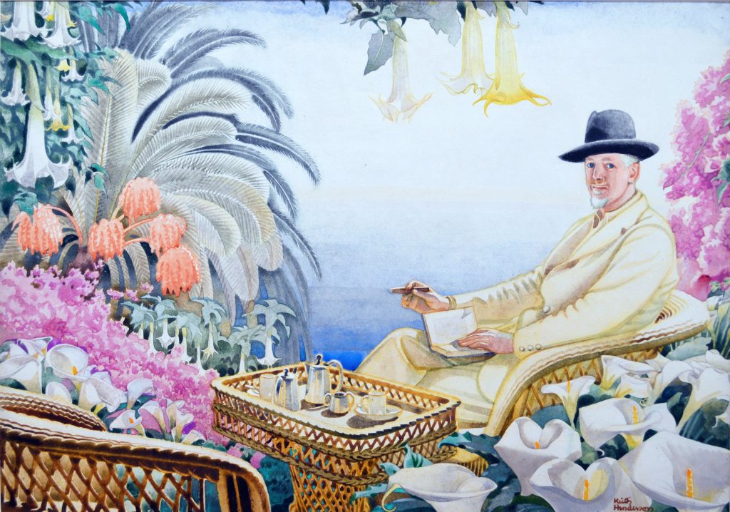
For seven years I have been a member of the Royal Watercolour Society, and for the past two years I have been the ‘Honourable Curator’. We have a fascinating collection going back to 1804 when the society was founded. Because of fugitive pigments used in the past, few examples are ever on show – this is also true of the Tate and the V&A collections. Works are hidden away, stored in light-proof Solander boxes. Every so often I go through these boxes and come across something that takes my breath away – sometimes by David Cox, but often by artists I have never heard of. One was a painting of a gentleman relaxing on a veranda surrounded by trumpet vines, with cigar in hand. It is called ‘After Coffee’, and is by Keith Henderson. It is a portrait of Clifford Bax, playwright and author, and brother of Arnold Bax, the composer. Henderson and Clifford Bax both studied at the Slade in the 1900’s. My guess is this was painted around 1950. This might now count as the ‘vintage’ look, the neutral style of the Ladybird parody books. It happens to be a brilliant painting. Henderson died in 1982, aged 98. He had been an RAF war artist in the second world war. He was a vociferous opponent of modern art – Picasso’s work was no more than ‘foolish doodling’.7Fenwick, Simon, (2004), ‘The Enchanted River; 200 years of the Royal Watercolour Society’, Sansom and Company, in association with the RWS, London. Page 151. I am indented to Jessica Kilburn, who identified the sitter; her book on Thomas Hennell RWS (1903 to 1945) will be out in a year’s time. After the war, several newly elected artists, marginally progressive ones, resigned on the spot because the society had become so stuffy. ‘After Coffee’ would not sit easily in a lecture that goes from Cubism via Abstract Expressionism to the post-Duchamp uplands. We deserve a guilty visual feast, now and then. An exhibition of half-forgotten watercolourists could be timely. In 2020 the RWS is opening a new gallery space in Whitcomb Street, just off Trafalgar Square, next to the National Gallery, so there is some hope for Henderson getting his due.
The late-nineteenth-century art establishment resented ‘the influence of foreign art-methods’, to quote the President of the Scottish Academy, George Reid, in 1889. He dismissed the impressionism of Arthur Melville – wonderful airy and spontaneous watercolours – and the Glasgow Boys, as ‘simply an impertinence’.8Gale, Iain (1996), ‘Arthur Melville’, Atelier Books, Edinburgh. Page 51. The Glasgow Boys included James Guthrie, John Lavery, William York Macgregor, and George Henry. This reminds us of the dismay at impressionism, its sketchiness. It was an affront. There was disgust that the painted surface was so obviously just daubs of paint. In the notorious law suit of 1878, Whistler had sued Ruskin for libel. Ruskin had written that Whistler had flung ‘a pot of paint in the public’s face’. These deep divisions are glossed over in today’s instruction manuals for aspiring watercolourists. There never was just one supposedly ‘traditional’ method for depicting scenery. There was the high finish of academic painting, depending on underlying drawing. There was the light and atmospherics of impressionism – dismissed as the ‘blob and swash’ school. And there was also Courbet’s social realism, earthy and loaded with subject matter. Which ‘realism’ was real?
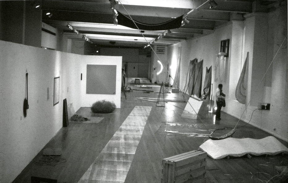
It is never-ending: on one side the undisguised honest earth, on the other, deception and illusion. Can there ever be unadulterated ‘stuff’ in a gallery setting? You have to learn to see it that way. As a student I worked on the installation of the 1969 ICA show, aptly called ’When Attitudes Become Form’. A square of hessian tacked to a stretcher by Barry Flanagan (confusingly wrapped in hessian), Robert Morris’s strips of felt dangling on the wall (he, too, liked cigars), a heap of soil (in bags from the garden centre) with mirrors in it, by Robert Smithson; these were counter-cultural gestures, chic in their own way.
A few days before coming across the ochre factory, I had been to the Yvon Lambert collection in Avignon. I remember visiting the gallery in Paris in the 1970s, when the Support/Surface group, via their work and their journal, ‘Cahiers Theoriques’, were proposing a new purpose for abstract painting. After seeing the work at the gallery, you were invited to buy the artists’ texts. They may have looked like cousins of American colour-field painters, influenced by Rothko, but they took their cues from philosophy. They spoke of deconstructing painting, of removing ‘le chassis’ – the stretcher.9This movement was described in ‘Notes on Style in the Seventies 3. Contemporary Painting in France: the subject and the subject’s space’, by Paul Rodgers, Artscribe No. 13, August 1978. I met Marc Devade, (also Claude Viallat; there was also Louis Cane) and remember our discussion, which came to life when he recognized our magazine, once it was pronounced ‘Artscreebe’.
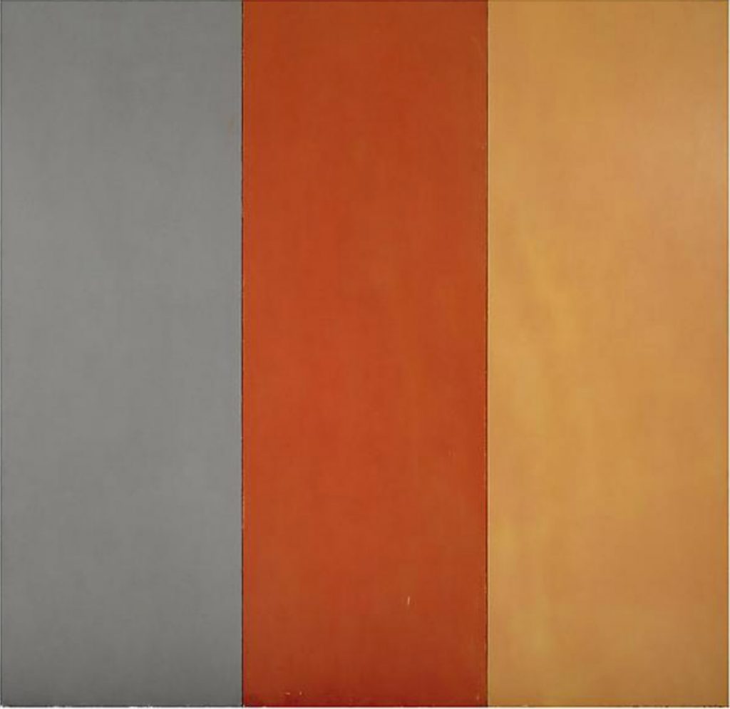
In the Yvon Lambert collection there were rooms of classic early 1970s minimalism: Sol Le Witt, Brice Marden, Robert Ryman. I remembered how this work looked fifty years ago. It had been provocative, it confronted, it had ‘Presence’. In conversations, ‘lyrical abstraction’ was – rightly or wrongly – dismissed as mindless ‘colour art’. Painting had been taken down from its perch, reduced to its essentials – in Brice Marden’s case distilled to the shades of fine leather. It would be a betrayal of the Zeitgeist to re-open the cubist kaleidoscope, forms floating at will. That was ‘Formalism’. Illusionism had also been killed off. Painting had reached its zero. Everything was to be literally what it was – that was the anthem. Yet at Avignon in 2019, Minimalism was now, well, history, a somewhat ghostly presence. It needed a reset. Gallery staff wandered about suggesting how you might respond: it might look tasteful, like washed out décor, but you needed to inhale the intellectual aroma.
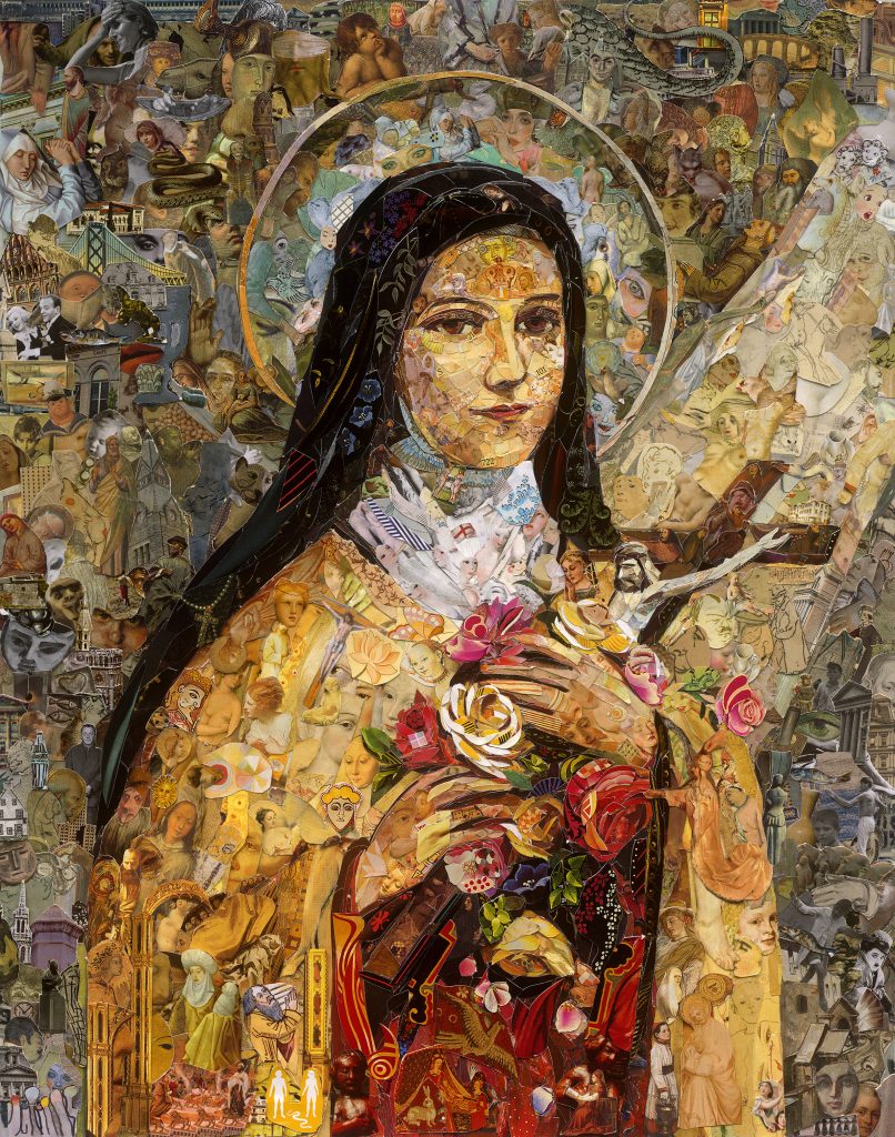
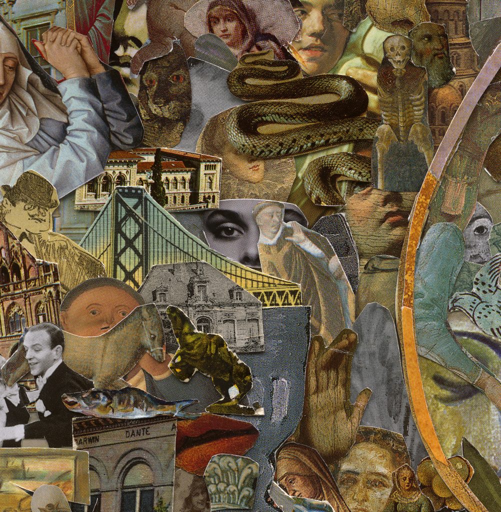
There was another exhibition in the same gallery complex, and it was quite a shock. At first, I groaned: a row of fake baroque devotional paintings, not painted, but collaged from thousands of snippets from magazines. It was trompe l’oeil in reverse, paper pretending to be paint. But… this was vivid, it was alive. I have seen marvellous work by Vik Muniz elsewhere, and there were passages in his book, ‘Reflex’, that have stayed with me.10Vik Muniz (2005): Reflex: A Vik Muniz Primer, Aperture. His work has been described as ‘playful studies in materiality’.11Andrew Forrest Baker, (2016), www.artsatl.org/review-vik-muniz-reveals-himself-through-his-dizzying-array-of-photographic-delusionsHe takes familiar paintings and remakes them filling them in with oddball substances. The subjects here were saints in states of ecstasy. You delve into the random juxtapositions: sweet wrappers, holy relics, souvenirs, Chinese trivia, cars, monuments, all kinds of patterns swirling about, perfectly fitting the painting-by-numbers matrix. You zoom into the detail and then stand back, like vertiginous shifts in a movie, with the gestalt of the saint locking you back. Some painters refuse to look at puzzle pictures on principle, which is understandable. But I could have spent hours taking it all in. It did not worry me that they were so frantically busy, nor that the format was the inkjet print, photo’d or scanned, and probably tweaked in Photoshop. I had a similar response – first put off and then captivated – by a one-person exhibition he had in New Orleans in 2001. The splodgey ‘photos’ of street children from his native Rio in that show turned out to be made of chocolate.
Improbable materials, overdone impasto, ‘foreign’ methods; these no longer make waves. That doesn’t mean working with standard art materials is just for closed minds, nor that a narrow technique takes you nowhere. I happen to be intrigued by paintings made from incongruous substances, even when they are repellent – Arcimboldo’s fruit and vegetable faces have been mentioned in connection with Muniz. Abstract painting needs its injections of innovation. Without critical pressure, without being tested, without taking the occasional wrong turn, it is as academic as anything else, just following the tracks and paying homage.
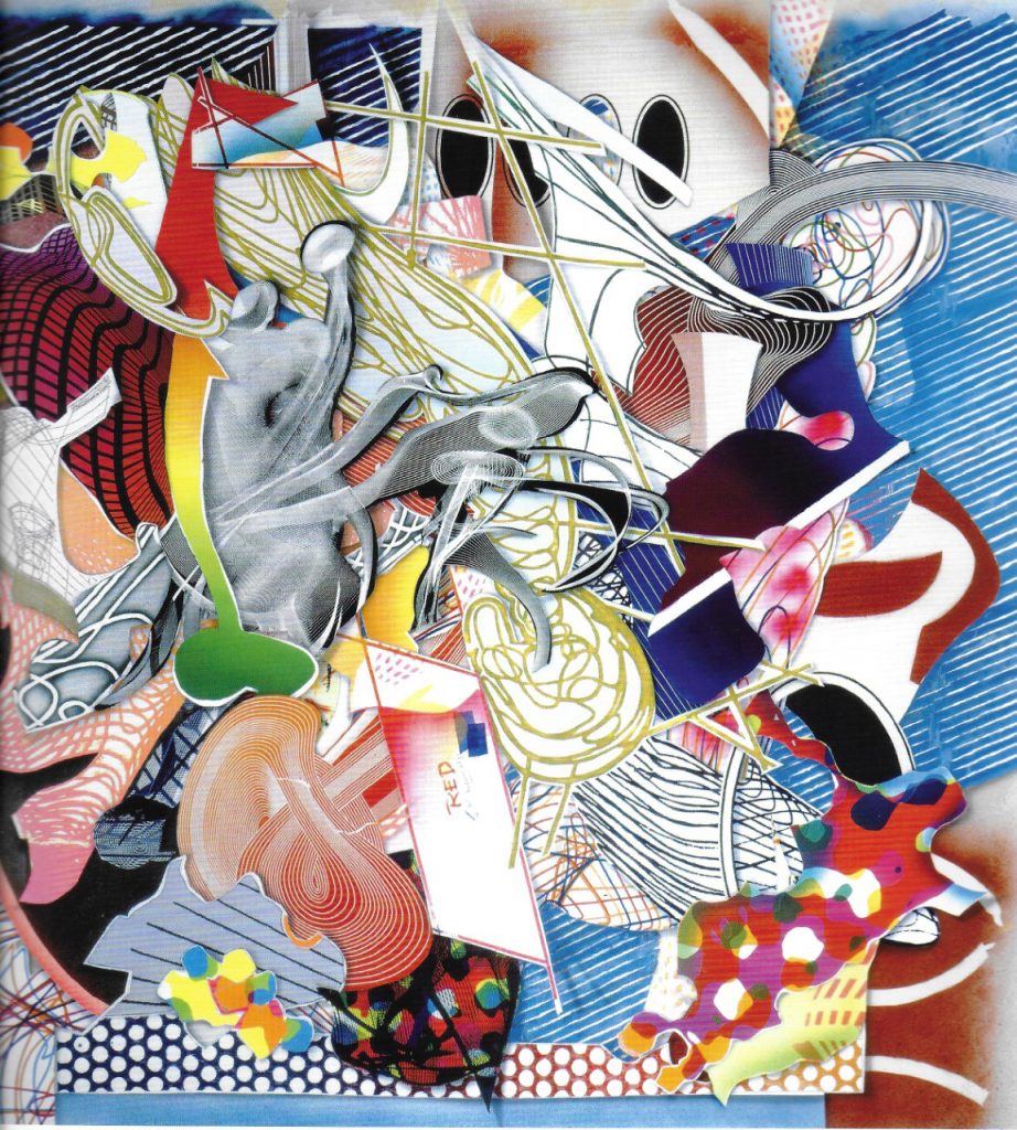
Twenty years ago, I had a long conversation with Frank Stella in a Pizza bar in Birmingham.12I should explain how this encounter came about. I was teaching at Birmingham (B.I.A.D), and arrived one morning to find a notice in the foyer: ‘Frank Stella, famous American artist, will be giving a talk on his work this afternoon’. I checked to see if this was real, and it was. Stella had designed the sets for a new production of the Pajama Game, having a first run at Birmingham Rep. One of the scene-painters taught at Bournville College, which had a foundation course. She asked whether Stella was coming over, and if so, would he give a talk to the students. He said yes. However, on the day in question the Bournville students had a trip to London arranged. Could he do his talk somewhere else? At short notice it was transferred to the B.I.A.D. At the time the Y.B.A.’s were in the ascendant, as was ‘slacker’ painting, and American abstract painting was not top of the syllabus. Thus the need for that ‘famous’. The lecture was straightforward, modest, and generous. A gift. Unfortunately few staff could attend, there was no official reception, and the technician in charge of the recording forgot to put a tape in the video. Thus after the talk three of us (Yvonne Hindle, a fellow tutor, was also there) ended up having a memorable pizza, with Stella demonstrating with salt and pepper pots how the Chapman Brothers worked their installations. He has never stood still; he constantly experiments, and his curiosity is infectious. He is a combative, creative spirit. He didn’t care for didactic exhibitions, and felt curators were taking over the agenda. In MOMA’s 1999 show of American Art – a show I had seen – he objected to the works being segregated according to banal themes. The chronology was lost. The then-new Tate Modern was doing the same. He didn’t share my enthusiasm for computer graphics, but he was a fan of d’Arcy Thomson’s ‘On Growth and Form’, of 1917. He was working with modular structures, fabricating components and then mixing them up. One method involved blowing smoke rings into a box. The smoke was scanned in 3D and rendered into a wireframe. The source of the smoke? A cigar.13I only touch on the smoke rings here. For a proper account see ‘Frank Stella’, 2017, Andrianna Campbell, Kate Nesin, Lucas Blalock, Terry Richardson, Phaidon.
Comments are closed.