David Sweet: ‘The Re-enchantment of Painting: New Work by Sharon Hall’
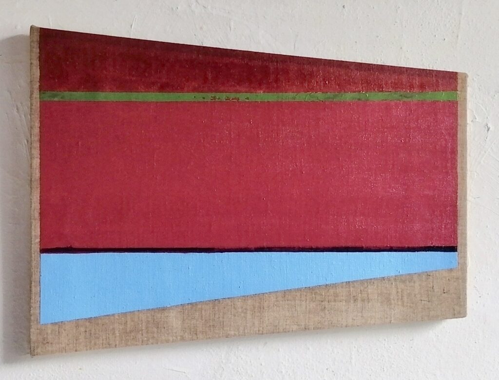
In the wider context Sharon Hall’s exhibition of smallish abstract paintings could be said to instantiate, even celebrate, the notion of ‘material culture’. Decisions about the dimensions and proportion of the stretchers, the choice of linen, cotton duck or panel for the support, the number of coats of gesso required for the ground, the selection of acrylic or oil pigment, from stain to impasto, embed her practice in the tangible and practical world, with methodologies developed to manage ‘stuff’ into significance.
In front of Hall’s work attention is focussed on the way the constituent substances operate and interact. This experience contrasts with what is offered in the virtual realm of the metaverse, which dominates contemporary culture, making material objects appear exotic or primitive. Not only are Hall’s works decidedly material, they are paintings, and particularly flat paintings at that.
Paintings have always been flat, even though the history of painting is a history of attempts to disrupt that flatness. Nevertheless, flatness is a gift of the medium. This exhibition is characterised by ‘medium specificity’, a concept that has been out of favour for some time. The work is organised around the possibilities and properties of painting itself, not as a theoretical or academic goal, but reflecting a personal commitment to a medium whose power she has explicitly recognised and practiced for several decades.
Acknowledgement of flatness is achieved by working with a staple of 20th-century abstraction, namely the plane – either the ‘picture plane’, which is co-extensive with surface of the canvas, or the internal planes that are generated when that plane is divided to create various geometric pictorial elements that interlock and interact.
Pictorially the plane functions to bring the eye to a stop, preventing flatness from being disrupted by vision’s need to travel into pictorial space. The verticals, horizontals and obliques, which cross the larger plane of the rectangle dynamically partition the area without suggesting that perspectival space is being invoked.
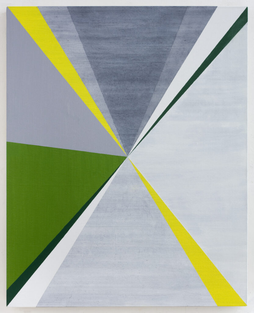
The best example of resisting the disruption of flatness can be seen in ‘Contrappunto (DS)’ (2018). Structurally, all the elements of the composition could be rushing headlong into an illusory third dimension; but rather than appearing to be foreshortened components, tapered to comply with the influence of perspective, they read as a series of triangles of various sizes, arranged around a rendezvous in the geometrical centre of the painting.
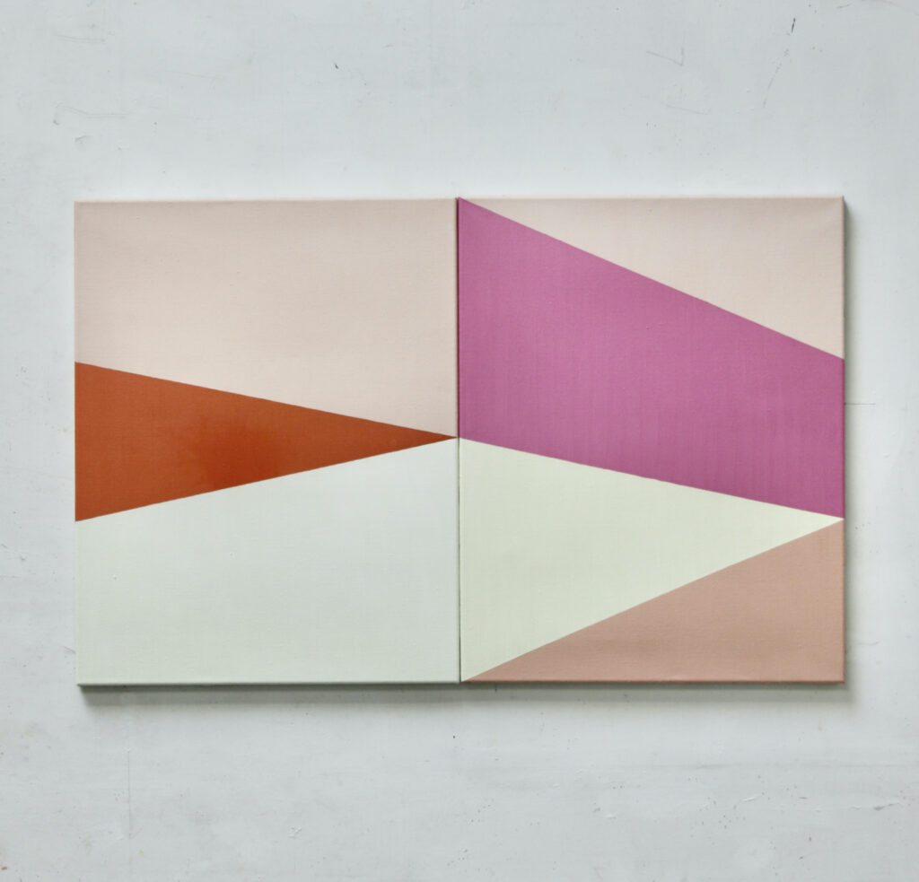
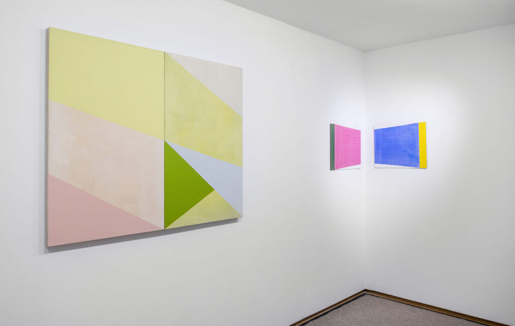
‘Contrappunto’ (2018) is an earlier work, but it shares with the later examples its denial of recession and promotion of the planar visual experience, involving slightly different strategies. For example, ‘Diptych with Pinks, Whites and Orange’ (2021) and ‘Asymmetrical l and ll’ (2021) both employ the device of side-by-side picture planes which combine to create the larger overall rectangle, divided at its centre by a seam consisting of abutting edges around which the geometric shapes pivot. ‘Maze’ (2023) and ‘Mura’ (2023) hint at the idea of the shaped canvas, in which the depicted and literal forms vie for attention. The wedge form appears again in ‘Mandapam’ (2023), fitting into the available framework to support chromatic activity with a system of locked planes. The dynamism generated by the diagonals in ‘Mandapam’ swings the eye around the painting but does not invite it into anything that might be seen as ‘depth’ because the eye’s wanderings take place in the same plane.
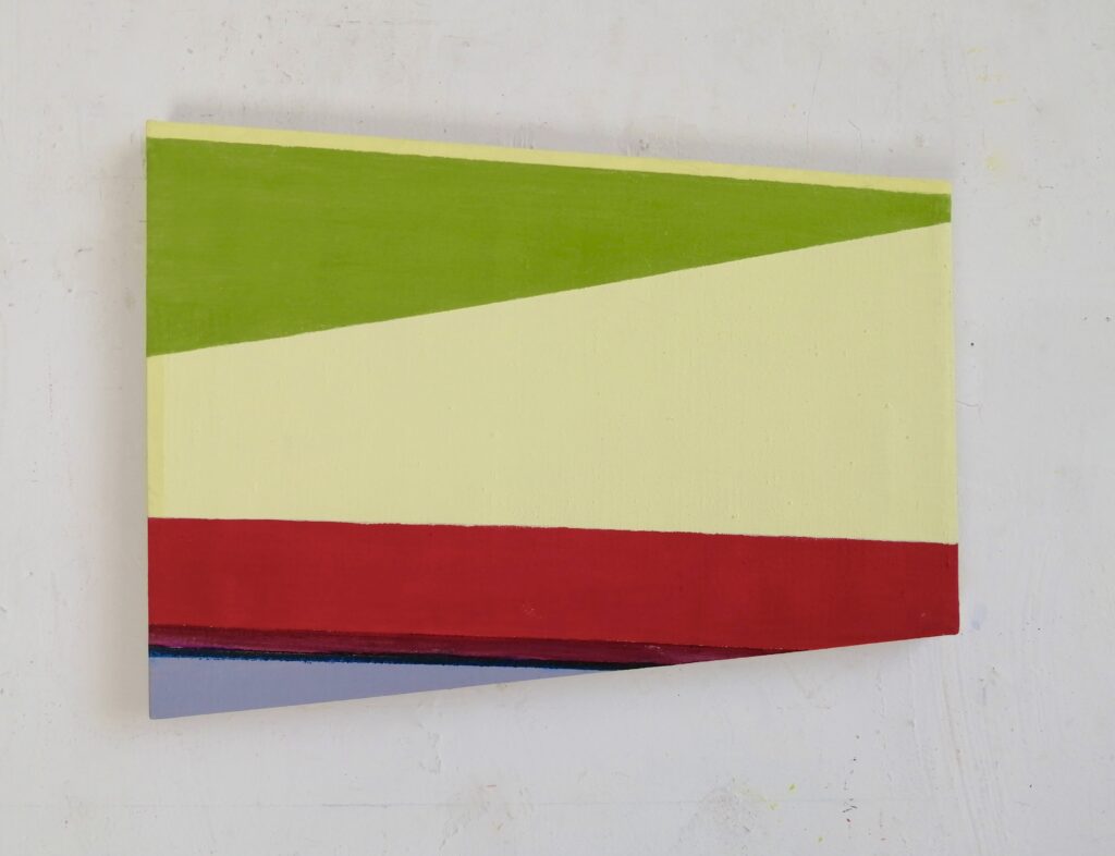
Placing such emphasis on flatness might imply that the surface activity of the pigment in Hall’s work has to be suppressed to avoid allowing incidental spatial cues to insinuate themselves within the anatomy of the painting; and indeed, parts of the surface are opaque or deadpan, qualities commonly associated with hard-edge abstraction. Others, however, are decidedly oxygenated, lively, almost ‘atmospheric’ and gauzily eloquent.
In ‘Levels (for MP)’ 2023 and ‘Levels ll’ (for MP) 2023, the rectangles of highly transparent glazes should read as gaping holes in the fabric of the paintings; something like high windows. But they resist that reading– even those coloured sky blue: and that’s down, quite literally, to how they are handled. By handling the paint, using a broad brush to give the surface a vertical grain, she constructs the form as a ‘plane within a plane’, not as a spacey lacuna, or ‘ground’ against which the linear elements act as ‘figures’. The handling holds the internal plane in tension, insisting on its front-facing, eye-stopping character.
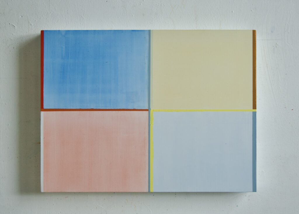
The plane-within-a-plane effect might be seen as a case of ‘depicted’ or ‘internalised’ flatness. It’s not unlike an effect central to the work of Agnes Martin, though achieved using different material means. Martin establishes the internal plane as if it is held on tenterhooks, stretched into flatness, maintained by equalising the tension throughout the rectangle, calibrated to the tension of the underlying support. Martin uses a drawing technique of filamentous line to construct her grids, keeping everything flat, though not uneventful. The visual sensation caused by holding up the eye, allowing it to dwell on a screen-like internal barrier, fencing off access to the ‘beyond’, gives the resultant forms a poise or grace, and aesthetic impact, they might otherwise lack.
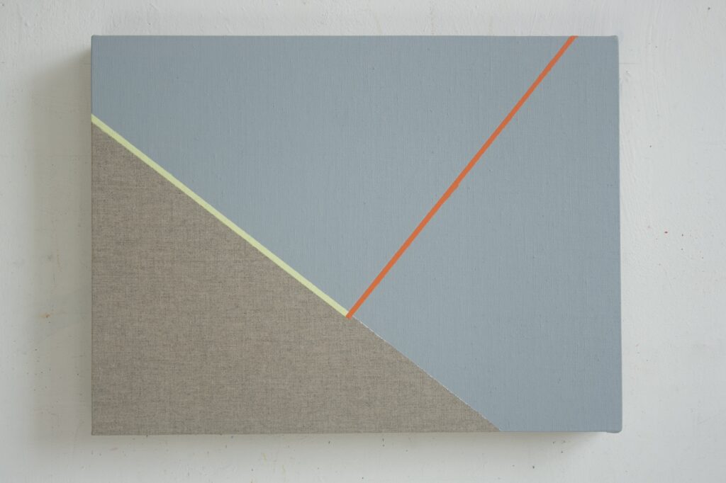
In her most recent work Hall has augmented the plane by introducing the element of line. The straight lines usually follow the route suggested by the edges of the planes, but can also mark out a territory of their own, as in ‘Touch’ (2023). They are produced using masking tape carefully aligned to leave a narrow gap, which is filled in later with pigment. Some lines are actually tape, cut into thin strips and stuck on the support. Though a modest innovation, the lines do have a noticeable effect on the way the paintings function.
The lines, varying in colour, tone and width, combine with the planar elements to give the pictorial structure an ‘articulate’ appearance; articulate in the technical sense of ‘having joints’. The lines are where adjacent planes ‘join’ rather than ‘abut’. This distinction can be seen in ‘Touch’ and ‘Interstices’ (2023), which contain both kinds of connections. The orange diagonal stripe in ‘Touch’ splits the large upper plane, dividing it in two, then joins both parts together. The yellow stripe, placed at the boundary of the lower triangular area and the upper light blue, creates an extra plane, enclosed by the two lines and the literal edges of the canvas. A similar effect operates in ‘Interstices’: the thin red diagonal, which starts in the top left corner, marks the join between two planes, but is complicated by the addition of a broader grey strip which, because it is wider, begins to look like the extension of an ‘abutting’ plane rather than being articulate, in the sense I’ve been using.
In ‘Across’ (2023) the joined planes outnumber the abutting planes, enough to set up an extra level of interaction, but also adding a sort of spatial innuendo. This is produced by the variations in the width and colour of the lines. The orange enhances the chromatic force of the green and yellow triangles, but the near-black diagonal (lower right) seems more like a shadow, or gap, as though the plane had shifted. The pale stripe (top left) looks as if it is illuminated, an effect of movement or chiaroscuro that is usually considered anathema to the codes of geometric abstraction. The implication here is that the lines’ variety in width suggests that the planes have somehow acquired volume or thickness. Of course, this does not occur in the world of pure geometry; but even when promoting the virtues of materiality and flatness, complications can arise. In the paintings where Hall combines line and plane, interactions can happen that can be interpreted in more illusionistic terms, such as the suggestion of kinetic action, light and shade, even ‘depth’ or perhaps ‘optical depth’.
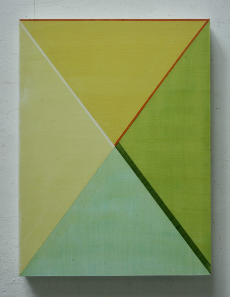
But the most obvious aspect of Hall’s recent works, like ‘Turning’ (2024), ‘Touch’ and ‘Across’, is their visual impact. Their chromatic vibrancy is generated by the compounded accumulation of glazes in which colour seems to condense level with the picture plane. This primary address to the eye is deliberate and part of the works’ aesthetic policy. They are intentionally beautiful. I’d like to suggest that this move can be linked to what might be called the ‘re-enchantment’ of painting,
What do I mean by this term? The visual language of non-objective painting; the point, the line and the plane, which has been around for a century, is the result of the modernist process of ‘disenchantment’. Amongst the properties of painting that were deactivated were figuration, illusion and the notion of beauty. These were the sources of enchantment. The viewer was under the ‘spell’ of pictorial space, or ‘in thrall’ to beauty, and both of these reactions seemed, to the modernists, problematic or nostalgic.
What’s interesting about Sharon Hall’s recent paintings, as I see them, is that they contain both the structures of disenchantment, which govern geometric abstraction, and the potential for re-enchantment, wherein illusion is admitted and aesthetic appeal is maximised.
July 2024.
Comments are closed.