Instantloveland‘s fourth ‘Abstraction in the Now’ feature is written by our longtime collaborator and writer-in-residence, Jillian Knipe. Her subject is painter Lizzie Munn, who talks about her working methods, both visible and invisible…
Lizzie Munn (b.1995) is currently studying at the Royal Academy Schools and is due to graduate in 2024. For the past six years she has made small-scale abstract paintings on metal supports. Her solo show ‘the loving treatment’ at Creekside Projects 2019, was titled after Patrick Heron’s 1989 essay on Prunella Clough’s ‘Recent Paintings 1980-1989’.
JK: What was the first abstract painting that really meant something to you?
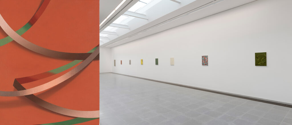
LM: It wasn’t so much a singular piece, as an exhibition. I’d always loved Tomma Abts’ work but seeing her solo show at The Serpentine was definitely a game changer. Not only was it the first time I’d seen the use of her fixed 48x38cm canvas outside of a book, but it was amazing to see a public institution dedicate a show to small-scale abstract paintings! They demonstrated endless configurations for such a limited size surface. What also really struck me was the rhythm of the hang: the spacing of the works and shifts in tone punctuating the gallery walls. Being an uncertain new graduate in the Summer of 2018, the experience offered a validation for me, considering I’d just exhibited seven paintings, all below 30 x 30cm in size, for my degree show.
JK: Over the past few years, I’ve only every seen your small scale works on metal. Did you ever work on a bigger format?
LM: Yes, definitely. During the first year of my BA I immediately began working on massive two metre canvases. I finally had the space and resources to do so, but it was partly spurred on by a belief that bigger was better, or more ambitious. By second year I realised this wasn’t the case and the size of my work began to shift. I paired up disparate images, either making a partial overlay between the two surfaces, or inlaying one in another. At one point I showed the collages and realised I was more interested in where these two images met and how the pictorial planes intersected which had very little to do with the need to make large format work.
JK: You’ve stayed with a smaller format for some time now. Why has it remained so compelling for you?
LM: There’s more freedom of chance. Each move of my hand is considered and integral, and there’s so much that can happen on the small surface. Every brush stroke is monumental. It’s about being able to hold the painting in my hand, move it around and be close to it. I enjoy the intimate interaction. I can also let the painting kind of lead me, which is so unlike my experience with a larger format where I was dominated by the surface with a pressure to create big, grand gestures.
JK: So your compositions rely on a sort of mind, hand and body paradox, as well as needing to be spare and resourceful on such a small surface. There’s nowhere to hide.
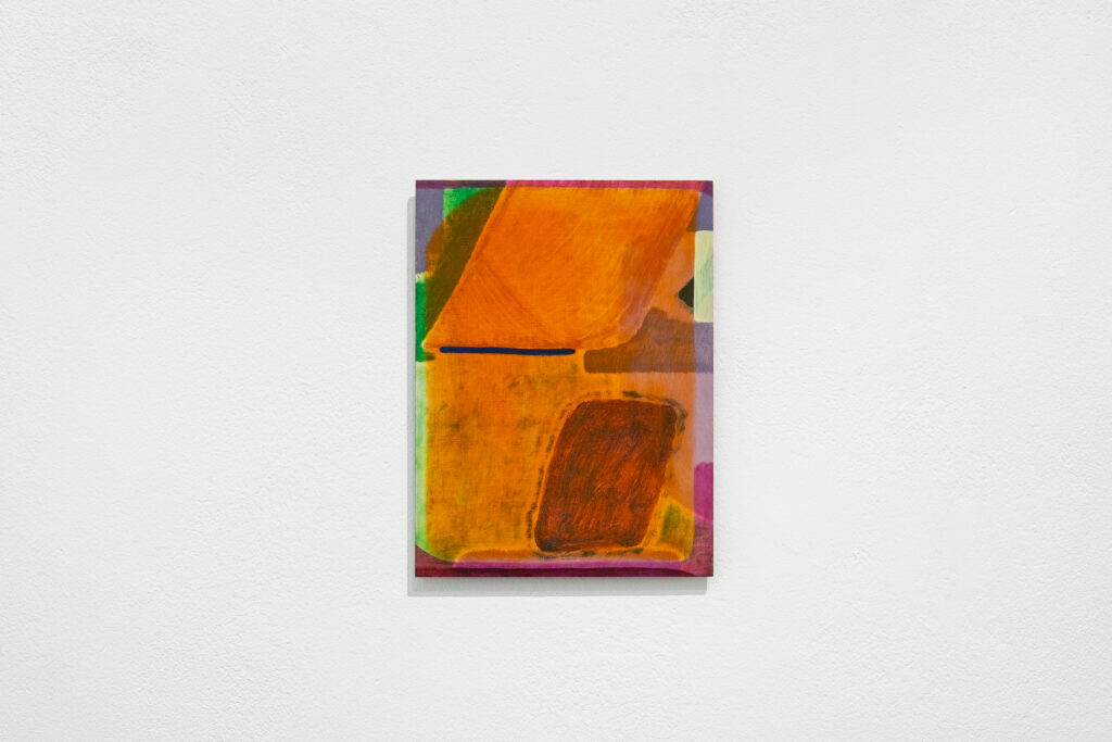
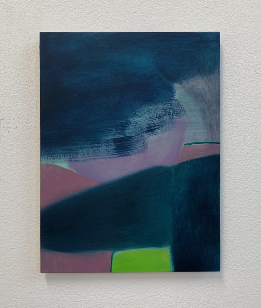
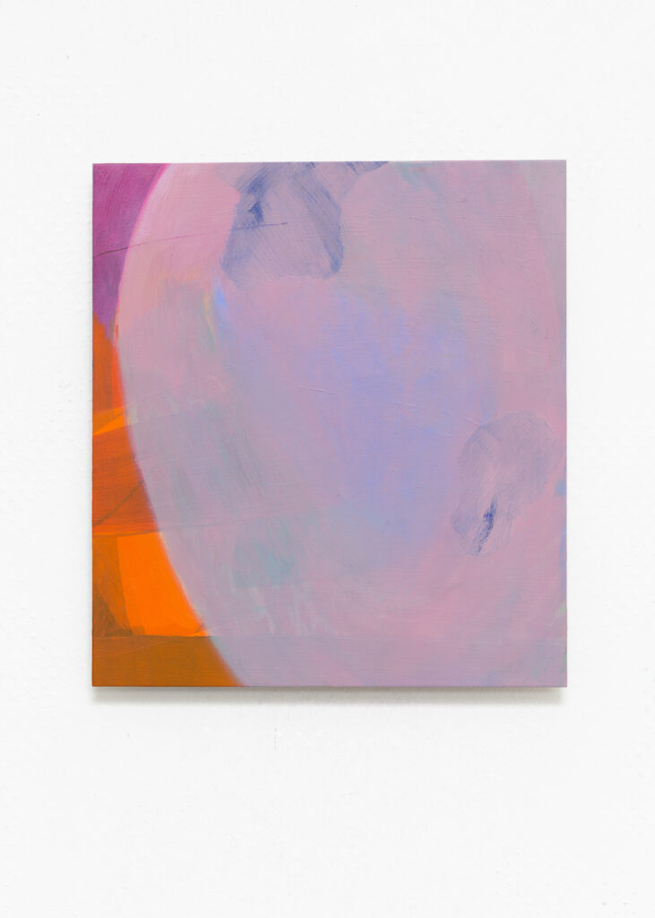
LM: Each one momentarily brings together carefully considered elements, that are all dependent on one other. Take Velvet Rainbow, 2021 for instance. Its components hover and vibrate, as if the whole composition is anchored to a distant point. The soft lilac veil seems to spill in from the sidelines, spreading to dominate the plane, and its translucency invites you to look beyond. There’s a violet glow which pulses through the centre, while two amorphous forms are emerging in the distance, as if they’re trapped in a vast hinterland.
JK: Metal has a striking presence of its own to begin with: a shiny, hard, cold surface with sharp edges. Can you tell me how this became your preferred support instead of canvas?
LM: It happened around the same time the paintings reduced in size. One of my tutors at Newcastle suggested it and, working directly onto hand-cut aluminium panels, I was immediately battling with a sort of hatred of the surface, where the paint seemed to slip and smear, and that aversion became part of the process. It took quite a long time to gain a sense of control over the surface, gradually building up layers of paint while continually responding to its unpredictable nature. The luminosity of the aluminium permeated the paint, suspending the layers in a state of flux. I enjoyed the tension between the pictorial space within the painting and the thinness of the edge of the surface – compressing or flattening the image – acting as a reminder of the illusion of depth. Its thinness also mirrors the physical fragility of the painted surface and the delicacy of the mark.
JK: Though you’ve recently started using pre-primed panels. How has that affected your work?
LM: It means the paint is more sturdy, though the appearance of delicacy remains. And I’ve been surprised at how much I’ve been able to extend to other materials. Gouache brings in a matt chalkiness I’ve not been able to achieve with oil paint. I’ve even used a scratchy little stick of charcoal which brings new problems into the composition.
JK: I understand this hasn’t changed how the works begin. Can you describe the starting point of your process?
LM: I deliberately try to begin each piece differently. It could be a really thin, allover wash, a solid colour or a pattern. The first move has little consideration. It’s purely to disrupt the surface and act as a springboard for the piece. I do think a lot about colour and this tends to lead my decision making about what colour should butt up against another, or how a veil of colour will sit on what’s beneath.
I’m constantly shifting about between pieces in the studio and reconfiguring their layout as the works progress. I often think about Thomas Nozkowski’s visual cues. They’re so succinct; as if his forms are language. And lyrical at that. Yet he allows each painting to assert its own autonomy. Seeing as I’m working on several paintings at once, there’s always conversations going on between them. There’s also a decisive intention to push each one on, not only on from how it began, but also to distance it from the surrounding works.
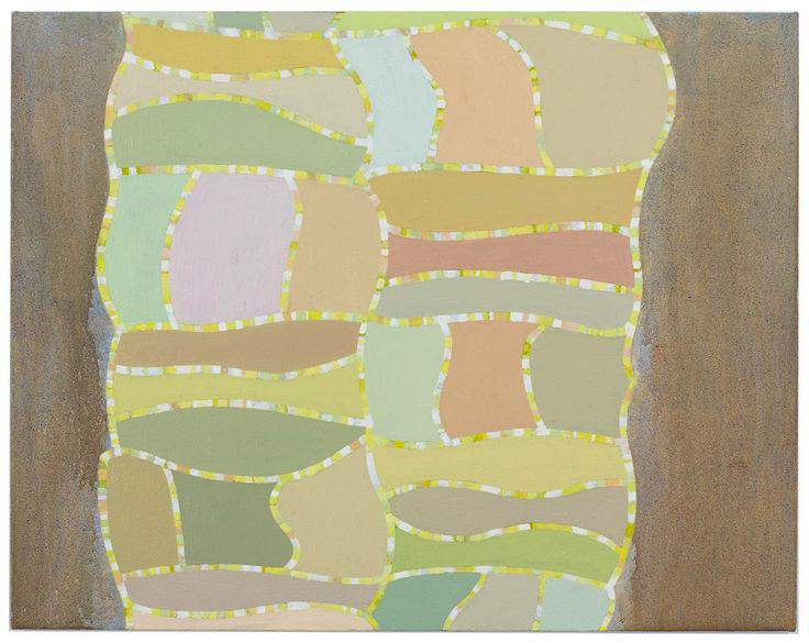
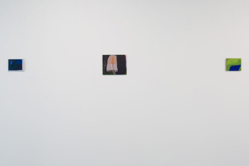
JK: It’s seems like your practice orbits around resistance in some way. I mean, there’s something really forbidding about metal which sort of resists image making in the first place, so you’re invested in a material which opposes its role as a support.
LM: Yes, and I really enjoy that. Everything is present on the surface, you can never erase it. Even if you’ve painted over something, you can always see the brush marks from the layer beneath. Nothing sinks in and disappears; it’s very unforgiving.
JK: In my own practice, I’d use semi-translucency to describe the lineage of mark making as a way of producing an individual image and across images in a series, but I gather you’re using the same tactic for a very different reason.
LM: I’ve been considering it as a way of being generous to the viewer. I’m allowing them to see quite a lot of the moves I’ve made previously. It’s also about pushing against being definite or defined; components always in flux. I’ve been experimenting with printmaking alongside the paintings which is helping me to think very differently about the process I’m developing and revealing: from using rollers to thin the ink and build up flat planes of colour, to creating stencil for obscuring or framing, to working with negative forms by rubbing into inked plates.
JK: So tell me more about exploring printmaking.
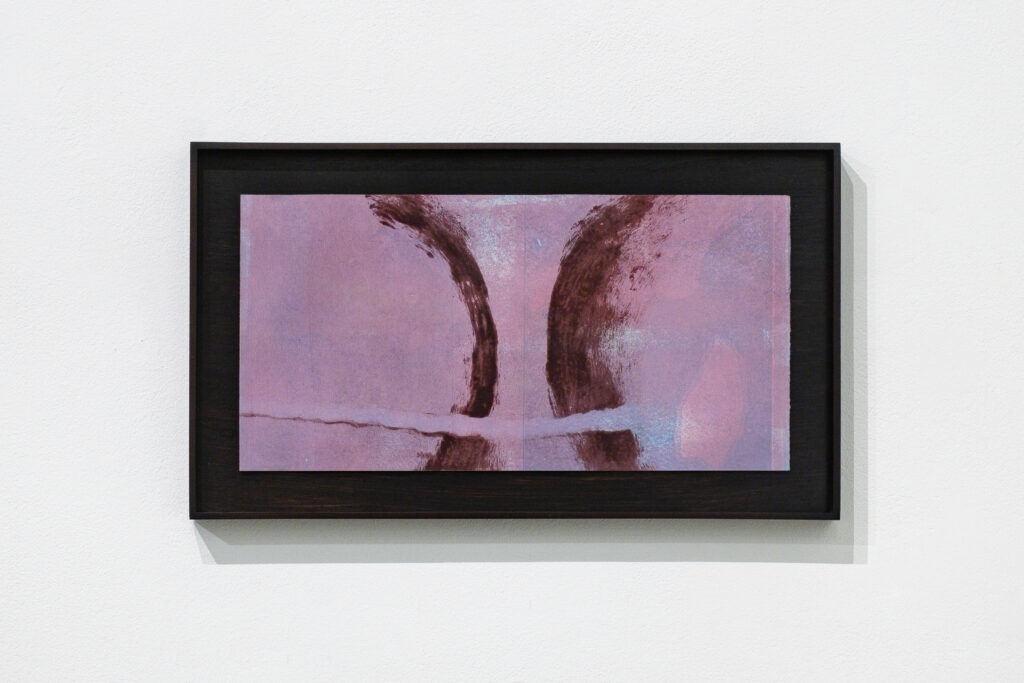
LM: I have an experimental approach, playing with a mix of mono- and woodblock printing. I use aluminium plating for the monotypes so it has a starting point which connects with my painting, but then it goes off in its own direction and at a very different scale.
JK: I love the idea of printmaking but the precision it requires puts me off. How have you managed to find the unpredictable you exploit so well in painting?
LM: Well, I’m still trying to get to grips with the limitless possibilities! For instance, I’ve been creating a first print, leaving remnants of ink on the plate, then working on top of that again. So I’m essentially responding to a ghost image, then repeating that until the original image dissolves altogether. The challenge is, despite building up multiple layers and constant reworking, to make the final image appear effortless, as if it were formed in one instance. With the woodcuts, I’m just using cheap ply at the minute, which actually takes a huge amount of sandblasting work to make all those beautiful rings of grain appear. The outcome looks natural but it’s actually fabricated to mimic what you might see on the original wood.
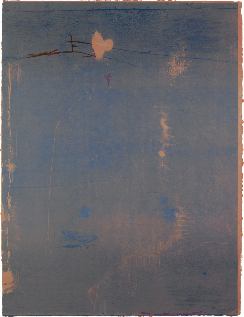
It was unbelievable seeing Helen Frankenthaler’s ‘Cameo’ 1980 recently at Dulwich Picture Gallery. The way the dusty rose paper glows through the ink. Then the ink itself is light and ethereal, almost as if it’s floating on the surface. The materiality of the woodblock printing process is visible in the scratched and rubbed sections, but even though you can see her hand at work, it still manages to remain organic and soft.
JK: I think yours have that sense too, as well as noisy static. In particular, ‘Untitled (Brace)’, (2022 ) looks as though the overlaid mono print is gently holding the woodcut. They extend the understanding of your process though they behave quite differently to the paintings at this stage. The latter seem more certain about their uncertainty. As if definite objects or shapes from the surrounding world have decided to appear, arrive or leave the surface.
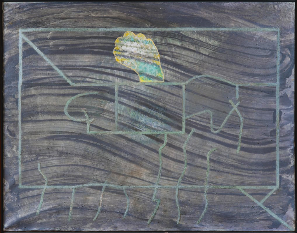
LM: Yes, as if there’s an invisible method which is a phrase Patrick Heron used to describe Prunella Clough’s later paintings. These appear to be abstract, though of course, she detached references from the real world and let the painting take over. In the same vein, my paintings don’t operate in isolation from their surroundings, but the way it informs them is perhaps more subconscious. Memories, objects, experiences, all fuelling my visual language. My intuitive working process is driven by, and visually explores, levels of doubt, responding to what the painting demands. In this gradual process of responding to the fluctuating surface, the paintings become essentially self-referential. An internal logic is established through a reductive process: selecting, veiling, hiding, and the residual image is defined by a set of chromatic and spatial relationships.
