Jillian Knipe in conversation with Moyra Derby: Propositions for Paintings
In her second piece as writer-in-residence at Instantloveland, Jillian Knipe moves back and forth between an interview with artist Moyra Derby, and reflections on the meanings and contexts of her work…
Off a main street in Margate is the Crate studios, co-founded by Moyra Derby, Senior Lecturer in Painting at University for the Creative Arts, Canterbury. We met there to discuss her art practice, teaching and studying – she is currently undertaking a practice-based PhD – and the crumbling of inflexible artistic doctrines.
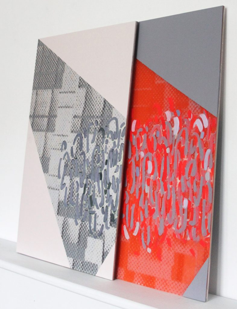
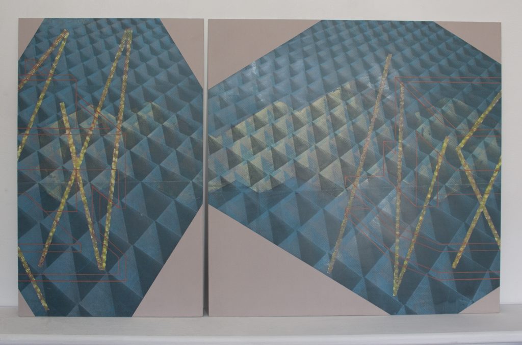
Moyra Derby makes abstract paintings which are presented in both two- and three-dimensional form. Using mostly board, sometimes accompanied by layers of acrylic sheeting, they appear on stands, or are hinge-folded, or overlapped on shelves, or viewed on a table surface. What they all seem to have in common is an acknowledgement that painting is problematic. Just how problematic is something Derby addresses in her 2013 essay ‘A Space Drawn in Ratio’: once you visualise ‘a line enclosing a space’, she asserts, ‘(it) functions like a diagram of painting. As it attempts to describe what the painting is like, it is also like a painting.’
The content of Moyra Derby’s practice is elusive: that much is highlighted when one attempts to view her work online. Her website, ‘floatingprojects’, presents images of well-behaved works all lined up to have their photo taken, when, in reality, most of them demand to be experienced in the round. Her paintings are challenging in their candid refusal to adhere to rules of categorisation. For her, the forming of an art practice in the mind of the artist is never a wholly rational construction: and since she grew up in Northern Ireland in the 1970s, a place and time of conflict politely and inadequately referred to as ‘The Troubles’, she feels that she came to maturity with a sense of the impossibility of choosing a side.
MD: I’m aiming for an openness which acts as an invitation and therefore an interaction, even if that interaction is cognitive. I’m interested in the idea that things might move and cross-compare; that things are set up one way and might be set up another way. The implication is that this isn’t the final composition as such because it’s open to another possibility. I know that relates to my own sense of indecisiveness so I create systems for myself in order to force my hand in terms of making a decision. But I also think indecision is a good place to be.
JK: It also implies a resistance to siding with a team, which would close things down and create opposition, thereby resulting in insecurity and defensiveness. I’m not sure, for instance, that the distinction between figurative and abstract is helpful, even if it’s practical. I know there are figurative painters I’m interested in and it might be because of the way they apply the paint or the way they manage space. For instance, the way Hans Memling painted his floors, and the way they open up the painting and drop you off at the surface, because they seem to fall forward.
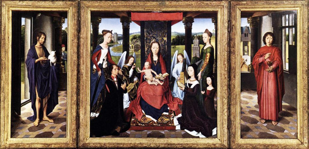
MD: Yes, they appear to lift up the image to make something visible which creates a particular type of space, but then they tip you over, like Cezanne’s apples falling off the table. There’s a generosity as well as an instability about it because it becomes vertical when depth is not visible.
Donald Judd, ever the pragmatist, wrote an article, ‘Criticisms’, for ‘Studio International’ in 1969. In it, he took issue with Clement Greenberg and his followers, whose opinions, he asserted, were ‘the same as those of the critics and followers of the late 1950s: there is only one way of working – one kind of form, one medium; everything else is irrelevant and trivial’. Judd pushed for a new kind of work which stretched beyond their silo categories of ‘painting’ and ‘sculpture’, because, in his view, doing either of them was no longer interesting. In his 1965 essay, ‘Specific Objects’, he applauded the sort of work which fell under the subheadings of his own creative endeavours, by being neither.
JK: You have works you refer to as ‘Propositions’ which I’ve only ever seen as photographs taken here in your studio.
MD: I’ve been interested for a long time in propositions. The proposal for a painting and the idea that something that is not resolved, which is quite different to a painting being finished or fixed or a statement. I’d prefer it to be discursive.
JK: That seems to relate to the titles of your works, which are all in lower case. I practice the same thing to convey that the work is, as it were, mid-sentence, not a conclusion. And for you?
MD: The lower case is also about being provisional, not fixed, a note, a thought, avoiding a declaration, avoiding a confident closure, and not being a statement of meaning. I’m interested in the connection between the linguistic and the visual and equally suspicious of that connection.
JK: Another aspect of your titles is reference to choosing between a fluid thing and a solid thing, such as ‘deciding between water and rock’ and ‘deciding between mountains and clouds’ (both 2017). There’s also illusion and materiality. You discussed these in the exhibition you curated with Bob Mathews in 2011 – ‘A Sort of Night to the Mind, A Kind of Night for Our Thoughts: Illusion and Materiality in Painting’.
MD: I’m interested in those weird oppositions that are activated, as though you have to take sides. I’m always quite resistant to that sort of oppositional thinking. I get involved in it as well, by just being aware of it. I’m interested in painting being fabricated, constructed, illusionistic as positives rather than that being things that it’s criticised for. I remember feeling at odds with Donald Judd when faced with his assertion that actual space is better than illusionistic space. I’ve never really understood the necessity for the distinction, and for the dismissal of particular components. The dogmatic, blanket statement, that something is closed or over, just sweeps everything off the table. Things are then assumed not to have any value, and are discarded. Think of when the work sits slightly off the wall and casts a shadow, allowing you to look at edge and actual depth with one as a marker of the other.
JK: Your practice is underscored or pre-empted by ‘what if’; and so, what are you looking at to begin with, to ask ‘what if’ about?
MD: I’m interested in what appear to be abstract paintings and in artists who identify with the difficulties of painting rather than the aesthetic pleasure of it; those who value painting as a thought process. I prefer painting which steps outside of itself and steps back into itself. Take for instance, Giovanni de Paolo’s ‘Saint John the Baptist retiring to the Desert (Predella Panel from an Altarpiece)’ 1454. It freezes time and extends time while working within the limits of painting. (This refers to the figure of Saint John being repeated in two different points of time, while also being a ‘freeze frame’, a still image.)
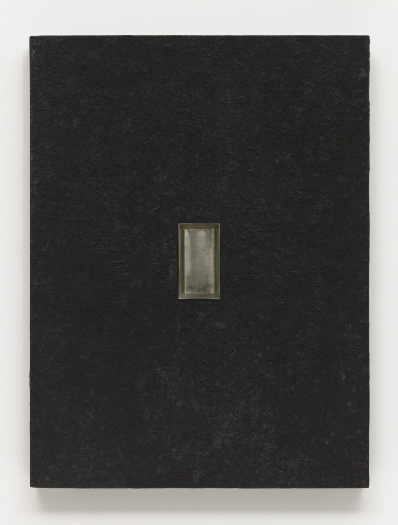
The often bitter bickering between form and content, like the Cain and Abel of painting, is embodied in Donald Judd’s ‘Relief’ of 1961. In short, it is a square black painting with a baking tin inset at its centre. Aside from gesso, the surface is a crudely thick smattering of Asphaltum Black. While Judd refused to be drawn in on intrinsic meanings, it is compelling that this groundbreaking work employed a pigment loaded with history. Its use can be traced back to medieval painting; but this form of asphaltum is a material cousin to that used for road making, as well as being a shoreline wash-up from oil spillage. By using a material that is pigment and detritus, Judd both borrows from painting’s history and refutes that history’s value, harnessing it at the same time as claiming that it had ‘unravelled’. Perhaps Judd intended the work’s non-reflective surface to evoke a deadening of lineage, and the constraint of painting asserted by Malevich’s black squares at the turn of the previous century.
As for the bread tin, it precisely measures the depth of the board mount. Actual depth therefore knocks perceived depth off the scoreboard, and not without a helping of humour, or even sarcasm. And that actual depth is not very deep at all, thereby making any assertion of pictorial depth seem quite silly; further, it suggests that aesthetically driven, painterly images might just be feeding the Juvenal loaf to the masses in the circus of the art world.
Judd was, of course, working at a particular time, and under a set of conditions that seem less relevant today. He shunned three-dimensional perspective on a two-dimensional surface, in which paintings served as windows to the world. His investment was in the truth of materials and that of actual, sensory experience as espoused by the empiricists, particularly David Hume. Contemporary survival seems to have become more about adaptation, rather than heeding the siren’s call of ultimate truth.1 Donald Hoffman, Professor of Cognitive Science at University of California and author of ‘The Case Against Reality: How Evolution Hid the Truth from Our Eyes’ (Penguin UK, 2019,) asserts that objective reality does not exist and, therefore, organisms in pursuit of truth suffer at the hands of throwing energy into something which is not possible. Whereas organisms which rely on illusion by creating models of reality from perception, are far more viable for evolution. Moyra Derby’s work is an adaptation to a present where the promise of a whole and singular truth is shattered, and its pieces are dispensable. Her work is both elusive and allusive, even reactive, in contrast to the fist-pounding forthrightness of the likes of Judd. She is driven by the possibilities which come from looking at how a painting might be put together, and how it might exist and be perceived in a space.
Perhaps, Judd’s belief in wholeness was derived in part from a widespread devotion to ideas of centrality in the America of his youth: One Nation, under God. One good side (us). One evil side (them). While Judd was not himself religious, he lived in a country where religion was buoyant amongst the masses;and there was a religious fervour, also, in his nation’s self-perceived exceptionalism, as it asserted world dominance in the aftermath of the Second World War. Judd championed the whole object, undiluted by detail and able to be experienced in its entirety, rather than a sum of its individually acknowledged parts, which he then extended to include the experience of the space around the three-dimensional object. Still, it remained singular, specific and permanent, in terms of where and when it was conceived, made and displayed. Derby appears to have shifted away from this sort of thinking, towards acknowledging a world where there is no longer a centre and, accordingly, continuity can no longer be assumed.
Despite the continuing use of terms such as the ‘Middle East’ (middle of what? east of where?), globalisation has shifted us away from a certainty of place to a more fragmented and complex viewpoint, from which we might perceive our sense of identity as residing in more than one place. In the western world, religious centrality has given way to a multiplicity that is more akin to the Buddhist concept of ‘Anatta’, in which there is no unchanging, permanent self, but a composition of selves. In art, representation has yielded to a ‘re-presentation’ of numerous possibilities across artworks.
From the mid 1980s, certain artists began to explore new, dynamic possibilities within the act of seeing. Roni Horn, an artist obsessed with doubling, began her ‘Pair Object’ series in which she cast two identical objects and placed them in different rooms; once the first one had been seen, it couldn’t be unseen when looking at the second. The work was not just the objects but the experience of creating the invisible bridge which holds the objects together in the mind. Around the same time, Sigmar Polke began his double-sided paintings. Being made of semi-translucent silk, they had no discernible front or back; what was seen on either side was a combination of the images on both sides. Recalling the sketchbooks of da Vinci, Michelangelo et al., double-sided from the practicality of conserving paper, Polke’s befuddling paintings introduced another schematic to the paradoxical entanglement of actual reality with the perception of it. They drew attention to the question of where a painting might begin, and bled background with foreground through a game of spot-the-difference in which the viewer checked that what appeared on one side also registered on the other; in other words, a dynamic way of looking at painting that was once only directed at sculpture.
JK: You produced double-sided works as part of ‘Interval [ ] still: now’ in 2018 at Tintype Gallery and ‘STOP GAP’ in 2017, in which you had two double-sided panel paintings next to one another with a gap between them, so the film projection dropped through the middle. To project an image onto a painting reinforces the idea that there is no such thing as a blank canvas, as did Rauschenberg’s white paintings of the early 1950s. An artist is always faced with shadow and light, always starting with their mind and memory, along with their physical surroundings, including architecture and decoration. Everything we see has an aesthetic to it, and we’re internalising all of that and, to a degree, reproducing it in another way. We are not producing something outside of that spectrum.
MD: Yes. One of the definitions of painting, perhaps used to distinguish it from sculpture, is that you can see painting all in one go. And I’ve never understood what that meant. I understand it rationally, of course, but no more than that; and I feel very resistant to the idea of an instantaneous ‘Gotcha!’ relationship between the work and the viewer. I’m interested in things not being visible all in one go, or ever. I’m interested in looking being extended, or needing to be held in the head. So when Nicky Hamlyn’s film piece flickers across the surface of my painting, the combined work asks: are you fully seeing the work when the projection is on or when the projection is off? There’s no moment in that durational work when you can concisely experience the work, because you’re experiencing it through time.
The Tintype exhibition was the third from a collaboration with Nicky Hamlyn, Conor Kelly, Joan Key and Jost Münster. Our first exhibition was for the Whitstable Biennale. I made a seemingly endless paper work with the idea that a film would be projected on it. This was more of a direct collaboration between Nicky and me, where we took a recording of me drawing, then Nicky made a sound piece and projected it on my split panel. Therefore, my painting in this show existed to facilitate another piece of work. It was painting in the background and that is to do with background in general, backdrop, painting as wall, and painting as a support for something else.
I have a sense of my work being space making, like the panels you saw at Tintype. They had a double-sidedness as well as a screen role, potentially negotiating between a private and a public space. They were also there as part of thinking about how you occupy space, or are welcomed into a space, or interact with space. The work is very much part of that interaction.
What’s interesting about working in a studio space is that it’s a form of exhibition which you’re continually moving through. And you can’t document that. You can’t ever adequately share that. You can’t take an image and put it online to show what it’s like to look across a surface properly. So my work is an argument for that material and spatial encounter.
JK: That’s quite a contemporary idea; that you ought to be able to take it all in at one moment. Thinking of paintings across chapels, there’s a light beaming here, while someone’s scratching their foot over there, a child is petting a dog in the corner and so on. Even if you could hold that within your visual sphere, it’s a massive challenge to hold it all in your mind.
MD: Definitely. As a second year art student I saw many frescoes and enjoyed that sense of standing and looking and spinning around and looking in one place and then behind another place to see the rest of the work. That is totally part of what painting is and was. That Modernist idea of the one big canvas was quite momentary; and anyway, I don’t even believe it. Though it did characterise one of painting’s principles which I never really understood.
JK: You’ve mentioned numerical systems as a way of driving your imagery. This is quite different from the sort of abstraction that responds to itself.
MD: I’m interested in subject matter for painting that has a function. For me this is mathematics. I’m aware of painting no longer being able to approach a subject outside of itself: for instance, Chardin’s ‘The House of Cards’ (circa 1737), reminding us that painting is stuff on a surface, compromised and edited. There’s the drawer which only we can see. It’s opened slightly, inviting us into this sleight-of-hand.
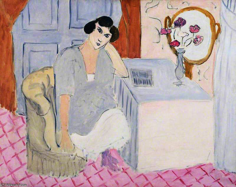
JK: System imagery makes me think of the grid. I mentioned Hans Memling earlier when I was thinking of works like his ‘Donne Triptych’ of the 1470s and ‘The Annunciation’ of the 1480s. They have geometric floors which both recede and tip forward, a perceptual error resolved by the late 15th century. Still, it was favoured many times over by Henri Matisse and he shows this clearly in ‘The Inattentive Reader’ of 1919, in which a floor works in both three-dimensional and flat space. You’ve also homed in on the ground as a somewhat shaky device for containing an image.
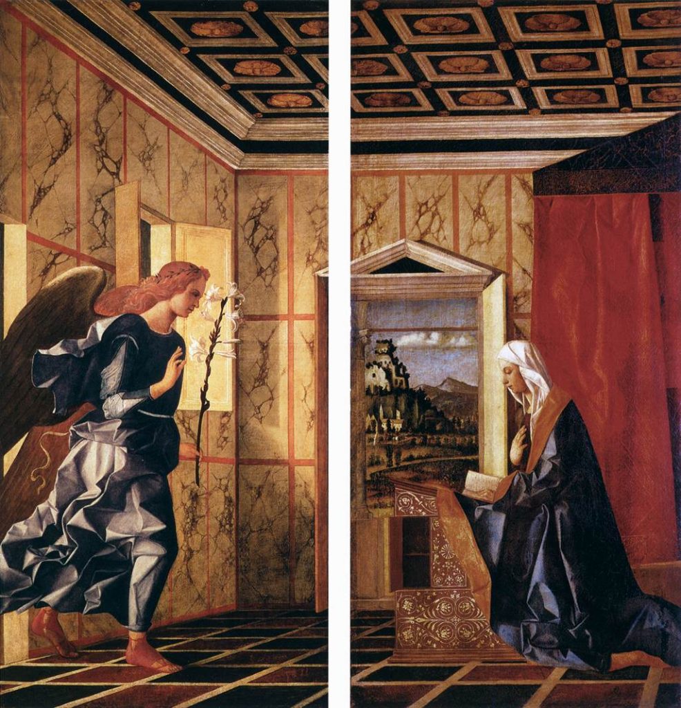
MD: I’m coming towards the end of a PhD which I’ve centred around an annunciation painting by Giovanni Bellini. It’s a double painting titled ‘Angel of the Annunciation’ and ‘Virgin Annunciate’, respectively. The two parts are hung abutted in a way I find really odd because there’s a definite division of the floor’s diamond pattern which cuts through all of Bellini’s beautiful, illusionistic space-making.
There’s a gridded floor and a gridded wall and a gridded ceiling. It’s an alluring spatial study. I found out about six months into the PhD that it wasn’t a painting as I understood it; it’s a pair of shutter doors to cover an organ. So they were double-sided and that sense of separation was spatially real. Also, it was made for a very particular space in a very particular church. What’s internal to the painting’s construction therefore echoes what was external in the actual space. It had moving components and I just love that. There’s a displacement that happens when these panels open. But they no longer do. I think there was a fire or something, resulting in the other side of the panel being lost, so they now look like paintings made for a gallery. They’ve lost their original aspect, so you can only imagine it. It’s not very clearly pointed to, because they can now be formal paintings and that feels like a hierarchical decision; that it’s better for them to be paintings than this complicated piece of decorated furniture.
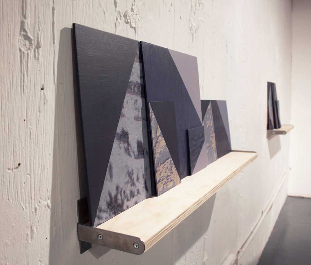
JK: Architecture, function and decoration brings me to ‘Notes on Painting I’ 2017, curated by Amelia Bowles and Antoine Langenieux-Villard at The Koppel Project. There you showed small works on shelves and double-sided paintings on stands. The latter appeared to be characters. As soon as you put two vertical struts of wood as painting supports, they mimic legs. Then you have to balance those with weights, which become signals for feet.
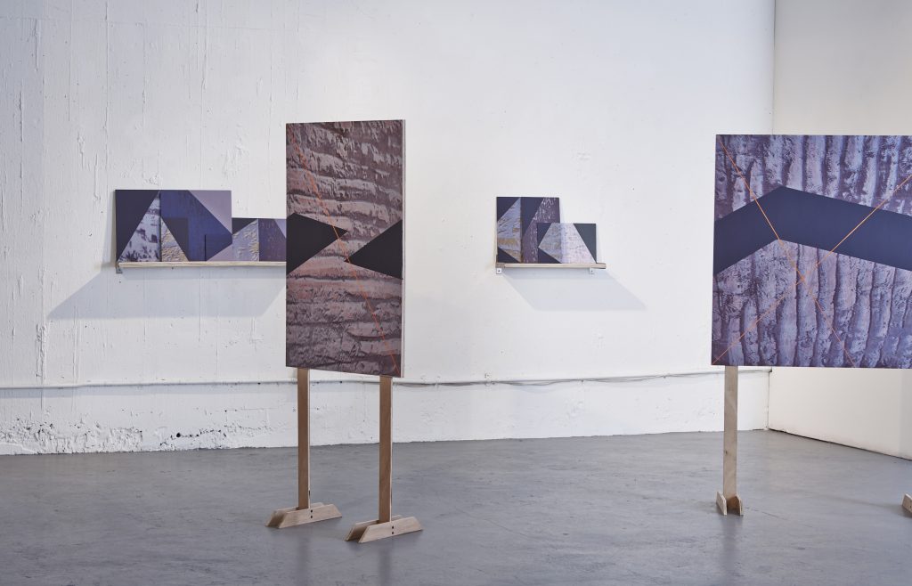
MD: The two Bellini panels were the two double-sided panels in that ‘Notes on Painting’ show. The compositional interactions they made were absolutely like characters. These abstract shapes came at each other in different ways and in response to a very figurative source which gave me a structure for my decision-making.
The paintings match up with their reverse as well as one another from either side. So, side ‘A’ can match on the left of ‘B’ and ‘B’ on the left of ‘A’. There are limits to the information, and therefore an interplay between reality and fiction. For instance, ‘A’ might go on the left of ‘B’, creating a whole image, but the active grounds run vertical and horizontal and therefore contradict.
JK: So they become an unresolvable puzzle; close enough to invite piecing together but too distant to be figured out. And what of their identity as paintings or sculptures? Can this be sorted or is that not relevant? We’re born communicators, we want to name, measure and number things, we want words with the pictures; yet these are the same devices which close everything down. The systems which help us to understand, also minimise our possibilities.
MD: That opposition between image and object, painting and sculpture, doesn’t feel useful. I am really more interested in the history of paintings which are spatially responsive. These are paintings which open and close and have a function in a space.
JK: What was the point of having multiple works – on shelves and on stands – appearing together as one work?
MD: All the works were made simultaneously in response to the space, particularly how the walls and floor met. I was presenting two different ways to make paintings that supported one another. Their simultaneous presentation reinforces both the different processes used in their making as well as the provisional nature of each. In other words, there is not just one solution.
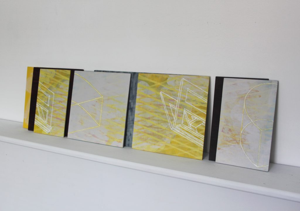
JK: One significant difference between these and your earlier panels is the use of diagrams. In ‘counting / structure (Semi Cylinder)’ (2016), for instance, we can see quite specific object images. In one piece of work there’s a diagram somersaulting across the surface, which reminds me of George Stubbs’ ‘Reapers’ and ‘Haymakers’, both from 1785, as they channel our view from one side of the canvas to the other. There are filled-in sections which seem to add weight or balance, while the rest are outlines. They connect with your ‘Mobius’ series, indicating twists, turns and possibilities of configurations.
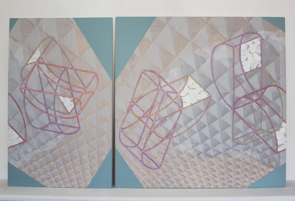
MD: The diagram is a segment of a cylinder from a balcony image. So it is sourced from something outside painting while also standing in for paintings which have invitations to move through them. The diagrammatic figure escalates in number using a mathematical system which is applied to the whole painting. My illustrative images often refer to the act of looking. They’re an image of looking, within something which asks to be looked at. Looking results in pointing something out. Early archaeological research refers to pointing as the origin of counting, so it follows that counting can be considered the basis of perception.
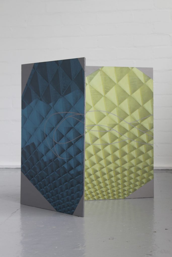
‘counting / structure (Yellow Tally)’ (2016) refers to an architectural diagram. There are one, two, three, then four yellow lines indicating an escalation of information and simultaneously movement.
JK: The blue background looks to be some sort of gridded floor image which we view from a confusing aerial perspective. It also appears to foreshadow the Bellini floor. Can you tell us a little about its source?
MD: The blue is printed on the acrylic sheet, then painted on the other side. It is sourced from an image of the Van Gogh Museum’s roof which featured in a 1960s architecture magazine. The connection with the Bellini floor is coincidental, or was at the time, as I’d forgotten about it. Both have that fall-away inset, creating a sense of vertigo.
The corners are acrylic paint which act as a framing device and are sized in the same mathematical ratios used within the rest of the paintings. They overlap and the image continues behind the facing piece.
Those corners seem to do two things. One is to mimic the ordinary, folded cards used to protect the corners of stretched canvas and picture frames. The other is to hold the interior images. It becomes a double play on the same thing. Returning then to compare with Judd’s baking tin, Derby’s boards have very little actual depth, but only a perceptual depth which is contradicted, or held in question, by the flat corner pieces. With their double screening – plywood and Perspex –there is a nod to screens themselves. In the virtual world we have the dual experience of flat screens with limitless perceptual depth. So while Judd rejected the falsehood of perceptual depth, it seems only logical now to recall it in its new context of a perfectly acceptable false depth, with a revived function of enabling access to endless and compressed space and time.
JK: Your ‘table painting (mobius strip)’ (2016) is a specific reference to the mathematical property of a one-sided continuum with no edges and to its being unorientable, or without gravity, in 3D space. Surely by slicing through the Mobius strip you have disabled its properties.
MD: Yes, but what is separated can also be put back together. And the strip can possibly join with its alter image or the reverse side. It’s like the old mobile phone game of snakes where the snake exists on one side of the screen and returns on the other, as if it has travelled around the back of the phone. That logic is in my works. Another example is how a rectangle holds the logic of the world map, a sphere, in flattened form, which I explored in ‘the world is round’ (2016). The readily-understood inference here is that the two external edges meet. So there’s a sense of what is furthest away is also closest. An image of a map gives you the sense of being able to put it together again. And that happens in my imagination – snake exits stage left and enters stage right. The convention of the rectangle has that possibility: to do curious things at the edges.
JK: How did the ‘Index’ series come about?
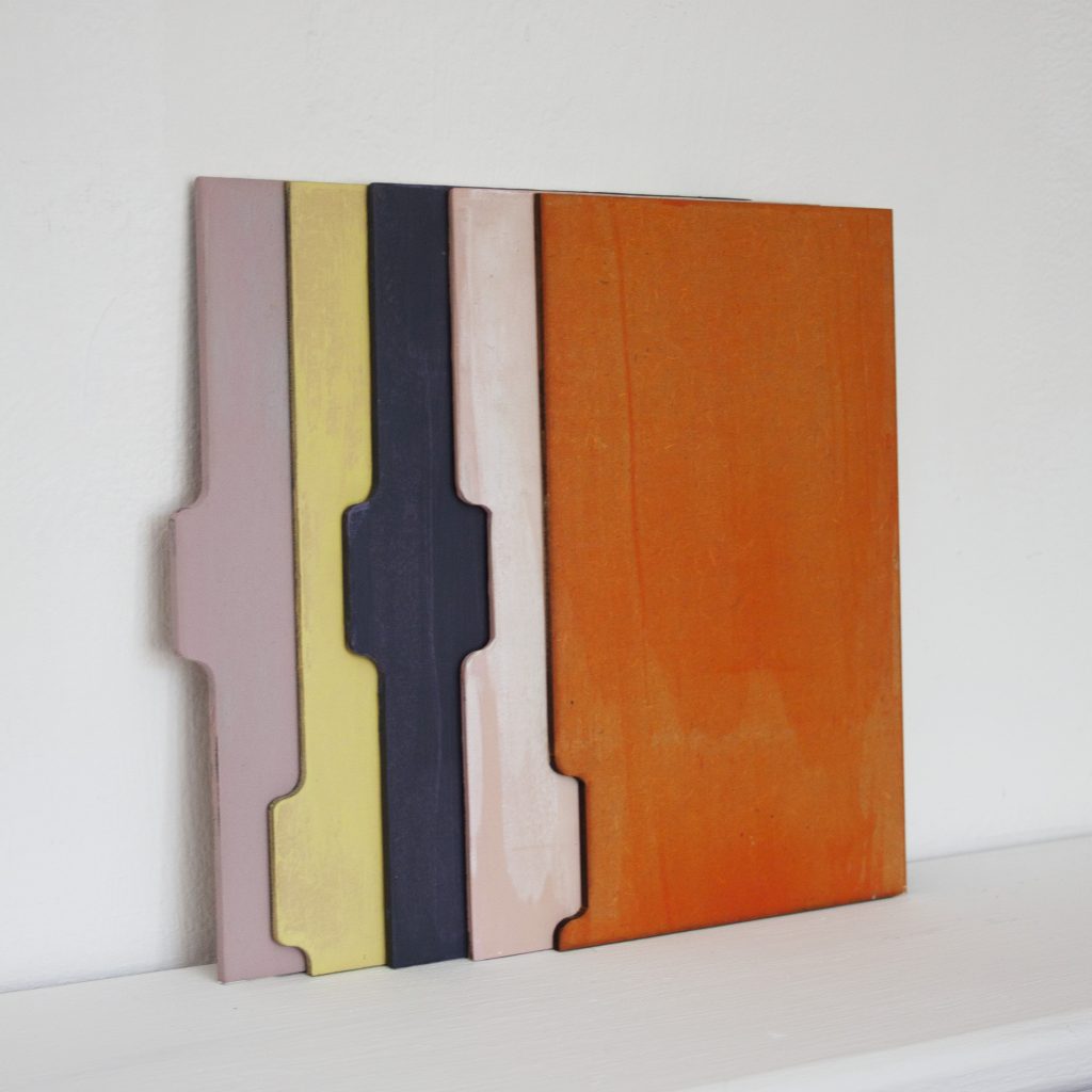
MD: I had a stack of little pieces of cardboard index dividers in the studio and I was using them just to wipe off excess paint. Then I thought about how I’d like to make the work more materially active, so this shape was appropriated, and I kept the resultant work to the side of my main practice. And then I became really obsessed with their shape.
In the early stages, the development of the work was to do with the relationship to paint, for all sorts of reasons. There’s a reluctance to invest in the gestural but, at the same time, areal interest in mark-making and the residues of the process. So I was trying to figure out how I could negotiate that space. Lots of my processing had become quite distanced. I use a lot of printmaking strategies within the paintings, and so there’s an at-arms-length relationship to the information in them. There’s quite a lot of image-based information, and trying to deal with ideas around representation and abstraction. So I wanted the work to be more materially active and I was finding a way to think about that.
So the ‘Index’ series started as a thing to one side but then I became involved with the shape and its compositional possibilities, because it has a tab, and then I introduced an innovation: I inverted the tab. Normally you’d just have 5 tabs in a set of index cards. Through laser cutting I kept the protruding tab and inverted it to create its opposite. So now I have 10 distinct shapes. And that intersected with my interest in perception and counting. I began to think about the work in terms of counting. I was enjoying the tabs moving across the rectangle and I had a moment when I gave myself permission to invert them: not just to follow the pre-designated shape but to come up with this other aspect to it. So then I was thinking about how this might be communicated; and now I have a number system.
The system is based on Sophie Germaine prime numbers which are a particular set of primes. I’ve never been incredibly mathematically competent but I’m really excited about how you can understand something visually.
A Sophie Germaine prime is a prime that if you doubled it and added one, it would make another prime. It’s named after a French mathematician. She would have been a young teenager during the French revolution and I’m interested in her story. In my wider practice there’s a way to take on story and narrative which is something I’m interested in in terms of painting, where the work also looks abstract but is firmly and directly representational. In the sense that this is representing a number.
JK: And they are double sided, and because of that you end up with double the possibilities about how the works appear, because they can go to the left or right.
MD: Actually, they’re not flipped but they can be rotated. In these works, the shape is stable but you need to imagine that it is being rotated 180 degrees, but it is still the same number. So the same number can appear in two different ways. You need to rotate it in your mind. I am interested in the imaginative rotation that the work might prompt. And in the works you’ve seen at Koppel and Tintype, in things that are double sided so you have to hold something in your head.
This is their significance as shaped paintings and that enters a particular history. In this case they are definitely frontal, in that they face outwards. I find it difficult to hold each particular shape in my head even though I’m working with them in an ordinary basis, because I need to try to remember which number is which. It’s on the edge of my ability to hold it. I don’t find those things immediately easy.
JK: I like the idea that it’s rotated instead of flipped from one side to another. You’ve mentioned that a couple of times so it’s obviously a very distinct decision you’ve made.
MD: They can, in a sense, be flipped, but due to the way the laser cutting works, they definitely have a front and a back. I’m interested in the directness of what you see and how that relates to the imagination. I’m interested in abstraction and I’m interested in abstraction not being in opposition to representation. I’m thinking of representation as holding a sense that it can stand for something. So the shape creates compositional possibilities. But that very physical type of surface gives me a different level of freedom when it comes to paint application; and in the associated possibilities of colour and mark.
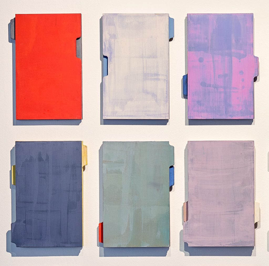
JK: Index cards are used to file and sort information and also facilitate the movement from one subject to another. So your Index pieces hold, let’s say, something near to abstraction and something else about representation. They’re such serious looking paintings, but they also have a cartoonish face profile to them.
MD: Yes, I think it’s quite cheeky that there’s a possibility they can move inside each other. And the tabs can also look like handles. And two can become a pair. And there’s also the idea of a facing side as well as a profile. They seem dependent on each other, as each one resists being thought of as a single work.
In my wider practice, the Sophie Germaine references are bigger than just a particular category of prime numbers and a relationship between abstraction and mathematics. I’m just as interested in her story, and in making a space that she is an imagined occupant of. Her level of interest in mathematics was seen as inappropriate for a young girl in late 1700s France. She was having to stay indoors, because it was revolutionary France, so she was bound into an inside space which contained her father’s library. It was here she developed her interest in mathematics, which was seen as obsessional and inappropriate, and was actively discouraged.
Over time, there has been a lot of talk about her not having had a proper education, and connecting this to whether or not her work is significant. As a female painter, her being overlooked particularly resonates with me. In my head, Sophie Germaine and the reading figure in the Bellini have become interchangeable, beautifully in profile. I am an occupant of the space, and a subject of the focused attention they share.
It’s been claimed that Alexander Pushkin was the first artist to assert that he transgressed all laws, simply by way of being a poet. His indiscretion was to follow an independent pursuit rather than being a good citizen in the service of the state. Perhaps it was he who pollinated the idea that all art is political. Most likely without intention on her part, I see this in Moyra Derby’s work. While she is not presenting bold political statements or calls to anarchy, she maintains a direct involvement with the so-called ‘rules’ garnered from opposing sides of the argument. She prompts us to question our decision-making in siding with ‘A’ or ‘B’ by suggesting the middle ground might be a more potent place to be; while refusing to invest in that as an answer either. The result is an engaging, open-ended body of work, ripe for the inquisitive, prompting us to apply a greater degree of curiosity to our regular, or at the time of writing, astonishingly irregular, lives.