‘Just get on with it’: Matt Dennis in conversation with Patrick Jones
‘For us, there is only the trying. The rest is not our business.’ T.S. Eliot, ‘East Coker’ from the ‘Four Quartets’.
In the last fifty years- the period of time, give or take, during which Patrick Jones has been making art- the conditions of high culture, and of the culture of painting in particular, have been transformed beyond all recognition. The High Modernist abstraction that once upon a time provided a working template for a generation of painters has long since had its status downgraded from ‘house style’ of advanced art to period curiosity. The only way left for abstract painting to be useful, in the third decade of the twenty-first century, is in declaring its own uselessness.
Or so a certain argument runs.
Over the course of a single day spent with him in his Devon home and studio during the winter of last year, and across several hours of recorded conversation that roam digressively- and sometimes transgressively- back and forth, from his beginnings as a student at Exeter School of Art to the canvas he had been working on that morning, it became clear how little time Patrick has for this sort of thinking. His attitude to it is best summed up by the response he gives in the text that follows: ‘I choose not to go there, however compelling the art-historical arguments for it might be.’ Not that he is resistant to theory as such; but his orientation is positive, practical, and geared to the task in hand: the daily practice of making paintings. In bringing his full attention to bear on the thing in front of him, there is a necessary narrowing of focus. Anyone painting now, he insists, must ‘isolate their area of interest and just get on with it.’
Which, in Patrick’s case, means what? In the paintings of the last few years he has poured layer upon layer of thinned acrylic paint onto raw, unprimed canvas, creating fields of diffuse and suggestive atmospheric colour; and then worked around, across and into these surfaces with brushes and painting knives. Again and again, other painters’ forms from the history of abstraction are explicitly quoted, but without irony, without any of the ‘visual sarcasm’ that artist Gary Stephan has identified as Postmodern painting’s stock-in-trade. As Patrick explains, these borrowings are gambits to be tried, as he searches for the point of balance between the accidental and the consciously willed, between the free, drifting spread of poured colour and the emphatic placement of discrete form, that will, in his words, ‘resolve the dilemma of the picture.’
But to begin at the beginning…
‘Gut Bucket’, ‘Triangle’, and beyond…
MD You started when, and how?
PJ I’ve always been an abstract painter, and I’ve painted, whenever possible, on a large scale. I tried, but failed, to get into St Martin’s: I went first to Cheltenham, and then to Exeter; I was 17 when I started. I was delinquent; I was in a lot of trouble with the police and the army; my father didn’t know what the hell to do with me, so he sent me to art school and I walked in, and they thought I was one of the scaffolders working on the roof (laughter). Nobody spoke to me for the first week, because I looked like a Teddy Boy.
My first teacher was John Epstein, a wonderful man, who’d been a student of Kossoff, Auerbach and Bomberg. He looked just like Leonard Cohen, and everybody was in love with him, women and men; and everybody wanted to dress like him, shabby overcoat, curly black hair. He was a very, very perceptive teacher, and he was doing one-colour canvasses, which he showed, I think, at the Whitechapel. He got me to paint the entire studio: we put hardboard up, we mixed our own oil paint, and I was just painting, free-form, all over the walls, and John Epstein sat there, smoking, just watching me…he used to put me in a room with no light, and make me paint in the dark. I realise now that this was a very amazing beginning I had, at Exeter, between ’67 and ’69.
MD If this is how you began, then you’ve never painted a figurative work in your life?
PJ No.
MD Like Stella, then, you started abstract. You had no figurative framework to break out of.
PJ I tried to do a version of a Matisse: it’s a rose form, and I made it out of plywood, and it ended up as a relief, with enamel paint on it…but it also had a connection with Albers, because they had a book on him in the library, and I was very much influenced by him, by Matisse, and by colour generally. Good beginnings for a 17-year-old delinquent.
MD So, after your studies, did you start exhibiting straight away?
PJ Yes. And things happened that are a lot to do with having a certain kind of confidence. But to begin with, I hadn’t got into St Martin’s, so I went to Cheltenham for my BA, by which time I’d become catatonically shy, and couldn’t speak to anybody. I painted very geometric versions of Magritte paintings; I’ve still got some of them somewhere.
MD But surely those would have been figurative, no?
PJ They weren’t actually figurative: you need to imagine a cross between Magritte and Jack Bush, as far as the forms went. They had the peculiar illusionistic qualities of a Magritte- you know, the rain of bowler hats; they were just funny shapes.
I got a second-class Degree from Cheltenham: I found it incredibly conservative, an army town; but we had an incredible Complementary Studies tutor called Nick Waite, who loved French cinema, and he was a Marxist, and he wanted all of us to become Marxists too…
Then I got onto the Postgraduate course at Birmingham, with Derek Southall, and Mick Bennett, who had shown in the Hayward Annual; and he was painting these enormous, thick, eighteen-foot paintings, influenced by John Walker, even though Walker had left by this point. Bill Gear was Head of Painting, and Trevor Halliday was very helpful to me too…I had a studio on the top floor, and it was a wonderful painting space. We were all seriously into drugs and rock ‘n’ roll…
MD Was there a house style?
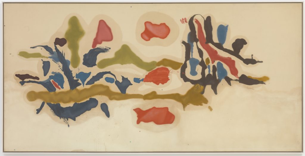
PJ Well, I was painting as close to Larry Poons as I could; and the house style was something called ‘Gut Bucket’- basically, pouring huge buckets of paint…
MD (Laughter) Who coined that?
PJ I don’t remember; but I remember that Birmingham School of Art had these big swinging front doors, and when you walked through them, the smell of oil paint hit you.
MD And students were pouring the paint onto canvasses laid out on the floor, à la Poons?
PJ Yes, and à la Morris Louis…but more physical. I think Birmingham was better than St Martin’s, at that point, for painting.
MD And was there a sculptural influence at work as well, as there was at St Martin’s?
PJ Not as far as I was aware. I was gutted, though, that I hadn’t got into St Martin’s, and when I was in London, I would go down to the pub they frequented, at Cambridge Circus, and Alan Gouk would be there…
MD This was while you were at Birmingham? You’d make pilgrimages down to London? With a view to doing what?
PJ Well, to get with what was really going on; and to buy Spectrum acrylics, in real bulk. I used to buy drums full of the stuff- huge quantities of paint.
MD And where are we up to now? The early 1970s?
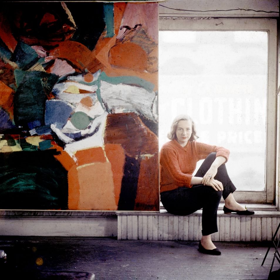
PJ Let me see..1973. In that year, Bert Irvin arranged for me to visit Grace Hartigan in Baltimore.
MD And how had you connected with Bert Irvin?
PJ I’d met him through my being a visiting tutor at Exeter: a job I got because I was rung up and offered it, saying that if I could be in a certain pub in Exeter at the end of the following afternoon, I’d be interviewed there. Which turned out to be Market Day, and a lot of people had been in there since midday and were seriously hammered; and a Surrealist poet I knew called Ken Smith took me there, and John Lyle, the Surrealist bookseller, arranged the interview; and after several large brandies I was given the job, right there in the pub, by Alex McNeish, before any other candidates had even been considered.
MD Sidmouth Surrealists wangled you the job, during a lunchtime session in the pub? Those were the days, eh? (laughter). Clearly you were ambitious; and clearly, you had a great deal of focus, you were putting yourself out there and making connections, getting remembered, getting put forward for things.
PJ So, from 1973-75 I was in Baltimore, at the Maryland Institute. When I was there, you could buy a downtown building, in a spectacularly beautiful spot on the harbour waterfront in the Chesapeake Bay, for a dollar. It’s true, the city was collapsing; but it was a wonderful place to be as an artist, though. I was on what was called a Hoffberger Scholarship; I was given a studio space, and that was it. I couldn’t afford anything on top of that. I was working as a carpenter, and being close to Washington, there were other artists around, such as Anne Truitt, the minimalist painter/sculptor. I had shows with the Osuna Gallery, and the Henri Gallery, and what I should have done, but didn’t do, because I didn’t know of him, was try to connect with Kenneth Noland…but Formalism was on the wane by then.
MD It must have been hard, it must have taken its toll, to have kept faith with abstraction through these lean years; and to be aware that the culture no longer acknowledged the primacy of High Modernist abstract painting and sculpture, and that the critical underpinning had been pretty much kicked away from under your kind of painting.
PJ There was a return to figuration in Baltimore in the mid-1970s; and of course, Guston was just embarking on his late figurative phase. I met him in Baltimore while he was lecturing there, and had a real barney with him over his use of figurative imagery, because I felt he was letting the side down. He was very funny: he just looked at me, and chain-smoked, and smiled. Guston was really a prime example, I think, of an artist whose work had felt like part of my underpinning, as you put it…I’d seen a most beautiful, delicate painting of his, like falling leaves, in the RA back around that time; and a few months later, I went to his new show, and suddenly it was all potato-headed, fag-smoking characters out of Samuel Beckett, all painted in greys; the backgrounds were beautifully painted, I grant you: but the figures were anti-style, anti-beauty. Still, despite all his pushing back against Formalism, he remained an interesting painter, one who had moved sideways, but nevertheless kept going forwards somehow.
Back in London, in 1982, I met Tony Caro at an opening, and he said ‘How are you getting along with your work?’ And I said, ‘I’m having quite a lot of difficulty with it.’ And he said, ‘Don’t be so fucking stupid. Don’t you understand that sometimes you just get lucky?’ and stormed off. And I thought: ‘I’ve only just met Tony Caro for ten minutes and I’ve already managed to piss him off.’ The next morning, I was sitting at home, still feeling pretty upset about it all, and the phone rang; it was Caro, and he said, ‘I got hold of your number. How would you like to go to the Triangle Workshop next week? We’ll see if we can get you a grant.’ And he got the Elephant Trust to pay for me to go: all of this, from having met him at an opening.
MD Well, and from pissing him off; enough, obviously, for him to feel remorse at how he bawled you out…
PJ No, actually, I think he must have just gone away and checked out my work somewhere. He probably thought, ‘He’s a young artist, I’ll help him out.’ Caro was very clever at manipulating people and situations; and I understand now that this was just his way of dealing with things. And then Margaret Thatcher went for the Falkland Islands, and I thought: ‘I’ve had enough of all this.’ So I took off for New York.
The Triangle Workshop was a totally Formalist boot camp: Greenberg was heavily in evidence, as was Larry Poons; Walter Darby Bannard; the whole nine yards of Formalism. I’ve got a catalogue here somewhere, that shows Greenberg doing life classes, him and Caro drawing from the naked figure; they had a figurative studio. I was there twice; 1982 was the first year, and the best one.
MD I’d like to get a sense of the place: it’s just a name to me, really. I don’t know what its significance was, other than this idea that it was a Formalist summer school.
PJ Imagine a great big New York dairy farm, full of the most Formalist abstract artists of that time. John Gibbons, Peter Hide, all the heavy metal sculptors were there, at Caro’s invitation. There were also a lot of Canadian painters.
MD And no-one was there unless they’d been invited by Greenberg or Caro? And the price of admission was a Formalist vocabulary to your work, that demonstrated that you were sympathetic to the ideas of the school?
PJ Yes. Remember, though, my relationship with Caro was often stormy: he could be patronising, and he was very posh…nevertheless, he helped me, or at least, tried to. After my time at Triangle, he arranged for me to make a sale of my paintings to Denis Lasdun, who’d just designed the National Theatre, so that he could hang them in the IBM building. Susan, his wife, chose eight of my biggest paintings; and I’d gone greatly into debt, not only in making the paintings, but in financing an accompanying catalogue. I sent them to the IBM building; but the Director of IBM, who was an American, refused, by phone from America, to select them; and they returned them, one at a time. I would have made well in excess of forty thousand pounds if they’d purchased them; instead of which, they sent every single one back, and they bought a Gilbert and George photo-work of a rose instead, because he had asked the secretaries at IBM to tell him what they’d like to sit in front of; and they turned me down flat, because my work was abstract.
MD So there, in a nutshell, you have the ‘changing of the guard’ of the early 1980s: abstract painting passed over, in favour of Gilbert and George.
PJ And that incident led to my going seriously bankrupt; I’d borrowed all this money in order to make the bloody things.
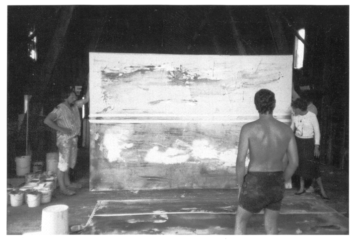
But anyway, the amazing thing about the Triangle Workshop was the facilities, the size of them; if you think this barn we’re standing in is big, well, the ones there were massive, it was upstate New York, after all.
I became very close to a Canadian artist named Terry Keller. He had mobility problems, he’d had a stroke and various other things, and he could barely move; but he had a wonderful way of painting, and what was so interesting about it for me was that he didn’t try to change the painting from one side to another, he just went across with pale grey, trying to make the marks move across the surface without any tonal or colour inflection. Of course, what I’d been trying to do in England was to make the most varied surface possible; and the idea that a painting could just be an expanse of a single tone of grey really affected me.
MD Aren’t you describing a Minimalist painting here, rather than a Formalist one?
PJ No, there were thick lumps of paint, grey on a grey ground; and they were quite beautiful, soft, muted greys…the surfaces would catch the light. And what I loved about them is that they reminded me of the sea; they looked like water. I was very taken with the idea that I might make huge sea paintings.
MD And now we’re looking at a painting of yours here, ‘Rough Rider’, that was made then. Was it fairly representative of your output at the workshop?
PJ It’s got more colour than most of them.
MD A lot of close-toned colour, thick impasto, a feeling of geological strata…Was this, and the other works you made, critiqued by Greenberg and Caro? How did it go, offering yourself and your work to critical analysis by them, and by the group?
PJ Well…it was serious, heavy shit (laughter). It was very hot, it was August, we were all in shorts, in our painting gear; and all of a sudden, people would start to congregate in your painting space, which would be at least double the space, for each of us, of what I have here. All these people would gather round, and Clem would appear, and he would ask, ‘How can you possibly be doing this shit?’ Or something like that. But bear in mind, not only was there criticism; there were galleries sniffing about, looking to see who they could pick up. You had Formalist criticism, and you had career ambition, all mixed up together, and I loved it: I had a whale of a time. Admittedly, I had absolutely no idea how to go about finding a New York gallery, whereas of course the Americans did; but what I was really interested in, and involved with, was the other artists there, working alongside them, feeding off them. It was quite heavenly, really: there was a big lake, we were having barbeques, there was fresh fish and white wine at lunchtime…it all had a kind of Woodstock Festival feel to it; it was pioneering, it was going to change the world…
MD So, it was really felt, in upstate New York in the early 1980s, that a Formalism blessed by Clement Greenberg was vanguard art? That this was the art that would be continuing the lineage from the High Modernist period into the Great Beyond?
PJ Yes. But as I’ve already mentioned, the Formalist outlook had already gone into decline: Greenberg was a heavy drinker, and Caro had been having all sorts of ups and downs in his career. I felt that Caro, and to an extent Hoyland- and Frankenthaler and Motherwell too, for that matter- had gradually mislaid the spirit they’d inherited from Pollock; so it was up to me to dig deep into my psyche and try to keep the whole bloody thing going, because I felt that their disillusionment with abstraction was wearing them out as artists.
MD A kind of fatigue? Rather than a lucid point of discovery, at which they arrive at the secret, that abstraction has run its course? You didn’t, yourself, feel that a terminal point had been reached?
PJ No, not at all. I’d already lived out in New York, in the years before Triangle; I’d taught at Hunter College, in the centre of Manhattan, a wonderful multicultural institution; and I was in the ‘Carnegie International’ in Pittsburgh, the most impressive show I’ve ever been in: myself, Hoyland, Bernard Cohen, and Jennifer Durrant represented the UK. I have to admit, I was totally green, totally naïve; I could just about manage to put on a suit, in order to get into the place.
MD Did you feel, by being in the USA and working at Hunter College, that you were going back to the cradle of Formalism, and that it would be a ‘safe’ working environment, as it were?
PJ No, not in the slightest. Hunter had a terrific reputation- Ray Parker was teaching there- but the work was geometric, not Formalist…I remember Olitski coming in to give a talk, and getting a real hammering from other people on the staff, most of whom were preoccupied with geometrical abstraction. The Head of Complementary Studies was none other than Rosalind Krauss…
MD She’d been a Greenbergian Formalist, but she’d turned, hadn’t she?
PJ There was a lot of that ‘turning’ going on. But as far as I was concerned, I’d left England, and I wasn’t coming back, I’d emigrated to get away from my work being rejected, and to get away from Margaret Thatcher, and from the sort of work that was presented in the ‘New Spirit in Painting’, which had opened at the RA in 1981…
MD But you’re in the USA during the Reagan years. Was that much of an improvement?
PJ It wasn’t an easy time: I had to sub-let my apartment, because although I was on what would have been a colossal salary by UK standards, it didn’t get me very far in Manhattan. Eventually I ran out of money and moved to Brooklyn, and had to get a job, so I went into all the bars and asked, did anyone have any work I could do? And an alcoholic painter who’d just lopped his finger off in a circular saw gave me carpentry work to do, and I fell in with a whole community of artist/artisans, and I absolutely loved it; I became a tile-layer for restaurants, and being around those kind of building materials inspired the three-dimensional pieces I went on to make. But in 1991, my Dad died of cancer back in Sidmouth, and my Mum was all on her own, so I came back to look after her, as she had Parkinson’s, and was in a bad way. I stayed in Sidmouth for five years, looking after her; and so my connection to New York faded.
The Paintings
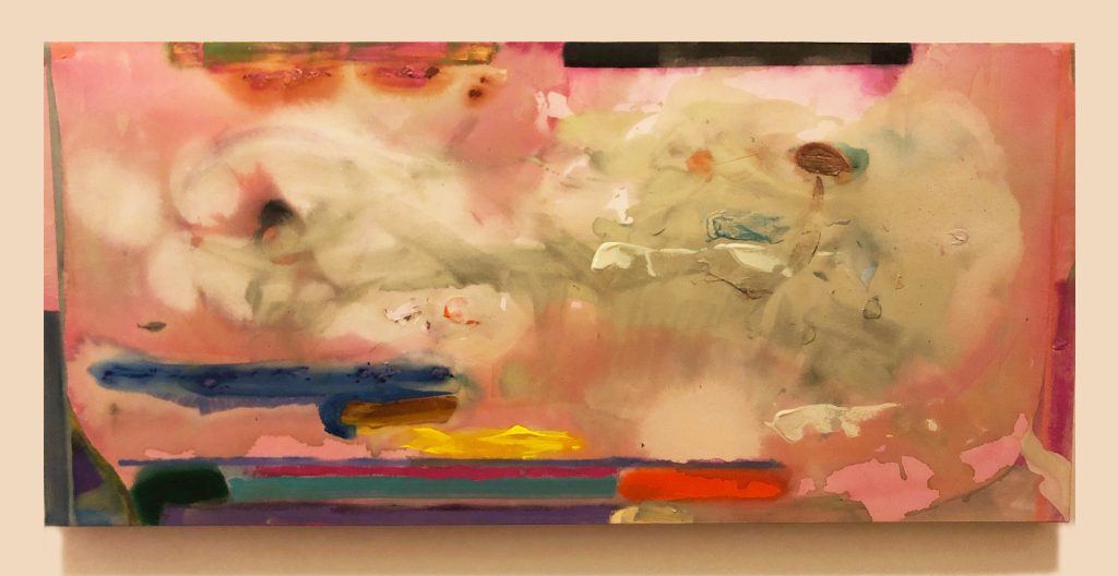
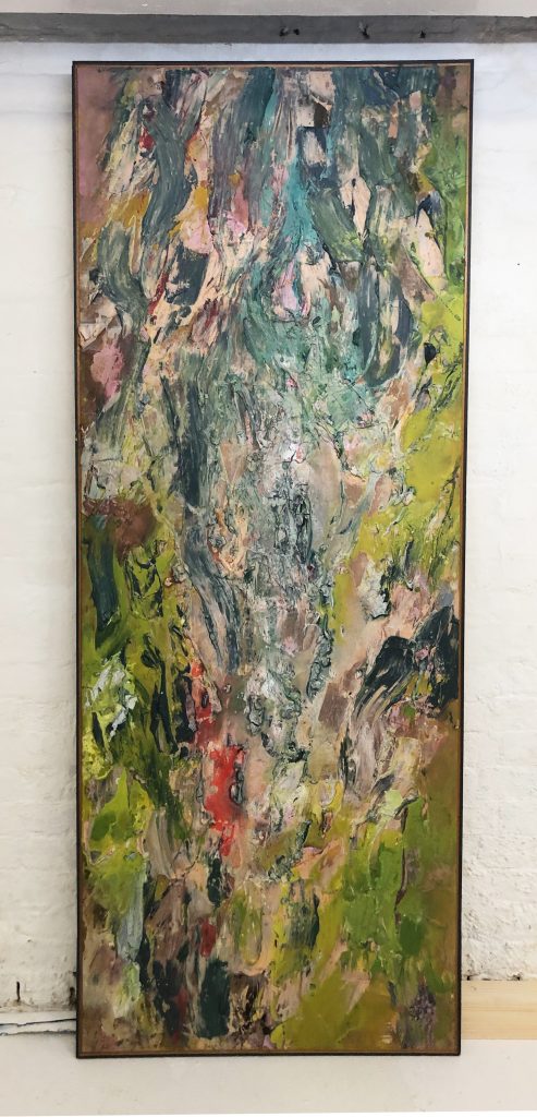
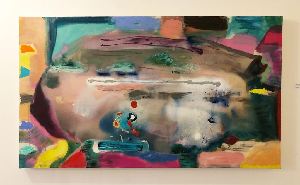
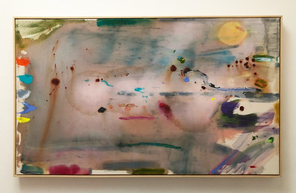
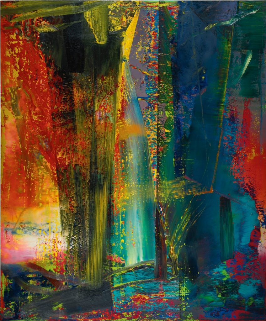
PJ (pointing at ‘The Sublime’, 2018) This one has fragments of the landscape in it. This painting took a lot longer to paint than I like: it took about six months.
MD So this one is part of a group of- what? -five or six paintings that relate to the same period of working?
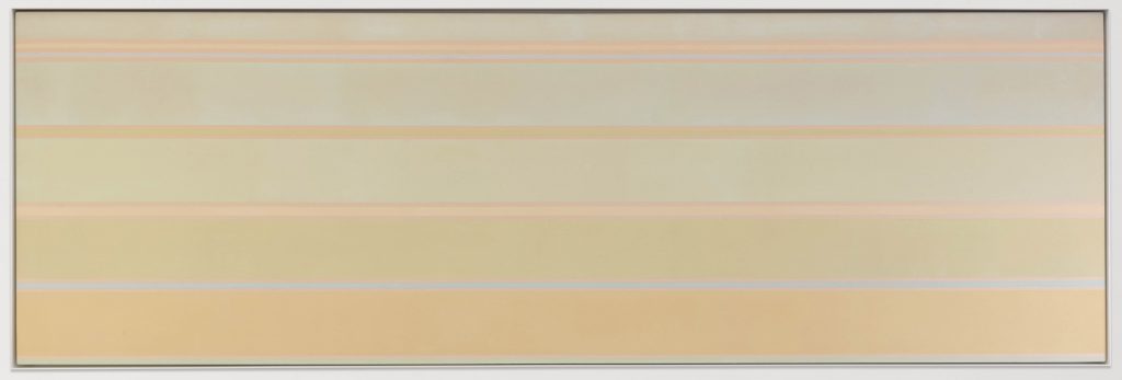
PJ Seven or eight altogether, if we include the long ones. They’re made with ‘Interference’ paint.
MD What’s that?
PJ It looks like nail varnish (laughter). The American company, Golden Acrylics, make it. It changes colour when you look at it, depending on the angle. I’ve got all sorts of gels, thin and thick…and this ‘Interference’ paint just captures a bit of the light, so you can build light into the painting.
MD It looks as if you’re combining pouring with scrubbing the paint in.
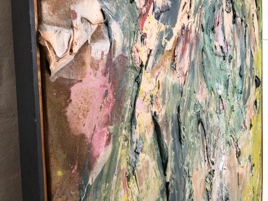
PJ Yes. There’s no priming on the canvas: my ‘style’ in these- if I have one- is to use heavyweight cotton duck, stretch it onto a wooden frame, and then ‘free-form’ straight on top of it. There’s no process of laying down a ground, and then building the layers, or anything like that. Having said that, the paintings have a shelf-life, whereby if you work on them for too long, you fuck them up completely: you ‘lose’ them. That’s what happened to that one. But with this one, I was able to work on for quite a long period of time, and I actually saved it right at the end, and it’s lighter now than it was when I began it, which is actually a very unusual result; and by ‘lighter’ I mean physically and visually lighter. Normally, the more work you put into something, the more tortured it gets.
MD I know from your ‘Brancaster Chronicle’1The ‘Brancaster Chronicles’ are live discussions on abstract art. Patrick has twice been the subject: https://branchron.com/2015/04/28/brancaster-chronicle-no-19-patrick-jones-paintings/ and https://branchron.com/2015/12/19/brancaster-chronicle-no-26-patrick-jones-painting/sessions that you’re very concerned to keep the raw weave of the canvas in as virginal a state as possible. Here, it’s hard to tell from the finished canvas, but it looks to me as if, having applied your first stained and scumbled layer, you’re not trying to a great degree to make forms come through. Is it more a certain sheen you’re after? A glow?
PJ I can show you a photo of this painting in progress that doesn’t look anything like this. At one point it just looked like a pour– like a great big Morris Louis; in other words, it was completely ‘other’- and I had to wash it over with a silvery translucent wash in order to get a sort of delicacy, which I think is quite important; and you will notice that that’s a feature of my work; it’s what I have in common with Frankenthaler. It’s a liking for Turner, and for the softer effect, like watercolour.
MD Yes, and much as with watercolour, you’re reliant on the radiance of the white ground. You’re leaving off a great deal, and then coming in with these gestural marks and accretions of paint. And once they go down, they’re not coming off again, are they? You’ve committed yourself, once the impasto lands.
PJ Yes. When I’ve been up at the farm studio, I’d leave things till the evening, till everyone has gone home, and then I would go for it, and coat the whole painting, and it would be dry by the next day, and then I would coat it again; but the problem with that process is that the paintings can die on you: they wilt like flowers that haven’t been watered. Anyway, I felt that I’d saved this painting from fatigue.
MD Yes, it feels fresh: and there’s a kind of antic spirit there, that comes out of Miro, I think. And the eye is drawn to these little ‘graphismes’, to borrow a term from Tapiès.
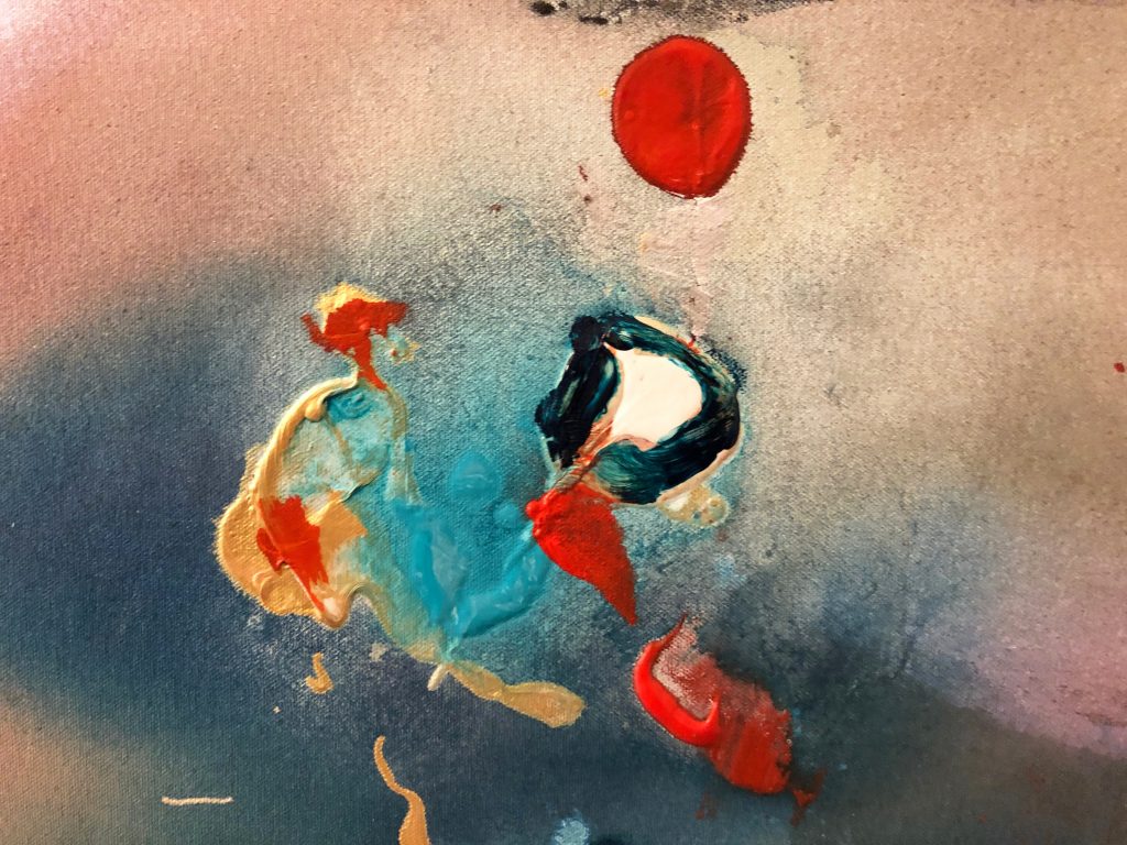
PJ They’re quotes: there’s a moon in there, you can see, a pale yellow moon; and then it became…well, it got a couple of little eyes, and then it turned into a figure.
The thing is, they are living things to me: this one here has the title ‘Moon Pull’. We have spectacular moons down here in Devon, and the feeling is that the moon is pulling something; so there’s something being pulled into the picture. And there are areas that are flicked on, and I really like what happened when the paint landed; but then, for a long time, they just sort of sat on top, and they weren’t integrated into the whole thing; they were just a sort of event. It took me bloody ages to get that to ‘bed in’ to the rest of the picture, and it became an obsession, really.
MD What do you mean exactly by ‘bed in’?
PJ Well, because these are flicked gobs of paint, and they’re on a soft, luminous, atmospheric ground…if the ground had dried, and then I’d flicked the blobs on, and I’d wanted it to be a serious, John Hoyland type of abstract painting (makes noise of a bomb dropping) then I’d have had to damp the whole bloody thing again, and lay in another wash, to have it all bind together; it’s not just a technical thing, it’s to do with how the painting knits together.
MD Do you mean that you’re looking for a slight but perceptible bleed?
PJ Yes. And all these tonal changes throughout the picture…well, we’ll see, when you’ve had a look at all my 1980s pictures, whether you feel that this is a signature of mine…
MD Technical questions aside, what strikes me about this work, and the work of yours that I know from the ‘Brancaster Chronicles’, some of which is also here, is that you’ve got an arsenal of framing devices; and in using them, it almost feels as if you’re circling the painting, walking around it, waiting for the right moment to plunge right in, to attack the main area of the image. Thing is, I don’t assume that all of this around the edges was necessarily laid in prior to anything happening in the middle; but the cumulative effect is of a kind of topography, that invites associations such as lake and surrounding shore…
PJ I don’t recall exactly where I found it, but I read something somewhere, Frank Stella talking about what happens when the painting arrives at its edge, before it gets to the wall; and in here (indicates centre of ‘Moon Pull’) we’re dealing with illusion, with atmospheric, imaginative space- but when you arrive at the edge, about four inches off the edge, all of a sudden it becomes real, and once it becomes real, it becomes a three-dimensional object, and it hits the wall; and at that point, the nature of the thing changes; into sculpture, or something like that.
MD Stella talked of dealing with something in between two and three dimensions, didn’t he? ‘Two point seven dimensions’, as I recall2‘I work away from the flat surface but I still don’t want to be three-dimensional; that is totally literal…more than two dimensions but short of three, so, for me, two point seven is probably a very good place to be.’ Frank Stella, quoted in ‘Frank Stella Retrospective’ exhibition catalogue, p230, Kunstmuseum Wolfsburg, 2012. And for you: do you feel the need to dispense with any lingering sense of illusion, of spatial quality, as you reach the edge?
PJ It definitely changes at the edge; and there’s the decision whether to make a hard line…
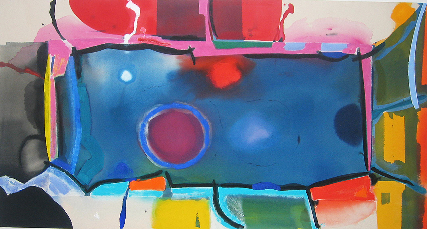
In this painting, (indicates ‘Sidmouth’ ) I tried to avoid any sort of edge, almost to the point of there being just a shadow.
MD That’s a very interesting way of looking at your work: as we near the edge, the depiction drops away, and you’re left with a framing device that readies us for the literal truth of the side of the support, and the wall. That’s a highly Formalist reading, of course.
PJ It started to become crucial for me. These two paintings, ‘Moon Pull’ and ‘Sidmouth’– and, I think, the ones downstairs- began to give the idea, which I think relates to what’s going on in the middle, of my wanting something in my painting to be truly pictorial; I can’t think of any way of putting it better than that. It goes in and out…
MD Are you talking now about ‘push-pull’?
PJ Well, yes, it is ‘push-pull’, and that’s very interesting, because for me, it relates to what I saw in Frankenthaler, that she took from Hofmann…their work, of course, is not at all alike; there are no ‘slabs’ in Frankenthaler, no great big blocks of colour, but there is the same in-and-out sort of space; and to me, it’s not unlike naturalistic space. Just now, when we were driving along the Sidmouth seafront, and we were looking at the sea, and how brown it looked: that tremendous physical and emotional experience of seeing the sea, I’d like that in my paintings. What we just saw, I want them to have. So there’s a pictorial quality to what are abstract pictures. There’s nothing in them that you could point at and say ‘Oh look, it’s the sea, it’s a cliff’ or anything like that; but on the other hand, I love the idea that the paintings might have a sort of drama.
MD You’ve got some gorgeous light effects going on, and there’s some sort of horizon being established…
PJ Does that all make sense?
MD It makes perfect sense. I’m struck by the fact that everything in the world- including the forms in paintings- looks like something else. Nothing looks only like itself: it isn’t possible to see a thing that doesn’t in some way strike echoes. Having looked at a large number of Patrick Heron’s paintings, grouped together, I’ve realised that somewhere along the way, you could say he made peace with himself regarding the idea that certain forms coming through in his work were so unbreakably linked to real things seen- his garden, the cliffs at Zennor- that the effort that would be needed to suppress those associations just wasn’t worth it.
PJ And of course, why would you want to suppress? Obviously I don’t want to illustrate; I’m not a figurative painter. But on the other hand, where is it written that paint can’t remind one of moonlight on water? I don’t have that instinct to suppress; and besides, I feel that the things in my paintings arrive there for formal reasons, as much as anything else. When we’re talking about the edges, the centre, I’m being pulled or pushed by decisions made with the canvas in front of me.
MD I can recall a discussion thread on Abstract Critical3A forum for discussion around abstract art, now reconstituted as https://abcrit.org/, in which one of the contributors referred to the late Rothko paintings, where you have a near-black band, and a grey or brown one beneath it, and inevitable associations of land, horizon and sky: and this example of Rothko was used as an argument to justify abstract paintings that carry landscape reference; to which Robin Greenwood responded, well, people should stop making abstract paintings with a simple horizontal division in them, and then the problem- as he saw it- wouldn’t arise. Is that where you and he part company? Because he is holding out for this notion of ‘abstract content’, which is entirely free of associations with things seen in the visible world.
PJ Those Rothko paintings you’re referring to: I saw then in a show at the Hayward, hung quite high, and in the last room of the show, there were black and grey ones, the black above, the grey beneath; they were made late in his life, he was dreadfully depressed, and he committed suicide shortly thereafter. They were powerfully moving pictures: and what moved me most was that the black areas were exactly like my perception, when I look out of my windows at night at the moonlit sea, where even if there’s very little light left, you’re aware of a vast amount of space and depth.
MD You found the Rothko paintings spatial.
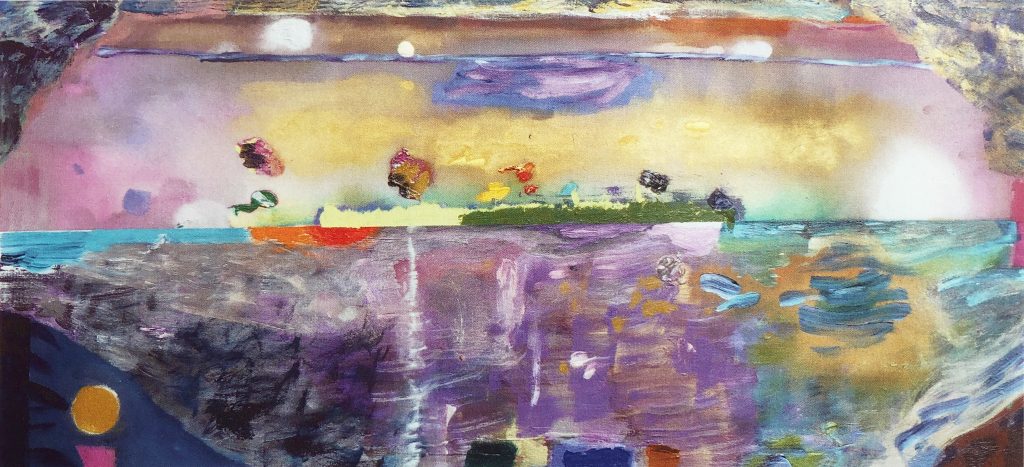
PJ Yes. There was a period of three months when I lived with Helen Frankenthaler: I’d broken my leg, and she looked after me and let me stay in her house…and we sat every night with a glass of something, looking out at Long Island Sound, at the tugboats going up and down; and what we were looking at, which is in a lot of my pictures, is that sort of space where you get one little red light and one little green one in the middle of a black space- and you know it’s a moving, fluid space, that it’s not flat. And this is one thing that both Frankenthaler and I seemed to share: an instinctive appreciation of that kind of space. Do you understand what I’m talking about? In this painting (indicates ‘Helen’), a great big, voided, open space…so, to me, the centre of the painting goes way back, and that’s what all the staining’s doing; the thick lumps of paint are coming forward, and then at the edges of the picture they’re beginning to come to some sort of accommodation with the physicality of the wall.
MD That’s very well described. But this painting also references another kind of space entirely. It seems clear to me that your tender care for the unsullied canvas surface, and the luminosity that you’re obviously looking for with the staining and the initial putting-down of the liquid paint, enlivened by the highlights and dabs of paint you then touch in; in all of this, I’m getting such a strong sense of the rectangle itself as a sort of backlit retaining surface for these various actions…it can’t help but put me in mind of the ubiquitous screen.
PJ Ah yes, the computer screen…I have a huge problem with the internet, in that it induces us to live our lives in terms of one screen or another. I suppose it’s inevitable, then, that my painting would have a ‘screen’ aspect to it…it almost becomes a political act, painting, in the sense that it remains important that they’re physical, that they’re made in the moment, and that you apprehend them fully in walking right up to the bloody things. None of that happens when I turn my computer on.
MD But I’m really talking about subliminal influence here: I feel as if these paintings- and this one in particular- are the sum of a great many influences, and one that’s really coming through strongly to me is the backlit world of the screen. And I’m wondering if you’ve been conscious of this or not? What’s different, of course, between a painting and a digital screen, is the difference between evoked backlighting, and being literally backlit…to my eyes, you’re achieving a marvellous kind of illumination in these; but there’s something in the way all the little incidents are distributed, atop the glowing background: on the one hand, we’re almost in the presence of the romantic sublime, like Turner’s storm at sea; but there’s a whole other vocabulary coming through, which is the virtual non-space of the screen.
PJ Interesting that you should say that; because I often have the TV on in the morning before I go to work, and recently they’ve been showing lots of wonderful films from the 1960s, with Burt Lancaster, Gina Lollobrigida, Tony Curtis…and the colour film they used in those films, Cinemascope, is beautiful. When I switch on my computer, alas, that’s not what I’m getting.
MD The colour in those 1960s movies is astonishing, isn’t it; that particular kind of palette, the kind that Rauschenberg described, when referring to his silkscreen paintings from the 1960s, as ‘glamorous’ colour. There’s a lot of this kind of glamour, and an upbeat richness of colour, in these paintings we’ve been looking at; you’re clearly not fighting shy of beautiful effects.
PJ No, no, not at all.
MD In one of your ‘Brancaster’ sessions, Emyr Williams says to you, in so many words, that you can do this sort of painting in your sleep. So, there you go, a hot potato. Are these in danger of becoming comfortable, easy pictures?
PJ They’re certainly not comfortable to make. I find responding to them, bouncing off them as I’m making them, incredibly challenging. You can see in ‘The Sublime’ that there are lots of ‘quotations’ along the bottom, particularly from Miro…but quoting doesn’t make it easier. I don’t think I find that there’s anything about the painting process that one could call ‘comfortable’. I find it extremely challenging. But just occasionally, you get lucky.
MD But ‘Moon Pull’: it’s certainly not overworked. So would it be true to say of a picture like this, that there are distinct stages? The staining, and then, what? You live with the thing for a while?
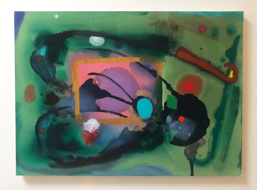
PJ I think that painting is one that happened quite quickly, and the reason is, that I poured the stain in the centre there, which has got that brown halo around it, and as soon as that began to dry, I put the line on it and began to recognise that sort of ‘in-and-out-y’ space that I talked about with Frankenthaler; and it’s something I know I’m interested in achieving. This green painting, ‘Green Monster‘, which has got a central section with a funny little creature in it- this couldn’t be described as ‘easy’ painting, or one that just relies on the staining; it’s got a lot of different things in it- a spider, for instance; a section in the centre, that underwent quite a lot of changes…I don’t think I’m misunderstanding what you’re asking: and my answer is, all of them are challenging. The fact that the darker forms in it started to look like a winged creature bothered me for a long time; it wasn’t an easy ‘hit’. I’m aware that if you stain and re-stain a canvas, you can get some gorgeous visual effects.
MD Yes, I’m talking about the gorgeousness of it all. ‘Green Monster’ is harder to approach than ‘Helen’, which is your work at its most glamorous and pretty and beguiling…I mention the question of the stages of the work, because I add it all up in my mind and I don’t see embedded in the painting evidence of long, long hours of working and re-working the thing, and fretting over it. As you say, you feel that the work has a ‘shelf life’, in terms of how much you can do to it before it spoils…I know it’s very easy to confuse apparent ease in the final result with ease in getting there- we know that making a painting is often tortuous- but in terms of sheer man-hours of working the material, there’s not a huge amount there, is there?
PJ Well, the top one of those two (indicates ‘Mirage’) was on the painting wall for damn near six months, and changed every day, and has ended up with a ‘seascape’ in it-
MD From this distance it looks as if you’ve broken your own rules, because there’s a great deal of overpainting. I mention this because you generally seem very adept at ‘letting the painting be’…’Helen’ is very gorgeous, very beguiling indeed to look at, this column of colour swatches on the left, and these touches, blobs, and little distributions of pigment on the surface, it’s gorgeous from end to end…and perhaps the ‘ease’ I’m talking about is not so much to do with ease of execution, but with the easy way that the parts of the finished painting live together, which is going to get you only so far, and then stop?
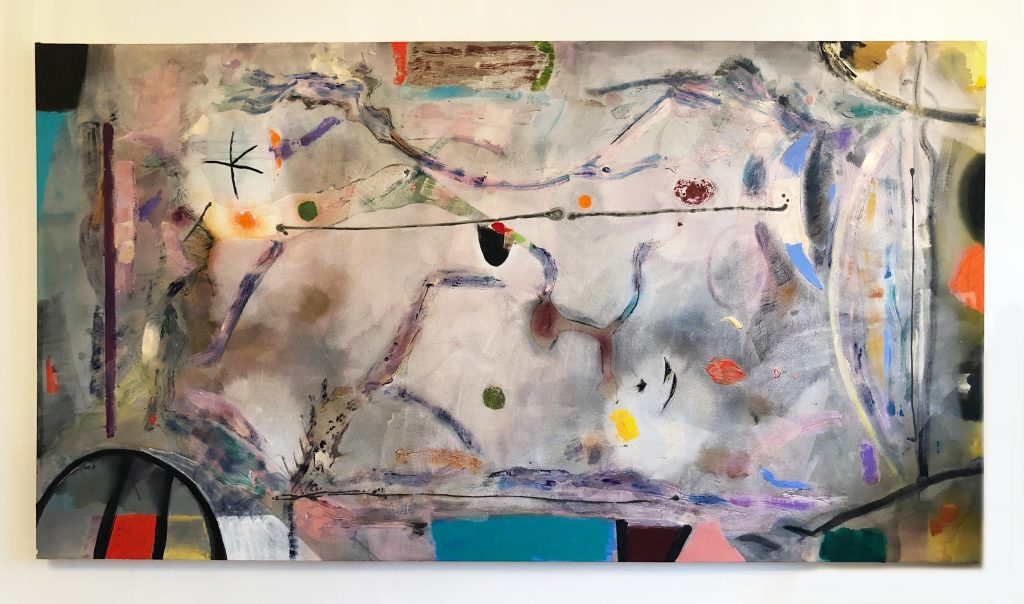
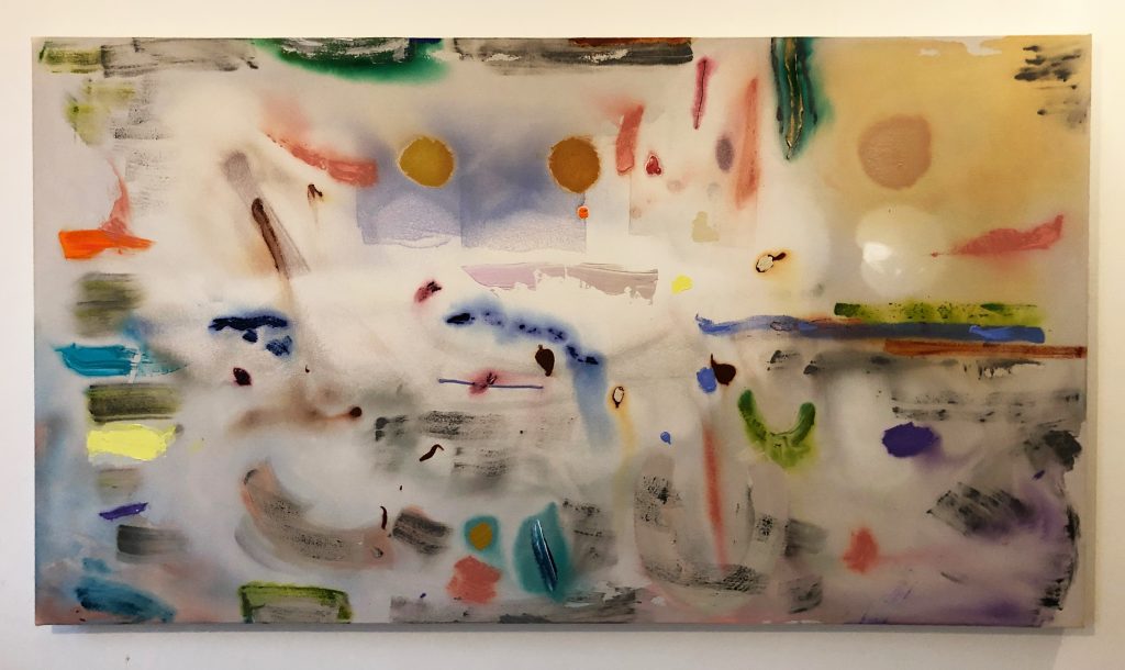
PJ It’s a good question; but it feels ironic to be asked that, given what I know about their making, and the sequence, how it unfolded…’Flat Screen’, downstairs, was the very first, two years ago, and it set the tone for all of these, and all of them received the washes in the middle, and they all received the ‘interference’ colour…and then they were dry-brushed, with the idea of creating edges. I thought they were all rubbish, and I was going to scrap them all; I put them up on Facebook, saying that I’d just had a really bad spell in the studio, and that I couldn’t seem to get anything together, and that I would be scrapping them the next day. And I got all these replies saying: ‘Don’t do that.’
MD I can certainly understand that. But to me, they’re almost too lovely, and that’s something I’m interested to hear your reactions to.
PJ If you twisted my arm, I’d have to say there is nothing that I can think of that would cause a painting to be too beautiful. I just can’t see it. One thinks of Fragonard- beautiful pictures of ladies in lace…as an aim, if I could do a drooling painting, which caused people to faint from bliss when they saw it, I would do it…(laughter) because what tends to happen is the complete opposite: all sorts of shit happens in the painting. With ‘Sidmouth’ I was trying to make a quiet painting, a delicate painting, and it just kept getting busier, and busier, and more and more frantic…I do feel that they’re living things, and that they’re separate from me; and to a certain extent, I’d be happy to bugger off out of here and never see them again, because they have their own lives to live. The only problem is, nobody’s seeing them; and I do think they deserve to be seen. The worse one could say of this activity is that it’s a form of masturbation- a solitary activity, pleasing myself. I don’t see it like that: I see it as a very testing activity, testing myself, and testing the genre within which I work.
MD Testing yourself how? Can you elaborate?
PJ Yes, I can. I test myself in ways that we’ve touched on: by working with notions that the thing shouldn’t just be beautiful, colourful, that the colour should be there for a purpose. Like here (indicates ‘Moon Pull’) – these yellows and greens down at the bottom, they have reasons to be there. I’m very, very aware of painting’s history: and I’ve been accused of being a formalist, as if the only thing that interested me was the way the paint physically attaches to the canvas…I was excited by the second-generation Ab-Exers, Jack Bush, Grace Hartigan; the people who were still alive when I was in America, and then, after them, the Colourfield painters. I went over there loving all these painters, and then I saw a Ken Noland show, where he was using the exact same paint, the ‘Interference’ paint, in his stripes, and he was putting it on in waves. And I thought they were bloody awful, purely decorative; all they were, it seemed to me, was a demonstration of what that paint could do on a striped canvas. In other words, the paintings didn’t have any allusion. Mine do.
MD Clearly, they allude to things outside themselves. But you seem to be interested in that tightrope walk, where there is nothing that could be singled out as depictive. I think you walk the tightrope very well; whereas someone like John Walker, for example, has long since abandoned the attempt, if indeed he ever made it in the first place; he doesn’t really paint abstract paintings at all. The paintings that first made his name in the late 1960s aren’t abstract; they’re figurative paintings of abstract shapes, as if he was painting a room, or a landscape, an illusionistic space, that happened to have a big plywood cutout of an abstract shape in it, if that makes any sense. And starting in the late 1970s, the ‘Alba’ paintings have this very distinctive form, covered with these lush, almost edible crusts of colour, on this very painterly poured and brushed field: as if Gainsborough had been commissioned to paint a portrait of a decorated abstract plywood cutout, rather than Mary, Countess Howe. And I mention all this because it looks to me as if you’re aware of this trap, the trap of ‘figurative abstraction’.
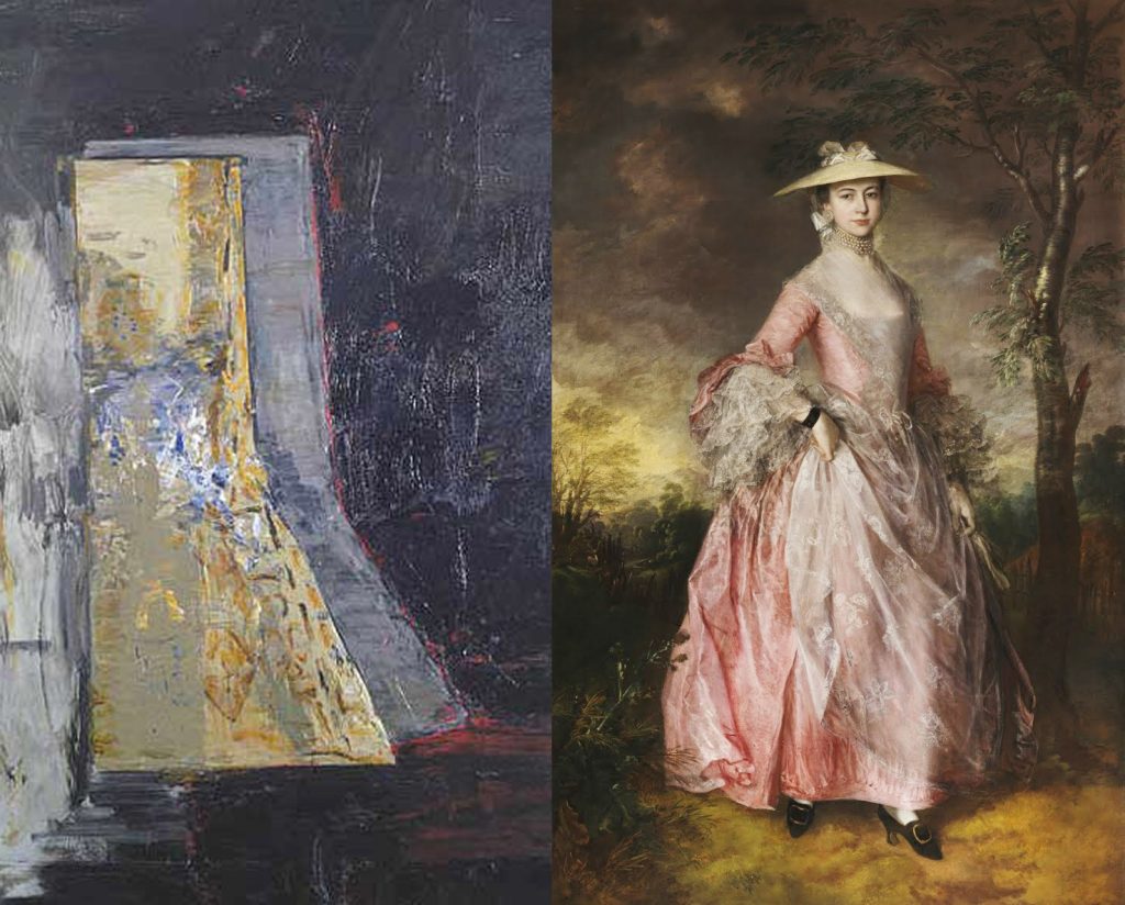
PJ In my paintings, there’s a sense of building towards a depicted space, and towards elements that have the weight and presence of a real thing, seen or remembered; but at the same time I’m working hard to avoid overloading the surface, or letting narrative come through. I was very interested in John Walker: I liked him as a man, very much. He was immensely influential on me when I was a student; but I had exactly the same reservations about the whole ‘Alba’ series. I would go in to look at them in the Knoedler Gallery in New York, really dying for them to work, and dying to be able to like them; but I would look at them and just think, well, these are weird…
MD What year was this?
PJ I’m pretty sure this would have been 1986…
MD He’d had the Hayward show in 1985, hadn’t he, which was a survey of the work he’d done since he’d stopped making huge canvas collages and devoted himself to the ‘Alba’ shape. And I think that these works, from the middle of that decade, point to the sense of exhaustion of a certain strain of abstraction; and to a sense of a ‘tipping point’ around then, or even perhaps earlier, with the 1980 Hayward Annual, which Hoyland curated, and which looks more and more like the point at which British abstraction of ‘High Modernist’ pedigree stopped being the ‘master narrative’ of painting…I was looking at the ‘British Painting’ section in the Middlesex University Library recently, and they have all these Hayward Annual catalogues from the 1960s and 1970s, all with the same look: the Helvetica Bold font, the clean lines, the clean abstract paintings; such period pieces now. They look like they belong to a lost world.
PJ Yes, sadly, it’s all gone, all of it. In my imagination, I feel like I should have had a go at having a one-person show at the Hayward Gallery: but it’s not the same place at all now that it was then. I’d been very impressed by Frank Stella’s retrospective there back in 1970; I knew Andrew Dempsey, the Curator there, and I knew all the people who’d curated it, and that’s all gone, the sort of things they did. So, with Walker, whatever the merits of the work, I was impressed then, and am still impressed now, with the way he went about it: painters have got to follow his example, and isolate their area of interest and just get on with it; and strive in any way they can to become known, because there isn’t a big group to be part of, not anymore.
MD We’ve looked at a set of paintings that address certain concerns that recur, and you see that as a body of work; and there’s an older body of your work, which we haven’t looked at, because there aren’t any examples of it hanging here, but I’m aware of it from looking online; in it, you’re using shapes and tropes straight out of Miro, to give one example. You’ve used the term ‘quoting’; you said earlier that you’re quoting this artist or that. Now, you’re using quotation, much as Julian Schnabel or David Salle or Philip Taaffe or any number of ‘appropriation’ artists have used overt reference to other artists; and yet, from everything you’ve said, it’s clear your attitude to quotation is non-ironical. I’m keen to know what you intend by the use of a mark or a form that’s clearly borrowed.
PJ I’ve given this quite a lot of thought. If you were to come in here and interrupt me while I was painting, you’d understand my whole attitude is one of ‘Help, I’m in the shit’; it’s all going horribly wrong, and I need all the help I can get. My quoting Miro is an invocation, it’s like a Native American invoking, I don’t know, a bird spirit… it’s introducing something into the picture that is a friend, that is going to help me make the thing. There’s no ironical purpose; and indeed, everything that I know about Miro as an artist and as a person, I find admirable. I would have loved to have been that sort of person, and to have straddled two generations, and to have combined surrealism and formalism as he did. I invoke him, in the hope of channelling him into the work.
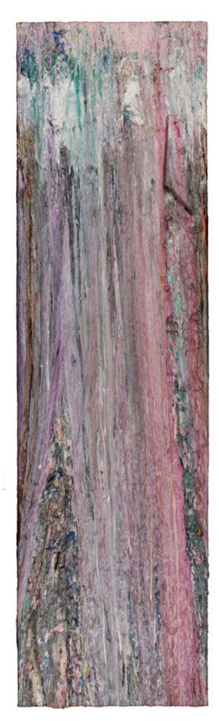
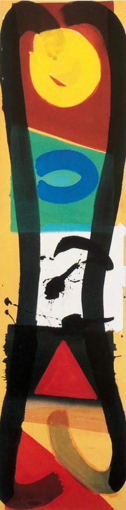
MD It’s a lovely idea, that you might have a guardian spirit coming to your aid in the making of the picture. It interests me that because of the way you paint now, you’re not really editing much, you’re not covering things up; so once these spirit guides have been introduced into the picture, they stay, you’ve committed to them; so the picture incorporates quotation into its structure. I’m thinking here of your vertical pictures that remind me of stacked totems, of modernist forms out of Miro, or there’s a gestural black splatter out of Pollock …
PJ Absolutely.
MD But presumably always with the intention that these spirits are going to be subsumed into the picture? You’re not playing a postmodern game of ‘naming’.
PJ No, I’m not. With those series of tall pictures, I often split them in two, because they seemed to want to fall into two halves, literally a right and a left-
MD How early on do they do that? Is the first decision when making the picture to divide it up?
PJ You’ve got to start somewhere with a picture: and cutting it in two is one way to start, or into three… you’ve got to make decisions. What happens then within the painting is that it begins to have tension: it pulls in different directions. Hofmann shows me, quite emphatically, that you’ve got to keep that tension, you’ve got to feel it when you’re painting, it’s what will ultimately resolve the dilemma of the picture. It’s got to be there right up to the last minute; you don’t try to free yourself from it, you actually have to try constantly to aggravate it.
MD But the working methods you’re employing now, using very little overpainting, mean that once you’ve introduced one of these- hard to know what to call them, really- known forms, or given forms from the history of art, then they stay, they’re not digested by the painting process; they remain as clear, apprehendable forms that carry particular associations with them…
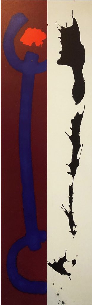
PJ They’re not just quotations, they’re an element of the painting’s drawing. Drawing has always been at the beginning of my paintings, an essential part of them. If anything, I’m a draughtsman rather than a colourist; I’d rather be a colourist, and build with colour, but I always feel that I want to draw the whole thing to begin with. Introducing linear forms into the thing- as far as I’m concerned, they don’t remain as quotations. The painting you’ve been talking about, it’s 12’ high, with 4’ of red bar, a red stain, opposite a half of bare canvas. I was about to put the black line on the red area, and I was walking towards the canvas with the black mixed and ready- and boom, it landed on the white instead. The painting is called ‘Duality’; the whole point of that group of paintings is that there were two things going on, and they contradicted each other…and that in the contradiction there was something exciting happening. That notion came from all the Dogon sculpture that I’d seen, with Tony Caro, at the Metropolitan Museum in New York. It was the first time I’d seen African art; there was a double figure, ‘The Eternal Couple’, a man and a woman, and they’re twins. It was all to do with the concept of twinning; they’re versions of the same person. It was stunning, that this one piece could say so much about the human condition, and yet remain so simple- a man, with his hand on a woman’s shoulder, and very perfunctorily made, for that matter. Anyway, I was trying to make paintings that had those sorts of internal relations; and with that, I actually felt as if I’d broken out of Formalism.
MD It reminds me of those early Pollocks, where he was very consciously invoking Jungian archetypes: the ‘Moon Woman’, the ‘Sorceress’ and so on. All of this that you’re describing, because you’re an abstract painter, you’re talking about sublimating all of this symbolic and psychological content into very simple abstract forms, some of which reference abstract art that has already been made, by Miro and Pollock. In all of this, then, I’m not sure what remains of Patrick Jones in the end product… it sounds like I’m being unduly harsh, I’m sorry.
PJ No, no, not at all.
MD In the written replies to the emailed questions I sent you before this visit, you wrote about your complete lack of cynicism. I can see that very clearly in the work. I’m interested in understanding how this lack of cynicism might operate- and again, I don’t mean this to sound harsh- as a block to self-criticism; meaning, that freedom from inhibiting scepticism and cynicism might come with a hefty price tag, in the sense that one might settle for something in painting that a more self-critical sensibility might identify as pastiche.
For example, I took Gary Wragg to task a while back4Matt Dennis on ‘Transformations’: Sculptures by Robin Greenwood, Paintings by Gary Wragg’, Instantloveland.com, May 2018 for showing works on paper that looked like isolated individual tropes of High Modernist abstraction, one to a sheet, pretty much; here’s a bit of brush-scribble, here’s some overlaid splattering lines, and so on. I couldn’t see what was being attempted, other than repeatedly stating the obvious.
I’m interested in how artists face this problem- or indeed don’t face it, turn away, run away from it- the problem of living in the ‘after times’, after all the pathways for painting have, seemingly, been explored. I’d like to ask you, in what way you believe originality, newness in painting is still possible? Or do you say to yourself, you know you’re moving in an ever-contracting spiral of ‘endgame’ painting, where all that’s left to do is make tiny movements in an endlessly-drawn out terminal phase? Do you dispute this state of affairs? Or do you acknowledge it, and live with it?
PJ I mentioned Samuel Beckett earlier, in relation to Guston; he, Beckett, could be seen as someone who moved beyond poetry, beyond theatre, into a grey imagined world of half-figures, an isolated mouth, saying next to nothing…what you’re describing has something of that bleakness, I think. I choose not to go there, however compelling the art-historical arguments for it might be. It’s very important for me that I remain optimistic, even to the point of naivety, perhaps; I honestly don’t know what the alternative might be. How does one put all one’s sophistication to good use? I try to be useful, through painting, and teaching painting…even if a lot of the people I try to teach think that abstraction began with what’s-his-name, the German, you know, with the squeegees…(laughter)
MD It’s interesting- I’d even say it’s refreshing- that you had to root around for the name there; because for pretty much anyone under the age of 50 with a serious interest in contemporary painting, Richter is the very first name they’d come up with, if asked; he is considered the painter par excellence; whatever you or I might feel, he is seen as defining where the limits of painting lie, by a huge number of people. His procedures, his attitude to painting, are seen by many as exemplary.
PJ Certainly by Nick Serota, Director of Tate (who has been to one of my shows, by the way, so he at least knows I exist). Because of two things- his use of photography, and his being German (laughter) he, Richter, seems to slip effortlessly through a sort of mesh, strung up to catch the likes of me…
MD This mesh, presumably, is a net woven by art criticism to catch what Matthew Collings dubbed ‘authentic’5Collings, M, catalogue essay in ‘British Abstract Painting 2001’ Flowers Gallery, 2001 painters such as yourself trying to swim upstream, against the critical current?
PJ Yes, and it’s such a shame. I have to say, though, that I’m getting a lot more tolerant of artists that I didn’t quite understand first time round…
MD What do you make of Richter’s abstract paintings?
PJ I think that they’re interesting enough…not that I hadn’t already seen plenty of that at the Triangle Workshop, there everyone was doing that kind of thing, piling up the paint and then spreading it around; perhaps not with a large rubber blade though. The point with Richter, though, is that the painting is always tied onto something; a blurred photograph, something that he’s seen. It has another reason for being, other than the bare fact of its being; whether one looks at it, or looks through it, whether it’s beautiful or not, it’s always got some other reason for being hovering near.
MD He has actually made countless paintings without a photograph as their point of departure, which simply begin with pigment being laid on, and then moved around by large brushes, and custom-made squeegees. Whatever the methods, they begin as- you’d have to say- ‘pure painting’. What seems to distinguish his practice from what an artist like yourself is attempting is the mindset behind it. He’s someone who has talked over and over about the impossibility of painting, the absolutely played-out, exhausted state of the medium, and of abstraction in particular; and yet he still makes these things. Now, I’m very curious to know what a painter such as yourself- I know the label is crass, but if we continue to use ‘authentic’– what does an authentic painter such as yourself, whose approach to painting is non-ironical, make of all that?
I take the point that your idealism, in the political and social sense, feeds into an optimistic attitude in terms of the work. The fact remains, though, as Patrick Heron took frequent pains to emphasise, the core of a Modernist art practice was the instinct-driven search to find the places where it was still possible- and therefore necessary- for art to go. So, unless one is happy to become a sort of professional mimic in painting, to say ‘Oh, I do knock-off Pollocks and Miros, and I’m fine with that, it’s what I’m good at…’ and ignore all the ethical questions as to what the mission of an artist might be, and instead, remains true to the ethos of Modernism, that art must evolve, and seek out fresh territory- what happens when the recognition of that duty comes up against the apparent impossibility of finding anything new to do?
PJ Well, quite. How will I work out where the next thing- the new thing- will go? I haven’t got a clue, is the straight answer. I don’t see my quoting other painters in my paintings as a problem; I don’t think it rules out the possibility of making something new. But I know what you’re driving at, and I want to do my best to answer you…
MD Maybe, if I tell you what I think, that might help make the question clearer, more answerable? For my money, ‘Duality’, which we discussed earlier, which you told me was going to receive the black down one side- because each of the individual forms is so closely aligned to forms that feel like other artists’ signatures, such as that light red there, the scumbled area inside the colour field that makes me think of Gottlieb, or the vigorous splatter on the right-hand side, that puts me in mind of Pollock or Miro, because of all of that, it feels to me as if Patrick Jones isn’t really here, isn’t really in the painting. Whereas, this painting- ‘Flat Screen’, which I’ve only ever previously seen on a piece of digital video- I was delighted to discover when I walked in here earlier that it’s even better than I’d thought it was; and I had already thought that it was very, very good. I genuinely don’t think that I or anyone else has seen anything quite like it before; and so, it affirms, it functions as a little object lesson in how new things are still possible in painting, through the coming-together of new combinations. Not the forms themselves, necessarily, but through new and complex sets of relations between forms; which, I suppose, are in themselves new forms by default… ‘Duality’ has so relatively few clashes or juxtapositions going on, that it exists for me only as a set of recognisable emblems; but ‘Flat Screen’ has so much invention, and so many surprises, that it feels amazingly fresh. We were standing in front of ‘The Sublime’ earlier, and I threw you a hot potato- that you can do beautiful and gorgeous paintings like that in your sleep, almost; and it strikes me how ‘Flat Screen’ shares parts of its format with ‘The Sublime’, such as the use of a decorative framing device, but gives me the strong sense that you didn’t know what you were doing until you’d done it. The other paintings grouped with ‘The Sublime’– all of which I really do like very much- feel like they contain an achievable prettiness that you don’t struggle all that hard with; whereas I think ‘Flat Screen’ took you totally by surprise.
PJ It was a difficult painting at a difficult time in my life. I’d hate to have to relive the circumstances of its making; it wasn’t made at a comfortable time. I don’t think I or anyone else should be afraid of doing as beautiful a painting as one possibly could; and in fact, ‘Flat Screen’ was singled out by André Fautaux, the Canadian sculptor, as the best painting I’d ever done, in his opinion. Because of the way it looks, it isn’t at all apparent how much trouble it actually gave me…there’s also a sweetness, that I am very much aware of; it’s a Colourfield painting. We talked about John McLean, and he was a huge supporter of what I was trying to do…I was aware, too, of what he was after, through the use of very simple shapes. This is a different kind of thing: it has quite a lot of ingredients in it.
MD You could say that having a lot of ingredients is good, in that it increases the likelihood of unexpected collisions or overlaps; when Robin Greenwood talks about ‘abstract content’ he often bangs the drum about the need for the ‘re-complication’ of abstraction. In a way, all the good things that are happening in ‘Flat Screen’ seem to bear out Robin’s view: it really does seem to be a matter of being prepared to try a huge number of things on for size, rather than fall back on an autographic mark that feels as if…how to explain it? As if it can’t be prised out of Pollock’s hands and used with conviction by anyone else.
PJ One might argue, that the longer-format paintings of mine we’ve viewed, that I’m not so happy with, probably do allude to landscape painting; and in that sense, they ought to fail.
MD Yes, but there’s a whole category of great paintings that come under the heading of ‘It shouldn’t work, but it does.’ Maybe that’s true, in fact, of all great paintings? They have to defy conventional ideas of what makes for ‘success’ in painting, in order to achieve the sense of freshness that all great art shares…
‘Flat Screen’ interests me because in it there’s a great deal of the sort of overpainting that you’ve gone on the record as being so uncomfortable with…you’ve got right away from the unsullied, pristine canvas here. How do you feel about this one- ‘Mirage’?
PJ I think it’s problematic; It’s overpainted…and what it’ll be like in the fullness of time, I couldn’t tell you. I’m 70 now; I’ve been painting for more than 50 years. One does develop a lot of knowledge over that span of time; but what do you do with that knowledge, so that it doesn’t curdle into an all-knowing cynicism? Heron, towards the end of his life, became dreadfully cynical about his life and about life in general; but happily, not about his painting, which stayed fresh. There are some fucking awful artists around Devon who base their sense of their own importance on how much they know…
MD You’ve talked a lot about keeping the freshness in the work; and the paintings upstairs, especially, read like object lessons in not allowing an image to clog up. Something like ‘Mirage’ where there’s a great deal of texture and overlay, seems to be inviting in all those problems you’ve done your best to avoid?
I think ‘Mirage’ is unresolved; I love parts of it- having those glowing pink tones there; but then this central lower section seems to fall away, and I’m not sure where it is exactly, within the space of the painting. Everything on the top layer seems much more firmly located, but the lower part feels generalised, and I’m not sure how it could be best resolved…
PJ I was aware of that while I was painting it.
MD I enjoy looking at work in which everything’s up for grabs, where nothing’s settled…and this is also tasteless, in a way, ‘Flat Screen’, which is a great joy to see. I haven’t used the word ‘taste’ yet today; and I certainly don’t intend it as a particularly vicious put-down, but in your more overtly beautiful paintings there’s a tastefulness there, I think, whereas in ‘Flat Screen’, if you look around it area by area, it’s not an ingratiating painting at all; the colour is quite shrill in places, and the paint application is cursory, slapdash even; and then you’ve got this constant recurring use of the dark blue line, which should, by rights, kill the whole thing stone dead; but it all feels absurdly alive, and freshly minted.
PJ What scared the shit out of me at the time was that I had an infection in my aorta where it had been repaired; and so my body was busily overheating something terrible…and I felt my painting had overheated too. It went so bad, that painting: I’d walk into the studio and just not believe what was going on. I was making things that I don’t think I could call paintings at all. I realised that painting is connected as much to the heart as to the head…
Painting- if it’s to be any good- must, despite one’s preoccupations with formalism, the shape, the colour and so on, be connected with something called life. The fact that it rained today; the fact that my fucking car’s been breaking down, and that I’ve had to leave the engine running while we were looking at the work in the farm studio, for fear that it wouldn’t start again if I turned the ignition off, and we’d be stranded; everything that’s happened today all feeds into the painting.
If I felt that what happens in the studio when I paint was only expressed in its own heirarchical language, entirely unconcerned with the day-to-day shit, it wouldn’t be of any use whatsoever. There has to be some sort of connection.
Comments are closed.