Emyr Williams in conversation with John McLean: The Last Interview
When I was first asked to conduct an interview with John McLean, I liked the idea of it, but had some reservations, as I knew how immobile he was becoming and how much of a struggle he found speaking. He could only whisper, and was being fed through a tube. In spite of this, he was going into the studio every week to paint and I really didn’t want to upset his routine. I knew I could ask him, though – John was fantastically generous with his time. We coordinated things through his wife Jan and picked a suitable day. I went with my wife Caterina and our two youngest kids – John loved to see the children and used to buy them funny little gifts. Jan, Caterina and the kids went out for lunch and left John and myself to do the interview.
I know John’s work well, and we discussed so much over thirty years (most of it unprintable – he could be hilariously critical of abstract painting at times). Essentially John had a flair for colour, and, if needed, a really deft touch: if a painter doesn’t have these, it shows. In this shared sensibility we formed a camaraderie. His circle of painting friends, many of whom knew him longer than me, also reinforce this view of him.
He never courted fame, yet should have had a much higher profile than he did. He was just beginning to be collected in a really significant way in China. The climate for advanced abstract painting is so airless and stultifying in this country; it has to have a twist or be narrative-friendly, it seems. John just got on with it, made his work and stuck the proverbial two fingers up to ‘the scene’. Thankfully, enough people and galleries did exist with discernment and support for his work. His shows were always a real highlight for me, and early on, they also provided me with a source of much-needed income, as he would pay me to make the stretchers he required and stretch his canvases too – usually over the course of a week. A fun memory was being introduced to the delights of a pastel de nata in a local Portuguese café in Stockwell.
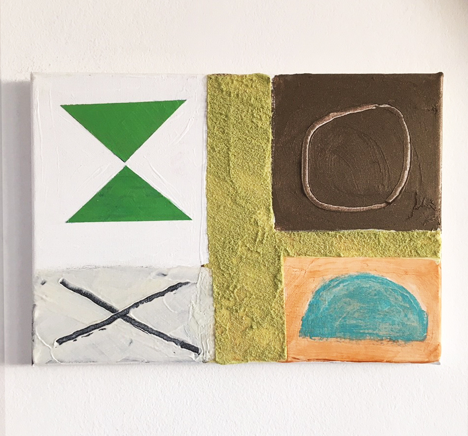
John is sitting in a recliner chair in the corner of his Barbican flat. He is unfailingly cheerful, and points to a few small canvasses on the walls dominated by a fresh light green, with a sandy facture and some simple scratched shapes, circles and triangles. They’re set into zones and areas. I nod, pick one up, say ‘this one’. John ponders it and nods. I chat about his Christmas card: a black and white linocut with an unusual shaped design. I had taken the liberty of scanning it, colourising it, and emailing it back. He really liked this, and we had flirted with the idea of doing more. When I showed him how the colour could be changed on screen, he was intrigued and it offered him possibilities to make his own changes to colour. A small, fun, side project was how we saw it. I cannot conceive of any other artist I know accepting my response. John was so devoid of any pretentiousness or ego. This cannot be stated loudly enough – it’s vital to understanding his work.
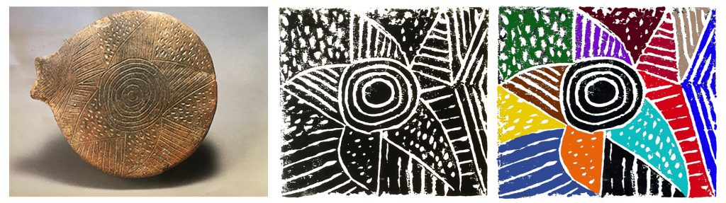
He motions me to get his scrapbook out and we look through it; there on one of the pages is an ancient stone carving with the same design. The book is a wonderful aide-memoire of cuttings, photos, funny postcards of paintings, cartoons even (his father Talbert worked as an illustrator and cartoonist as well as a painter). John would often make funny little cartoons and send them out to people. He’d framed one I sent him back, of him sitting on his new toilet which lit up –I’d added musical notes coming out, commenting too on the ‘correct foreshortened positioning’ of the knees. That was John: always able to find something significant and even encouraging in the slightest of gestures, to make you smile.
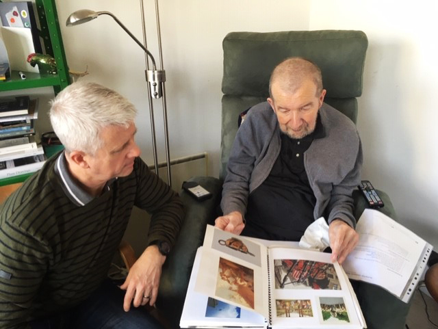
I show him the iPad and run through the idea of recording things. He thinks it’s a good one and we get started.
This was how it was done:
I had written out a series of questions, and also jotted down, from his own comments, a series of abbreviated model answers which I felt were the sort of things he might say. I had bought an iPad for the occasion, with these phrases typed up on screen. John could use the pencil to type, and he practised this effectively- it was tiring, though, and he preferred to nod, or edit and tweak the answers orally. His voice was reduced to a whisper but his brain was razor-sharp. He still had that twinkle in his eye and he laughed by pursing his mouth and narrowing his eyes.
I am conscious that the text will not flow as a fully voluble conversation would; but this was the situation we have to contend with, and this is the best I can come up with. We look at stuff online too. He says a lot about paintings by raising an eyebrow, pursing his lips, smiling, nodding, whispering ‘good’ or the odd ‘shite’.
John is on the record as saying so much about his work; and it’s also pretty evident from his actual paintings what he was about as an artist. As he had said, ‘I hope my paintings speak for themselves’.
We had planned to do two sessions, and I went into the studio a few weeks later to see what he had been up to. I had a series of questions about these works and his thoughts about them, how he was adapting to his immobility. Unfortunately, this second interview session never materialized, as John’s health had deteriorated, and I finally received the news that he had passed away. I have still not come to terms with it really.
At the end of this first and only interview, there is a postscript in which I write about his latest work. It held so many fascinating developments and was, I felt, laced with a certain heartbreaking quality too.
Emyr Williams in conversation with John McLean
EW: When we first met, you were living in New York. You were back in London and Mali Morris brought you to my degree show. I remember you bought me a drink in the pub afterwards and said to me ‘you look like the kind of man who’d like a whisky’, and we became friends after that. I really liked ‘Opening’, the painting you had in the Tate, done with the squeegees, and such lovely open colour and subtle surface nuance. It inspired me as a student and helped me to approach the colour work of Morris Louis, but in a more personal way – getting more variety out of the handling of the paint, which I enjoy doing. Louis’s work was such a touchstone for me.
JM: That painting was up for a week recently for my birthday. It was badly lit. I first saw Louis’s work in London in the early 1960s; and Noland’s. Their directness opened up things for me. It took a while for me to fully assimilate it and to get rid of unnecessary intricacy in my own work. Also, later, seeing Sam Gilliam’s wet-into-wet painting, and working as loosely as that helped me more to come to terms with the directness and scale of Louis and Noland, also Pollock of course. You were a pup back then. The work blew my socks off.
EW: Would it be fair to say at the time we met, in the late 1980s, your work was more North American in its sensibilities? I know you’d been to Emma Lake Workshop in Western Canada on a number of occasions and become great friends with Bob Christie, Bill Perehudoff, and landscape painter Greg Hardy. I went in there in 1991, not long out of Uni. You had put a word in for me, I’m sure, as it was on your suggestion I went. Kenneth Noland was a visiting artist there. He had an astonishing eye. I remember also being amazed by the set-up some of the artists had -their studio sizes, their use of materials (making their own gels for example). Bill was such a generous man too. He gave me a lot of his paints to use as I didn’t have much money. His daughters Cathy and Beccy – both fine painters – bought small paintings off me to help me on my travels. You and Bill were great friends.
JM: I’m not sure if I put a word in – I think I might have done (he winks). I met Bill and his wife, the landscape painter Dorothy Knowles, at a party given by Tim Scott in 1980. Bill’s work enthused me as much as Jack Bush’s, which I first saw in 1964. I’d first gone over to Emma Lake as guest artist in 1981. Bill and Dorothy bought a painting from me in 1983 when we were in Saskatoon. They had heard Jan was taking other people’s washing in for ironing. They guessed we were hard up. Bill’s paintings are an inspiration to me. He had an amazing eye for colour.
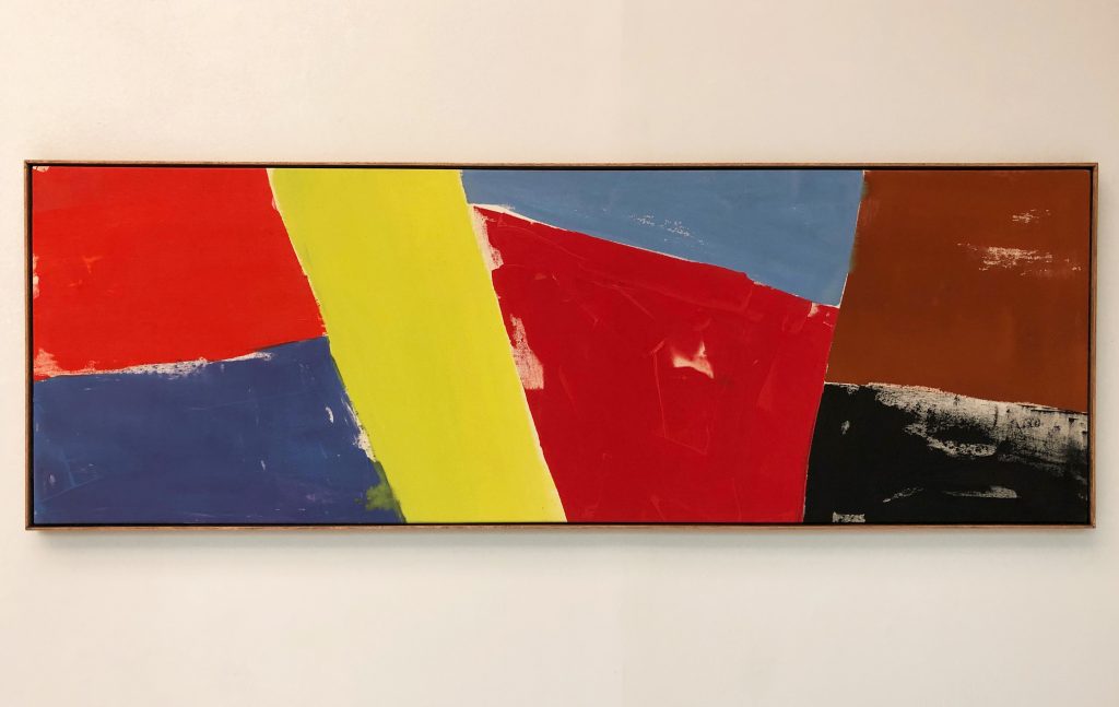
EW: Bill’s work was so beautifully tuned. As you know, I visited his and Dorothy’s studios after Emma Lake with the painter Gerry Faulder and was blown away by the whole place, that each of them had a barn for a studio and another for storage. Noland had been there the week before, after leaving the workshop, and had cropped a lot of Bill’s paintings at the top edge to take away the ‘float’ (Most of Bill’s paintings were two-metre-plus squares, and had blocks of colour surrounded by large, atmospheric washes.) Bill was living with them to see if he agreed with Noland’s decisions. I have always felt Bill’s colour was Russian in sensibility; yours deals with the issue of facture in a more expressive way for me. You connect the surface with the colour at every moment of the painting. I caught a glimpse, when I came in today, of the Edinburgh Fine Art show leaflet – that painting ‘Blue Berry’ is startling in its colour and touch – that’s what I mean I suppose. I don’t think anyone else could have painted that.
JM: Thank you. The way paint goes on is dictated by how the painting is going. I enjoy the inference of movement in painting too.
EW: The precedent of Jack Bush is evident in your figure-ground approaches in the late 1980s, which have a greater involvement with touch as a determining factor on the weight of colour as well. You’d set them up with a soft ground and then stain in an atmospheric darker hue which was full of incident to create an exposed, glowing zone, then onto that add bars of colour in direct weighted strokes, often with higher-keyed hues jostling with softer tertiaries and earths to connect back to the ground colour. I often notice a clever twist, with some bars of colour reading as breaks – a positive working as a negative, so to speak. How did Canada affect your colour?
JM: The light in Western Canada is as bright as anywhere on earth. Our light is more subtle, so colours tend to relate tonally. My colour often had a close tonality to it in the 1980s, but I moved away from that as the decade went on.
EW: We met in New York in 1992 at the time of the of the Matisse retrospective and you kindly organised for me to meet Greenberg at his apartment (which was memorable). After that show, and when you had returned to London, I thought your work was also moving its centre of gravity back to Europe. Matisse of course, but also Miró whose opening-out of the painting’s space seemed so significant. I remember cat-sitting for you when you and Jan went to see the centenary show in Barcelona the following year. You also gave me the use of your studio. We used to play table tennis in your dining room, which also doubled up as a studio. You’ve been so supportive and generous, John – giving me work stretching your paintings for shows too when I was broke.
What was it about Miró that grabbed you?
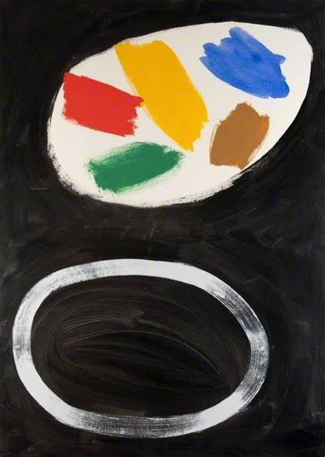
JM: By the early 1990s I was working in absolutely saturated hues. Plus, I saw that black was a colour which could energise the others. Miró and Goya also use black in such an expressive way. A couple of my preoccupations are: making the surface as rich as possible, and dramatising the space between things, as in Miró’s huge ‘Blue I’, ‘Blue II’ and ‘Blue III’ of 1961.
I now show John the following phrases, and he nods in agreement:
Pictorially dramatic use of black
relationship between shape and space
opening out of the space
directness of colour and the electricity of strident decision-making
an emphatic insouciance in the drawing
EW: You say ‘things’. I know that a lot of your softer, brushed paintings of the early 1980s were sometimes compared to the atmosphere of landscape: the vegetal colours of the heathers, the moors and mosses for example. Thinking of the ‘shapes’ in your later work, does it bother you if people see them as connecting with natural forms?
JM: I have no issue with their having overtones of forms in nature and would even rejoice in that, but any shapes in my paintings are there for the painting’s needs – they gain their strength and meaning through their configuration, the way they connect with the spaces, the edges and the corners.
EW: How do you start a painting?
JM: You have an idea but it’s inchoate.
EM: I have a strategy rather than a definite plan.
JM: You have to be on the lookout. You must be ready for a surprise.
John beckons me closer and whispers this:
From the crypt of St James’s in St. Gilles
Came a shriek that resounded for miles
Said a vicar ‘Good gracious, Father Ignatius
I’ve forgotten the Bishop’s got piles.
EW: (Laughs out loud) I think that’s the perfect ending!
Postscript
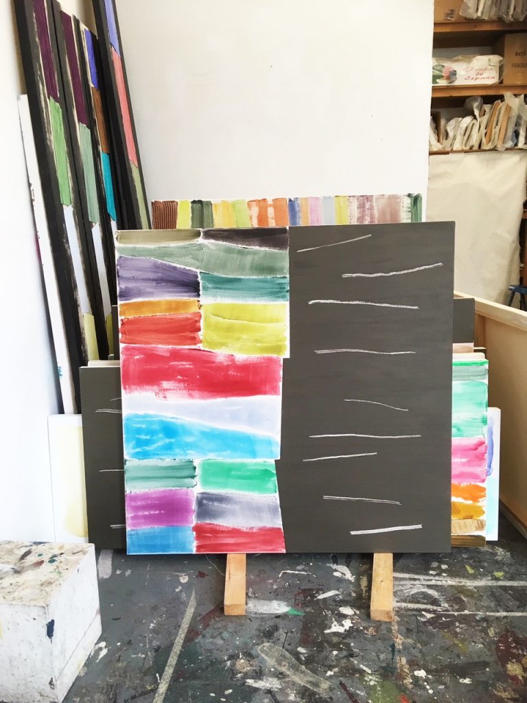
I’m at APT one Thursday morning a month or so later. Shiba, APT artist and John’s acting studio assistant, lets me in and we discuss the visit. We agree half an hour is okay. John has a freshly primed canvas to hand with a few areas of laid-in colour in vertical strips with a staggered arrangement to them. Around the walls and in groups are stacked many more completed works. I immediately lapse into the familiar routine of rummaging and looking. I feel totally comfortable in John’s studio – more than any other artist’s I know of – and drag works out. John indicates which way up and we take them in.
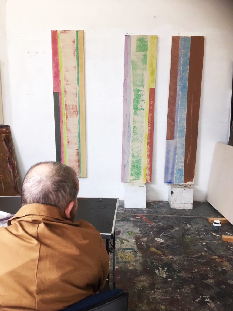
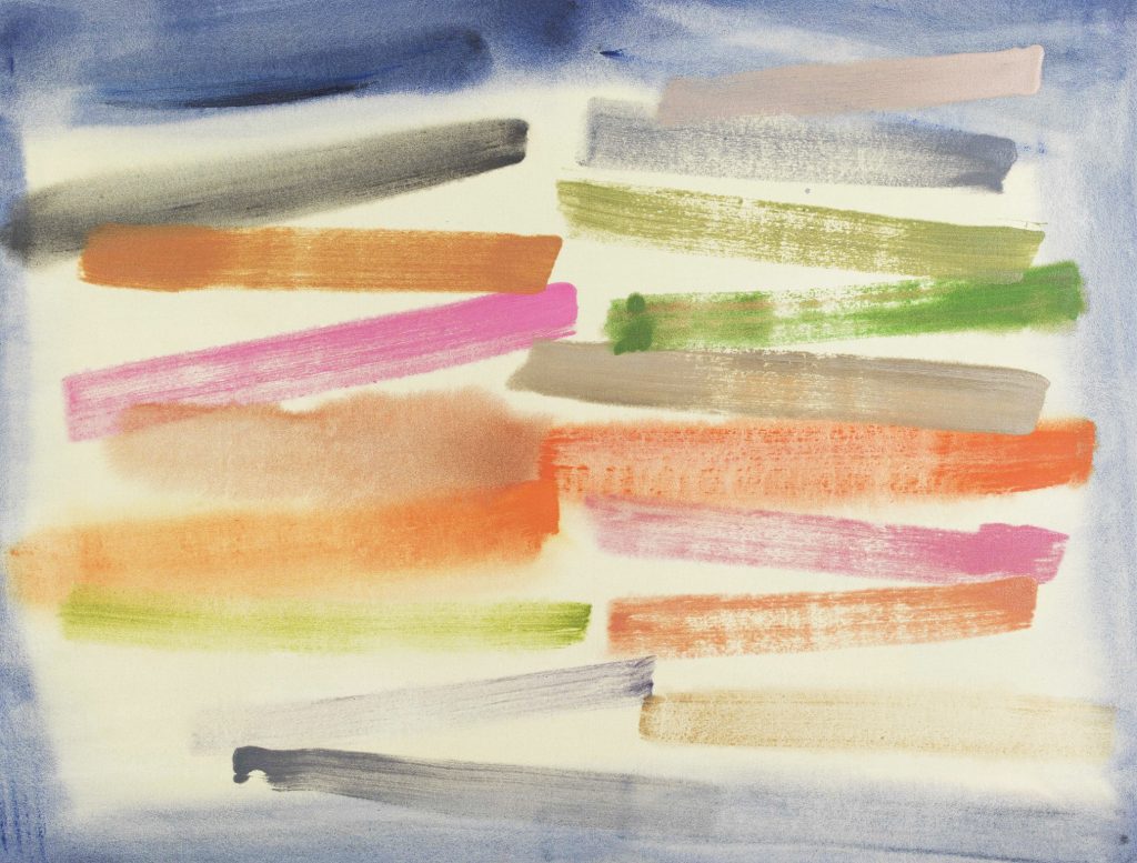
These new paintings are at once familiar and strange: many are split in half or thirds, with one or two areas having a series of loosely-smeared, almost phosphorescent colours, often leaning towards pastel hues. These colours are glazed, lucid and deftly applied. The paintings connect back to earlier work through their soft airiness and a similar lyrical, almost vegetal colouring; their surface is heavier though. Whereas once these colours would be stained with the brush in light touches, these are more spread-on, and suspended in a gel medium, which gives them a greater transparency and lustre. Against these jostling hues abuts a startlingly flat metallic pigment-infused area of ever-so-slightly shimmering charcoal grey (‘got some shit in that’ -JM), or a bronzed brown. The colour is taped in, with ledges or kinks which check the pace of the centre edge across the surface. John is in familiar territory here, and he uses these little kicks and kinks to set up mini spatial dramas in the jostling colour areas where these two worlds meet. It’s all about finding a surprise, something that knocks things out of the kilter of an almost-grasped visual logic, but ends up achieving a greater expressiveness through more unpredictable configurations of colour and drawing. Into these flat areas are introduced linear scrapes that echo the angles and contours of the pastel hues, adding an abrupt counterpoint. They should split the painting into separate units and break down any available wholeness; they don’t, the contrast creates unity.
I tell John how much I like them. We can’t really go through anything and I am conscious of the time. I kiss him on the head and leave. This is the last time I ever see John.
I’ve been thinking about his last works. Yes, there’s the overriding visual quality, but then I look again with the knowledge of the context in which those paintings were made. It’s a miracle they exist. John had mentioned Goya, and how much he enjoyed his work. Goya, for me, is the most human of artists. I have thought a lot about his work of late. It seems to be the end of the road for a painter – that’s it, it’s finally Goya, you ultimately get to Goya. I have an image of him at the end wandering the streets, tinnitus ringing in his ears, daubing mud on the walls whilst muttering ‘Nada, nada’.
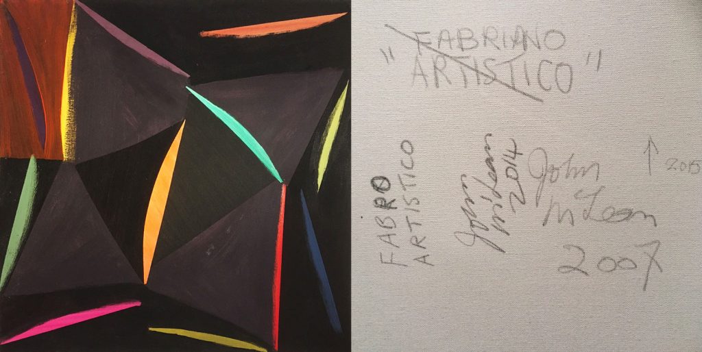
I’m looking at a card with John’s work on it. On one side, the colours are soft, tremulous: are they fading in or out of focus? The other side is an emphatic dark zone with an almost clanging finality to it. It positively slams itself at you. I’m taking in the scrapes, which simultaneously look feeble yet also strident. I know how his printmaking has informed his painting and vice versa, and the scrapes connect with his use of lines in his prints, linear elements which also create incomplete but nevertheless perceived ‘units’ with the dark colour — they are devoid of bravado and are completely certain of their place in the painting; no need to rework too much, just get it down, get it said, move on to the next. Those scrapes are like cries, utterances trapped within the darkness of the body colour, the sharp edges that contain them are like prison walls and the triumphant removal of their pristine surfaces jolts your sensibilities – marks which are so clearly scratched in much the same way as a key would a posh car.
Many a commentator uses the term ‘simple’ when describing John’s colour – as perhaps they would of Matisse’s cutouts; it’s meant as a sort of backhanded compliment, yet no artist worth their salt ever made a really ‘simple’ painting, or ever made a ‘playful’ work for that matter – it’s a complete myth, this sort of narrative. Everything should be fully charged, fully committed to; either you mean it or you don’t.
John used to use the word ‘funny’ to describe works that intrigued him. Taking that word at face value, though, there is nothing remotely funny about these last works; these really are ‘last works’. When you know your time is running out, what do you do? Do you turn away from it, accept your fate, go gently into that good night? Or do you daub your daubs, embrace your ‘nada’ and just get on with it? …the bravest artists do.
If you really want to get John’s work, I think something he used to say about his aspiration for a painting was very revealing: ‘Painting is like drumming’. Look again at his paintings, and see that shock of the colour, how it maximises the surface tension: ‘We break the waters’, he used to say. He was very reluctant to go on the record about this – I never knew why. I hope he doesn’t mind me quoting him now.
EW November 2019
‘Being John McLean’ is at Art Space Gallery from 29th November 2019- 24th January 2020
2 thoughts on “Emyr Williams in conversation with John McLean: The Last Interview”
Comments are closed.
Thank you, Emyr, for a most moving account. I hope Robin will put something on AbCrit as well. John and I were exceptionally close in the early 1990s, when he had his studio at the Oval. We lost touch after I moved to Devon, but he made a huge impact on my life with his humour and intelligence. His seriousness as an artist was easy to overlook, with his really funny stories. Somebody -like Tate Britain- needs to do a retrospective, so we can see all his work.
Thank you, Emyr, for your perceptive and sympathetic account of John, who sadly I only met once. I have seen his wonderful prints at Kip Gresham’s and his show at The Cut. But what you have written has told me so much more about him. Thank you.