Sam Cornish: ‘Equivalents to Life: Frank Bowling at Tate Britain’
With his essay, ‘Equivalents to Life: Frank Bowling at Tate Britain’ Sam Cornish joins Charley Peters on Instantloveland’s ‘Writer-in-Residence’ programme. Welcome aboard, Sam!
Sam Cornish is a writer and curator with an interest in abstract art, particularly the transatlantic High Modernism that arose in the 1960s in dialogue between Britain and North America. His book on Mali Morris has recently been published by the Royal Academy. He is co-editor of the catalogue raisonné of the paintings of John Hoyland.
Frank Bowling’s Tate retrospective is overdue and overwhelming. During the last decade or so I have seen Bowling’s paintings in a number of commercial galleries, as well as in his studio. Always impressive, now they have the space to fully open up. At last they can breathe! Without sacrificing intimacy, these are epic paintings. Grand, dramatic statements, they are filled with beautiful details. These details accumulate on, in, and through their surfaces, with each speck, whirl, splatter or drip of paint poised between the intentional and the arbitrary. At their best they are expansive and exhilarating.
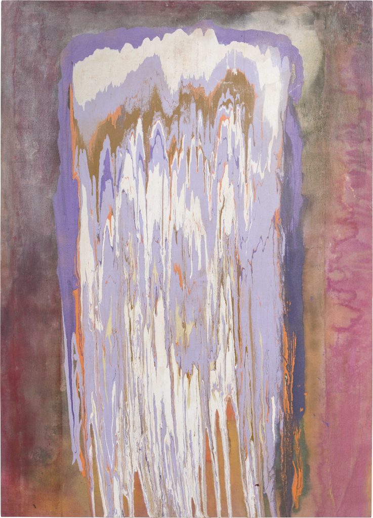
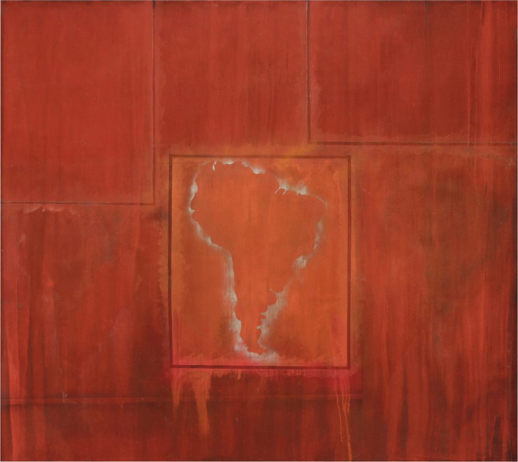
Bowling’s work sprung into life with his ‘Map Paintings’ of the late sixties and early seventies. Beyond their potential political meanings, they claim the world – more than this, the world dissolved in the infinities of deep space – as an arena in which the artist can act, as the territory over which painting can roam. The ‘Poured Paintings’ of the mid-seventies are tighter, more solid – although tightness and solidity are relative terms, and don’t do justice to the flowing light of ‘Kaieteurtoo’ (1975), the juddering intensity of ‘Tony’s Anvil’ (1975) or the muted glow of ‘Yonder’ (1976). The ‘Poured Paintings’ confront us as individual upright presences. Each stands in for a single person, painterly equivalents of sculptural monoliths. Painting as an equivalent to the universe; painting as an equivalent to the individual. How, Bowling seems to ask, does the individual stand in the universe; how is the universe contained in the individual?
Spending time with Bowling’s mature paintings, giving oneself over to them, is to be constantly and thrillingly pulled from the very small to the very large, and back again. Visual and material disintegration and reintegration circle around each other. With the partial exception of the ‘Poured Paintings’, fundamental to the work from the Map Paintings onwards is the visual drift found within the paintings of Helen Frankenthaler or Jules Olitski, that represented a loosening of the all-over energy of Jackson Pollock. Olitski, along with Morris Louis and Larry Poons, is perhaps the most important influence on Bowling’s mature art, although Bowling is alive to possibilities outside this particular trajectory in post-war American art. For example, it is striking how far an early engagement with Francis Bacon is sustained. As recently as 2006,the staging, dark background and turbulent, glowing forms of ‘Benjamin’s Mess (Hot Hands)’ shows this influence. Bowling is a much more direct painter than Bacon, able to confront emotions, even deeply troubling ones, and render them in paint, where Bacon often seems to fall into illustration, or the theatrical.
As an exhibition format the retrospective is especially appropriate for Bowling because of the extraordinary way he insists on painting as an equivalent to life, as something able to contain the whole breadth of life, or even the medium through which life can be lived at its most intense. The photographic images of his earlier work signal this co-existence, as does the detritus that gathers on the later paintings. His paintings’ sometimes cryptic titles often recall significant people from his own life, sometimes his collaborators. Crucially, the co-existence of art and life is made palpable – turned into a felt reality – by the rhythms of the paintings themselves, as they open and close, coalesce and fragment, shift from light to dark and dark to light. These rhythms are present within individual paintings and from painting to painting. Exploring a single work and moving through the exhibition as a whole are equally kaleidoscopic experiences within which structures shift, forming and re-forming.
The idea that paintings breathe, obviously somewhat an easy cliché, here becomes a much more acute metaphor. We could also see the paintings’ rhythms as tidal, from the ‘Map Paintings’ to the ‘Great Thames Series’ of the late eighties. From the surge of blood in the body to the surge of the tides, again we see Bowling’s concern for shifting from the micro to the macro, from the macro to the micro. Yet translating Bowling’s images so directly into words robs them of much of their power, which must lie in their resistance to language, their ability to figure states real but un-nameable. Intensely alive, as the exhibition’s subtitle puts it, to the possibilities of paint, Bowling is able to imbue the materiality of paint with meaning we cannot find elsewhere, that we can recognise but not otherwise articulate.
Bowling’s sense of painting as capacious is well served by the cumulative effect of the beautifully arranged exhibition. The height of ‘Mirror’ in room two prepares us for the huge size and scale of the ‘Map Paintings’ in room three. The near-sculptural energy of some of the ‘Poured Paintings’ is succeeded by a room of softer, calmer works, a sequence subtly repeated as the laden and brooding surfaces of paintings such as ‘Spread Out Ron Kitaj’ (1984-86) or ‘Wintergreens’ (1986) are followed by the pale luminosity of the ‘Great Thames Series’ (1988-89). Each painting within the exhibition is overlain with the memory of those that preceded it, so we are conscious at some level at least of a continuity, or otherwise of a change of mode or feeling. The exhibition opens with a group of images of a dying swan, made in the early sixties. Combining a desire for liberation with tragedy and a sense of the absurd, the way the swans’ unfurling wings blur and slice through space resurfaces, in abstract guise, through much of the work that follows.
Perhaps the only disappointment in the arrangement is how the exhibition ends. In the final room, containing paintings from 2011 to 2018, there is a heightened sense of experiment. The variety of approaches Bowling habitually uses becomes clear in a way that it had not been before. Not all of these paintings achieve the emotional heft and weighty coherence present in his earlier work. Yet despite- or because of? -Bowling’s physical frailty, they have, as a group, a new kind of nimbleness – particularly the wonderfully fresh ‘Iona Miriam’s Christmas Visit to & From Brighton’ (2017). Now somewhat removed from the physical act of painting, at times directing from a distance, is Bowling more attuned, or at least differently sensitive, to the forking paths down which an image can venture? The recent Tate Britain retrospective of his Royal College of Art contemporary, David Hockney, was pretty much downhill from the mid-seventies, with the last few rooms dragging on, bright but meretricious. By contrast, Bowling’s most recent work may have benefitted from being given the chance to be explored in greater depth, and from being spread out over an extra room or two, showing more clearly the diversity a single room can only hint at. It could also be questioned why none of the recent paintings shown at Tate Britain display the partial return to figurative imagery, whether found, or derived from his own screenprints left over from the sixties, that has marked his last two exhibitions at Hales Gallery. How might have their inclusion have changed our sense of the arc of Bowling’s painting?
The ‘Map Paintings’ must be the crux of discussion of Bowling’s art in relation to issues of identity, at least in a political or public sense. It seems to me that they, and the related works that include screen-printed images of Bowling’s family, are about staking a claim, saying in some fundamental way: ‘I am here’. They seem to assert that as a black artist he has a right to the universality promised by abstract art – a universality otherwise almost always assumed by white artists. This statement – carried by such confident, ambitious paintings – is certainly hugely significant, and given current worldwide debates around racial and national identity, you can see why the ‘Map Paintings’ have recently been so lauded. Yet, I think it is worth asking whether Bowling’s titles and his screen-printed images can say anything specific about slavery, colonialism, or, as is claimed by the exhibition caption in relation to ‘Polish Rebecca’ (1971), the Holocaust? Jonathan Jones in The Guardian seems to me to be carried away by the works’ titles on a wave of false feeling that has little to do with genuine engagement with the paintings. But even more genuine and thoughtful commentators than Jones are running a great risk of over-interpreting the work.
Instead of being carriers of specific translatable content, don’t the ‘Map Paintings’ ultimately show how irreconcilable the means of High Modernist abstraction are with specific historical, political or social commentary? Images and titles float through glorious expanses of colour without really making contact with them. Perhaps it is not recognised enough that the richness and beauty of abstract art, even one as wide-ranging, dense and deeply felt as Bowling’s, necessarily entail a kind of loss. Discussion of the ‘Map Paintings’ should admit their power, but also their brevity within the trajectory of Bowling’s art, preceded as they were by the cryptic Pop riddles of his sixties painting and then followed by his move into a purer type of abstract painting that he has now explored for forty years. The Pop-type paintings of the sixties, with their discordant levels of meaning, and their discordant feeling, treat representation as a conundrum. From the early seventies, the abstract pictures reduce representation to its most oblique forms – titles, studio detritus – and allow colour, formal experimentation and feeling full reign.
There is much work to be done on fully situating Bowling in relation to the transatlantic ecosystem of High Modernist painting and sculpture, operating chiefly between American, British and Canadian artists in the sixties, seventies and beyond. Some of these artists have been extensively lauded, many have not, others were briefly successful before falling out of fashion. The backbone of Bowling’s mature painting was formed in dialogue – comradeship, competition – with British artists including Anthony Caro, Peter Hide, Alan Gouk, Tim Scott, John McLean and John Hoyland, or Americans such as Olitski, Frankenthaler, Jack Whitten, Peter Bradley, Sam Gilliam, Michael Steiner, Walter Darby Bannard, Susan Roth, and Larry Poons (many names could be added to either list). Of course, this dialogue is by no means the whole story of Bowling’s art, but it must be a substantial part of it. How great would it be to see Bowling in an exhibition which fully told the story of these interactions, which once occupied a central position in the British and American art-worlds, and which are now so neglected. Seeing this context is essential to understanding the formal story of Bowling’s work, allowing us to judge the extent to which he continued or broke with the example of his peers.
There are many specific questions that could be asked. To pick just one topic: how does Bowling’s technique of collaging canvases sit in relation to the cropping practiced by many High Modernist painters from Jackson Pollock onwards? Cropping – the finding of an image at the end of the painting process by cutting the canvas, or wrapping it round a stretcher – often seems to involve a judgment that is both communal and exclusive. It opened up painting to discussion beyond the decisions of the artist, but brought with it other questions concerning authority. If the artist alone doesn’t decide the limits of their painting, then who does, and how is a hierarchy of decision-making established? Clement Greenberg is important here, but a Canadian artist once told me the story of a workshop discussion in which Kenneth Noland suggesting cropping a large painting by a lesser-known artist down to the thinnest vertical sliver, only a couple of inches wide. In comparison to this example, Bowling’s collaging of canvases is positive and generous. It is also more directly physical. How might Bowling come over in direct comparison to Olitski or Poons, or perhaps in relation to the collaged canvases of Susan Roth? We might also ask to what extent the physicality of Bowling’s collaged canvases was arrived at via an engagement with modernist sculpture, an especially important aspect of the British contribution to this transatlantic story.
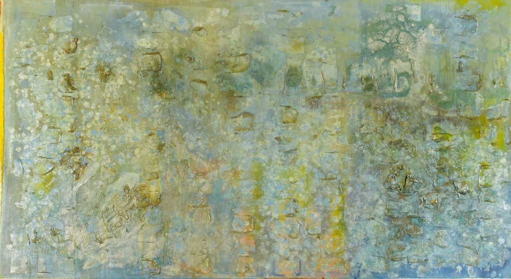
Judging from the current display, Bowling’s greatest period was the mid-eighties, with paintings such as ‘Spreadout Ron Kitaj’ (1984-86); ‘Silver Birch (No Man, No Vote)’ (1985); ‘Wintergreens’ (1986); ‘Philoctetes Bow’ (1987). In these works, Bowling reconciled the spreading expanses of the ‘Map Paintings’ with the sculptural physicality of the ‘Poured Paintings’. Each is covered in heavy acrylic gel, a material employed by many High Modernist painters during the eighties. Gel acts to anchor these paintings, giving them a kind of gravity. But as well as weighing the pictures down, gel is the medium through which light enters the pictures, holding colour in thickly physical suspension, and creating a variety of surfaces off which the gallery lights reflect. The power of the paintings comes from how their literal weight carries colour that is both strongly marshalled and strangely diffuse. The gel also creates a depth within which Bowling could embed a diverse range of materials. Most of these encourage the viewer to move closer to the surface of the picture, although long strips of material (I think some kind of packaging) are employed as a substantial part of the pictures’ overall architecture. These strips discipline the lateral movement across the surface of the picture, so what might have appeared chaotic or mercurial, instead – or perhaps rather, also – contains proportion, order, finality. In ‘Spread out Ron Kitaj’ and ‘Philoctetes’ Bow’ the strips also act to centralise the image, so that almost panoramic pictures appear concentrated, directed at the viewer. Across the group the mood is somber, meditative but without becoming portentous, the paintings glimmering as if their gloomy depths might soon burst into flame.
In Bowling’s art the light of the world permeates paint’s hue and stuff. This light, whether emanating from the Guyana of his boyhood, the shimmer of the Thames, or elsewhere, animates his paintings. As we move through the exhibition Bowling seems to be telling us – or rather demonstrating again and again – that our journey through life is one that always takes place in light. Even things that we feel in the depths of our bellies can appear rendered in light and colour. And that something this constant – nothing could be more literally everyday – can also be a medium of transportation, of revelation.
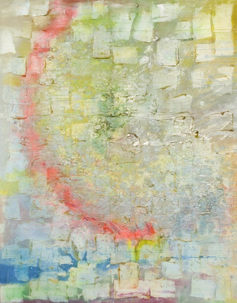
Installation view of ‘Frank Bowling at Tate Britain’ 2019
Installation view of ‘Frank Bowling at Tate Britain’ 2019
Frank Bowling, 2019
Frank Bowling, ‘Cover Girl’ (1966), acrylic, oil and silkscreen ink on canvas, 144.8 x 101.6cm
Frank Bowling, ‘Sacha Jason Guyana Dreams’ (1989), acrylic and resin on canvas, 178 x 136cm
Frank Bowling, ‘Barticaborn I’ (1967), acrylic, spray paint and oil wax on canvas, 234 x 122.4cm
9 thoughts on “Sam Cornish: ‘Equivalents to Life: Frank Bowling at Tate Britain’”
Comments are closed.
Frank is a lovely guy and this show far too late in his career. However, I found many of the works over- cooked and some too damn sweet. This blanket awe from Instantloveland and Sam is against the edgy quality of much of Frank’s practice.There were good ones and not so good ones, and this doesn’t lessen Frank’s achievement at all. The Krasner show was equal in its variance: I personally preferred upstairs, from the year Pollock died, and the collages with linen. Both shows, which were very good, need critical discussion of a serious level. Which is what Instantloveland is for. I Look forward to seeing the Hales gallery show of recent work and going back to the Tate Britain. Looking at Painting is very testing, it’s great to see it in the Tate, but let’s debate!
Hi Patrick. Obviously I was impressed by the exhibition and my review reflects my enthusiasm. Unlike the Krasner, I felt it developed as it progressed, with the partial exception of the last room, as I discussed. I like your comment about the edgy quality of Frank’s work – I suppose I could have gone into which particular works were relatively unsuccessful, but – unlike the Krasner – I did not feel that there was an early moment of promise which failed to materialise. Although I agree determining quality or even stating preference – too sweet, overcooked – is important, I don’t think it is the end of road as far as criticism is concerned. I hope I’ve opened up the works in other ways.
Which paintings did you think too sweet or overcooked? Or at least what periods are you mainly talking about?
The Hales show is finished btw…
Dear Sam, I think from the very first room, I was aware of how consummate an artist Frank is, from the figures on the circular staircase, with their golds and reds. However, the paintings I enjoyed most were the most iffy, like the ones with foam bars attached, even darker blue bars on a pink or violet background. This is based on a lot of personal experience of Poons and Olitski in the US, who I am sure we were both influenced by, living over there. I personally had to reject the process of continuous layering (shown in the Forge Hayward Annual in 74) as acrylic rapidly loses its energy, and its excitement, with overpainting and overwork. My point is that the reason it’s taken so long for this show to get to the Tate is less to do with ethnicity, and more to do with how uncomfortable English curators are with the subjective nature of Abstraction. All of a sudden, they are finding very good English Abstract Painters like Frank and John McLean, who have been there all along. Greenberg may have been about taste,but you had to stand by your feelings, right or wrong. The English have always been shy of having to risk their reputation on subjective judgements. This is Frank’s strength, even when he gets it wrong, he chances his arm. I’ll come back up for another look, and get some titles and dates. A great show.
Worth reading David Evison’s review for a different position to mine, although perhaps close to Patrick’s http://www.pirihalasz.com/blog/posts/34368
Thank you Sam. I felt that it seemed to be just sour grapes that it wasn’t me getting the star treatment. Instead, I’d agree with Evison that somehow the curators have given us a post-modern blockbuster, whereas Frank’s smaller and more tender works gave me the authenticity I was looking for. Many of the works are too big….I actually liked the styrofoam strip paintings as a bit more risky …I’m coming back for several more looks…Frank is worth the trouble and scrutiny, and as somebody said, ‘we won’t get fooled again’. I don’t want his birthright squandered.
For the record, my criticism isn’t of Frank’s work. It’s of Tate Britain’s Post-Modern hanging by the two curators. After years of neglect, it would have been nice to see the delicate, more private concerns of such a talented artist. I agreed with David Evison only as regards the slightest whiff of grandiloquence, which I didn’t recognise from Frank’s character, but which seemed essential to the Tate, to justify their interest.
I promise this is my very last remark, regarding who was looking at what, and when. I’ve spoken to Alan Gouk, who was in New York shortly before me, in 1972. He was with David Evison, John Mclean and Jenny Durrant, meeting Clement Greenberg at Ken Noland’s studio. I came from Birmingham Art school, where everyone was using tons of paint, Poons being my spur. Derek Southall took me to meet Jules Olitski in the Carolinas in 73/4. Olitski was both mercurial and marginal. Being Russian and slightly older, he wasn’t central for me, or the Stockwell group mentioned above. I came via being taught by Irvin and Beattie at Exeter, and Andrew Forge’s introduction to Grace Hartigan in Baltimore. This was a direct link to the Abstract Expressionists, not the Colour field Painters. Even though I had my first show in Washington D.C.in 73, I missed Morris Louis entirely, who lived there. This was to do with whom you knew ,rather than what. I didn’t meet Mclean until 1976, when he threw a stick at Tim Hilton in the Serpentine Gallery, which missed and hit me. So Frank’s influences must have come via a different route, although Greenberg was touting Olitski as the most important abstract painter of the day.
Thank you Sam Cornish. I very much enjoyed your review along with the commentary by Patrick Jones. I was particularly taken with Frank Bowling’s splitting of colour fields revealing raw canvas between colour blocks rather than the colours butting up against one another as in Mondrian whose work he closely studied. I connected this with ‘Who’s Afraid of Barney Newman’ and thought about the split between left and right brain, between the rational and emotional and Frank’s continual exploration of how he personally, and how the painting itself, might be structured to allow for both. This is beautifully captured in what I think of as the half-and-half paintings such as ‘Cover Girl’ with its description of the present topped by the headiness of memory and ancestry. I then imagined that canvas gap was like the gap, and therefore the bridge, between places. Just as the ocean is the bridge between lands. Thus becoming particularly rewarding to move into the pour and water works as measures of active, mysterious places which sit between certainties . The exit painting ‘Iona Miriam’s Christmas Visit to and from Brighton’ seems to arrive at a resolution where the space between two places can be represented as a complex and imaginary transition noted by the coloured line which horizontally splits the canvas. So, in essence, while there are many reasonable question marks over both the timing of Frank Bowling’s exhibition as well as the selection of works, I found an intriguing story of how one person’s interior might be structured to incorporate his full experience of being in the world.
And I’m greatly looking forward to the transatlantic contextual exhibition ! 😉