Eye Opener: James Faure Walker
In the second instalment of our new feature, it’s the turn of British artist and critic James Faure Walker to describe the art and artefacts, from the ancient to the contemporary, that have helped shape his painting and his thinking.
Early…
The first paintings that I really looked at were reproductions in Oliver Warner’s ‘British Marine Painting’. I copied them using a Rowney’s oil painting set. I was about ten years old. My brother had won the book as an art prize. For a while it was all storms and seascapes. I imitated a French postcard artist called Yvon, waves foaming over rocks, done with a wild palette-knife. Turner’s 1805 ‘Shipwreck’ in the Tate brings it all back. Wonderful.

Joseph Mallord William Turner, ‘The Shipwreck’ (1805), oil on canvas, 170.5 x 241.6 cm
Surprises happen when travelling. As a student at St Martins I hitch-hiked to Florence. In the Brancacci chapel it wasn’t the Masaccio ‘Tribute Money’ that stuck in my mind, but the fresco opposite: Filippino Lippi’s ‘Crucifixion of St Peter’. Three figures are framed by an arch, witnessing the execution. One is turned towards you (probably, I now realize, a portrait of Botticelli). He makes eye contact. It makes you complicit.
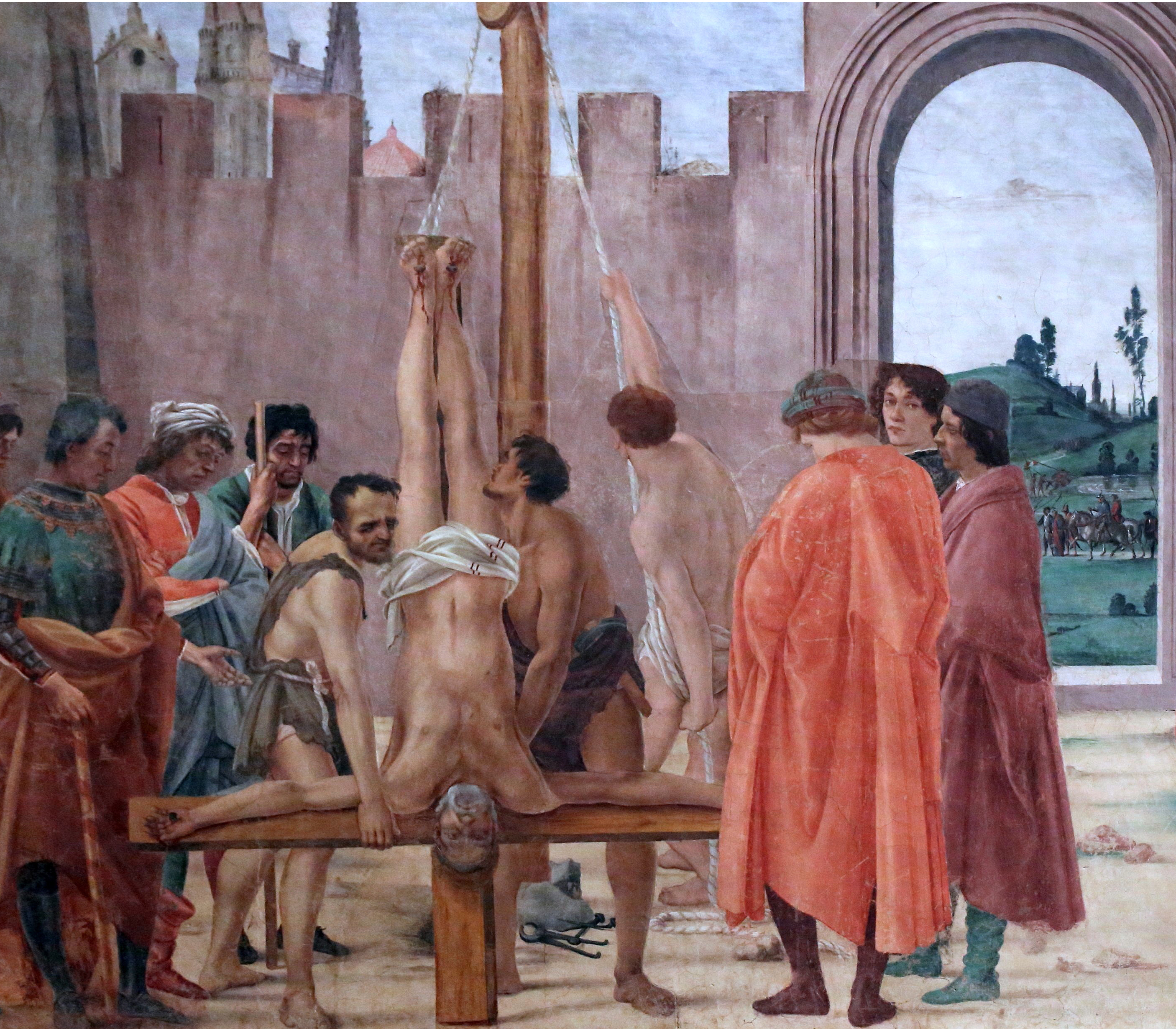
Filippino Lippi, ‘The Crucifixion of Saint Peter and the Dispute with Simon Magus’ (c 1481-85), fresco, 230 x 598 cm
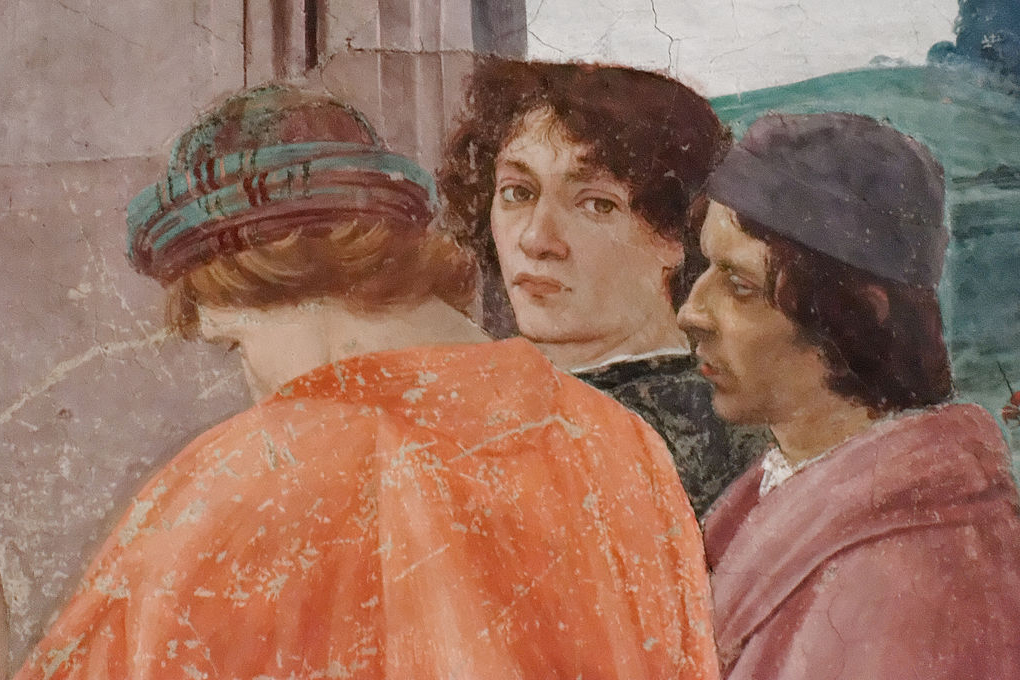
Detail
Panofsky’s ‘Early Netherlandish Painting’ introduced me to those peculiar interiors loaded with iconography. I think of carpentry, perhaps because of Joseph on the right of Robert Campin’s ‘Merode Altarpiece’ in the Cloisters, New York. There is timber too in Rogier van der Weyden’s ‘Deposition’ in the Prado, a Picasso favourite, and up there with ‘Las Meninas’, and ‘Les Femmes d’Alger’. Decades later, I was in Germany a few times, and discovered the Cologne School, especially Stephan Lochner. ‘The Martyrdom of the Saints’ is exquisite – sugary and gruesome.
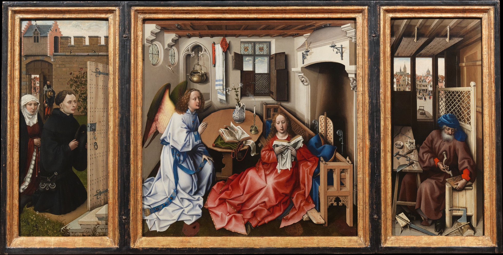
Workshop of Robert Campin, ‘Annunciation Triptych (Merode Altarpiece)’ (ca. 1427–32) oil on oak, 64.5 x 117.8 cm

Rogier van der Weyden, ‘The Deposition’ (ca.1443) oil on panel, 204 x 261 cm
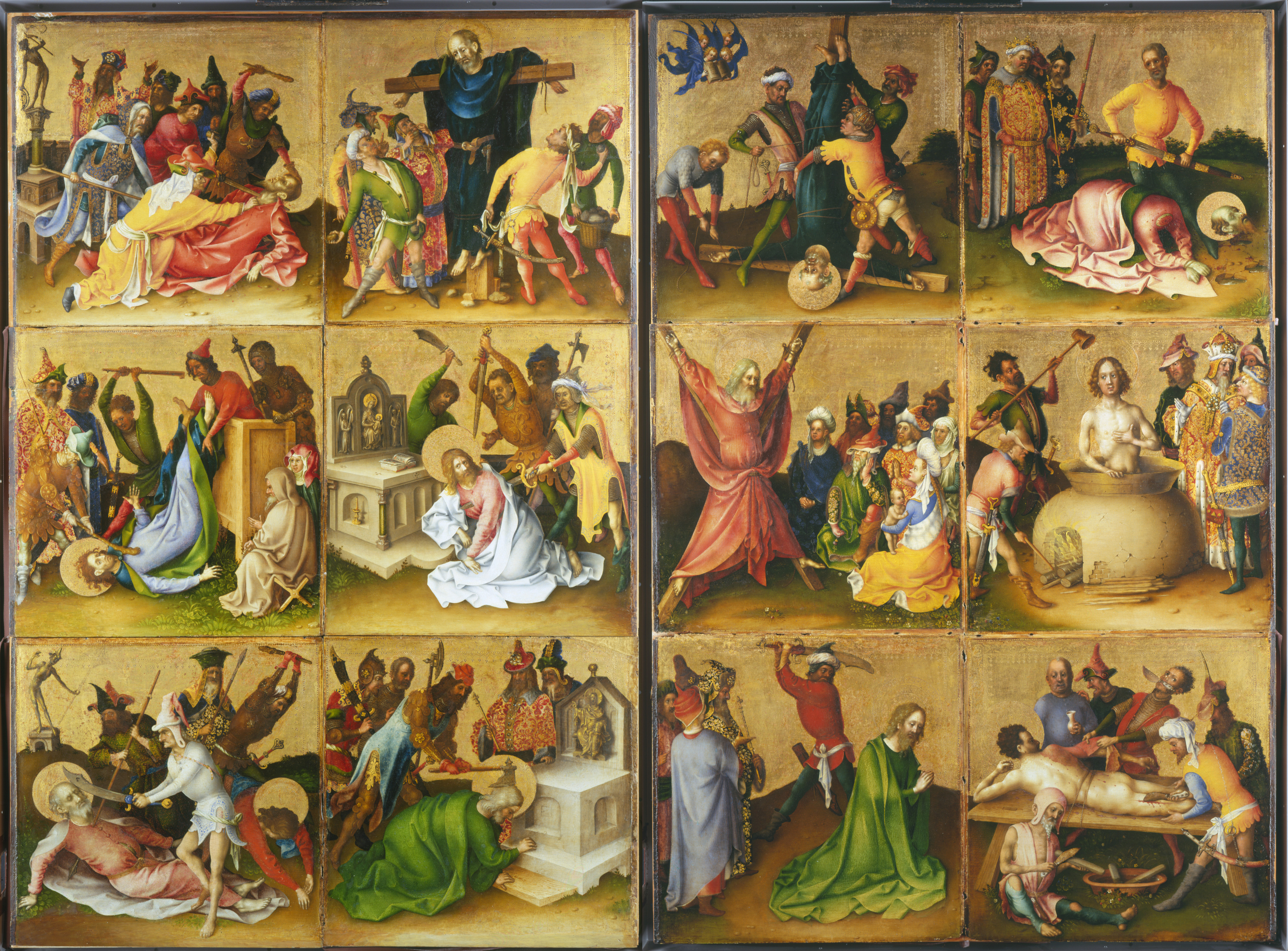
Stephan Lochner, ‘The Martyrdom of the Apostles (The St Lawrence Altarpiece)’ (ca.1435), tempera and oil on walnut, 120 x 180 cm
At St Martins I had to give a seminar on the de Kooning show at the Tate in 1968. I knew little about Abstract Expressionism beyond the clichés. At the time the breezy cool of Ken Noland’s horizontal stripes, and Tony Caro’s ‘Prairie’ at the Kasmin Gallery, made everything else look fussy and nostalgic. I wasn’t prepared for de Kooning’s slippery shapes, the muscular brushwork, the sheer energy of ‘Excavation’ or ‘Easter Monday’. Shortly after this I worked as Sol Le Witt’s draughtsman at the ICA, in one of the first conceptual shows, ‘When Attitudes Become Form’.
Willem de Kooning, ‘Excavation’ (1950), oil on canvas, 205.7 × 254.6 cm
There was an exhibition of Chinese ceramics at the V&A in 1971 that started me off, particularly the Kangxi period. I was at the RCA and haunted the Chinese galleries. Later, I kept returning to the Greek vase section in the British Museum. I like to work out how they were done – the compass point in the shields in Exekias’ vases. Then there are Iznik ceramics…
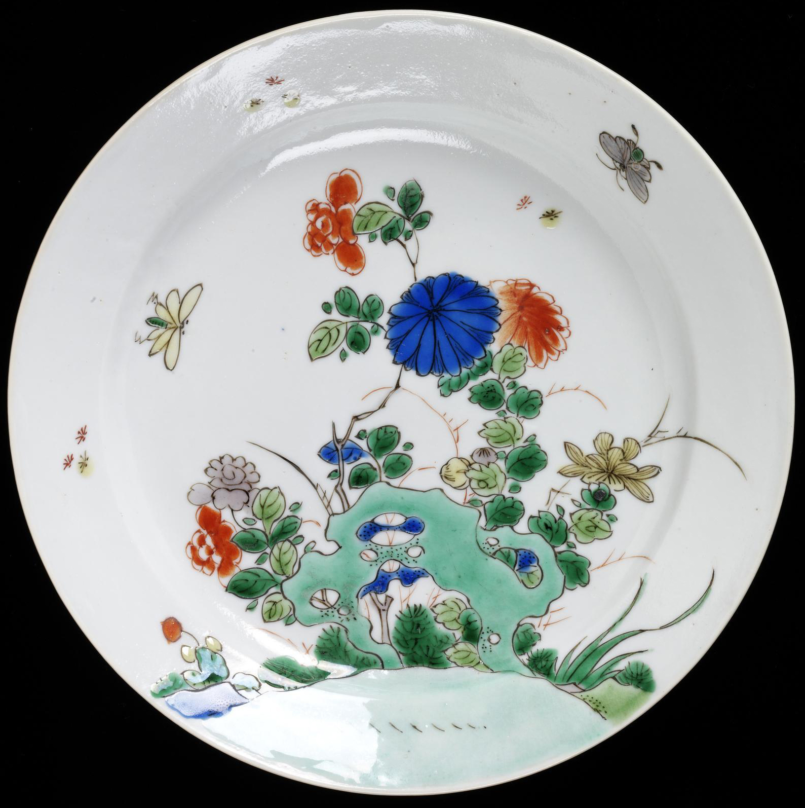
Jingdezhen (made), (1662-1722), porcelain painted in underglaze blue and overglaze polychrome enamels
1980’s…
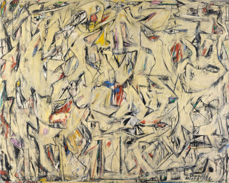
Fast forward to 1980 and the Clyfford Still exhibition at the Metropolitan Museum in New York. In Britain there were just one or two Stills. Rothko and Newman were all about the sublime, spoken of in hushed tones. I had a good friend, the painter Jim Adley, who got to know Still at the University of Pennsylvania1James Adley obituary guardian: https://www.theguardian.com/artanddesign/2015/apr/21/jim-adley-obituary. I had also interviewed Al Held, whose fabulous black and white paintings of the 1970s, shown at Annely Juda, should be on this list2http://alheldfoundation.org/artwork/black-and-white-late/6/. Held had been close to Still, so I knew some background. Held had put up a sign in his studio: ‘who’s afraid of cubism?’ If I said something too respectful of the mythology around Abstract Expressionism Held would point at me and say, ‘you’ve been had!’ I learned from Irving Sandler to trust what I saw for myself, to look really hard. (Irving’s nickname, I believe, was ‘Iron Eyes’.) So, the Met retrospective was something of a confrontation – shrieking colour clashes, lemons and pinks in impasto, a feathery touch in the late works. The paintings were forceful, strained, but defiant and alive. They were more interrupted than composed – odd, contrary, unresolved. In the recent Abstract Expressionist exhibition at the RA I noticed that Still had first outlined the jagged contours in charcoal. I never could get their measure. Sometimes the paintings looked nothing special, just austerely bombastic. Sometimes they were mighty and beautiful. But they were free, independent, and stood apart. They made other works look ingratiating, aesthetically perfumed, overworked, over-explained.
Clyfford Still, ‘August 14 1978, (PH-1085)’ (1978), oil on canvas, 289.6 x 233.7 cm
Through John Hoyland, several of us at Artscribe3https://en.wikipedia.org/wiki/Artscribe got to know Jackson Pollock’s elder brother, Charles4Terence Maloon, 2002, Charles Pollock, Sweet Reason, Ball State University Museum of Art. I went round the Pollock exhibition at the Pompidou in the 1980’s with him – quite a privilege – and again when I tried to be clever, Charles, who was a gentle and quiet painter, said, ‘Jim, the thing you have to understand is that Jack was a perfectionist’. Such a simple remark…and it came from the person who had taught Jackson to paint.
Two discoveries – which had nothing to do with art – changed my whole outlook. In 1983 I was an artist-in-residence in Melbourne (alongside John Bellany), and I undertook a lecture tour. My ambition was to get to the Great Barrier Reef. I stayed on Heron Island. I was just snorkelling, but I was overwhelmed by this living kaleidoscope: parrot fish nibbling at the coral, flashes of silver as vast shoals switched about, huge clams, the optical tricks of camouflage, the threat of moray eels, reef sharks, and manta rays. It wasn’t the soft green landscape of the home counties. The ecology was awesome. Back home I set about making sense of this, and that meant a rethink, and painting with fewer distractions. After eight years it was time to cut loose from editing an art magazine.
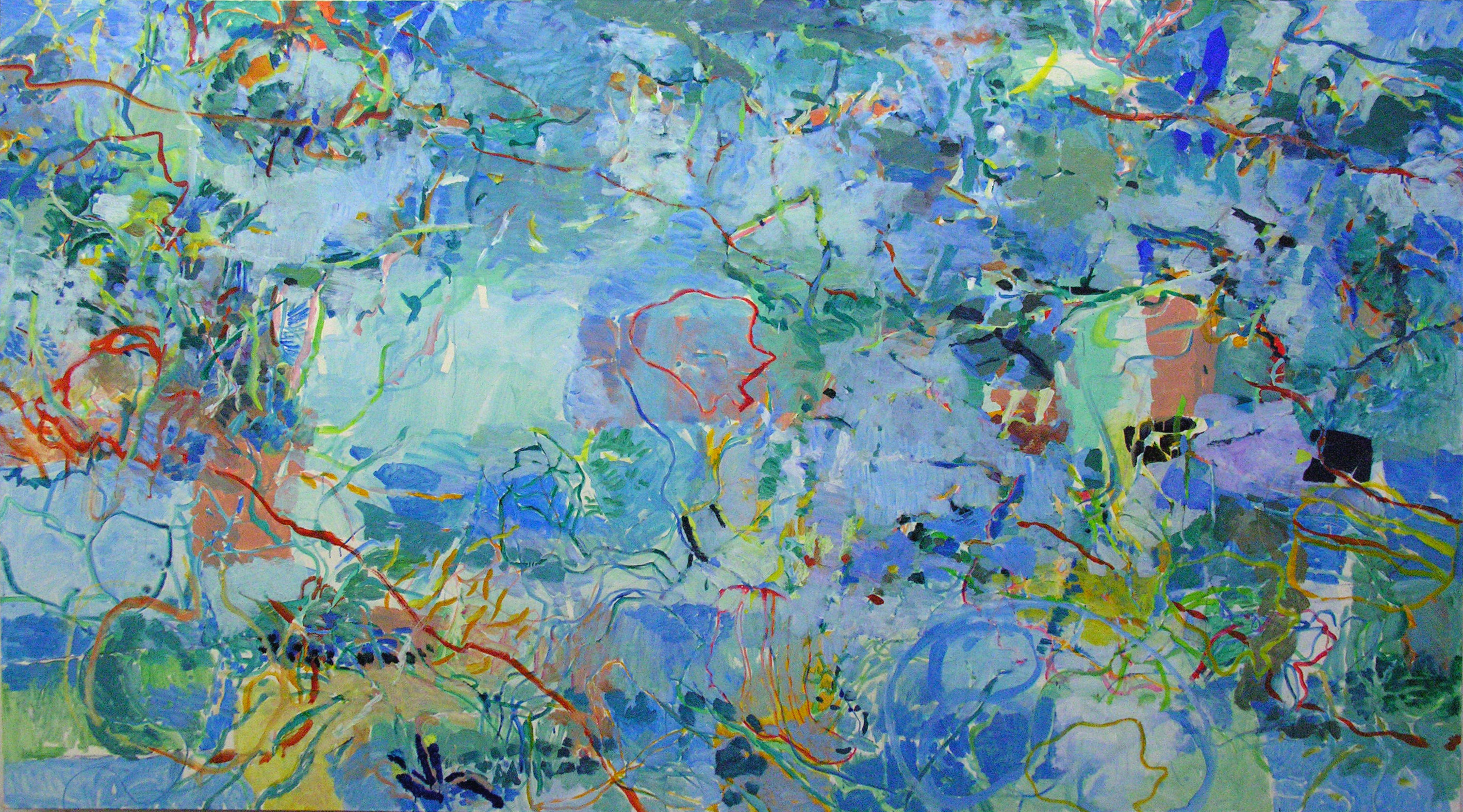
James Faure Walker, ‘Heron Island’ (1984), oil on canvas, 170 x 305 cm
The other discovery was computer graphics. I was primed for this because of the fluorescent colour-scape of the reef. Before the internet, Macs, mobiles, laptops, Photoshop and so on, you could only access ‘high end’ systems – Quantel, Getris, Matisse – in labs or at trade shows. The hardware was way beyond the budget of an independent artist. At the shows huge screens flickered with the palest greens and purples. Tantalizing shapes were transformed in ‘real time’– even photos! This was a revelation. The implications for a painter – for a Klee or Kandinsky – were boundless5http://www.vam.ac.uk/content/articles/a/computer-art-history/. Till then I had only worked on the crude Apple II and Amiga. Here was speed and power. Today none of that would make you blink. We take it for granted, as if it had always been available.
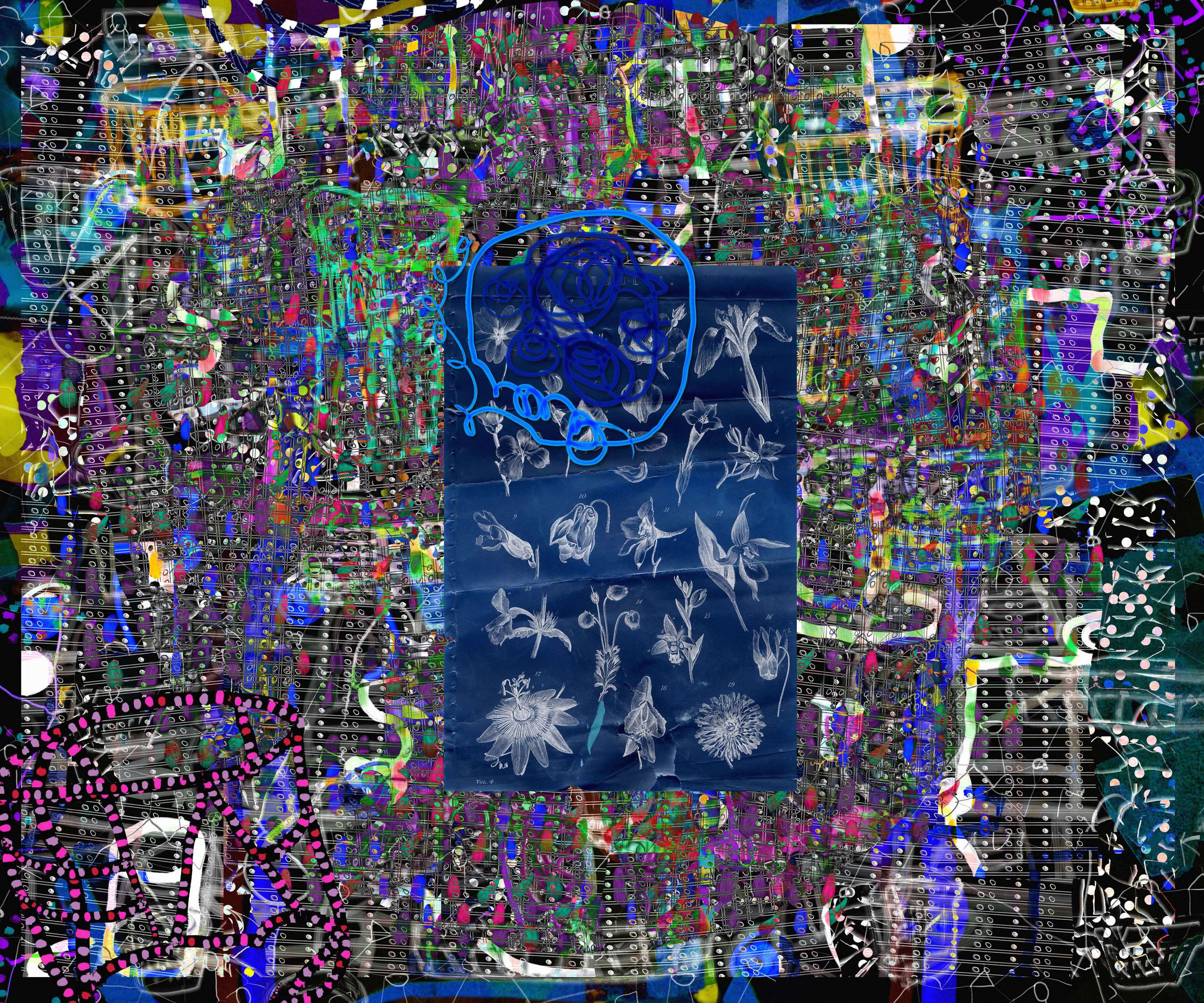
James Faure Walker, ‘Dark Filament’ (2006), archival Epson inkjet, 102 x 127 cm
By and large the painting community did not take any interest: ‘computer’, ‘graphics’, ‘design’, these were bogey words. It was dismissed as novelty art – sometimes with justification, it has to be said. The committed painter preferred the primitive physicality of ‘real’ paint, along with the aura of art history. I wrote a few enthusiastic articles, and had a regular column in CGI, a computer graphics journal. In 2006, my book, ‘Painting the Digital River: How an Artist Learned to Love the Computer’ 6Faure Walker, J., ‘Painting the Digital River: How an Artist Learned to Love the Computer’, Prentice Hall, Upper Saddle River, New Jersey, 2006.was published in the USA. One reproduction I used was Gossaert’s ‘Adoration’ from the National Gallery, making the point that Renaissance artists were quite capable of producing the flashy rendering of a 3D computer demo. They wouldn’t have been too bothered about the smooth impersonal surface. Or was I wrong?
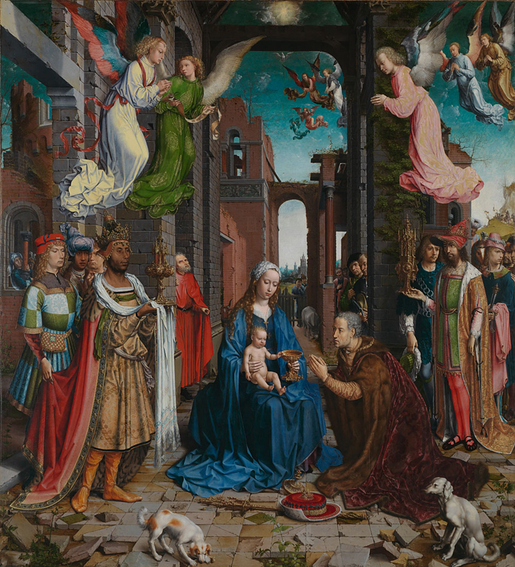
Jan Gossaert, ‘The Adoration of the Kings’ (1510), oil on oak panel, 177 x 162 cm
Abstraction…
What of abstraction? I confess I use images to solve problems all the time, (except in watercolour, for some reason). After more than thirty years of working with physical and digital paint in parallel there simply is little point in having no-go areas. Here is a list of shows that have won me over by their sheer inventiveness and joy: Sigmar Polke (drawing show at MOMA), Tàpies (print show in Falmouth), Dubuffet (Pompidou), Neo Rauch, Tal R, Hockney, Bernard Cohen, Patrick Heron, John Hoyland, Rose Wylie, Jules de Balincourt (the early paintings), Peter Doig, Vik Muniz (retrospective in New Orleans), Craig-Martin (Serpentine). I don’t recall ‘abstraction’ coming up as a question.
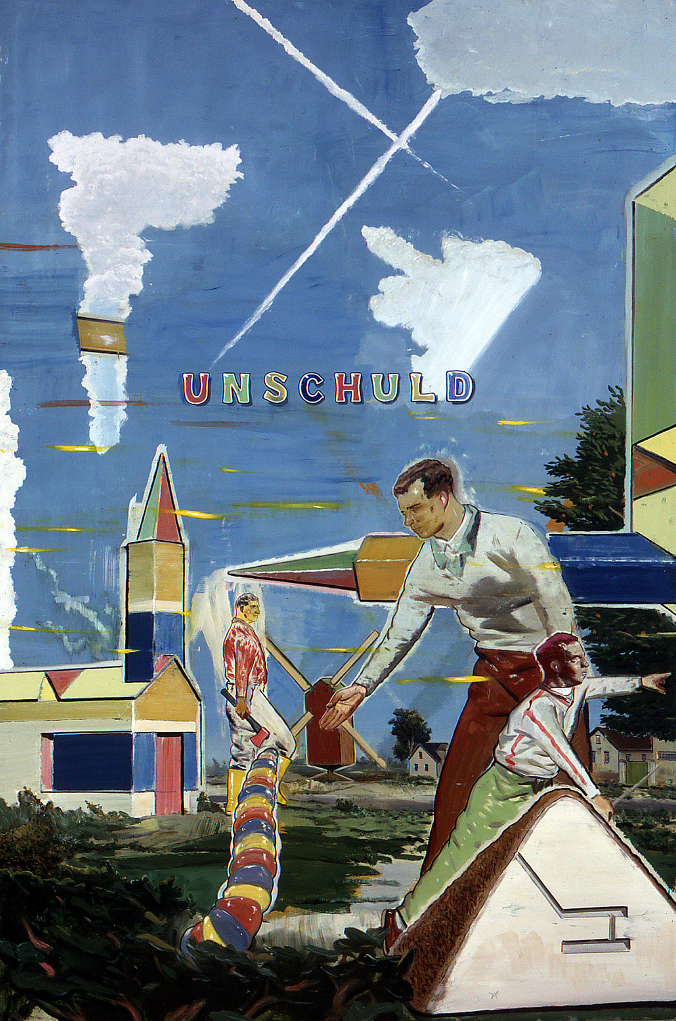
Neo Rauch, ‘Unschuld’ (2001), oil on paper, 298 x 200 cm
There was a Sam Francis print at Bernard Jacobson’s a few years back. I really wanted to own it, but took photos instead, especially the details. I ‘borrowed’ these for a painting called ‘Marsh Harrier’.
Sam Francis, ‘Senza Titolo III’ (1988), etching and aquatint, 49 x 53 cm

James Faure Walker, ‘Marsh Harrier’ (2016), oil on canvas, 137 x 173 cm
When you transcribe a painting, or make a quick sketch in a museum, you unravel its secrets. I saw the Miro show last year in Paris. I love the way the images are found in the dance of the line: the looping calligraphy ropes in weird personages while spelling out the title: ‘Escargot, Femme, Fleur, Étoile’. It’s all discovered in the making.
Hang on. I haven’t mentioned the Braque ‘Pink Tablecloth’ in the Thyssen in Madrid….
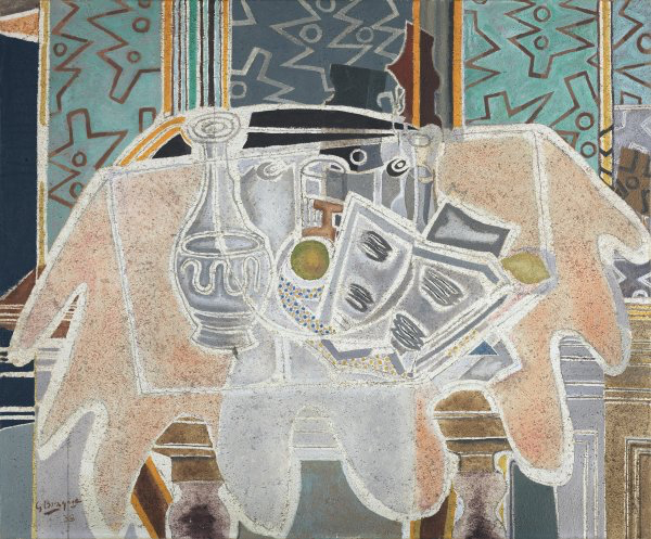
Georges Braque, ‘The Pink Tablecloth’ (1938), oil and sand on canvas, 87.5 x 106 cm
www.jamesfaurewalker.com
James Faure Walker will be showing recent paintings at Felix and Spear, 18 May – 15 June
Black-figured Amphora (wine-jar) signed by Exekias as potter and attributed to him as painter (540-530 BC)
Willem de Kooning, ‘Easter Monday’ (1956-56), oil and newspaper transfer on canvas, 243.8 x 188 cm
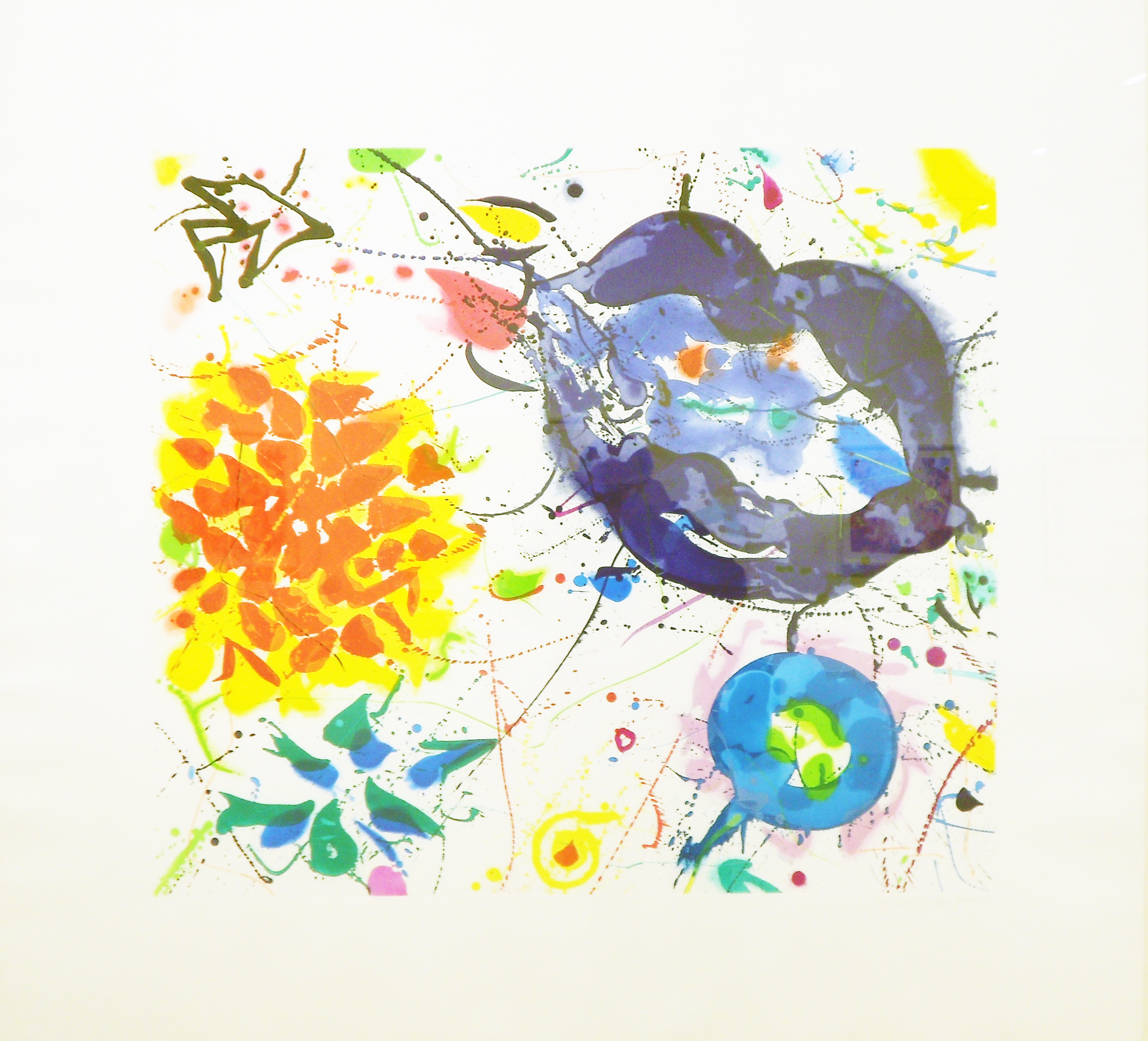
Joan Miro, ‘Escargot, Femme, Fleur, Étoile’ (1934), oil on canvas, 195 x 172 cm
3 thoughts on “Eye Opener: James Faure Walker”
Comments are closed.
Wonderfully intelligent and erudite. Any good exhibition, and I always see James. Not sure about the Held appraisal however, as I felt he let the cat out of the bag by introducing perspective. Also about Clyfford Still, I got to see Edward Dugmore frequently, one of his close students. He (and Ernie Briggs) was a very interesting man and artist, not at all stuffy or restricted (shows at Loretta Howard). I’m amazed at the lack of a rigorous devotion to ongoing Abstraction,in both this and Alan’s piece. Can we ask Sean Scully to do one ?
Good to read about your connections and influences, like the qoute from Charles Pollock. Something that came to mind – were you interested in, or do you feel any kind of synergy with Hockney’s rendering of water in his Pool paintings? It may be a spurious thought, but they came to mind when seeing the Heron Bay work.
Excellent James. There is always so much thought and revision that one has to put into these bio/memory inspirations, it takes time and genuine effort to really get across in an honest fashion one’s feelings, and your recap and enthusiasm for art and life powers throughout – and most eclectic. Very enjoyable indeed.