David Sweet: Clyde Hopkins, 1946-2018
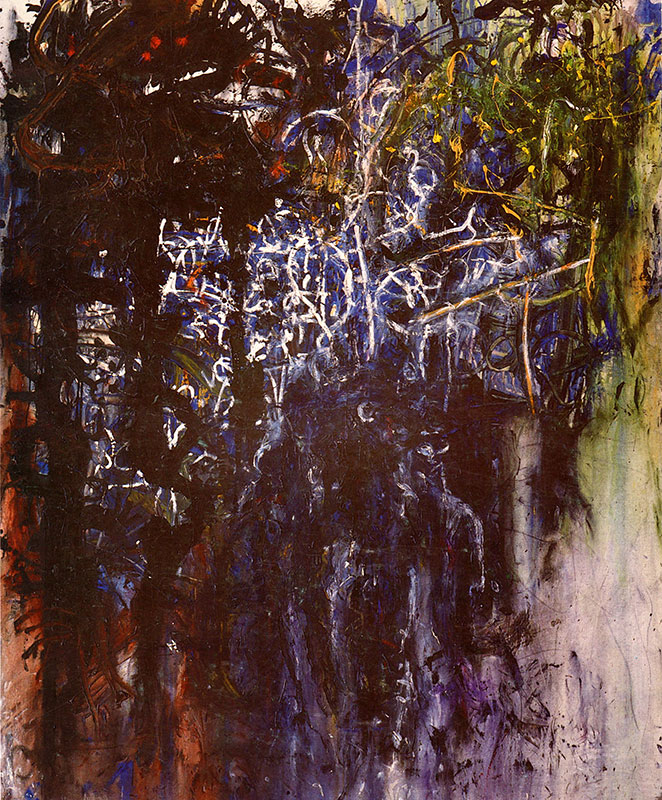
Clyde Hopkins, ‘A Working River’ (1985), acrylic on canvas, 204 x 168 cm
I’ve written about the paintings of Clyde Hopkins over a number of years. This is an attempt to reflect on his achievement by revisiting those texts to see what light they throw on what I think is quite challenging, even difficult, work.
John Hoyland selected two of Clyde’s paintings for the 1980 Hayward Annual. The decade that followed was characterised by a mood of liberation and eclecticism in painting, and a spike in interest in the medium in the aftermath of the Royal Academy’s ‘New Spirit in Painting’ exhibition of 1981.
Much of the work in the Academy was big, excessively ‘painterly’, and stuffed with emotive imagery. By contrast, Clyde’s canvases were not over large, painterly without being excessively so, and, by staying close to the pictorial language of abstraction, avoided the ‘quick fix’ of incorporating figurative elements; yet they were liberated and ‘open’. They were also structurally complex, exploiting the range of technical variations of pigment density to produce forms at different thresholds of visibility, some explicit and some suggestive. I said of the latter type that they were “deliberately left in a condition of finely judged incompletion so the viewer comes to ‘know’ them by concluding…the process of realisation recorded in the form”. By eschewing obvious images like screaming skulls or rows of teeth, which would abruptly “short-circuit appreciation of…expressive incident”, the experience of the work is enhanced and extended, “offering the traditional and satisfying cognitive optical rapport of major painting”.1‘Pitfalls of Liberation’, Artscribe 37, October 1982. p.20-27
Technical complexity was a way of keeping in touch with painting’s past, and this preoccupation offset the other strong current in eighties culture: politics, specifically Thatcherism, which became a focus of dissent for infuriated liberal and progressive commentators and artists – most of whom were on the left, as they witnessed the Falklands adventure in 1982 and, more significantly, the Miners’ strike of 1984-85. In October 1985, Clyde showed twelve paintings and six works on paper in an exhibition whose national tour included the Ikon and Serpentine Galleries: political and social issues featured strongly in Brandon Taylor’s catalogue notes for this show, with stress on protest and dissent. My approach to writing about his work, on the other hand, prioritised more pictorial concerns. To me, it exemplified something of the contemporary sense of a painting “free of taste and historicism”, “more inclusive and less taboo-ridden”, but not “fashionably abandoned to mere anarchy”. In it, “the familiar language of painterly gestures” was re-purposed to accommodate political interests; nevertheless, I did not believe that such interests constituted the core of his practice, but rather, that they operated more like the Mont St Victoire did for Cézanne, as a motif around which the ‘sensations’ of his subjective responses could coalesce. Thus, Clyde’s work of this period focussed on his subjective processes, “making actual the findings of introspection”: what was central was not his ideological objections to Thatcherism, but his emotional response to the political circumstance of the time, which converted a style with roots in impressionist picture-building into an approach more reminiscent of European expressionism. Dissent and conflict, in pictorial terms, were the results of this conversion.
In the same essay, I saw him loosening the grip the ‘Frenchness’ of Monet, Braque and Matisse had on him, in favour of the ‘Spanishness’ of Velasquez, Goya, Picasso and Miro. This manifested itself in his adoption of a certain kind of black, not black as colour as in Matisse, but black as negativity, darkness; “a savage, cruel note” that “enters from the Spanish tradition”. This black is associated with “script-like gestures…which connect to form an ugly and uneven network reaching across the picture surface”. Interacting with this structure were more charming passages built from overlaid glazes in blues and greens, which “alternatively hold their place on the picture plane or read back into depth”; and a third element was created by the wiping away of areas, or the application of pale washes of light over dark, to generate intriguing, somewhat wraith-like forms that competed with those rendered in heavy swathes of thick pigment.2‘Clyde Hopkins’ Artscribe International 56, 1986. p 36-38.
Although Clyde’s work underwent a series of changes, I think the use of these three overlapping tropes was still there to be found in the paintings made after this period; as was his particular take on ‘expressionism’. Overt gesture was reduced over the years but the attempt to actualise introspection, and to incorporate an emotional charge, still animated the painted surface.
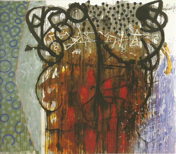
Clyde Hopkins, ‘Bread in Pocket’ (1990-91), oil on canvas, 170 x 203cm
A major exhibition of paintings Clyde made between 1990 and 1998 showed a shift away from the methods he had successfully employed in the eighties. The oldest painting in the show, Bread in pocket of 1990-91, still offered a great deal of gestural activity, combining black calligraphy, drizzles of thin paint, glazes and plain canvas; but it also introduced a planar element, activated by a schema of dots and circles. I included two works of this period in a group show I organised in 1996. The emphasis on the subjective, evident ten years earlier, was still there, indicated by a use of symbol-like forms, derived from the external world, but transformed by an extensive process of stylisation, and ‘modified in order to participate in new, non-naturalistic arrangements and structures’ more associated with imagination than perception. His palette had also expanded and intensified.
These works combine strong opposing forces, travelling at very different speeds. “Black, brushed, hasty contours (are) in vigorous conflict with those with the careful edges; yet their overt energy and aggression does not triumph. Instead the gestures, with their entourage of drips and dribbles, are arrested in mid-flight, still alive, but frozen in time, while the slower process of surface coating catches up, capturing the forceful drawing in an envelope of heraldic stillness”.
I went on to write,
“In ‘Idiot Painting’ (1995), and ‘April the First’ (1994), the contradictory expressive modes meet head-on, with the intuitive markings and splash shapes meticulously preserved by snail’s-pace brush work, which is almost miniaturist in technique. The air of contrivance is enhanced by the unnatural, enamelled beauty of the colours, and the artificiality and omnipresence of the shadowless, modern office light which illuminates their transactions. In both, the overall rhythm of the pictures is set by visual pulses of metronomic regularity in the form of polka dots or meandering scratches, obsessively turning gesture into pattern.
The elements in Hopkins’ work seem to come from strikingly different, even contradictory, traditions, as if he is seeking to cover extremes of expressive language, rather than occupy a unified middle ground. The juxtaposition produces a peculiarly complementary effect, as though two implacably opposed artistic visions had collided in the same work. The result is an increase in intensity so great that the contents of the painting seem to pass through a tangible ordeal, a sort of visual pain barrier, which strips them of lyrical compromise and aesthetic consolation and delivers, in the place of these lesser pleasures, the unmistakable rewards of serious poetry.”3Catalogue note, Delight, exhibition at Manchester Metropolitan University and Kingston University, 1996. P 10 and p 23.
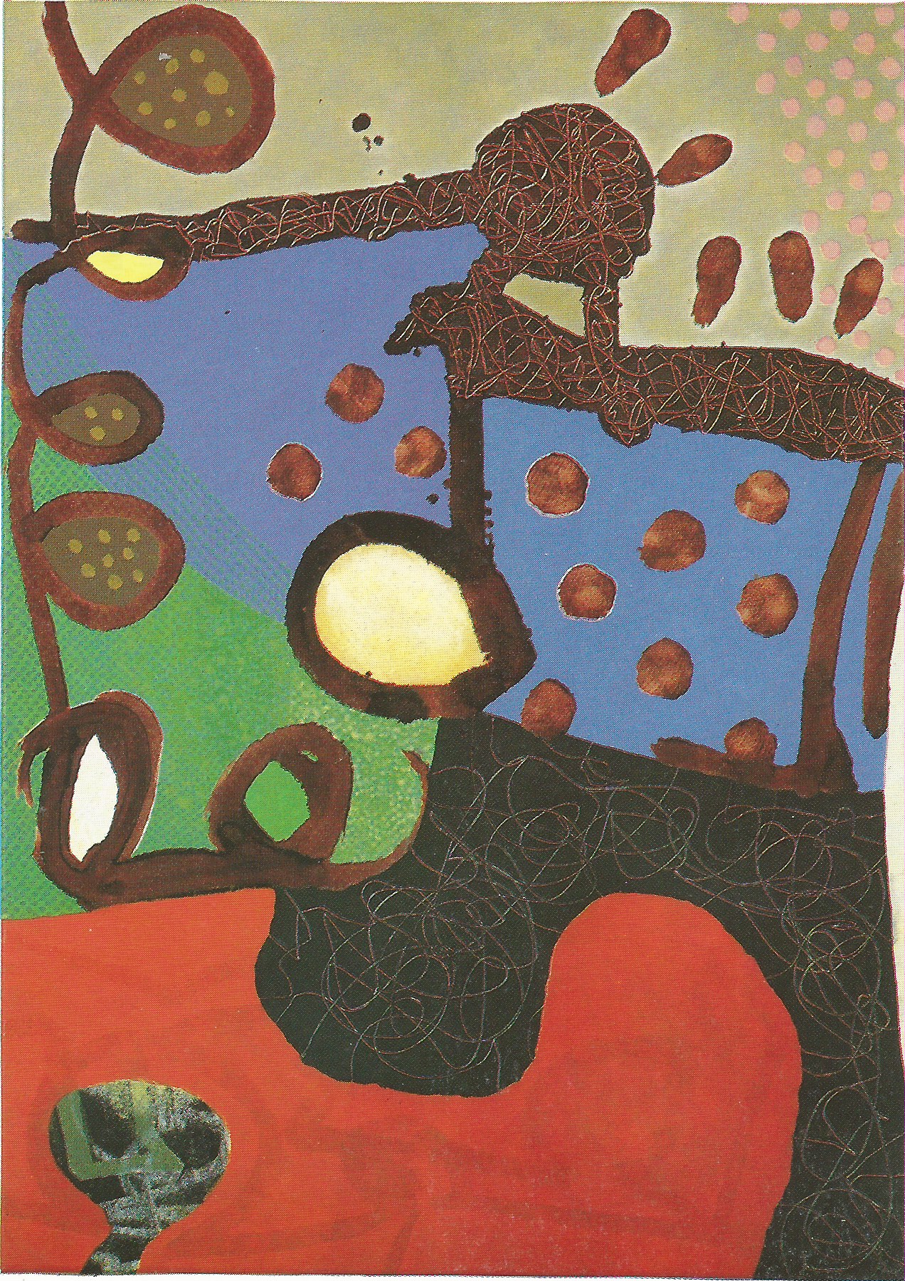
Clyde Hopkins, ‘Idiot Painting’ (1995), oil on canvas, 71 x 51cm
Clyde Hopkins, ‘April the First’ (1994), oil on canvas, 36 x 31cm
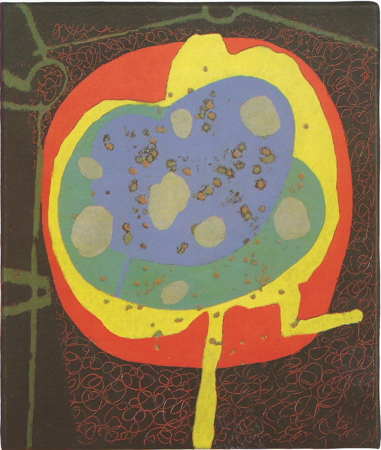
Towards the end of the nineties the paintings became increasingly planar and flat. The areas within the boundaries were filled with intense colour, applied with a small brush and laid down with a level amount of pressure across the surface, not accumulating or thinning, thereby maintaining frontality. There were occasions where the intervening spaces would be filled with a regular pattern of small dots: these were used sparingly at first, alternating with areas of conventionally applied paint, but they gradually seemed to colonise more of the picture surface in his later work. In a catalogue note, I wrote this of a 2013 painting, About the Orinoco:
“Goethe, in 1840, wrote about painters’ ‘dread of the motley’. He defined motley as placing colours ‘next each other in their full force’, ‘falsely arranged in relation to light and shade’. Shade and shadow traditionally provided the initial pictorial armature, with forms gradually emerging from darkness into visibility. But in this painting there is no shade, only a pitiless kind of light. Yet each colour is right in itself, associated with pigment with its own material characteristics (…) and the impression of strong light comes from the legibility of the painting’s elements, which have something of the quality of symbols. Unlike forms, which can be eclipsed or half lost in shadow, the full anatomy of a symbol has to be explicitly seen for it to be effective…”
“The loops, spirals and discs pass through the chromatic geography of the painting, sometimes confined by a complex system of border fringes and divided spaces, each of which bears a specific hue which distinguishes it from its neighbour. The colour itself seems precious, as if made from a rare earth or scarce mineral, and is applied carefully, so as not to waste a drop. But in many areas of the canvas, the blue and purple section particularly, the sensation of pure colour is supplanted by the optical buzz of tiny points of pigment that settle on the surface in an uncannily even matrix, as if each corresponded to a single cell on the retina. This treatment melts the areas into a mirage or memory, like colours in a dream, producing passages of visual stimulation offset by the variegated column of solid pigment on the left, a sequence of blue, yellow, red and green, interspersed with neutrals, to which the eye keeps returning almost for reassurance.”4Catalogue note, Colour/Boundary exhibition, Gallery North, Newcastle. 2014. p 8
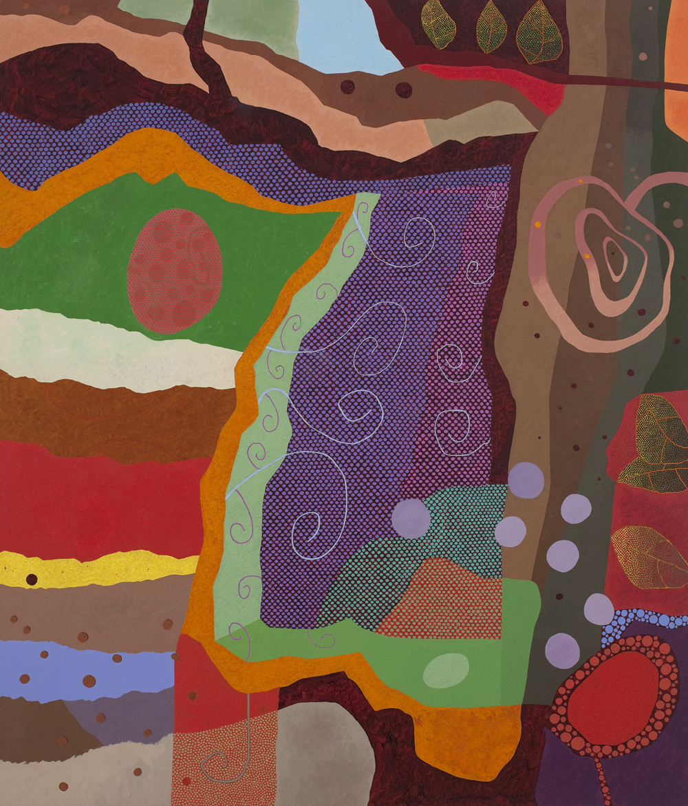
Clyde Hopkins, ‘About the Orinoco’ (2013), oil on linen, 105 x 90cm
I didn’t like to ask him, “Why the dots?” But to him they seemed important. I think they are partly a reference back to one of the procedures in his mid-eighties canvases, where an area would be cancelled by a wash of white or the action of a cloth soaked in turps. The wraithlike form that emerged was ‘there’, but not in the same way as other events in the painting. These intermediate elements were ontologically insecure, partly present and partly absent. The planes assembled out of dots also seem insecure: they are like codified versions of glazes where, instead of the ground colour showing through the transparent over-painting, it is visible in the interstices of the matrix, under the dense ranks of punctuation marks.
Now I can’t ask him, so the question allows other speculations. The dots might be about time, measured out in careful pulses, each dab taking, say, 2 seconds to lay down. With a density of 5 per cm2 it would take perhaps 15 minutes to cover an area of 100cm2: you could therefore probably work out how long it took to paint the two areas in Night Crossing (1996). No such calculation would occur to the viewer in front of Clyde’s paintings of the eighties, where the pace and dynamic of his working processes gave them a marked urgency, despite their structural complexity; but here, the dots slow down the viewing of the painting, as the time absorbed in producing these passages seems to be echoed in the time taken to contemplate them.

Clyde Hopkins, ‘Night Crossing’ (1996), oil on canvas, 204 x 180cm
The development of Clyde’s oeuvre over the last thirty-eight years is hard to encapsulate, and the work itself cannot be categorised too readily. He fitted well into a variety of art institutions, successfully playing central roles in art schools and studio organisations; but he made work that seems to not quite ‘belong’. It should be obvious by now that I admired his painting, but in describing it, I seem to have emphasised its challenges, its avoidance of aesthetic consolation, and its pitilessness. But maybe that’s what makes it worth looking at.
7 thoughts on “David Sweet: Clyde Hopkins, 1946-2018”
Comments are closed.
Clyde’s long journey as a painter remembered, thank you, David.
A great tribute David
This is a fine and elucidating essay and a fine tribute to Clyde.
Good to read intelligent thoughts about non figurative painting.
Terrific David, thank you. It was a much more emotional ceremony in Greenwich, and this gives a sense of why we all loved the man so much. For me it was his wit and anarchy, both of which are all over the work. What an unusual and interesting man.
Thank you for this. Thrilling writing which keeps me going. Paul Morin (Medlock ’84 -’88).
Lots of memories. Saw the show yesterday, very firm yes to everything, as is expected. Is there any really early work in existence.? Curious
Yes there is